Consider the User Experience
Installing your software should be a pleasant experience. It shouldn't be regarded like a trip to the dentist. Let's first look at the installation process from the point of view of the user's experience.
Simplifying the User Experience During Setup
Don't make the user jump through hoops during the setup process. Consider the following:
- For large, complex programs, offer different levels of installation (usually Typical, Compact, and Custom) and carefully explain their differences in terms of functionality and disk space. (The user isn't going to discover the differences the hard way because the user is only going to install once.) The Typical installation should do what is best for most users. Assume that most users will make this selection. The Compact installation should provide the most basic setup when disk space is at a premium. The Custom installation should select what is installed by the Typical installation by default. Most likely a user will select the Custom installation to add or remove options from the Typical installation, using it as a baseline. The Custom installation shouldn't make the user guess what the required files are.
- A setup program should let the user know how much disk space is needed to perform the installation and the amount of disk space available on the selected drive.
- Avoid situations in which the user has to abandon the setup process to gather information. If the user needs critical information to complete the setup, ask for it at the beginning of the setup, not in the middle.
- If the user has to enter a password, a serial number, or a registration number to perform the setup, ask for it once. Don't ask every time the setup is run.
- Avoid having the user restart Windows during setup. For most program installations, the only reason to restart Windows is if an installed file was in use by another program. Notice that you do not have to restart Windows to install a driver. If the setup program cannot install a file because it is in use, explain this to the user and give the user another chance to quit the running programs before requiring a restart. Or, better yet, have the setup program offer to close the running programs automatically.
TIP
Avoid restarting Windows during an installation.
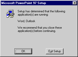
Notice how the Microsoft Office setup automatically detects when other Office applications are running and suggests that you quit them before continuing the installation.
Simplifying the User Experience After Setup
Once the setup is complete, don't make the user jump through hoops to use the program. Consider the following:
- Provide an option to automatically launch the program after setup.
- Present an initial welcome screen or product introduction screen that briefly explains how to use the program and where to get more information. Provide just one window of this type. Don't pile up a bunch of welcome windows—this is far more confusing than it is welcoming.
- Choose the default program configuration carefully. If your program has a lot of functionality, let users grow into it at their own pace. You don't need to show every feature in the beginning—let the user choose to display these other windows when they are ready. Favor default options that help beginners, such as tips, agents, and wizards.
- If your program has optional components, make it easy to add or remove components after the initial installation. Such a setup should detect that the program is already installed and offer the option to add or remove components. Don't make the user completely reinstall to add a component. Worse yet, don't make the user uninstall and reinstall to remove a component.
- Make the program easy to upgrade. The upgrade should maintain all the user's current settings. An upgrade shouldn't require the user to start completely over.
- Make the program easy to uninstall. Always provide an uninstall program, and don't require the user to insert the source media to uninstall.
Simplifying the Start Menu
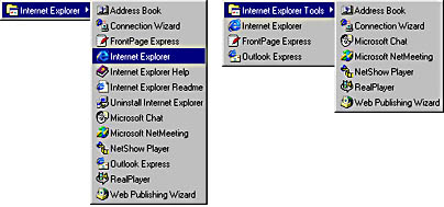
Suppose that your program consists of the following items: the program itself, its help file and help contents file, the setup program and uninstall utility, an online tutorial, a readme file, release notes, a technical support document, and several data files. How many of these items should be in the Start menu? The answer is one—the program itself. Putting the other items in the Start menu adds clutter and doesn't help the user at all. How many times have you launched a program's help file from the Start menu? How many times have you done this for the readme file? For most users, the answer is never. It makes sense to use the Start menu to help the user get his work done, not for dealing with installation and technical support.
Help the user clean up the Start menu and make your program easy to find. The user shouldn't have to wade through a bunch of unused icons to find your program in the Start menu. Instead of using the Start menu to tie all these items together, use the program itself. Use the program's Help menu to provide access to all the help and technical support files. The uninstall utility needs to be registered with Windows and is accessed using the Add/Remove Programs applet in the Control Panel (and possibly the program's Help menu as well), not the Start menu. Rarely used auxiliary programs and utilities should be moved to a submenu to make the main program stand out.
TIP
Reduce Start menu clutter by not adding installation, documentation, and technical support-related files to the Start menu.
Simplifying the Desktop
The setup program can help the user clean up the desktop as well. Don't add icons to the desktop, Quick Launch bar, or taskbar System Tray without asking. These system resources have a limited amount of space, so the user will want to reserve them for the most commonly used programs. Don't take it for granted that your program is one of these. Let the user choose.
Status-only System Tray icons should be optional and off by default. For notifications, it's better to dynamically add and remove icons to notify the user of an event than to permanently keep an icon and just change its appearance. For example, a mail icon that appears in the System Tray only when there is new mail is more effective than an icon that is always there and changes its appearance when new mail is received.
Note that adding an icon to the desktop or the Quick Launch bar is very simple, since you can drag and drop an icon directly from either Windows Explorer or the Start menu. Having to add an icon to the desktop is at worst a minor inconvenience.
TIP
Reduce desktop clutter by not adding icons to the desktop, Quick Launch bar, or taskbar System Tray without asking permission.
Respect the user. Put the need of the user to maintain control of his desktop and hard disk over your need to promote your programs and your company. Don't install things like promotional material and demos without asking permission. Don't use unnecessarily long titles for items in the Start menu, since each menu is adjusted to be long enough to display the longest item. You'll make an impression if you don't respect the user, but it probably isn't the kind of impression you want to make.
The two basic installation goals I discussed earlier were to provide the ability to successfully install and uninstall the program. But the best setup programs don't just install and remove the software; they go out of their way to help the user control his system. This is the ultimate goal for setup programs.
TIP
The best setup programs go out of their way to help the user control his system.