A Case Study: Tooltips vs. Balloon Help
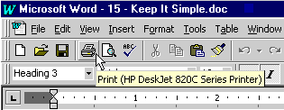
Let's now look at keeping things simple by examining a real-world example. My favorite example of simplicity is a comparison of tooltips and balloon help. You are familiar with tooltips—little pop-up windows that provide brief context-sensitive help. Here's a typical example:
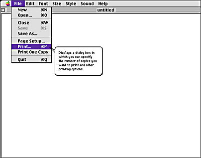
Balloon help is very similar. It was developed by Apple Computer to be their context-sensitive help system for System 7.0. Here's an example:
Both these features have identical objectives: to display context-sensitive help in an interactive manner. Specifically, the user receives help related to a specific screen item by moving the mouse pointer over that item. Although both approaches accomplish the same objective, most users find balloon help to be irritating while tooltips have become popular. To get a sense of why this is the case, let's compare the two features.
Tooltips
- The display of the help window is timer-based. You don't have to select a special mode for the feature to work.
- The help window is a small, simple rectangle. Its appearance is low-key.
- The text is generally short and concise, aimed primarily at intermediate users. The text is typically a few words or a sentence fragment.
Balloon Help
- The display of the help window is modal—you must select balloon help mode for the feature to work. Once you activate the mode, help balloons are displayed without any delay and they pop up nearly everywhere as you move the cursor.
- The help window is a large, cartoonish thought balloon. Its appearance is hardly subtle.
- The text is generally long and detailed, aimed primarily at beginning users. The text is often several sentences long.
The difference is that tooltips require simple user interaction (moving the mouse and waiting a couple of seconds), have a simple appearance (a simple rectangle taking up very little screen space), and present simple text (usually a few words). By contrast, balloon help requires much more effort by the user, its appearance is much too "in your face," and it presents far more text than most users would want to read. In short, tooltips are successful because they are the simplest possible implementation of mouse-driven context help, and balloon help fails because of unnecessary complexity that undermines its effectiveness. While the differences between the two approaches might seem small, they make all the difference in the world.
EAN: 2147483647
Pages: 334