A Windows Interface Road Map
One interesting characteristic of Microsoft Windows is that it provides such rich user interface functionality that often you can implement a user interface feature in several different ways. It's a useful exercise to lay out the various options and to understand the relationships between them. This knowledge will help you understand your options and help you make the right choices when simplifying your user interfaces. Very often the difference between a simple user interface and a complex one lies in making the right choices among these options.
TIP
Windows typically allows you to implement a user interface feature in several different ways. Often the difference between a simple user interface and a complex one lies in making the right choices among these options.
Primary Windows
Several types of primary windows are commonly found in Windows programs, including the following.
Single-document interface (SDI) window
An SDI window is a single primary window, with possibly a menu bar, toolbar, and status bar. This approach is simple and is suitable for both applications and utilities. Since there's a one-to-one relationship between a document and its window, an SDI program is easy to understand and manage. A good example is the Microsoft WordPad program.
Split single-document interface (split SDI) window
A split SDI window includes a single primary window and a window splitter, with possibly a menu bar, toolbar, and status bar. This approach is also simple and is suitable for both applications and utilities. The splitter gives you additional flexibility to add a second view of a document or a tree view or a list view to control the contents of the document window. The one-to-one relationship between a document and its window makes a split SDI program easy to understand and manage. Good examples are Windows Explorer and Microsoft Internet Explorer. In fact, this style window is sometimes referred to as an Explorer-style interface.
Multiple-document interface (MDI) window
An MDI window includes a collection of any number of document windows within a single frame, almost always with a menu bar, toolbar, and status bar. MDI applications often also have docking windows. This approach is fairly complex and is suitable only for applications. The biggest problem with an MDI application is simply the fact that the user has to manage all of these windows. Also, there's no clear relationship between documents and windows, especially if the user can display multiple windows containing the same document. Good MDI examples are Microsoft Word and Microsoft Visual C++. While it's fashionable to suggest that there are better (that is, more document-centric) alternatives to MDI, such as workspaces, workbooks, and projects, I don't buy it. The fact is that for complex applications like Microsoft Excel and Visual C++, MDI works well.
Dialog box window
A dialog box window is a dialog box used as the primary window, possibly with a menu bar and status bar. A dialog box program is typically used to view or change some values—no document is involved in the usual sense. This approach is simple and is suitable for utilities. Good examples are the Windows Find utility and the Calculator utility.
Secondary Windows
Secondary windows are used to provide information or supplemental interaction to the primary window. Of course, your interface will be simpler with fewer secondary windows, and your first choice should be to eliminate the need for secondary windows when possible. For example, Chapters 22 and 23 present many suggestions on how to eliminate unnecessary dialog boxes and message boxes. The most common forms of secondary windows follow.
Modal dialog boxes
A modal dialog box is a modal secondary window used to collect additional information from the user. Because the dialog box is modal, the user cannot use the primary window until the dialog box has been dismissed.
Modeless dialog boxes
A modeless dialog box is a modeless secondary window typically used to help the user interact with the primary window. Modeless dialog boxes are fairly awkward, since it is difficult to position them without having them in the way. Consequently, modeless dialog boxes are rarely used today and toolbars, docking windows, and palette windows are used in their place.
Convertible dialog boxes
A convertible dialog box is a secondary window that the user can make either modal or modeless, often by clicking on a "push-pin" button. For example, the Visual C++ resource properties dialog boxes are convertible. This type of dialog box is a good choice when either mode makes sense. It lets the user decide.
TIP
A convertible dialog box is a good choice when either the modal or modeless state makes sense. It lets the user decide.
Toolbars
A toolbar is a modeless dockable frame that contains a set of controls, often buttons and combo boxes, that are typically used to issue commands and set options. Toolbars are functionally equivalent to modeless dialog boxes but are far more convenient since they don't obscure the document window. For example, Visual C++ supports text searching through both a modal dialog box and a set of toolbar controls. There is nothing you can do with a modeless text search dialog box that you can't do with a search toolbar.
Docking windows
A docking window is a modeless dockable frame that contains any type of controls or information. Docking windows are similar to toolbars except that they are larger and they are not used primarily to issue commands.
Palette windows
A palette window is a modeless floating secondary window typically used to help the user interact with the primary window. While palette windows are similar to modeless dialog boxes, they have a smaller caption bar and typically contain only a small set of nonstatic controls. Palette windows are often obtained by undocking toolbars.
Commands and Options
Giving commands and selecting options are two frequent user activities. The most common techniques for presenting commands and options follow.
Menu bars
Menu bars are used to present most of the commands and high-level options available in a program. Users can quickly determine what a program does simply by scanning through the menus. This technique makes menus an excellent teaching tool for beginning users.
Buttons
Note that there is a strong relationship between buttons and menus. For example, this menu:
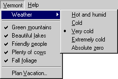
is functionally equivalent to this dialog box:
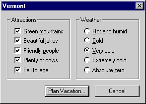
In fact, both approaches result in the same WM_COMMAND messages being sent to the appropriate window.
Programmers often try to simplify their interfaces by using buttons instead of menus. If there are only a few commands, this approach is effective because all the options are displayed right in front of the user, so the user doesn't have to hunt for the right menu item. However, this technique works with only about eight or fewer buttons.* (You can, however, get away with many more buttons if there is an obvious relationship between them—the Calculator utility is a good example.) With too many buttons, this becomes a poor trade-off since the user is overwhelmed with screen clutter and will have trouble finding anything. In this case, a better approach is to place the most common commands on the screen using buttons and place all the infrequently used commands in the menu bar. The Find Utility on the following page is a good example of this technique.
Context menus
Context menus are displayed when you right-click an item that has a context menu. Context menus are an excellent way of simplifying the presentation of commands and options. Since you can gather all the commands and options relevant to an object in a context menu, you can sometimes simplify the structure of the menu bar. Windows Explorer is an excellent example of this technique. Note how simple Windows Explorer's menu bar is, given the amount of functionality this program provides.
The problem with context menus is that they're not visible. You can't tell if an object has a context menu just by looking at it. You have to know to right-click the item to see whether there is a menu. This problem makes context menus a poor choice for programs that are targeted at beginning users. While a program aimed at beginners can use context menus, such programs should always provide alternative methods visible on the screen. As a result, Windows Explorer presents the most commonly used commands on the toolbar in addition to the context menu.
TIP
Context menus aren't visible, making them a poor choice for programs that are targeted at beginning users.
Toolbars
Toolbars are an excellent technique to simplify the user interaction required to give a command or select an option. They offer the simplicity and visibility of buttons but eliminate the screen clutter. However, toolbars are most effective once the user has experience with a program. Typically, a user learns how to use a program first by using the menu bar and then graduates to the toolbar once he feels more comfortable. Given the amount of time users spend with applications compared to utilities, toolbars are most effective with applications, since this graduation process is less likely to happen with utilities. Note that few of the utilities that come with Windows 98 use toolbars.
Keyboard commands
The keyboard is still a good way to give commands and select options. This is by far the most efficient technique if the user knows the keyboard shortcut and already has his hands on the keyboard. All programs should support the standard key assignments discussed in Designing for the User Experience. Programs should also have shortcut keys assigned for the most common commands and options. Using the keyboard greatly simplifies the effort required by intermediate and advanced users.
Control Grouping in Dialog Boxes
Organizing related controls into clearly related groups is one of the best ways to simplify an interface. It's important to understand that you don't have to display everything in a single dialog box. The technique of presenting information only as it is needed is called progressive disclosure. The most common techniques for grouping controls in dialog boxes follow.
Property sheets
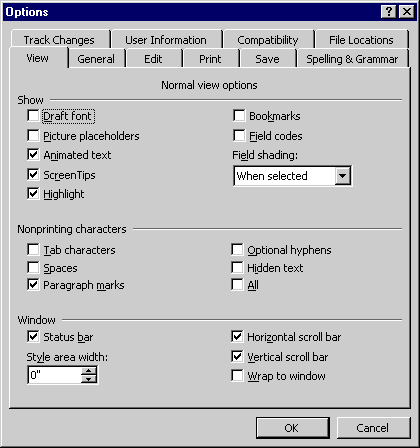
Property sheets have done wonders in simplifying complex dialog boxes. Instead of cramming dozens of controls into a single dialog box or having complex and confusing multiple dialog box sequences, property sheets allow you to consolidate a significant number of controls into a single dialog box in a way that is still quite usable. The only potential problem with property sheets is using too many tabs. Two rows of tabs, as shown here in the Options dialog box in Microsoft Word, is about the limit for tabs.
Another approach is to use scroll bars to allow the user to scroll the tabs. While this approach eliminates screen clutter, it makes it difficult to find a tab. Perhaps the best solution to this problem is to consolidate several categories of settings on a single tab, as in this example from Visual C++.
Using hierarchical property sets is a good way to reduce the number of tabs while still making it easy to find settings without much effort. Note how awkward it would be to have multiple link tabs, such as "Link—General," "Link—Custom," and so on.
Should you ever use a property sheet with a single tab? If you are using a property sheet to display an object's properties and not using it as a dialog box with tabs, then yes. Always use property sheets for properties, even if there is only a single property page. Using a property sheet makes it clear that the user is viewing properties and not a regular dialog box. A property sheet (like the one on the following page) has an Apply button to help the user experiment with property settings.
Group boxes
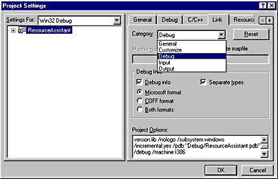
Group boxes are used to group related controls within a dialog box or a property page. While group boxes are traditionally used to group radio buttons, they can be used to group any type of control, such as the Debug Info in the Visual C++ Project Settings dialog box shown earlier.
Static lines and text
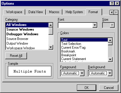
One problem with group boxes is that they can add too much complexity to a dialog box if there are too many of them because they take up a fair amount of space and can increase the clutter. A good alternative is to group controls using a combination of static text and a static line (actually a static frame with a height of one dialog box unit). The Options dialog box in Microsoft Word, shown on page 243, is a good example. This technique also works well to organize groups of controls within a group box.
TIP
Static lines and text are a good alternative to group boxes because they don't take up as much space and don't add to the clutter.
Dynamic dialog boxes
Dynamic (or unfolding) dialog boxes initially display only the most essential information and give the user a command to use to see more advanced information. The size of a dynamic dialog box changes to display the selected level of information. Dynamic dialog boxes are becoming less common as property sheets are often used instead. A good example is the Color common dialog box, which unfolds when the user clicks the Define Custom Colors button. Note that using a property sheet would not be appropriate in this case because a custom color is not an independent property.
Cascading dialog boxes
Just because you can use a property sheet doesn't mean you can't have a dialog box display another dialog box. Sometimes the best way to group controls available through a dialog box is to put them in a separate dialog box. This is especially true if the controls are used for a task that isn't often performed.
Menu Item Groupings
Organizing clearly related menu items into groups can greatly simplify menus. The following are some of the most common techniques for grouping menu items.
Menu separators
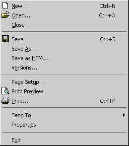
Menu separators are used to group related menu items. While this technique is simple and effective, the only trick is to make sure you don't use too many separators. Avoid creating several groups with only one item in them. For example, the File menu from Microsoft Word, shown below, has Send To and Properties in the same group even though they are unrelated. Together, they are kind of a related group of unrelated items.
Cascading menus
Cascading menus are another effective technique for grouping related menu items. Cascading menus are best used to allow the selection of one of a related set of options. Since cascading menus can be difficult to use, you should avoid employing them for frequently used commands and try to limit them to one or, at most, two levels of submenus.
Dialog boxes
If your menu structure is too complex, you might need to move some of the commands into a dialog box. As discussed earlier, a strong relationship exists between dialog box controls and menus. If your menu structure is simple, use the menus to eliminate unnecessary dialog boxes. If your menu structure is complex, you should favor dialog boxes.
Single-Choice Selection
You can present the user with a single choice in a set of mutually exclusive choices in several ways. The trade-off between these approaches involves the amount of effort required to make the choice and the amount of screen space employed to present the choices.
Radio buttons
Radio buttons should be your preferred technique for presenting the user with a single-choice selection. Radio buttons work well when you have a small set of options, typically eight or fewer, and a dialog box that isn't too cluttered. If the dialog box is cluttered, a combo box is usually better, even with only two or three options.
Combo boxes
Combo boxes allow you to present the user with a nearly unlimited number of choices in a compact form. If only a few choices are available, be sure to make the drop-down list long enough so that the user doesn't have to scroll to make a selection. The only drawback to using a combo box is that it requires the user to take an additional step to see the selections. This makes combo boxes less desirable than radio buttons in situations where user efficiency is most important.
Single-selection lists
Single-selection lists are also a possibility but are used less often because they take up a fair amount of screen space. Lists are preferable to combo boxes when it is desirable for the user to always be able to see the list of selections or when the user is constantly changing the selection. A good example, as shown on the following page, is the Category list on the Format tab of the Visual C++ Options dialog box.
Note that combo boxes could be used in place of the Category and Colors lists, but this would result in the user constantly having to drop down the combo boxes to make selections.
Multiple-Choice Selection
To present the user with multiple choices in a set of nonexclusive choices, you also have several approaches you can take. Again, the trade-off between these approaches involves the amount of effort required to make the choices and the amount of screen space used. Note that there is no such thing as a multiple-choice combo box.
Check boxes
Check boxes should be your preferred technique for presenting the user with a multiple-choice selection. Check boxes work well when you have a small set of options in an uncluttered dialog box. If the dialog box is cluttered, a check box list is probably better.
Multiple-selection lists
A multiple-selection list is a possibility whenever you need to present a set of related choices that is so large it needs to be displayed in a scrollable list. The problem with multiple-selection lists is that they aren't visible—the user can't tell that the list supports multiple selection just by looking at it. This problem is solved with check box lists.
Check box lists
A check box list is the best alternative when you have too many choices to use check boxes. A good example is the Advanced tab of the Internet Explorer Internet Options dialog box.
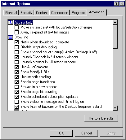
Note that a check box list is not a standard list format. You need to use an owner-draw list box control, the MFC CCheckListBox class, or the new Internet Explorer 4.0 ListView control with the LVS_EX_CHECKBOXES style.