Section 3.3. Character Formatting
The simple formatting applied by a paragraph format isn't much to write home about, much less to advertise on a rsum. Heading 1, for instance, is generally displayed in black and bold using a large Times New Roman font. As mentioned in the box on Section 3.1.1, this type of paragraph formatting is intended to provide structure, not good looks.
To make your Web pages stand out, you'll want to apply different fonts, colors, sizes, and styles to your text. Unlike paragraph formatting, which applies to an entire HTML paragraph, you can apply character formatting to any selection of text, whether it's a single word, one sentence , an entire paragraph, or your whole Web page.
In general, you apply character formatting just as you would in a word processor: Select the text (using any of the methods described on Section 2.2.6) and then apply a format using the Property inspector or Text menu.
Up to this point, you've been using HTML only for structuring your Web page with headlines, paragraphs, lists, and so on. When using the Property inspector to apply formatting like fonts, colors, and text sizes, Dreamweaver is working behind the scenes to create Cascading Style Sheets to format text (see Section 3.3.4 for an explanation). Professional Web designerswho not only want to keep up with technical trends but who also must build functional Web sites that please the vast audience of Web surfershave already embraced the more sophisticated typographic controls offered by Cascading Style Sheets.
Note: Cascading Style Sheets aren't just for text, either. You can format any HTML elementimages, tables, and so onwith the power of CSS. Read all about it in Chapter 6.
Using the instructions in the rest of this chapter, you'll learn how to apply basic CSS-based formatting to text by using the Property inspector and Text menu. (A wider array of additional CSS formatting options is discussed further in Chapter 6.)
Note: If you don't want to use CSS (perhaps you've built an entire site using the <font> tag and you wish to remain consistent), you can revert to Dreamweaver's old method of formatting text. Press Ctrl+U (
3.3.1. Text Styles
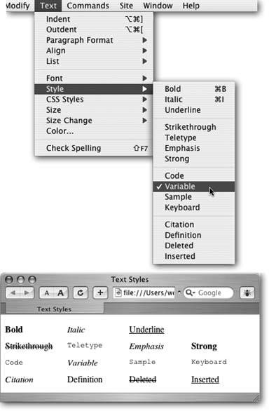
To add emphasis to your words, you can choose from several text styles. You can apply the two most common emphasis effects, bold and italics, from the Property inspector. For less frequently used styles, choose from the Text  Style submenu (see Figure 3-8).
Figure 3-8. Top: While the Property inspector lets you apply bold and italic styles to text, the Text Style menu offers a larger selection of text styles. Dont be confused by the term "styles," which, in this case, merely refers to different HTML tags. They're unrelated to Cascading Style Sheet styles and are intended to identify very specific types of text, like citations from a book or magazine.
Bottom: As you can see, the many style options are usually displayed in bold, italics, the browser's monospaced font (usually Courier), or some combination of the three.
To add bold or italic formatting to text, select the word or words you'd like to make bold or italic, and then click the Bold or Italic button on the Property inspector.
Note: Use italics with care. While italics are frequently used in printed material to add emphasis or when referencing a book title, they can be difficult to read on a computer screen, especially at small type sizes.
As shown in Figure 3-8, HTML offers a host of different text styles, some of which fulfill obscure purposes. For instance, the Code and Variable styles are intended for formatting the display of programming code, while the Sample style represents the output from a computer programnot exactly styles you'll need often in promoting, say, your Cheeses of the World mail-order company.
Unless you intend to include content whose meaning is supported by the tag (for example, you include some sample computer code on a page, so you format it with the Code style), you're better off avoiding such styles. But if you think one of them might come in handy, you can find more about these styles from Dreamweaver's built-in HTML reference; see Chapter 9 for details.
In particular, avoid the underline and strikethrough styles: both have been deprecated (Section 3.1.1) in the HTML 4 standard and may produce no effect in future browser versions. (You can, however, turn to Cascading Styles Sheets' text-formatting abilities to put lines through and under any text you'd like. See Section 6.7.1 for more.)
| UP TO SPEED When Bold and Italic Are Neither |
| You may be confused by the HTML code that Dreamweaver produces when making text bold or italic. Instead of using the <b> tagthe traditional HTML code for boldDreamweaver uses the <strong> tag. And instead of <i> for italics, clicking the I button on the Property inspector gets you <em>, or the emphasis tag. That's because Macromedia as decided to follow industry practices rather than stick to an old tradition. For most purposes, <strong> and <em> behave identically to <b> and <i>. They look the samebolded or italicizedin most browsers. However, when encountered by screen readers (software or equipment that reads Web pages aloud for the benefit of the visually impaired), the <strong> tag triggers a loud, strong voice. The <em> tag also brings an emphasis to the voice of screen readers, though with less strength than the <strong> tag. Since most Web browsers simply treat the <strong> tag like the <b> tag, and the <em> tag like the <i> tag, you'll probably never notice the difference. However, if you prefer the simple <b> and <i> tags, choose Edit |
3.3.2. Fonts
Formatting fonts for the Web is very much like using fonts in a word processor. Sadly, it carries some of the same drawbacks. For example, if you create some beautiful document in Microsoft Word, using fancy fonts you just bought from a small font company in Nome, Alaska, you're in for a rude surprise when you email the document to your boss. He won't see anything resembling what the memo looked like on your screen. Because he doesn't own the same fonts, he'll see some default font on his computerTimes, perhaps. Fonts show up in a distributed document only if each recipient happens to have the same fonts installed.
On the Web, you're in the same predicament. You're free, as a Web designer, to specify any font you want in a Web page, but it won't show up on a viewer's computer unless she's installed the same font on her system. Otherwise, your visitor's Web browser will show your text in a default font, which is usually some version of Times or Courier.
There are several solutions to this dilemma. One is to use Flash text, described on Section 5.6.3, or to convert your text into graphic images. Another is to specify the font you'd like to use; if your viewer's computer has the specified font installed, that's what she'll see. You can specify secondary or tertiary font choices if the preferred font isn't available. In fact, Dreamweaver offers prepackaged lists of such "first choice, second choice, third choice" fonts, as you'll find out in the following section.
3.3.2.1. Applying font formatting
Dreamweaver's approach to font formatting is straightforward:
-
Select the text whose font you want to change .
As in a word processor, you can also click anywhere in your Web page and then choose a font for text that you're about to type. (If you're pasting text from another program, paste first and then select the text and apply a font.)
-
From the Property inspector or the Text menu, select the font .
Choose a font from the Font pop-up menu in the Property inspector, or choose Text
Font and select a font from the submenu. UP TO SPEED
Knowing Your Font TypesYou can find literally tens of thousands of different fonts to express your every thought: from bookish, staid, and classical typefaces to rounded, cartoonish squiggles.
Most fonts are divided into two categories: serif and sans-serif. Serif fonts are best for long passages of text, as it's widely believed that serifssmall decorative strokes ("hands" and "feet") at the end of a letter's main strokesgently lead the eye from letter to letter, making text easier to read. Examples of serif fonts are Times, Times New Roman, Georgia, and Minion, the font in the main body paragraphs of this book.
Sans-serif fonts, on the other hand, are often used for headlines, thanks to their clean and simple appearance. Examples of sans-serif fonts include Arial, Helvetica, Verdana, and Formata, which you're reading now. Some people believe that you should use only sans-serif fonts on Web pages because they think the delicate decorative strokes of serif fonts don't display well on the coarse resolution of a computer screen. This is an aesthetic judgment, so you should feel free to pick the fonts you think look best.
You'll soon discover that Dreamweaver's font menus aren't quite what you're used to. When you apply a font to text, you have to choose a little list of fonts like "Arial, Helvetica, sans-serif." You can't just choose a single font, such as Helvetica.
That's because, as noted on Section 3.3.2, in order for your viewer's computer to display a font correctly on a Web page, it must have the same font installed. If the font's not there, the browser simply replaces the font specified in the Web page with the browser's default font.
To gain some control over the font-picking process, you can specify a list of fonts that look similar to your first-choice font (Arial, for example). Your visitor's Web browser checks if the first font in the list is installed on the computer. If it is, that's what your visitor sees when viewing your Web page.
But if the first font isn't installed, the browser looks down the list until it finds a font that is. Different operating systems use different fonts, so these lists include one font that's common on Windows and another, similar-looking font that's common on the Mac. Arial, for instance, is found on all Windows machines, while Helvetica is a similar font for Macs.
That's it. You've just applied one of Dreamweaver's preinstalled fonts. If you'd like a greater degree of control of what fonts your page displays, read on.
| POWER USERS' CLINIC Font Convergence |
| While Mac and Windows used to come with very different sets of preinstalled fonts, there's been some convergence in the past few years . These days, you can count on the average Mac or PC having the following fonts: Arial, Arial Black, Arial Narrow, Comic Sans MS, Courier, Courier New, Georgia, Times New Roman, Trebuchet MS, Verdana, and Webdings. If your audience includes people running Unix or Linux, all bets are off. In that case, stick to these three fonts: Helvetica (make sure to also specify Arial for Windows owners ), Times (Times New Roman for Windows), and Courier (Courier New for Windows). You can find a list of fonts included with various versions of Mac and Windows operating systems at the following Web sites: Mac OS X and Windows XP : www.xvsxp.com/fonts/. This page not only provides lists of preinstalled fonts for Mac OS X and Win XP, but also contains useful information on how to use fonts in the two operating systems. Windows 2000 : www.microsoft.com/typography/fonts/win200.htm. And for a concise comparison that lists fonts friendly to both operating systems, check out www.ampsoft.net/webdesign-l/WindowsMacFonts.html. To jump-start your adventures , here are a few font combinations that work relatively well for both Mac and Windows visitors :
|
3.3.2.2. Creating custom font lists
Dreamweaver comes with six preset "first choice, second choice, third choice" font lists, which incorporate fonts that are standard on both Windows and Macs. But you can easily stray from the pack and create your own font lists for use in your Web pages. If you proceed with the custom approach, make sure you know what fonts your visitors haveeasily done if you're designing a corporate intranet and know what computers are used in your companyand always specify one font that you know is installed. In this way, your page may not look exactly as you intended, but it'll at least be readable.
Here's how you create a new "first choice, second choice, third choice" font list.
Note: Technically, you can specify any number of fallback fonts in one of these lists, not just first, second, and third choices. Your list can specify only a single font, or a long list arranged in order of preference.
-
Open the Edit Font List dialog box .
Choose Edit Font List from the Property inspector's Font menu, or choose Text
Font Edit Font List. Either way, the Edit Font List dialog box appears (Figure 3-9). Figure 3-9. Not only can you create your own font lists, but you can also edit, remove, or reorder the current lists in this dialog box. When you click a list in the "Font list" menu, the "first choice, second choice, third choice" fonts appear in the lower-left corner. To remove a font from that list, click the font name and then click the >> button. To add a font to the list, select a font in the "Available fonts" menu and click the <<button. Finally, to reorder the font lists as they appear in the Property inspector or Text
Font menu, click the arrow keys near the upper-right corner of the dialog box. 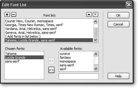
-
Select a first-choice font from the list of "Available fonts," or type in the font name .
All fonts on your computer are listed in the "Available fonts" menu. Simply click to select the font you wish to add.
Alternatively, you can type a font's name into the box that appears directly below the list of available fontsa handy trick if you want to include a font that isn't installed on your computer (a Windows font when you're working on a Mac, for example).
-
Add the font you've just specified to your new, custom font list by clicking the << button (or just double-clicking the font name) .
Your first-choice font appears in the " Chosen fonts" list.
-
Repeat steps 2 and 3 for each font you wish to include in your custom list .
The order in which you add the fonts is the order they appear in the list. These become the "first choice, second choice, third choice" fonts.
Unfortunately, there's no way to change the order of the fonts once you've added them. So if you accidentally put the fonts in the wrong order, you must delete the list by clicking the minus () button (at the upper-left corner of the dialog box) and start over.
-
Add a generic font family .
This last step isn't strictly necessary, but it's a good idea. If your Web page visitor is some kind of anti-font radical whose PC doesn't have any of the fonts you've chosen, his browser will substitute the generic font family you specify here.
Generic fonts are listed at the bottom of the list of "Available fonts" and include " cursive ," "fantasy," "monospace," "sans-serif," and "serif." On most systems, the monospaced font is Courier, the serif font is Times, and the sans-serif font is Arial or Helvetica. Select a generic font that's similar in appearance to the fonts in your list. For instance, choose "sans-serif" if your list consists of sans-serif fonts like Helvetica or Arial; choose "serif" if you specified fonts like Times or Georgia; or choose "monospace" for a font like Courier.
-
Click OK .
Your new font package appears in the Property inspector's Font menu, ready to apply.
3.3.3. Font Size
Varying the sizes of fonts on a Web page is one way to direct a viewer's attention. Large type screams "Read Me!" excellent for attention- grabbing headlineswhile small type fades into the backgroundperfect for necessary but unexciting legal mumbo jumbo like copyright notices.
Unless you specifically define its size, text in a regular paragraph appears at the default size specified by your visitor's Web browser, such as 12 points. (A point is a typographic measurement equal to 1/72 of an inch.)
In theory, 12-point lettering is roughly 1/6 of an inch tall. In practice, however, the resolution of the monitor, the font itself, and the operating system drastically affect the size of type on the screen. To the eternal frustration of Web designers who are used to, say, Adobe InDesign or Quark XPress, text on a Web page viewed in Netscape Navigator for Windows, for instance, appears substantially larger than when viewed in Navigator on a Mac. Add to this the fact that people can change their browsers' default text size to any size they like, and you'll quickly understand that Web design requires a Zen-like acceptance of factors beyond your control.
Note: You may notice two options under the Text menu (see Figure 3-8): Size and Size Change. These submenus are used to apply the old-style <font> tag size property, which was limited to only seven sizes (1 through 7). Unless you purposely turn off the CSS option (see the note on Section 1.3.1), these submenus are grayed out, making these properties inaccessible.
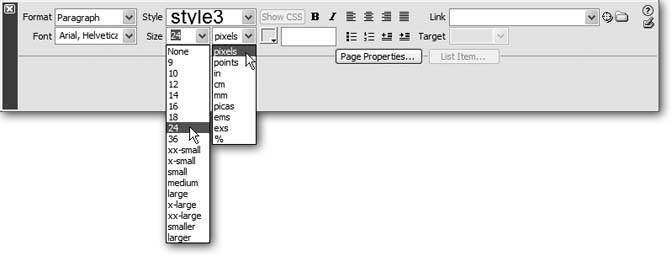
Dreamweaver has replaced the old <font> tag method of sizing text with CSS, which offers a much wider range of sizes. To specify a text size, first select the text, and then use the Property inspector's Size menu to select a font size (see Figure 3-10). The choices available from the Size menu break down into four groups:
-
The None option removes any size information that you may have applied to the text. The text returns to its default size.
-
The numeric choices 9 through 36 indicate how tall you wish to make the text, in pixels. Nine-pixel-tall text is nearly unreadable, while 36 pixels makes a bold statement. One benefit of pixel sizes is that text appears nearly the same across different browsers and different operating systems, overcoming the problems mentioned above.
-
The options xx-small through xx-large indicate fixed sizes, replacing the sizes 1 through 7 used with the old HTML <font> tag. The medium size is usually the same as the default size.
-
The last two choices smaller and larger are relative sizes, meaning that they shrink or enlarge the selected text based on the default size. These choices come in handy when you've defined a base font size for the entire page using the Page Properties window (see Figure 1-15 on Section 1.3.3).
Suppose the default size of text on a page is 12 pixels. If you apply a "larger" size to a selection of text, it will get bigger (the exact amount varies by Web browser). If, later, you change the base size to 14 pixels (in Page Properties), all of that "larger" text will also increase proportionally.
Figure 3-10. You can set a dizzying array of font sizes using the Property inspector. Dreamweaver generates CSS styles when formatting text using the Property inspector. In this case, the style is unimaginatively named style3.
To change the size of text, simply select it and choose a new size from the Property inspector (Figure 3-10). If you applied a number (that is, a pixel value), you have an additional option: if you don't like any of the sizes listed, you can type any number you wish. In fact, unlike HTML, CSS can handle humongous texthundreds of pixels tall, if that's what you're into.
You're not limited to pixels, either. The Units pop-up menu (to the right of the Size menu, shown in Figure 3-10) lets you specify pixels, points, inches, centimeters, millimeters, picas, ems, percentages, or exes (an ex is the width of the letter X in the current font). Most of these measurement systems aren't intended for onscreen display. The most popular options are:
-
Pixels are great for ensuring that text looks the same size across different browsers and operating systems. The downside, however, is that Internet Explorer for Windows doesn't let Web surfers adjust the pixel size. So people who can't see well, or whose monitors are set to very high resolutions , are stuck with your choice of pixel size. Make it too small, and they won't be able to read your text.
-
Ems are a relative measurement, meaning that the actual point size varies.
One em is equal to the default font size. So suppose a Web browser's default font size is 14 pixels tall. In that case, 1 em would mean 14 pixels tall, 2 ems would be twice that (28 pixels), and 1.5 ems would be 21 pixels.
The advantage of ems is that they allow Web visitors to control the size of onscreen text. If it's too small, they can increase the base font size. (In Internet Explorer, you make this adjustment by choosing an option from the View
Text Size menu [View Text Zoom on the Mac].) Any text measured in ems then changes according to the Web browsers new setting. You can use pixels and ems together. You could, for instance, set the base font size on your page to 16 pixels (see Figure 1-15 on Section 1.3.3) and then use ems for other parts of the page. For example, you could set headlines to 2 ems, making them 32 pixels tall. If you later thought the overall text size of the page was too small or too large, you could simply change the base font size for the page, and the headlines and all other text would resize proportionally.
Many Web experts advocate the use of ems, because they allow visitors to decide how big text should appear, thus making the site more widely accessible. Many designers, on the other hand, don't like the fact that other people can radically change the design of a page by simply changing a browser setting.
-
Percentages (%) are another relative size measurement. When applied to text size, they're functionally equivalent to ems. If you're more comfortable with the notion of percentages than the typography-inspired ems, use percentage values instead.
The other measurement options, like inches and millimeters, don't make as much sense as pixels, ems, and percentages, because there's no consistent way to measure them on monitors. For example, Windows is set to 96 pixels to the inch, whereas Mac OS X is set to 72 pixels per inchbut even these settings can be changed, so there's no reliable way to measure an "inch" on a computer screen.
3.3.4. Font Color
Most color formatting in Dreamweaver, whether it's for text or for a table cell , makes use of Dreamweaver's color box . For more information on applying color in Dreamweaver and using the color box, see Section 1.3.3.
To set the color of text, first select it and then take your pick:
-
In the Property inspector, click the color well and select a color.
-
In the Property inspector, click the Font Color field and type in the hexadecimal number (see Section 1.3.3) of the color you want. (Clearly, this is the option for hard- core HTML geeks . After all, surely you've memorized the hex number of that light shade of blue you always use#6699FF, isn't it?)
Remember, as part of the properties for a Web page, you can choose a default color for all text on the pagesee Figure 1-14 on Section 1.3.3. Setting this default color provides a useful shortcut for when you want all or most of the text on a page to be a color other than black.
3.3.5. Character Formatting Behind the Scenes
Dreamweaver creates Cascading Style Sheets for most of the character formatting choices you make in the Property inspector. For example, if you select a paragraph of text and then apply a color to it, Dreamweaver creates a CSS style and applies it to the paragraph. You'll learn a lot more about Cascading Style Sheets in Chapter 6, but until then, here are the basics.
A CSS style is a set of instructions telling a Web browser how to display things on a Web page. When you use the Property inspector to change the font, color, or size of text, Dreamweaver creates a new style and places the code for it in the <head> of the document. The new style's name now appears in the Property inspector's CSS Style menu (Figure 3-10) with an unimaginative name like style1, style2, style3 , and so on. Because these names don't mean much, you should rename them to something more descriptive such as mainHeadline, bodyText , and so on. (Renaming styles is discussed on Section 3.3.6.3.)
Note: If you already know a thing or two about CSS, you may want to note that Dreamweaver creates these styles using a class selector .
Depending on how you select the text, one of two other things happens:
-
If you select an entire paragraph, Dreamweaver adds an HTML attribute called class to the paragraph. This attribute ties the new CSS style to the paragraph of text and informs the Web browser to apply the style to this particular paragraph.
For example, if you add a dark-blue color to the first paragraph of text on a page, Dreamweaver creates a new style called, say, style1 . The HTML looks like this: <p class="style1">. All text in the paragraph becomes dark blue, and this new style's name appears in the Property inspector.
The same process takes place when you style other block-level elements, such as headlines.
-
If you select just a few words of a paragraph and then apply some character formatting, Dreamweaver behaves slightly differently. It still creates a new style ( style2 , say), which still appears in the Property inspector. But it also injects an HTML tag called span. The <span> tag might look like this: <span class="style2"> [your text here] </span>. This tag wraps around the text you selected, so that the style affects only the text inside the span. (See Section 6.3.2 for more on spans .)
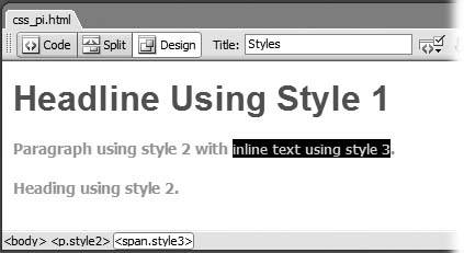
A good way to determine which method Dreamweaver used is to look at the tag selector (Figure 3-11). If you see something like <p.style4>, then the paragraph as a whole is in style4 . If you see <span.style6>, then Dreamweaver applied the style to just a portion of the paragraph, headline, or block-level element.
Figure 3-11. You can apply a style to any text. In this case, style2 is applied to both the middle paragraph (<p> tag) and the bottom headline (<h1> tag). When you apply a style to only part of a paragraph, the <span> tag is used. The tag selector (at bottom) can help you identify and select these (and other) tags.
3.3.6. Character Formatting Styles
Once you've formatted text just the way you want it, you needn't repeat the same steps for formatting other text on a page. Since Dreamweaver has already created a style containing your formatting choices, you can reuse it freely throughout your document via the Property inspector.
3.3.6.1. Applying styles
To format an entire paragraph, either select the paragraph or click anywhere inside it, and choose from the Property inspector's Style menu (Figure 3-12). To format just a few words, select the text and choose a style name from the Style menu; in this case, Dreamweaver formats just the selected text (wrapping it in a <span> tag as described above).
3.3.6.2. Removing styles
Removing a style is just as easy. Click anywhere inside the styled text or, using the tag selector, select the paragraph, headline, or range of text whose style you wish to remove, and then select None from the Property inspector's Style menu. This action removes the class property (or eliminates the <span> tag) used to apply the style. Note that the style itselfthat is, the code placed in the <head> of the Web pageremains. (To remove that code, see Section 6.4.4.)
Tip: To reuse styles you've created on other Web pages, consider exporting them as an external CSS style sheet. See the Tip on Section 6.2.2 for details.
3.3.6.3. Renaming styles
Because Dreamweaver uses generic names style1, style2 , and so onfor the styles you create using the Property inspector, it's a good idea to rename them using more descriptive titles. For example, if you create a style for formatting a copyright notice, copyright is a more descriptive name than style16 .
To rename a style, choose Renamefrom the Styles menu in the Property inspector (see Figure 3-12). The Rename Style window opens. From the top menu, select the style you wish to rename, type the new name, and then click the OK button. Behind the scenes, Dreamweaver searches the Web page for the old name and replaces it with the new name. (That's why you'll see the Search Results panel pop open after renaming a style this way.)
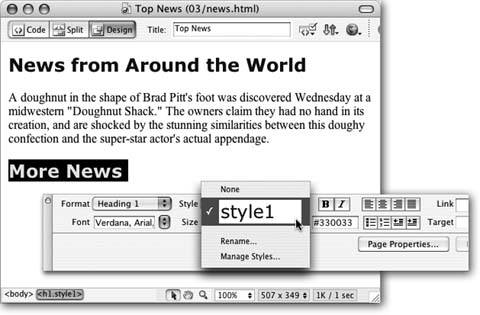
Figure 3-12. In this example, you can apply style1, a style that Dreamweaver created when you formatted the top headline, to the bottom headline. You can change the uninformative style namesstyle1, style2using the Rename option in the Style menu, as described above.
You need to keep a few things in mind when renaming a style. Style renaming is described in greater detail on Section 6.4.4, but in a nutshell :
-
Use only letters and numbers in the name.
-
Don't use spaces or any punctuation marks like !, *, &, and so on.
-
Always begin the name with a letter: header2005 is good, but 2005header is not.
3.3.6.4. Editing styles
Editing styles is trickier, and you may find yourself running into some of Dream- weaver 's strange antics pretty quickly.
Suppose you've selected a paragraph and applied Arial, Helvetica, sans-serif as the font; colored it red; and changed its size to 36 pixels. Dreamweaver creates a new stylesay, style1 . You decide you don't like the red color, so you immediately change it to a deep orange. Dreamweaver (as you'd expect) updates the style1 style with a deep orange color. So far, so good.
But now suppose that you apply this style to another headline on the page. Now there are two headlines with the identical style1 style. However, you've again decided the color is wrong (man, are you picky!). So you select the second headline and change the color to a lovely chartreuse.
Several strange things happen: First, the Property inspector's Style menu now reads style2 , or something similar like style3 or style4 . Second, the first headline doesn't change color .
Instead of updating the original style, Dreamweaver created yet another style and applied it to the paragraph (replacing the previously applied style). This approach may seem crazy, but it happened because Dreamweaver had no idea what you wanted. Did you intend to change the color of just that one headline for special emphasis? Or were you trying to change the color of the whole style?
In any case, Dreamweaver's behavior may seem erratic, and it's certainly not helping you edit the style. You have two choices if you want to update the style. First, make sure that no other text on the page uses the style. You can then change the color, typeface, and size using the Property inspector, causing Dreamweaver to update the style. Once you're donereally donethen you can use that style elsewhere on the page.
A better choice, if you wish to edit the style itself, is to use Dreamweaver's CSS tools and not the Property inspector, as discussed on Section 6.4.
Using the Property inspector to format text is quick, easy, and sometimes quirky: it's great for a single, one-off, " gotta get it down now" type of Web page. But, because editing these styles is tricky, and because the more you use the Property inspector to format text, the more styles ( style3, style5, style1001 , and so on) are added to your page, the Property inspector isn't the best method for formatting an entire Web site. You'll generally want more consistency over your style names and how they're used throughout your site. You'll also want to tap into many more formatting options and harness advanced CSS features that aren't available from the Property inspector. For this, you'll need to learn how to use the CSS Styles panel and Dreamweaver's other CSS tools, as described in Chapter 6.