Section 12.2. Powerful Positioning Strategies
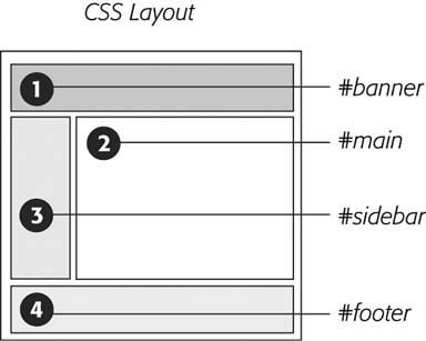
12.2. Powerful Positioning StrategiesAs explained at the beginning of this chapter, you can run into trouble when you try to use CSS positioning to place every element on a page. Because it's impossible to predict all possible combinations of browsers and settings your visitors will use, CSS-controlled positioning works best as a tactical weapon. Use it sparingly to provide exact placement for specific elements. Figure 12-7. The visibility property is useful for hiding part of a page that you later want to reveal. The top image shows movie listings. Moving the mouse over one of the images makes a previously invisible pop-up message appear. Programmers usually use JavaScript to create this kind of effect, but you can use the CSS :hover pseudo-class to make an invisible element visible when a visitor mouses over a link.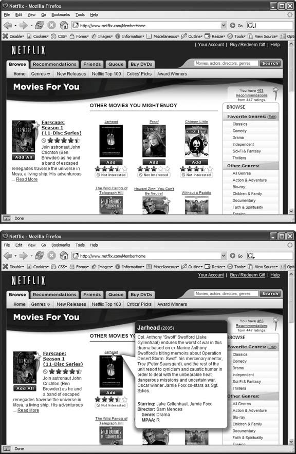 In this section, you'll learn how to use absolute positioning to add small but visually important details to your page design, how to absolutely position certain layout elements, and how to cement important page elements in place while the rest of the content scrolls . 12.2.1. Positioning Within an ElementOne of the most effective ways to use positioning is to place small items relative to other elements on a page. Absolute positioning can simulate the kind of right-alignment you get with floats. In example 1 of Figure 12-8, the date on the top headline is a bit overbearing, but with CSS you can reformat it and move it to the right edge of the bottom headline. In order to style the date separately from the rest of the headline, you need to enclose the date in an HTML tag. The <span> tag (Section 3.1) is a popular choice for applying a class to a chunk of inline text to style it independently from the rest of a paragraph. <h1><span class="date">Nov. 10, 2006</span> CosmoFarmer Bought By Google</h1> Now it's a matter of creating the styles. First, you need to give the containing elementin this example, the <h1> taga relative position value. Then, apply an absolute position to the item you wish to placethe date. Here's the CSS for the bottom image in example 1 of Figure 12-8: h1 { position: relative; width: 100%; border-bottom: 1px dashed #999999; } h1 span.date { position: absolute; bottom: 0; right: 0; font-size: .5em; background-color: #E9E9E9; color: black; padding: 2px 7px 0 7px; } Some of the properties listed above, like border-bottom , are just for looks. The crucial properties are bolded: position, bottom , and right . Once you give the headline a relative position, you can position the <span> containing the date in the lower-right corner of the headline by setting both the bottom and right properties to . Note: Internet Explorer 6 and earlier can get the placement of an element wrong when you use the bottom or right properties. In this example, the width: 100% ; declaration in the h1 tag style fixes the problem, as discussed in the box in Section 12.1.4. Figure 12-8. Absolute positioning is perfect for simple design details like placing a date in the lower-right corner of a headline (top), punching an image out of its containing block (middle), or placing a caption directly on top of a photo (bottom). (You'll learn the caption trick in the tutorial in Section 12.3.2.)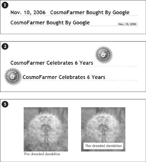 12.2.2. Breaking an Element Out of the BoxYou can also use positioning to make an item appear to poke out of another element. In example 2 in Figure 12-8, the top image shows a headline with a graphic. That is, the <img> tag is placed inside the <h1> tag as part of the headline. Using absolute positioning and negative top and left property values moves the image to the headline's left and pushes it out beyond the top and left edges. Here's the CSS that produces that example: h1 { position: relative; margin-top: 35px; padding-left: 55px; border-bottom: 1px dashed #999999; } h1 img { position: absolute; top: -30px; left: -30px; } The basic concept's the same as the previous example, but with a few additions. First, the image's top and left values are negative, so the graphic actually appears 30 pixels above the top of the headline and 30 pixels to the left of the headline's left edge. Be careful when you use negative values. They can position an element partially (or entirely) off a page, or make the element cover other content on the page. To prevent a negatively positioned element from sticking out of the browser window, add enough margin or padding to either the body element or the enclosing, relatively positioned tagthe <h1> tag in this example. The extra margin provides enough space for the protruding image. In this case, to prevent the image from overlapping any content above the headline, add a significant top margin. The left padding of 55 pixels also moves the text of the headline out from under the absolutely positioned image. As in the previous example, Internet Explorer's ready to make trouble. What's worse , adding width: 100% doesn't even fix things this time. Since there's padding on the <h1> tag, setting its width to 100 percent actually makes the <h1> wider than 100 percent of the page (see Section 7.5.1 for the reason why). There's a solution, but it uses a non-standard CSS property zoom . Simply add zoom: 1 to the <h1> tag style: h1 { position: relative; margin-top: 35px; padding-left: 55px; border-bottom: 1px dashed #999999; zoom: 1; } Tip: The zoom property doesn't cause harm in other browsers, although it prevents your CSS from validating correctly (Section 2.4.1). You can use Internet Explorer's conditional comments to hide the non-standard property, as discussed in Section 14.5.2. An even better solution's to create a separate external style sheet just for IE (Section 14.5.2). 12.2.3. Using CSS Positioning for Page LayoutAs mentioned in Section 12.1, trying to position every last element on a page in exact spots in a browser window is usually an exercise in frustration. Using absolute positioning judiciously, you can build many standard Web page layouts (like the ones you saw in the last chapter). This section shows you how to build a three-column, fluid layout using absolute positioning. The page will have a banner, left and right sidebars, a main content area, and a footer for copyright notices. Note: This section teaches you a generic approach to absolute positioning that you can apply to almost any page layout. For a real hands-on exercise in creating a layout with absolute positioning, turn to the tutorial in Section 12.3.3. Whenever you use absolute positioning, keep this rule of thumb firmly in mind: Don't try to position everything . To achieve a good layout, you usually have to use absolute positioning on only a couple of page elements. Here's a simple technique you can use to figure out which elements need positioning. Say you want to build a three-column design, like Figure 12-9, right. First, study how the different sections of the page follow the normal HTML flow, without any CSS positioning (Figure 12-9, left). Then, for each layout element on your page, ask yourself, "Would this be in the right place if I didn't position it at all?" Figure 12-9. The left diagram demonstrates how to divide the HTML of a page up into sections, each wrapped in a <div> tag with a unique ID. The right diagram shows the final, three-column layout and the types of positioning required: relative positioning for the content wrapper div (R); absolute positioning to place the left and right sidebars correctly (AP). Finally, the main content area needs a little left and right margin to keep it from being covered by the sidebars (arrows).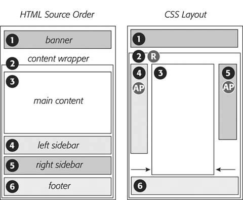 Here's a walk through the page elements in the left image of Figure 12-9:
Note: It's usually a bad idea to use absolute positioning to place a footer at the bottom of the browser window. If the page's content runs longer than the height of the browser window, then the footer scrolls along withand rides on top ofother page elements when your visitor scrolls. A better solution is fixed positioning, as described in Section 12.2.4. Now that you know how to decide where to use CSS positioning in your design, here's an overview of the process for building a three-column layout:
Tip: If you like to live on the edge of Web innovation, you can try a JavaScript solution to this problem: www.shauninman.com/plete/2006/05/clearance-position-inline-absolute.php. You can modify this basic page layout technique in any number of ways. Remove the right sidebar and eliminate the right-margin on the main content <div>, and you've got a two-column layout. Or eliminate the left sidebar instead to create a two-column layout, but with the thinner column on the right. You can also use this basic design in a fixed-width layout. Just set a width for the banner, and a width for the content wrapper <div>, like this: #banner, #contentWrapper { width: 760px; } 12.2.4. Creating CSS-Style Frames Using Fixed PositioningSince most Web pages are longer than one screen, you often want to keep some page element constantly visiblelike a navigation panel, search box, or your site logo. HTML frames were once the only way to keep important fixtures handy as other content scrolled out of sight. But HTML frames have major drawbacks. Since each frame contains a separate Web page file, you have to create several HTML files to make one complete Web page (called a frameset ). Not only are framesets time-consuming for the designer, they also make your site hard for search engines to search. And HTML framesets can also wreak havoc for visitors who use screen readers due to vision problems, or who want to print pages from your site. Figure 12-10. If an absolutely positioned column is longer than any statically positioned content that needs to appear underneath the column, then overlap ensues. An easy fix in this case is to indent the footer just as you did the main content area (see step 6 in Section 12.2.3).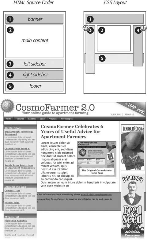 Nevertheless, the idea behind frames is still useful, so CSS offers a positioning value that lets you achieve the visual appearance of frames with less work. You can see a page created using the fixed value in Figure 12-11. Figure 12-11. Revisit the Web of yesteryear, but with a lot less code. Using the position property's fixed value, you can emulate the look of HTML frames by fixing some elements in place, but still letting visitors scroll through the content of a very long Web page. The scrollbar (circled) moves only the large text area; the top and bottom banners and the sidebar stay fixed.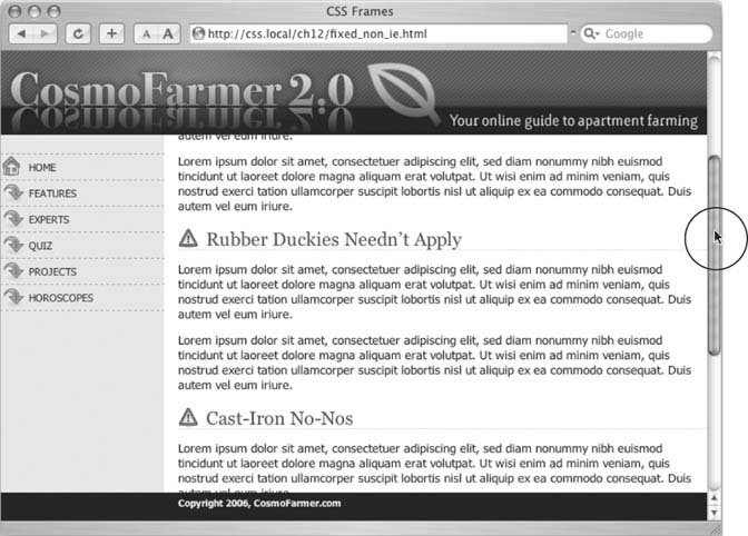 Note: As mentioned in Section 12.1.1, fixed positioning doesn't work with Internet Explorer 6 or earlier. However, with just a little extra CSS (described in step 5 in Section 12.3), you can make the page look fine in IE 6 (although the "fixed" elements end up scrolling along with everything else). And since Internet Explorer 7 does support fixed positioning, it's only a matter of time before you can use this technique and get similar results for all of your site's visitors. Fixed positioning works much like absolute positioning in that you use the left, top, right , or bottom properties to place the element. Also like absolutely positioned elements, fixed positioning removes an element from the flow of the HTML. It floats above other parts of the page, which simply ignore it. Here's how you can build the kind of page pictured in Figure 12-11, which has a fixed banner, sidebar and footer, and a scrollable main content area:
Note: To see examples of frame-like Web pages that do work in Internet Explorer 6, visit www.456bereastreet.com/lab/cssframes/ and http://jessey.net/simon/articles/007.html. |
![CSS[c] The Missing Manual](/icons/6360-small.jpg "CSS[c] The Missing Manual")
EAN: 2147483647
Pages: 154
- Chapter II Information Search on the Internet: A Causal Model
- Chapter IV How Consumers Think About Interactive Aspects of Web Advertising
- Chapter V Consumer Complaint Behavior in the Online Environment
- Chapter IX Extrinsic Plus Intrinsic Human Factors Influencing the Web Usage
- Chapter X Converting Browsers to Buyers: Key Considerations in Designing Business-to-Consumer Web Sites