Section 11.4. Applying Floats to Your Layouts
11.4. Applying Floats to Your LayoutsNow that you've learned a basic two-column liquid layout, you can adapt it in countless ways. Converting it into a fixed-width layout is a snap. Simply wrap all the tags within the page's body inside another <div> (like <div id = "wrapper"> ). Then, create a style for that new container element that has a set width such as 760 pixels (see Figure 11-4, bottom). That width setting constrains everything inside the container box. Expanding it into a three-column design isn't difficult, either (Figure 11-5). First, add another <div> between the two columns and float it to the right. Then add a right margin to the middle column, so that if the text in the middle column runs longer than the new right sidebar, it won't wrap underneath the sidebar. The rest of this section explores more CSS layout techniques that use float-based layouts. Figure 11-5. A three-column design uses the same concepts used to create a two-column design. In this case, you float both the left and right sidebars and add both left and right margins to the center column. The left-hand diagram shows the order of the HTML; the right side shows what the Web page looks like.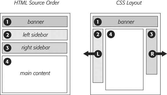
11.4.1. Floating All ColumnsIt's perfectly possible to float every column, not just the left and right sidebars. You could float the first sidebar to the left, the middle column to the left, and the right sidebar to the right, as shown in Figure 11-6, top. This approach lets you put more than three columns in your design. You can float four or more columns, as long as there's room for all the floats to fit side by side. When you float all columns in a design, you need to pay close attention to the widths of each column. If the total width of all the columns is less than the space availablefor example, if the browser window is smaller, or the columns are placed inside another <div> with a set widththen the last column drops down, below the others. (You can read a solution to this dropping float problem in Section 11.1.1.) In addition, floating more than just the sidebars lets you change the order of your divs in the HTML. Take, for example, the left diagram in Figure 11-5, which shows the order of the <div> tags for that page. Because of the way floated elements work, they must appear before any content that wraps around them, so in this example, the main content area must go after the sidebars. The order of the <div> tags in the HTML may not seem like a big deal until you try to browse the Web page without CSS, which is the case for many alternative browsers, including screen readers which read a page's content aloud to visually impaired visitors . Without CSS, all the sidebar material (which often includes navigational elements, ads, or other information that's not relevant to the main topic of the page) appears before the content the visitor came to read in the first place. The inconvenience of having to scroll past the same sidebar content on each page will turn off some visitors. Furthermore, your page is less accessible to vision-impaired visitors, who have to listen to their screen readers read off a long list of links and ads before coming to any real information. And if that doesn't sway you, you've got the search engines to worry about. Most search engines limit the amount of HTML they read when searching a site. On a particularly long Web page, they simply stop at a certain pointpossibly missing important content that should be indexed by the search engine. Also, most search engines give greater value to the HTML near the beginning of the file. So if you're worried about getting good placement in search engine results, it's in your best interest to make sure the important contents as close as possible to the top of the page's HTML code. Finally, floating every column also avoids a 3-pixel bug that affects Internet Explorer 6 and earlier (see Section 11.1.1). In the top-left diagram in Figure 11-6, the main content's HTML is between the left and right sidebars, which is better than having it after both sidebars. You can even put the main content before both sidebars' HTML by wrapping the main content and left sidebar in one <div>, floating that <div> left, and then floating the main content right and the left sidebar right within that <div> (Figure 11-6, bottom). Voil the main column's HTML falls before the other <div> tags. 11.4.2. Floats Within FloatsThe bottom diagram in Figure 11-6 illustrates another useful techniquefloating elements within floats. Imagine that the main content (3) and the left sidebar (4) divs didn't exist, and only the column wrapper (2) and the right sidebar (5) were left. You'd have just a basic two-column design with one column floated left and another floated right. In fact, it's still a 2-column design even with the two divs (3 and 4) placed back inside the column wrapper div. The difference is that the left column is itself divided into two columns. Although this arrangement's a bit confusing, it's also helpful in a number of instances. First, it lets you add columns within a column. The three-column layout at the top of Figure 11-7 shows a small Tips box in the middle column that also has two columns inside it. By nesting floats inside floats, you can create some very complex designs. Figure 11-6. There's more than one way to float a page. CSS's flexibility provides many ways to create a multi-column layout. Using different methods of floating, you can easily change the source order of the HTML for the page, as you can see in the diagrams at left. Right-side diagrams represent final Web page layout.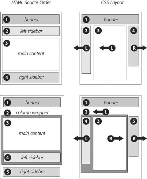 In addition, when you have just a couple of floated elements divided into columns with additional floated elements, it's easier to calculate the widths of page elements. That's a good thing when you need to control float drops (Section 11.1.1) and other problems that occur when columns get too wide. 11.4.3. Using Negative Margins to Position ElementsWhile the last section provided a few techniques that let you reorder the HTML for each column in a design, there's an even more advanced technique that gives you complete control over the placement of your columns. By using negative margins, you can put your <div> tags in any order you wish in your HTML, and then position them in a different order onscreenthereby keeping your pages accessible to screen readers, text browsers, and search engines as described on the opposite page. In addition, since you don't need to worry about the source order, you can always change the design of a pagemaybe float the main column to the far right, and the two sidebars to the leftwithout having to change the HTML of the page. Be warned , though, this method involves math and some mind-bending uses of CSS. You can live a healthy , happy life using just the float methods presented earlier in this chapter. But if you're up for some adventure, read on. (The tutorial also presents a hands-on demonstration of this method, starting in Section 11.1.) Figure 11-7. Top: create columns within columns by floating elements inside another floated element. In the middle column, the Tips box provides a simple two-column note that adds visual interest to the page. |
| POWER USERS' CLINIC Finding the Middle Ground |
| The two types of layouts fixed-width and liquidhave their pluses and minuses. A fixed-width design gives you a lot of control and lets you make sure that your layout looks exactly the same even on different sized monitors . However, on a particularly small monitor, a fixed-width page may force your visitor to scroll horizontally to view the whole page. On a really wide monitor, your lovely fixed-width design may look like a small sliver in a sea of empty space. Liquid layouts solve these problems, but have their own limitations as well. On a small screen, a liquid layout may contract so much that the design falls apart. And on a really wide screen, your design may stretch so far that your visitors get eye cramps trying to read 30-inch-wide lines of text. Several CSS properties aim to solve this problem: min-width, min-height, max-width , and max-height . The min - properties instruct a browser to make an element at least as wide or tall as the specified value. You can apply min-width to the <body> tag to control the total width of the page's content, like so: body { min-width: 760px; } . If a visitor expands his browser window to 1000 pixels, the page content stretches to fit the space. However, if he makes the window 500 pixels, then the content remains 760 pixels wide and the browser adds horizontal scrollbars. The min-height property does the same thing, but for an element's height. On the other hand, the max - properties limit an element to a maximum size . The styled element can get smaller than that value, but never larger. With them, you can make sure your pages don't get too wide to be unreadable. Say you create a style for the <body> tag with this property: max-width: 1200px . Now, if a visitor expands her browser window to 1800 pixels wide (on her unbelievably expensive 30-inch monitor), the page content doesn't sprawl all over the screen, but remains 1200 pixels wide. Max-height does the same thing, but for the height of a style. By combining the two properties, you can create a style that expands and contracts only within set dimensions, so your design never gets too small or too big: body { min-width: 760px; max-width: 1200px; } The only problem with these otherwise useful properties: Internet Explorer 6 and earlier ignores them completely. If you're feeling adventurous, try one of the workarounds at www.cssplay.co.uk/boxes/width3.html or www.antix.co.uk/code/css/imposing_minimum_width/ . Both workarounds are experimental, but they work fairly well. There's also a JavaScript technique that dynamically changes the dimensions of Web page elements based on the size of the browser window: www.doxdesk.com/software/js/minmax.html . |
Note: The technique described on these pages works only for fixed-width layouts, where you know the exact width of each column. For another method that achieves the same results with a liquid layout (where you don't know the exact width of the middle column), visit www.alistapart.com/articles/holygrail/.
Here's how to lay out a page using negative margins:
-
Add a wrapper <div> around all of the page content .
This step provides a container for setting a fixed width for all of the content on the page, and gives you an easy way to make the banner, columns, and footer the same width.
-
Set a width for the wrapper <div> .
Create a style for the wrapper div that gives it a set width. For example, 760 pixels is a typical size that accommodates visitors with 800 x 600 pixel monitors.
-
Wrap each column in a <div> tag with an ID or class attribute .
This part of the process is the same as creating any float-based layout. It defines the basic layout blocks (Figure 11-8, top left).
-
Float the divs for each column .
You must float each of the columns in your design. When you float them all to the left, they sit side-by-side. Another option's to float the left sidebar and main content left and the right sidebar right. (Since all columns are enclosed in the wrapper <div> from step 1, the right sidebar stays close to the central column.)
Note: If you're not using a wrapper div as described in step 1, then you must float the right sidebar left . Otherwise, it clings to the right edge of the browser window, potentially creating a large empty space between the right sidebar and the main content.
-
Set widths for each column .
You should always specify a width for a floated element. Depending on your design, you can also add padding, margins, and borders. Keep in mind, though, that the total width of the three columns in the browser window is the sum of the CSS width property values and the left and right margins, padding, and borders for each column. (And remember that, as described in Section 7.5.3, Internet Explorer 5 on Windows has its own ideas about what width means.) Yep, here's where the math comes in. If you're not careful, the total width of the columns may exceed the width provided by the wrapper <div>, causing the dreaded float drop (see Section 11.1.1).
Note: The width property doesn't define the total width that an element takes up onscreen. Margins, padding, and borders count, too. If this stuff doesn't sound familiar, then read Section 7.1 to brush up on the CSS box model theory.
-
Add a left margin to the main column .
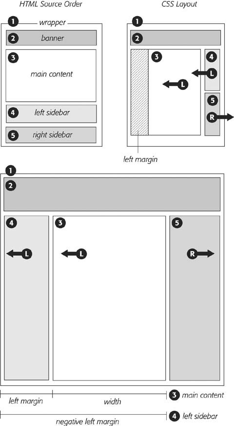
Here's where the negative margin technique differs from the layout methods described earlier in this chapter. The left margin should equal the space required for the left sidebar . If the left sidebar is 160 pixels wide, then set the left margin of the main column to 160 pixels: margin-left: 160px . The top-right diagram in Figure 11-8 shows the page so far. The crosshatched area to the left of the main column (3) represents that column's left margin.
Or, say the left sidebar is 160 pixels wide and you want 10 pixels of space between it and the main content. In that case, add 10 pixels to the main column's left margin: margin-left: 170px .
Figure 11-8. Yes, Virginia, you can put three divs into any order in your HTML (top left) and position them in any order on the screen (bottom). The secret is using negative margins to pull an element that appears later in the HTML over and past an element that precedes it. In the top right diagram, notice that the left sidebar (#4) floats next to the main content column (#3); adding a negative margin to the left sidebar pulls it into position on the left edge of the page. To make room for that left sidebar, you also add a positive left margin to the middle columns (indicated by the crosshatched box on the top-right diagram).
Finally, when the left sidebar has padding and borders, you need to factor those in as well. Suppose the left sidebar is 160 pixels wide, has a 2-pixel right border and 10 pixels of left and right padding, and you want 10 pixels of space between it and the main column. Add all of these together to get the left margin value for the main column. So, 160 (width value) + 2 (right border) + 10 (left padding) + 10 (right padding) + 10 ( gutter between sidebar and main column) = 192 pixels ( margin-left: 192px ).
-
Apply a negative margin to the left sidebar <div> .
At this point, the left sidebar's floated to the left, but since it comes after the main column in the HTML's source order, it appears on the right edge of the main column (Figure 11-8, top right). To get it into position, use a negative margin, whichbelieve it or notpulls the sidebar clear across the main column to the left edge of the page. The only trick is figuring out what that negative margin value should be to move the sidebar the exact distance required to position it at the left side of the page. In other words, the left margin must equal the distance from the right edge of the main column to the left edge of the wrapper <div>.
To determine that value, add the main column's width, left and right margins, left and right padding, and left and right borders. Say the main column is 400 pixels wide, has a 1 pixel border around it, has 10 pixels of left padding and 15 pixels of right padding, and has a 160 pixels left margin to accommodate the left sidebar. Just add the values together to get the left sidebar's left-margin value: 400+1+1+10+15+160= 587. Then add a left margin to the style formatting the left sidebar, but make its value negative: left-margin: -587px ;. The minus sign is the critical piece that makes the whole thing work.
-
Fix the Internet Explorer bugs .
When you use negative margins, Internet Explorer 6 and earlier exhibits a weird bugthe double-margin bug. In this case, IE doubles the left margin applied to the main column, totally disrupting the design. The fix is to add display: inline to the style formatting the main column . (Read more about the double-margin bug in Section 11.1.)
Once you get past the math, the negative margin approach rewards you with flexibility. If you want to swap the sidebars so the left sidebar moves to the right and right sidebar moves to the left, then simply swap the styles for those two divs. In other words, set the first sidebar to float right, and the second sidebar to float left using a negative left margin. You'll see negative margins in action in the tutorial in Section 11.1.
![CSS[c] The Missing Manual](/icons/6360-small.jpg "CSS[c] The Missing Manual")
EAN: 2147483647
Pages: 154