Section 11.5. Overcoming Float Problems
11.5. Overcoming Float ProblemsAs you get more adventurous with CSS, you'll probably encounterlike many Web designers before yousome of the weird intricacies of working with floats. This section describes a few common problems and their solutions. (And if you ever stumble upon a problem not listed here, you can always take it to one of the online forums or discussion lists in Appendix C.) Note: When it comes to designing pages that work in Internet Explorer, there are even more potential pitfalls. So many, in fact, that this chapter has a separate section dedicated to dealing with that one browser. See Section 11.1. 11.5.1. Clearing and Containing FloatsFloats are powerful design tools because they let content flow around them. Floating a photo lets text below it move up and wrap around the image (Figure 11-3). When you're creating float-based column designs, though, sometimes you don't want content to move up and next to a floated element. For example, you frequently want to keep copyright notices, contact information, or other housekeeping details at the bottom of your Web page, below all other content. In the two-and three-column designs you've seen so far, if the main column is shorter than either of the floated sidebar columns , a footer can move up and around the left floated column (Figure 11-9, left). To make the footer stay down below the sidebars, you can use the clear property (Section 7.6.2). This property prevents an element from wrapping around floats. You can make an element drop below a left-floated object ( clear: left; ), or a right floated object ( clear: right ;). For footers and other items that need to appear at the bottom of the page, you should clear both left and right floats, like this: #footer { clear: both; } Figure 11-9. You don't always want an item to wrap around a floated element (left). Copyright notices and other material that belongs at the bottom of a page usually need to clear any floats they encounter. To achieve this, use the clear property for the copyright notice to force it to the bottom of the page below any floated elements.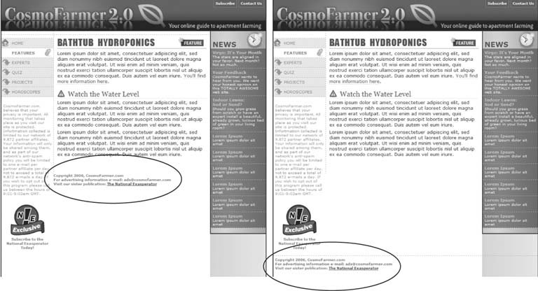 Another problem occurs when you float one or more elements inside a non-floated containing tag like a <div> tag. When the floated element is taller than the other content inside the div, it sticks out of the bottom of the enclosing element. This snafu is especially noticeable if that tag has a background or border. The top of the web page in Figure 11-10 shows a <div> tag that has an <h1> tag ("Bathtub Hydroponics Tips") and two columns created by floating two divs. The background and border, which appear only around the <h1> tag, are actually applied to the entire enclosing <div>, including the area where the two columns are. However, since the columns are floated, they pop out of the bottom instead of expanding the borders of the box. Note: For a good explanation of why floated elements can break outside of their containing blocks, read www.complexspiral.com/ publications /containing-floats/ . Figure 11-10. A floated element can escape its containing <div> if it's taller than the container itself. If the containing tag includes a background or border, then the escaping elements can look like they're not even part of the container (top of page). In addition, a floated element can bump into other elementsincluding other floats, thereby creating a "stair-stepped" effect (bottom of page) instead of the nicely stacked boxes in Figure 11-11.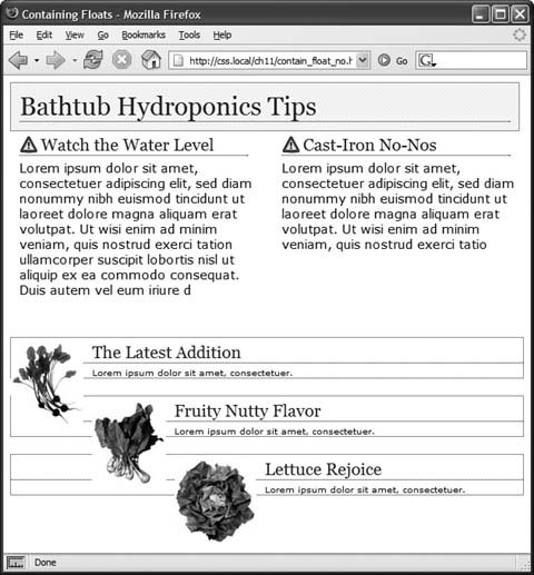 A similar problem happens in the bottom example in Figure 11-10. In this case, each image is floated left inside a containing <div> that has a border. Because the images are taller than their boxes, they pop out of the bottom. Unfortunately, this example's even worse than the previous one, because each image causes the image below it to wrap to the right, creating an ugly staggered effect. You have three ways to tackle the problem of these renegade floating elements:
Tip: You can simplify this code by replacing the last two styles with this CSS: .clear { zoom: 1; } . This single style knocks all versions of IE into shape, but since it uses the non-standard zoom property, it makes your page flunk the CSS validator check. To get around that , you can put this rule (along with any other IE-only styles) into an external style sheet and attach it to your Web pages using any of the tricks described in Chapter 14 (Section 14.5.2). Figure 11-11. Don't let a float escape! You have several ways to make floated elements stay inside the borders and backgrounds of their containing tag. Floating the container works (top), as does a special combination of CSSaffectionately called the "easy clearing method" (bottom). Both methods result in borders and backgrounds that surround the container and the floats inside.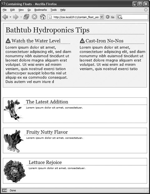 11.5.2. Creating Full-Height ColumnsHTML tables aren't great for Web page layout for several reasons. They add lots of code, are difficult to update, and don't work well on alternative browsers like those used by cellphones. But tables have one thing going for them in the layout departmentthe ability to create columns of equal height. Equal-height columns let you add a background color or graphic to one column and have it fill the entire height of the page. The backgrounds of the two sidebars in the top image of Figure 11-12 fill the screen height, creating solid, bold stripes on either side of the page. CSS floats, on the other hand, fall a bit short in this regard. Table cells in a row are always the same height, which isn't true of divs. The height of a float is usually dictated by the content inside it. When there's not a lot of content, the float's not very tall. Since a background image or background color fills only the float, you can end up with solid-colored columns that stop short of the page bottom, as in the circled areas in Figure 11-12, bottom. As with most problems related to CSS, there's a workaround. The secret's to add background images to a tag that wraps around the stubby sidebar and the other columns on the page. Say your HTML has two <div> tags that contain the content for a left sidebar and the page's main content: <div id="sidebar">Sidebar content here</div> <div id="main">Main content for page, this column has a lot of text and is much taller than the sidebar.</div> The sidebar <div> is floated to the left edge of the page and has a width of 170 pixels. Because there's less content in the sidebar, it's shorter than the main text. Suppose you wrap that HTML in a wrapper <div> tag, like so: <div id="wrapper" <div id="sidebar">Sidebar content here</div> <div id="main">Main content for page, this column has a lot of text and is much taller than the sidebar.</div> </div> That outer div grows to be as tall as the tallest element inside it, so even if the # main div is very tall, that wrapper div will be just as tall. Here's the magic: Create a style for the wrapper <div> with a background image the width of the sidebar, in the background color you want for the sidebar. That way, if the background image tiles vertically, it forms a solid bar the height of the wrapper <div> (Figure 11-13, top). #wrapper { background: url (images/col_bg.gif) repeat-y left top; } Web browsers display that background image directly under the sidebar , creating the illusion that the sidebar has a background color. In essence, you create a "faux column" in the words of Dan Cederholm, the fellow who first publicized this technique. Figure 11-12. Full-height columns with bold background colors are a common design technique. The left and right sidebars (top) show how solid backgrounds can help visually define the different areas of a page. When a sidebar's background stops abruptly (circled at bottom), you get extra white space that's both distracting and unappealing.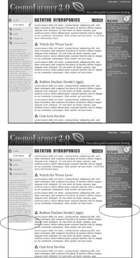 Tip: You're not limited to solid colors either. Since you're using an image anyway, you can make a decorative pattern that tiles seamlessly down the left side of the page. Reproducing this result for two columns is just a little more involved. First, add two wrapper divs: <div id="wrapper1"> <div id="wrapper2"> <div id="sidebar1">Sidebar content here</div> <div id="sidebar2">Second sidebar</div> <div id="main">Main content for page, this column has a lot of text and is much taller than the two sidebars.</div> </div> </div> Tip: If the wrapper and each column are all fixed widths, you can create this "faux" column look for both the left and right columns with just a single image and wrapper div. Just make the graphic as wide as the wrapper, with the left side of the graphic being the color and width of the left sidebar, the right side of the graphic the color and width of the right sidebar, and the center part of the graphic matching the background color of the center column. If the first sidebar appears on the left side of the page and the second sidebar appears on the right side, you create two styles. Apply one style to the first wrapper <div> tag to add a background to the left sidebar; apply one to the second wrapper <div> to add a background to the right sidebar (Figure 11-13, bottom). #wrapper1 { background: url(/books/2/835/1/html/2/images/col1_bg.gif) repeat-y left top; } #wrapper2 { background: url(/books/2/835/1/html/2/images/col2_bg.gif) repeat-y right top; } When adding a background image to the right-hand column, make sure you position the background image in the top-right of the second wrapper, so that it falls underneath the second sidebar on the right side of the page. Note: If you use percentages to define the width of columns, then it's more difficult to create the illusion of full-height columns using graphics. But it's not impossible . To learn how, go to www.communitymx.com/content/article.cfm?page=1&cid=AFC58. 11.5.3. Preventing Float DropsSuddenly, one of your columns simply drops down below the others (Figure 11-14, top). It looks like there's plenty of room for all the columns to coexist perfectly side by side, but they just don't. You've got the dreaded float drop. A floated column drops down because there's not enough room to fit it. Be careful if you set widths for each column. If the available space in the browser window (or the containing block in a fixed-width design) is less than the total widths of the columns, then you're asking for a float drop. Also, keep the CSS box model in mind: As discussed in Section 7.5.1, the width of an element displayed in the browser window isn't the same as its width property. The displayed width of any element is a combination of its width, left and right border sizes, left and right padding, and left and right margins. For the columns to fit, the browser window (or containing block) must accommodate the combined total of all those widths. Figure 11-13. You sometimes need to think outside the tag for creative solutions to CSS problems. To get full-height backgrounds behind floated columns, you need to resort to some extra <div> tags that wrap around all of the main columns of text. These divs grow to be the height of the tallest column in the group . By adding background colors to these wrapper divs, you create the appearance of equal-height columns. See Section 11.1.1 for details.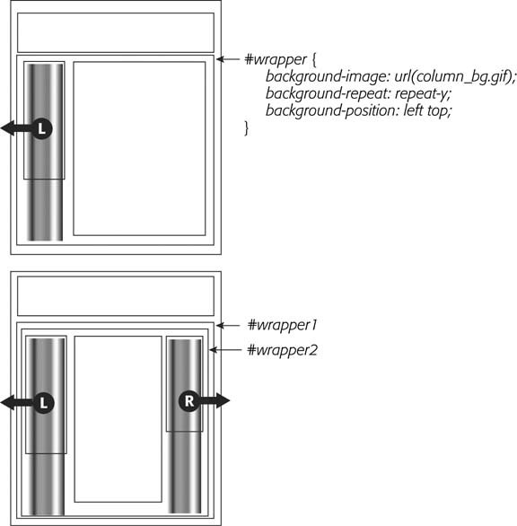 Take, for example, the simple three-column layout in Figure 11-14. As you can see in the top example, the three columns don't fit. Here's a breakdown of the math behind the problem:
The actual widths of each element add up to a grand total of 762 pixels . That's two pixels more than the width of the wrapper <div>. The middle image of Figure 11-14 shows an outline around the main content <div> indicating its total width plus margins. Just those measly two extra pixels of width (circled) are enough to cause a column to drop down. The solution: Remove two pixels of space from any of the elements. Changing the main content div's left and right margins from 15 to 14 pixels buys you the extra room needed for all three columns to fit side by side (bottom). Figure 11-14. It takes only a single pixel or two to ruin a design. When the width of floated elements are just a hair wider than their containing block (like a <div> with a set width, or even the browser window itself), the last floated element drops below the others (top). The actual width of an element combines many CSS properties. In the middle image, the outline around the main content area shows that it's a tad too wide to allow the right sidebar to fit (circled). Adjusting any of the elements by removing a bit of width, padding, or margins can solve the problem (bottom).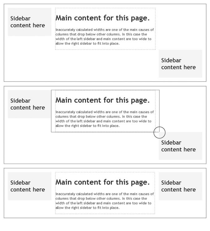 While miscalculated column widths are the most common cause of dropping floats, they're not the only cause. Here are a few other culprits:
Tip: For the definitive treatise on dropping floats (and how to solve them), visit http://nemesis1.f2o.org/aarchive?id=11. Bottom line: Float drops are always caused by not enough room to hold all of the columns. Rather than striving to use every last pixel of onscreen space, give all your elements a little more wiggle room. Get in the habit of making the overall column widths a bit smaller than necessary, and you'll spend less time troubleshooting float drops. |
![CSS[c] The Missing Manual](/icons/6360-small.jpg "CSS[c] The Missing Manual")
EAN: 2147483647
Pages: 154