Swatches
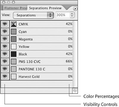
| It may seem redundant that InDesign has a Color palette as well as a Swatches palette, but they serve slightly different functions. Think of the Color palette as an informal mixing bowl for creating a color you'll only apply to a selected object. Colors created in the Color palette are not automatically stored in the Swatches palettethey evaporate. In addition, you can only specify CMYK, RGB, or Lab colors with the Colors palette. However, if you select an existing object colored with a spot color, the Colors palette does offer a quick method of creating a tint of the spot color. In practice, it's best to create swatches rather than informal colors. In addition to allowing you to select from Pantone, Toyo, and TRUMATCH swatchbooks, the Swatches palette ensures that you have global control. Change the recipe for a swatch, and you change every object filled or stroked with the swatch. If you've applied colors with the Color palette, you can easily turn those colors into official swatches without even hunting for the objects to which those colors have been applied. In the Swatches palette menu, choose Add Unnamed Colors, and InDesign hunts them all down and adds them to the Swatches palette. The Swatches palette itself can be a bit confusing (Figure 12.15). The colorful semaphore flags in its rightmost column do not indicate whether a swatch is spot or process. Instead, those icons merely indicate the color mode used to generate the onscreen appearance of the swatch. It's the column with the dull gray icons that answers the question "spot or not?" A gray square indicates a process color (a swatch that will image in CMYK), regardless of the swatch name or the color mode indicated in the far-right column. A white square containing a gray circlea spotindicates a spot color. Figure 12.15. The indicators in the Swatches palette can be confusing. Here's a decoder ring.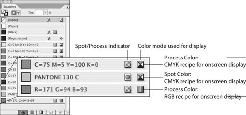 RGB colors may drastically change appearance when converted to CMYK. If you're in a color-managed workflow, you may wish to retain your RGB swatches, but preview their conversion to CMYK. To do this, first choose the appropriate color profiles in InDesign by choosing Edit > Color Settings, or use the great Synchronize Color Settings function in Adobe Bridge. Then, choose View > Proof Colors to display content using the color profiles in effect. If you're not in a color-managed workflow, and the print service provider requests that there be no RGB content, double-click the name or an RGB swatch, and then change its color mode to CMYK. Stubborn SwatchesWhen you import artwork such as an Illustrator file or a Photoshop duotone containing a spot color, InDesign adds the color to the Swatches palette. As long as that artwork is in the document, you can't delete the spot swatch, nor can you merge it with another swatchit's protected. If the swatch is used by a paragraph, character, or object style, it will also resist deletion. However, if you delete all artwork and styles related to the swatch, InDesign will allow you to delete the swatch. At least, it should. Occasionally, InDesign develops a fondness for a swatch and will not allow you to delete it or convert it to process, even if you've deleted the artwork or eliminated the styles that inspired it. It's a petty annoyance. If there's truly nothing using the swatch, it won't appear during output or export. If you want to assure yourself that the color is a phantom, preflight the document (File > Preflight) and check the Colors and Inks information. If the swatch doesn't show up in Preflight, it won't show up on output or export either. However, if it just bugs you to see that insolent swatch in the list, exporting the file to InDesign Interchange may be the cure. The true purpose of InDesign Interchange is to allow InDesign CS2 users to save files for individuals using InDesign CS. But it also can often repair a neurotic document. Choose File > Export, and then select InDesign Interchange for the format. InDesign creates an INX file with the file extension .inx. Close the misbehaving document, and then open the Interchange file by using File > Open. You should now be able to edit or delete the offending swatch. You'll also find this feature in InDesign CS, although users of InDesign 2.0 will not be able to open an Interchange filethat bridge is out. The curative powers of INX, however, are still useful in InDesign CS. What to Do About All Those Extra SwatchesDoes this sound familiar? You're working on a job that should consist of CMYK plus one spot color, Pantone 130. After importing duotone images created by your team's retouchers and placing the vector art provided by another designer, you realize that there are three spot colors in the Swatches palettePantone 130 C, PMS 130 CVC, and something named Harvest Gold. Although we easily recognize that PMS 130 CVC and Pantone 130 C refer to the same color (and we suspect that Harvest Gold does too), a RIP sees the different names as indicating different inks and faithfully outputs them separately. Consequently, you need to take measures to ensure that only spot-color platePantone 130is output. And you'll have to perform some detective work to find the culprits responsible for the extra spot colors. To determine which artwork uses each spot color, you could print out separated prints if your desktop printer supports that feature (some non-PostScript devices don't). But this would require you to endure the printing process, waste half a tree, and get out of your chair and walk over to the printer. There's a much more efficient way to determine where the spot colors are being used. You can use the Separations Preview feature in InDesign. Choose Window > Output Preview > Separations Preview. Initially, the Separations Preview palette (Figure 12.16) doesn't do anything special until you choose Separations from its View menu. When you do, InDesign assumes you want to know as much as possible about your document, so it activates Overprint Preview, which in turn displays all graphics at high resolution. Consequently, in a document containing extensive graphics, you may experience slower performance. Figure 12.16. The Separations Preview palette lets you selectively display individual or multiple printing plates. As you move your mouse over areas of the page, the percentage value of each ink color is displayed in the right column. There's bad news here: It's a five-color job, so somebody's going to have to fix those two extra spot colors. Using the visibility controls in the left-most column of the Separations Preview palette, you can hide and display individual plates or combinations of plates. As you move your mouse over the document, the right-most column displays the percentage values of each ink. Note If you close the Separations Preview palette while it's set to Separations view, Overprint Preview and High Resolution Display remain in effect, which slows things down a bit. Before closing the Separations Preview palette, choose Off from the View menu. This turns off Overprint Preview and returns display performance to the setting in effect before you activated Separations Preview. The Separations Preview feature may show you where most color problems are, but it can't fix the problems. To correct the problem, you could open all the images and vector artwork containing the PMS 130 CVC and Harvest Gold components and change them to use Pantone 130 C. Alternatively, if you're under a tight deadline, you could instruct the print service provider to resolve the problem during output. Or you could fix it in seconds by using the Ink Manager. Ink ManagerThe primary purpose of the Ink Manager (Figure 12.17) is to fix spot-color errors by remapping extraneous colors to correct inks. In this example, the job should only have one spot color, Pantone 130 C. So the Ink Manager is used to remap the two problematic colorsPMS 130 CVC and Harvest Goldto the correct Pantone 130 C plate for output. Figure 12.17. The Ink Manager can remap an incorrect spot color (A) to the correct ink (B) by using what InDesign calls Ink Aliasing. With one click, you can designate all spot colors to image as CMYK builds (C). Selecting the Lab option (D) may provide more accurate onscreen approximation of spot colors. In a color-managed workflow, this option may provide more accurate rendering of spot colors in CMYK. However, this may not match output from previous versions of InDesign.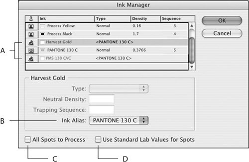 You can launch the Ink Manager in several ways (Figure 12.18). The Separations Preview palette menu offers one route. The Swatches palette menu provides another. You will also find the Ink Manager in the Print dialog box (under Output) and in the Export dialogs for both EPS and Adobe PDF. Figure 12.18. The Ink Manager is available from the Separations Preview palette (A), the Swatches palette (B), the Export EPS dialog (C), the Output section of the Print dialog (D), and the Export Adobe PDF dialog (E).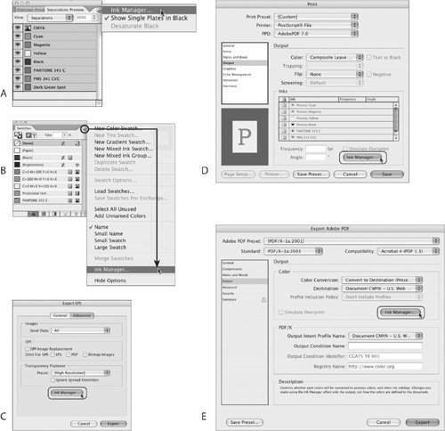 To map one spot color to another spot color with the Ink Manager, select the spot color you wish to remap. The dialog comes to life, offering you the Ink Alias list. Choose the correct color in the Ink Alias list and you're done. You can even remap a spot color to a single process plateoutput the Harvest Gold on the magenta plate, for example. You cannot, however, map a process color to a spot color. But you can convert all spot colors to process with one click, by selecting the All Spots to Process check box in the Ink Manager dialog. The remapping function is nondestructivethe remapping takes place in the output stream, as the file is printed or exported to another format such as EPS or PDF. It doesn't actually change placed artwork or any content created in the InDesign file, so it's easy to undo at any time if you make the wrong choices. Just turn off the Ink Alias for an ink, or unselect the Spots to Process option in the Ink Manager dialog. Changes made in the Ink Manager are not reflected in the Swatches palette, which may unnerve you. But there's a certain logic to this. Since you haven't actually changed content, the Swatches palette doesn't feel compelled to change its display. But rest assured that any outputexport to EPS or PDF, or File > Printwill contain only the correct inks. You can confirm this by reopening the Separations Preview palette (Window > Output Preview > Separations Preview) to check for process and spot-color usage. If you're sending native InDesign files to the print service provider rather than submitting PDF files, it's a good idea to inform them that you have already rectified the spot-color issues with the Ink Manager, lest they freak out unnecessarily. ("There are 15 spot colors in the Swatches palette!") Colorizing ImagesInDesign allows you to colorize grayscale and bilevel (black and white, with no shades of gray) TIFF and PSD files to create simplistic monotone effects. Colorizing is a quick-and-dirty way to apply color to images with the ability to change your mind late in the game. There are two ways to colorize images in InDesign. Select the image by clicking with the Direct Selection tool (white arrow), and then choose the swatch. Alternatively, you can just drag a swatch on top of the image, and then release the mouse button. The swatch is then applied to the image, not the frame. If you want to create a true duotone, it's preferable to use Photoshop, where you have complete control over the mixing of inks. But if you're in a hurry or don't care about the refined controls in Photoshop, InDesign allows you to create what's often called a fake duotone. First, colorize the image using one of the methods above, and then apply another swatch to the frame itself. The frame color will show through the lighter areas of the image in the frame. (Warningthis has some potential to be truly ugly.) For a somewhat less ugly result, select the image with the Direct Selection tool (white arrow) and then, using the controls in the Transparency palette, apply the Multiply blend mode to the image itself. Note that grayscale TIFF and PSD files with transparency on the bottom layer cannot be colorized by InDesign. All other layers can contain transparency, but the bottom layer cannot. InDesign does not give you any warning or explanation when you attempt to colorize such an imageit just doesn't do anything. |
EAN: 2147483647
Pages: 132