When Variations and HueSaturation Fail
When Variations and Hue/Saturation Fail
Most images with color casts and saturation problems respond well to either Hue/Saturation or Variations. But every so often, you run into an image that defies your most earnest attentions. Such is the case for the image on the left in Figure 11-31. This photograph was shot in the evening with the warm amber light of the setting sun bouncing off the face of that mountain and giving the image a decidedly reddish cast. Not that this isn't aesthetically pleasing ” it was most definitely the intention of the artist even ” but it's got more to do with the camera than with what the human eye would be seeing when the image was shot. So, what if you've been tasked with ruining the photographer's intentions and making this image look more like an actual "six o'clock Aspen in the off- season "?
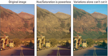
Figure 11-31: Many still cameras are hypersensitive to red light (left). This particular image is so heavy into the reds and yellows that neither Hue/Saturation (middle) nor Variations (right) does a satisfactory job of fixing it.
The first thing you might try to do is selectively rotate and desaturate the red hues using the Hue/Saturation command. Problem is, just about all the colors in this image fall into the Reds or Yellows range. You could try toning down the Reds and lowering the Saturation value, but as shown in the left example of Figure 11-31, the effect is awful . How about trying Variations instead? After several minutes of adjusting the range settings and intensity slider, the right image is most likely the best you can do.
So after these two failed attempts, it's time to restore the original image and set out on an inspection of the color channels. Sure enough, the moment you press Ctrl+1( z +1 on the Mac), the red channel shows us it is by far the most overblown (first example of Figure 11-32). Given that the red channel is responsible for the lion's share of what's wrong with this image, it isn't hard to guess that this is the channel we'll spend the rest of this discussion correcting.
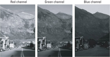
Figure 11-32: Thanks to the preponderance of red lighting, the red channel is severely overblown (left). Meanwhile, the green channel looks great (middle), and the blue channel is dark and noisy (right).
Somehow, we've got to get better information into this red channel, but how? Well, the green channel looks pretty good, so let's borrow some of its brightness values. By pressing Ctrl+2 ( z +2) you can see what the green channel has to offer. Thankfully, the news is good. As shown in the second example in Figure 11-32, the green channel is nearly perfect, with smooth gradations in luminosity from light to dark. Ctrl+3 ( z +3) proves a bit more disappointing. The blue channel is rich with sculptural details, but it is overly dark. Worse yet, it's riddled with noise, which will only get worse when we lighten it.
If you had to grade the channels, green gets an A, blue a C, and red a D-. So a perfect image is out of the question. Still, the three channels average to a C, and with any luck, you can tweak them into a solid B. The tweaker of choice is a command that lets you mix channels together, fittingly known as the Channel Mixer.
Mixing color channels
Choose Image Adjustments Channel Mixer to display the dialog box shown in Figure 11-33. Select the channel that you want to modify from the Output Channel pop-up menu. Then mix in different amounts of data from this and other channels using the Red, Green, and Blue sliders. (This assumes that you're editing in the RGB mode; the dialog box includes Cyan, Magenta, Yellow, and Black sliders in the CMYK mode.) Each slider overlays the contents of a channel using a formula very similar to the Linear Dodge blend mode set to the Opacity level indicated in the option box. You can read about Linear Dodge in Chapter 6, but the upshot is that each channel adds brightness. The slider value can be as high as +200 percent, which produces an effect very much like two layers dodging together. Negative values, as low as “200 percent, are the same as inverting the contents of a channel and applying a close cousin to Linear Burn.
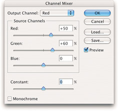
Figure 11-33: The Channel Mixer dialog box allows you to swap brightness values between your channels.
In the first example in Figure 11-34, the Output Channel was set to Red. Then, using the Source Channels values, the amount of Red information was lowered to 50 percent and the amount of Green was raised to slightly more (60 percent). If you entirely substitute the red channel with the green channel, you'd upset the color balance. Next , the Output Channel was set to Blue and the Green value raised to 30 percent, lowering the Blue value to 85 percent. Clicking the OK button applies the changes. Pictured in the middle of Figure 11-34, the resulting image is hardly perfect, but it's as good as it's going to get using the Channel Mixer, and good enough to serve as a starting point for Variations and other corrections.
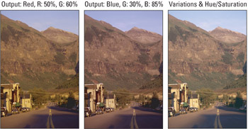
Figure 11-34: The results of changing the Red value to 50 percent Red, 60 percent Green (left) and the Blue channel to 30 percent Green, 85 percent Blue (middle). After exiting the Channel Mixer dialog box, further corrections were applied using the Variations and Hue/Saturation commands (right).
To remove what is now a more civil red color cast, choose Variations and click More Cyan (red's opposite ) and Lighter with the intensity slider set to the middle. Then use the Hue/Saturation command to decrease the Saturation value for the Reds by “10 percent and increase the Saturation for the Yellows by +10 percent. Shown on the right side of Figure 11-35, the corrected image looks significantly better, but it's a bit too green. So once again choose the Channel Mixer, set the Output Channel to Blue, and insert a little more green content into the blue channel. You can produce effects with two or more passes of the command that are impossible to produce in a single application.. To retrieve colors in a particular area of your image, select these regions and use the Hue/Saturation command to raise the Hue value to +20 degrees and the Saturation to +40 percent. Last, apply the Unsharp Mask filter. Pictured in Figure 11-35, the end product is so much better than the original(Figure 11-31) that it looks as if the photo were reshot. It just goes to show you that as long as you have one good channel, you can work miracles in Photoshop.
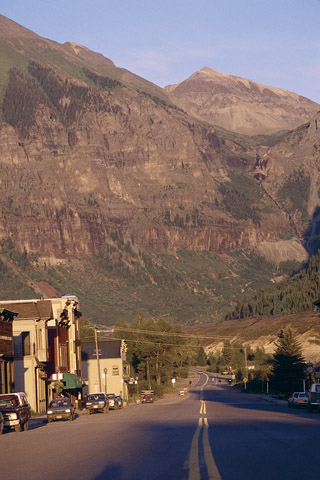
Figure 11-35: Thanks to the Channel Mixer, a photographer's valiant effort at artistry has been dashed against the rocks of realism .
Reducing red eye
Though Photoshop CS2 has the new Red-eye tool, which is a valiant warrior in the eternal struggle against red eye, the Channel Mixer is no slouch in this department either. We'll give the Red-eye tool a spin shortly, but first let's see what the Channel Mixer can do. Illustrated in Figure 11-36, red eye affects the pupils or, worse, both pupils and irises. It can range in brightness and saturation, but it is almost always red. That may seem like an obvious observation, but by "red," we mean dead-on, Hue-of-0 red, thus making the Channel Mixer a fine solution.
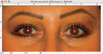
Figure 11-36: Zoomed in on a bad case of red eye
Red eye results from a camera's flash entering the pupil and reflecting off the back of the retina. Why does the retina appear red? The most commonly given answer is that the flash lights up the blood vessels that line the retina . Why is blood red? Because blood contains the pigment hemoglobin. Which begs the question, why is hemoglobin red? Thankfully, this isn't the Hemoglobin Bible, so I'm under no obligation to tell you. But I will tell you that the retinas of animals with night vision, which include most dogs and cats, register different colors, including yellow, green, or blue. In such cases, the flash is reacting to the mirror-like tapetum . Located behind the retina, this highly polished membrane lights up the eye like a mirror in a small room. The tapetum therefore permits the retina to pick up very dim light that it may have missed on the first pass, and it permits the camera to register yet another wacky eye color. Humans have no tapetum so our eyes are blood red.
Even though red eye is a menace , it's actually a relatively rare occurrence that relies on three conditions: First, the pupil has to be dilated. Second, the flash has to be mounted close enough to the lens that it can enter the pupil and reflect back at a sufficiently acute angle that the camera will pick it up. Third, you have to be far enough away from the subject that the iris doesn't cut off the reflection. So for red eye to occur, you generally have to be shooting at night using a consumer-grade camera positioned two or more feet from your subject. Solutions? Shoot in well-lit environments; use an external flash that's not mounted close to the lens; or get farther away from your subject.
There is a fourth solution of course ” the dreaded red-eye flash mode. Included with just about every consumer-grade camera on the market, the red-eye mode actually fires two strobes, one to shock the pupil into shrinking and a second to light the picture. There are two good reasons to avoid this flash option: First, a dilated eye is a more attractive eye. Babies have dilated eyes, so do young ravers in nightclubs, and those are exactly the kinds of people that get our attention. So you want to inspire dilation, not quash it. Second, with two strobes, you have twice the chance to miss the shot. You also have twice the opportunity to inspire your subject to blink, for you to move the camera, and so on.
So take reasonable precautions to avoid red eye. And when the precautions don't work, take advantage of the fifth solution, Photoshop. Figure 11-36 shows a bad candid photo taken with a consumer-grade digital camera. Like most such candid photos, taken at night in a poorly lit living room, red eye was almost impossible to avoid.
The first example in Figure 11-37 shows the eyes as they were originally captured by camera. The other images are the eyes on a channel-by-channel basis. In the red channel, the eyes look as you might expect ” blown out. The green and blue channels look normal. Surely, if we could save Figure 11-31 using one good channel, we can save my pupils using two good channels.
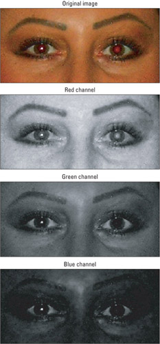
Figure 11-37: The original red-eyed pupils (top), followed by their appearance in each of the color channels.Granted, there's something of a problem in the red channel, but the green and blue channels are just fine.
Naturally, you don't want to replace all the reds in your image, so you need to select the area that you want to correct, namely, the pupils. Because the pupils are round, this is easier than you might think. Using the Elliptical Marquee tool, drag around one pupil and then Shift-drag around the other. To soften the selection edges, choose Select Feather and enter a Radius value of 1 to 2 pixels. Then choose Image Adjustments Channel Mixer. Set the Output Channel to Reds; then enter 0 percent for Red, +50 percent for Green, and +50 percent for Blue. As shown in Figure 11-38, these magical settings do the trick virtually every time.
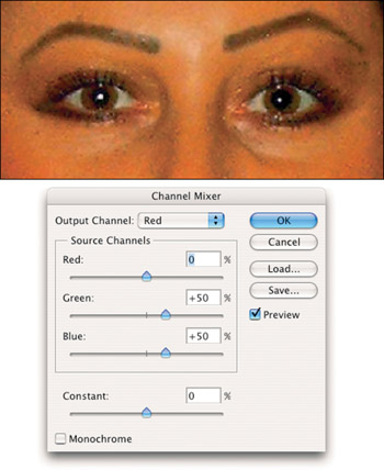
Figure 11-38: After selecting the pupils with the Elliptical Marquee tool and feathering the selection outlines, choose theChannel Mixer command and replace the red channel with an even mix of green and blue.
Final channel-mixing tidbits
In addition to the Output Channel pop-up menu and primary color sliders, the Channel Mixer dialog box offers two options: Constant and Monochrome. The Constant value brightens or darkens the image across the board. Because it is incapable of distinguishing between highlights, midtones, and shadows, this option is sufficiently dangerous that you'll almost always want to leave it set to 0. Only when editing small selections might you want to give it a tweak.
| |
In creating your own Monochrome recipes, you may find it helpful to know what Photoshop does as a baseline. In the world of television, the standard formula for converting RGB to grayscale is 30 percent red, 59 percent green, and 11 percent blue. The percentages used by Photoshop's Image Mode Grayscale vary depending on the active RGB color space; and the Channel Mixer dialog box employs its own special calculations, so an exact recipe is not possible. But starting with the television formula outlined above, experiments in the Adobe RGB space suggest that placing more emphasis on red ” as in Red: 40, Green: 50, Blue: 10 or Red: 45, Green: 60, Blue: 15 ” should get you in the right ballpark. From there, you can experiment at will.
| |
Thanks to the Monochrome check box, the Channel Mixer is a great command for creating custom grayscale images. Rather than choosing Image Mode Grayscale and taking what Photoshop gives you, you can divine your own grayscale recipe. Just select the Monochrome check box and adjust the Red, Green, and Blue values as desired.
Using the Red-eye tool
The Red-eye tool is almost too simple to use. Fortunately, it's quite effective ” to a point. It has two options: Pupil Size and Darken Amount, both set to 50 percent by default. You can drag the options' sliders to accommodate larger or smaller pupils and more or less of a glow in the subject's eyes. Remember to use different settings for each of the eyes if the subject was not facing the camera head-on; if he or she was at an angle, the eye farthest from the camera will have a smaller pupil and may have less of a glow going on.
| Photoshop CS2 | Now, about that "to a point" comment: The tool works by washing out the color (as though you've used the Sponge tool in Desaturate mode) and it also darkens it (as if the Burn tool was used). In color photos, or in close-ups where the eye is quite visible in detail, this may not be a good thing, as having black or dark gray pupils in a color photo looks, well, weird. You may prefer to use the Channel Mixer or the Color Replacement tool (which is discussed next). |
Using the Color Replacement tool
The Color Replacement tool works by taking a color sample from the area in which you first click and then applying your foreground color to any area that matches your sample. For example, if you were trying to clean up some red eye, you would set your foreground color to a very dark gray, select the Color Replacement tool, and then click and hold on the reddest section of eye you can find. What you're doing is telling the tool, "You see this shade of red? A red so deep and piercing that it's as though you're staring into oblivion itself? Do your magic." As you drag with the tool, you replace any section of matching red with your more natural gray while leaving the non-red-eye components of your image untouched.
When you're dealing with a problem like red eye, the Color Replacement tool can usually give you results in just one or two clicks. Figure 11-39 shows how the Redeye tool, Channel Mixer, and Color Replacement tools fared against the glowing red eyes from Figure 11-36.
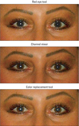
Figure 11-39: The Red-eye tool and Channel Mixer seem to have equal success. The results of theColor Replacement tool aren't quite as dark, but it did a decent enough job.
But the Color Replacement tool is also capable of expertly replacing large chunks of one color with another in a variety of situations. You control the behavior and sensitivity of the tool using the settings in the Options bar. Here's how they break down:
-
Brush: You don't get a whole lot of brush choices when using the Color Replacement tool. The minimalist controls found in the Brush option bear a closer resemblance to Photoshop 6 “era brushes than the snazzy, robust Brushes palette available to a number of the other tools.
-
Mode: This setting tells the tool how to combine the newly painted pixels with the existing ones in your image. By default, the Mode option is set to Color, and you're generally going to want to leave it there. Because the Color mode affects hue and saturation (the color values of an image) but doesn't affect luminance (the lightness values), it's generally the way to go. However, you can achieve some nice results by experimenting with the other choices.
-
Sampling: The Sampling option lets you set how Photoshop will decide what color you're replacing. The first option, Continuous, causes the tool to keep sampling colors, nonstop, for as long as you're using the tool. Drag over your red eye to fix it instantly, but if you keep dragging until you reach skin and you're left with a grayish, splotchy mess. Much more useful than Continuous is the second Sampling option, Once. This sets the color on which you click when you begin your drag as the target of your replacement. This means that for as long as you continue dragging, only the original color will be affected. The third and final Sampling setting is Background Swatch. Choosing this option tells the Color Replacement tool to only alter pixels in your image that share a color with the current background color. It can be a neat way of providing even more control over what the tool will affect, but you should still stick with the Once setting.
-
Limits: The Limits options let you set even more guidelines for which pixels the tool will affect. Discontiguous means that patches of color don't have to be adjacent to each other to be affected. Let's say you have a large mass of color, with little islands of the same color along the shore of the large mass. Assuming that you have a large brush with Sampling set to Once, if you click on the large mass and drag so that the color islands fall within the shape of the brush, they will also be affected by the Color Replacement tool. Contiguous means just the opposite: an island of color must be clicked on itself in order to be affected. Find Edges is similar to Contiguous, but as its name suggests, it finds the edges of the color mass you clicked on and is much more mindful of not changing colors beyond those edges, keeping them sharp. Experiment on your own, but you'll generally want to leave this set to Find Edges.
-
Tolerance: The Tolerance value determines how exact a color match is required to be in order to deem a pixel suitable for replacement. Lower values only replace colors very similar to the sampled color, and higher values replace a broader range of colors. Most of your work with the Color Replacement tool will live or die based on this setting and it can be a bit tricky to get it right. Keep in mind that a value that works for one section of color in an image may not be the correct setting to affect a lighter or darker section of the same color in the image.
-
Anti-aliased: This check box lets you toggle anti-aliasing, or softening, on or off. It's almost certainly a good idea to keep it turned on.
Figure 11-40 shows a series of mailboxes, before and after their makeover with the Color Replacement tool. The tool does a decent job, and it's certainly got speed on its side. But in terms of quality, you're better off making a good selection and using the Hue/Saturation or Channel Mixer commands. Still, give Color Replacement a spin, and you might find it suits your needs.
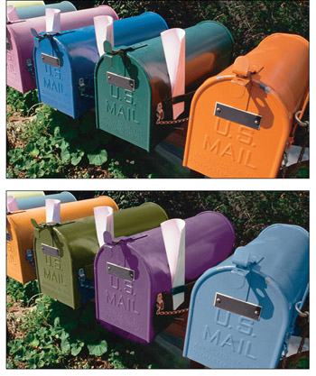
Figure 11-40: These unsuspecting mailboxes (top) are perfect candidates for the Color Replacement tool. With a good bit of fiddling around with the tool's options, a fairly convincing paint job can be achieved (right).
EAN: 2147483647
Pages: 95