Creating Toolbars
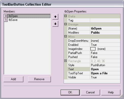
| Toolbars are as easy to create as menus. The designer makes it simple to specify buttons, associate bitmaps, and hook up events. Toolbars are handy for frequently used items where a button can be selected quickly without the need to search menus. Setting Up the ToolbarTo add a toolbar to a form, find the ToolBar control in the Tool Palette by scrolling or typing the letter "T" in the <Search Tools> box. Select the ToolBar control, drag it over the designer surface, and drop it on the form. So far, the toolbar is just a blank box on the form. To define buttons, find the Buttons property in the Behavior section of the Object Inspector, select the property, and click the button to display the property editor (see Figure 8.5). Notice that I used the naming pattern of tbButtonName in the Name property of each button, where tbOpen and tbSave are for the Open and Save buttons, respectively. I do this to give them a meaningful name and differentiate the actions from menu items on the main menu and context menus. Table 8.2 describes the other toolbar button properties. Figure 8.5. ToolBarButton Collection Editor.
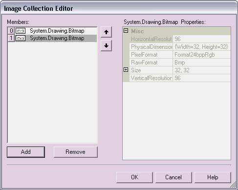
Adding Images to Toolbar ButtonsThe first step in adding toolbar button images is to create an ImageList with the images. The steps in accomplishing this are to create an ImageList control, assign the ImageList control to the ToolBar control, and associate each ToolBarButton control with an image in the ImageList. To create a new ImageList, find the ImageList control in the Tool Palette and drag it to the designer surface. I set the Name property in the Design section of the Object Inspector to imgListMyApplication because it can be used by other application controls. If its purpose was only for a single control, I would have named it to reflect this. There is an Images property in the Appearance section of the Object Inspector for the ImageList control. Selecting this property brings up the Image Collection Editor (see Figure 8.6). Clicking the Add button of the image editor brings up an OpenFile dialog where you can retrieve images from the file system. I created bitmaps for open file (see Figure 8.7) and save file (see Figure 8.8) that I will add to the ImageList control. In addition to bitmaps, images can be any format, as identified by the static members of the ImageFormat class, including GIF, JPEG, PNG, TIFF, EMF, WMF, and icon files. Figure 8.6. Adding images to an ImageList control.
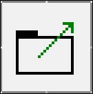
Figure 8.7. An Open File bitmap, with upward-pointing arrow.
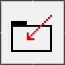
Figure 8.8. A Save File bitmap, with downward-pointing arrow.
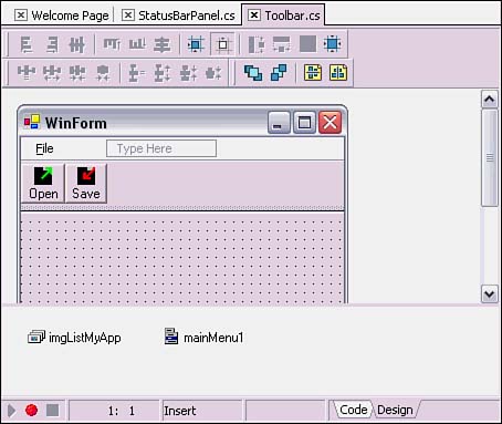
The next step is to assign the image list to the toolbar. There is an ImageList property in the Behavior section of the Object Inspector for the ToolBar control. Selecting this reveals a drop-down list that should be selected to pick an ImageList control. There can be multiple controls to choose from, and the list consists of those ImageList controls that were dragged from the Tool Palette and dropped onto the designer surface. With an ImageList selected for the toolbar, go back to the Buttons property and open the ToolBarButton editor. Select the ImageIndex property for each button. There is a DropDown list with a miniaturized picture and index for each image in the ImageList that was assigned to the enclosing toolbar. For this sample, I added index 0 to the Open button and index 1 to the Save button (see Figure 8.9). Figure 8.9. Images on toolbar buttons.
Creating ToolBar Event HandlersThe .NET Framework documentation shows a ToolBar event handler example that uses a switch statement to examine the toolbar button index and figure out what to do. Although this works, it is clunky and brittle in the face of customizable user interfaces. Considering that every program command should be accessible through a menu option, it makes more sense to bind individual toolbar buttons to a specified menu item. This will simplify ToolBar event handler code and make the user interface more flexible. To build toolbars that link their buttons with menu items, add a MainMenu control to the same application that the toolbar is on and configure the menu items. For this example, just add a File menu with Open and Save menu items. For information on how to do this, see the previous section on "Creating Menus for Your Application." In the code for the form, write OpenFile and SaveFile methods as shown in Listing 8.2. Also, create the event handlers for the Open and Save menu items (see Listing 8.2), either by double-clicking to the left of the text in each in the Visual Menu Editor or using the Event tab of the Object Inspector. Listing 8.2 Methods for Menu Items and Toolbar Buttons (ToolBar.cs) protected void OpenFile() { MessageBox.Show("Called OpenFile."); } protected void SaveFile() { MessageBox.Show("Called SaveFile."); } private void menuFileOpen_Click(object sender, System.EventArgs e) { OpenFile(); } private void menuFileSave_Click(object sender, System.EventArgs e) { SaveFile(); } Notice how the menu item event handlers call the OpenFile and SaveFile methods. This separates user interface handling from logic because now other programs can call the OpenFile and SaveFile methods. For further separation, these two methods could be moved to another class or library. If you recall from Table 8.2, the Tag property of a ToolBarButton control is of type object. That means a reference to a corresponding menu item may be assigned to the Tag property. In fact, anything could be assigned to a Tag property, if there is a need to associate objects and information that is not already supported with a button. Although the Tag property appears in the ToolBarButton Collection Editor (refer to Figure 8.5), the only thing that may be assigned to it is a string, which doesn't help here. Another situation when you would assign the menu item to the Tag is when the objects are initialized. Some people might be thinking about putting the assignment code in the InitializeComponent method, but that is not a good idea. Because the InitializeComponent method is manipulated directly by C#Builder, there is no guarantee that manually edited code will persist. Even if C#Builder left the code in place, what if a menu item were deleted and subsequently added again something that is not too far-fetched in a team environment. In such a scenario, the new menu item could possibly be added later in the routine, and the code assigning the menu item to the ToolBarButton's Tag property would be invalid. A better solution is to put the code in its own routine and call it from the constructor, after InitializeComponent has been called. All initialization will be in one place and safe from C#Builder manipulation. Listing 8.3 shows what I suggest. Listing 8.3 Initializing Toolbar Button Tag Properties (ToolBar.cs) public WinForm() { // // Required for Windows Form Designer support // InitializeComponent(); // Initialization of ToolBar buttons // comes after InitializeComponent InitializeToolBarButtons(); } private void InitializeToolBarButtons() { toolBarMain.Buttons[0].Tag = menuFileOpen; toolBarMain.Buttons[1].Tag = menuFileSave; } In Listing 8.3, the call to InitializeToolBarButtons comes after the call to InitializeComponent to make sure that menu items are properly built and initialized. Within InitializeToolBarButtons, each ToolBarButton is accessed through the Buttons collection of toolBarMain, the main toolbar. The int identifying each button corresponds to the order in which the buttons were added to the toolbar. The order is easy to retrieve by opening the button editor, accessible via the Buttons property of the Object Inspector for the toolbar. This is where the corresponding menu items are associated with each ToolBarButton by setting Tag properties. Now the program has menus, it has buttons, and it has associated menu items with buttons. The next step is to add logic for the buttons to ensure that the associated menu item logic is invoked. Listing 8.4 contains the ToolBar event handler, which provides the necessary invocation logic to accomplish this. Listing 8.4 A ToolBar Event Handler (ToolBar.cs) private void toolBarMain_ButtonClick( object sender, System.Windows.Forms.ToolBarButtonClickEventArgs e) { MenuItem menu = (MenuItem)e.Button.Tag; menu.PerformClick(); } The toolbar event handler in Listing 8.4 extracts the menu item from the Tag property of the ToolBarButton, supplied by the ToolBarButtonClickEventArgs parameter. The MenuItem class has a PerformClick method, used in this routine, which simulates a user click programmatically. |