|   Composition refers to the arrangement of various forms, shapes, textures, colors, and elements in a photograph. Think of it as trying to put a puzzle together, with pieces that are not precut to fit a certain way. There are a variety of techniques for composing good photographs depending on the subject matter, including the following:  Spiral. People in Western cultures read from left to right, and we've trained our eyes to scan other things, including images, in a similar left-to-right sweep. Our eyes naturally tend to scan pictures in a clockwise fashion and then spiral in to the area that has the whitest and brightest colors at its center.  Lowercase "a". Thinking about the shape of a lowercase "a" is helpful in understanding the principles of good composition. It is a simple shape that acts as a guide for the eye. The "a" leads the eye in a clockwise fashion, similar to a spiral, pointing it to the main subject, which is slightly off-center. Note If you keep the "a" in mind, you will automatically create interesting compositions. This will help you balance the elements in a photograph, creating a yin-yang effect.
 Bullseye. This is an old-fashioned technique of placing the key element smack in the middle of the photograph. The use of concentric shapes pulls your eye into the middle of the photo.  Rule of thirds. Okay, this is not necessarily a rule, but it is a great suggestion that really works. Think of a photograph as divided into thirds, either vertically or horizontally, like a tic-tac-toe board. The idea behind this type of composition is to place the key element in the shot at one of the four intersecting points, away from the center. Composing pictures this way helps make them more dynamic. 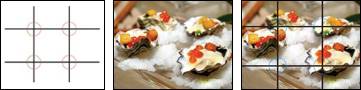 Camera tilt. A simple tilt of the camera can help composition because it places the subject slightly off-center and creates movement and visual flow. To illustrate the effect, examine the following two photographs. The first example is a typical public-relations shotstraight on, with the bottle's label partially obscured. In the second example, tilting the camera slightly and shooting from a downward angle results in a much more contemporary feeling. The first image is static and rigid; the second image is fluid. This approach goes nicely with the brand's upbeat positioning, and significantly improves the visibility of the label. 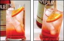 Framing. Use the outer area of your photos to frame the image and to draw the viewer's eye into the picture. Try to use darker elements near the perimeter and lighter ones in the key areas. 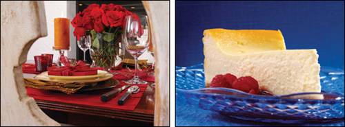
Tip Avoid using too many objects that crowd the space. Try to keep it simple! Like most things in life, simplicity works best. Determine the key mouth-watering element in your image, and compose your photograph to draw the viewer's eye to it.
Although good composition is something that people can learn through practiceand the experience of observing many images, movies, TV shows, and fine art piecesit is also an inherent skill. Some people just have a knack for itand they may not realize how or why it works. That said, make it a point to study images that particularly "work" to determine how they are composed. Realize, too, that all rules are made to be broken; you may create just the image you want by turning these rules of composition on their ear!  |