Forms
Windows are the basic ingredients in any desktop application—so basic that the operating system itself is named after them. However, there's a fair deal of subtlety in exactly how you use a window, not to mention how you resize its content. This subtlety is what makes windows (or forms, to use .NET terminology) one of the most intriguing user interface topics.
This chapter explores how forms interact and take ownership of one another, and how forms are used to manage events. It also examines the basic classes involved, and considers the far from trivial problem of resizable windows. You learn how to design split-window interfaces, use the dazzling Windows XP control styles, and create irregularly shaped windows that will amaze your programming colleagues. Finally, the end of this chapter considers the advantages and limitations of visual inheritance, which offers an elegant way to create form templates.
The Form Class
The Form class is a special type of control that represents a complete window. It almost always contains other controls. The Form class does not derive directly from Control; instead, it acquires additional functionality through two extra layers, as shown in Figure 5-1.
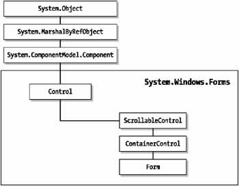
Figure 5-1: The Form class lineage
The Form class provides a number of basic properties that determine appearance and window style. Many of these properties (listed in Table 5-1) will be familiar if you are a seasoned Windows programmer because they map to styles defined by the Windows API.
|
Member |
Description |
|---|---|
|
|
|
|
FormBorderStyle |
Specifies a value from the FormBorderStyle enumeration that identifies the type of window border, including its appearance and whether or not it can be resized. |
|
|
|
|
ControlBox |
Boolean property that determines whether the window has the system menu box at the top left corner. |
|
|
|
|
MaximizeBox |
Boolean property that determines if the window has the maximize box at the top right corner. |
|
|
|
|
MinimizeBox |
Boolean property that determines if the window has the minimize box at the top right corner. |
|
|
|
|
HelpButton |
Boolean property that determines if the window has the Help question mark icon at the top right corner. This button, previously used to trigger context-sensitive Help, has fallen into disuse in recent years. |
|
|
|
|
Icon |
References the System.Drawing.Icon object that is used to draw the window icon in the top left corner. |
|
|
|
|
ShowInTaskBar |
Boolean property that determines whether the window has an associated box that appears in the Windows task bar. This is generally used for main forms, but is not required for secondary windows like configuration forms, About boxes, and modal dialogs. |
|
|
|
|
SizeGripStyle |
Determines whether the sizing grip is shown on the bottom right corner of the window. |
|
|
|
|
WindowState |
Identifies (and allows you to configure) the current state of a resizable window. Possible values are Normal, Maximized, and Minimized. |
|
|
|
|
TopMost |
When set to true, this window is always displayed on top of every other window in your application, regardless of form ownership. This can be a useful setting for tool windows. |
|
|
|
|
Opacity |
A percentage value that makes a form partially transparent if set to a value less than 100 percent. For example, if you set this to 10 percent, the form and all its controls are almost completely invisible, and the background window clearly shows through. This feature is only supported on Windows 2000 or later operating system. While interesting, this feature should not be used by the application programmer. |
|
|
|
|
TransparencyKey |
Identifies a color that becomes transparent. Any occurrence of this color becomes invisible whether it is in the form background, another control, or even a picture contained inside a control. These transparent settings act like "holes" in your window. You can even click to activate another window if you see it through a transparent region. This feature is only supported on Windows 2000 or later. Generally, if you need this type of functionality you are better off creating an irregularly shaped form, as described later in this chapter. |
The Form class defines references to two special buttons, as shown in Table 5-2. These properties add automatic support for the Enter and Escape keys.
|
Member |
Description |
|---|---|
|
|
|
|
AcceptButton |
The button referenced by this property is automatically "clicked" when the user presses the Enter key. This is also sometimes known as the default button. It should always be the least threatening button. Typically, this is a form's OK or Close button, unless that button could accidentally commit irreversible changes. |
|
|
|
|
CancelButton |
The button referenced by this property is automatically "clicked" when the user presses the Esc key. This is usually a Cancel button. |
As you saw in Chapter 2.
The Form class also defines some events of its own. These events (shown in Table 5-3) allow you to react when the form acquires focus, is about to be closed, or is first loaded into memory.
|
Event |
Description |
|---|---|
|
|
|
|
Activated and Deactivated |
These events are the form equivalent of the LostFocus and GotFocus events for a control. Deactivated occurs when the user clicks a different form in the application, or moves to another application. Activated occurs when the user switches to the window. You can also programmatically set the active form with the Activate() method, and you can retrieve the active form by inspecting the static ActiveForm property. |
|
|
|
|
Load |
Occurs when the form first loads. It gives you the chance to perform additional control initialization (like accessing a database and filling a list control). |
|
|
|
|
Closing |
Occurs when the form is about to close as a result of the user clicking the close button or the programmatic use of the Close() method. The CancelEventArgs object provides a Cancel property that you can set to true to force the form to remain open. Event handlers for this event often provide a message box prompting the user to save the document. This message box typically provides Yes, No, and Cancel buttons. If Cancel is selected, the operation should be cancelled and the form should remain open. |
|
|
|
|
Closed |
Occurs when the form has closed. |
Finally, every form has a special designer region, which contains the constructor and an InitializeComponent() method that is executed immediately when the form object is created. The code in the designer region creates all the controls and sets all the properties that you have configured at design time. Even for a simple window, this code is quite lengthy, and shouldn't be modified directly (as Visual Studio .NET may become confused, or simply overwrite your changes). However, the hidden designer region is a great place to learn how to dynamically create and configure a control. For example, you can create a control at design time, set all its properties, and then simply copy the relevant code, almost unchanged, into another part of your code to create the control dynamically at runtime.
The previous chapters have presented the skeleton structure of a custom Form class, which is detailed here:
public class myForm : System.Windows.Forms.Form
{
 // (Control member variable declarations go here.)

 public myForm()
 {
 InitializeComponent();
 }
#region " Windows Form Designer generated code "
 private void InitializeComponent()
 {
 // (Control and form initialization code goes here.)
 }
#endregion

 // (Your custom form-level variables go here)

 // (Your control event handling code goes here.)
}
In the next few sections, you examine more advanced properties of the Form class and the classes it inherits from. You also learn the basic approaches for showing and interacting with forms.
Form Size and Position
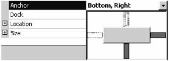
The Form class provides the same Location and Size properties that every control does, but with a twist. The Location property determines the distance of the top left corner of the window from the top left corner of the screen (or desktop area). Furthermore, the Location property is ignored unless the StartPosition property is set to Manual. The possible values from the FormStartPosition enumeration are shown in Table 5-4.
|
Value (from the FormStartPosition enumeration) |
Description |
|---|---|
|
|
|
|
CenterParent |
If the form is displayed modally, the form is centered relative to the form that displayed it. If this form doesn't have a parent form (for example, if it's displayed modelessly), this setting is the same as WindowsDefaultLocation. |
|
|
|
|
CenterScreen |
The form is centered in the middle of the screen. |
|
|
|
|
Manual |
The form is displayed in the location specified by the Location property, relative to the top left corner of the desktop area. |
|
|
|
|
WindowsDefaultLocation |
The form is displayed in the Windows default location. In other words, there's no way to be sure exactly where it will end up. |
|
|
|
|
WindowsDefaultBound |
The form is displayed in the Windows default location, and with a default size (the Size property is ignored). This setting is rarely used, because you usually want exact control over a form's size. |
Sometimes you need to take a little care in choosing an appropriate location and size for your form. For example, you could accidentally create a window that is too large to be accommodated on a low-resolution display. If you are working with a single-form application, the best solution is to create a resizable form. If you are using an application with several floating windows the answer is not as simple.
You could just restrict your window positions to locations that are supported on even the smallest monitors, but that's likely to frustrate higher-end users (who have purchased better monitors for the express purpose of fitting more information on their screen at a time). In this case, you usually want to make a runtime decision about the best window location. To do this, you need to retrieve some basic information about the available screen real estate using the Screen class.
Consider the following example that manually centers the form when it first loads using the Screen class. It retrieves information about the resolution of the screen using the Screen.PrimaryScreen property.
private void dynamicSizeForm_Load(System.Object sender,
 System.EventArgse)
{
 Screen scr = Screen.PrimaryScreen;
 this.Left = (scr.WorkingArea.Width - this.Width) / 2;
 this.Top = (scr.WorkingArea.Height - this.Height) / 2;
}
The members of the Screen class are listed in Table 5-5.
|
Member |
Description |
|---|---|
|
|
|
|
AllScreens (static) |
Returns an array of Screen objects, with one for each display on the system. This method is useful for systems that use multiple monitors to provide more than one desktop (otherwise, it returns an array with one Screen object). |
|
|
|
|
Primary (static) |
Returns the Screen object that represents the primary display on the system. |
|
|
|
|
Bounds |
Returns a Rectangle structure that represents the bounds of the display area for the current screen. |
|
|
|
|
GetBounds() (static) |
Accepts a reference to a control, and returns a Rectangle representing the size of the screen that contains the control (or the largest portion of the control if it is split over more than one screen). |
|
|
|
|
WorkingArea |
Returns a Rectangle structure that represents the bounds of the display area for the current screen, minus the space taken for the taskbar and any other docked windows. |
|
|
|
|
GetWorkingArea() (static) |
Accepts a reference to a control, and returns a Rectangle representing the working area of the screen that contains the control (or the largest portion of the control, if it is split over more than one screen). |
|
|
|
|
DeviceName |
Returns the device name associated with a screen as a string. |
A common requirement for a form is to remember its last location. Usually, this information is stored in the registry. The code that follows shows a helper class that automatically stores information about a form's size and position using a key based on the name of a form.
using System;
using Microsoft.Win32;

public class RegistryForm
{
 public static string RegPath = @"SoftwareApp";

 public static void SaveSize(System.Windows.Forms.Form frm)
 {
 // Create or retrieve a reference to a key where the settings
 // will be stored.
 RegistryKey key;
 key = Registry.LocalMachine.CreateSubKey(RegPath + frm.Name);

 key.SetValue("Height", frm.Height);
 key.SetValue("Width", frm.Width);
 key.SetValue("Left", frm.Left);
 key.SetValue("Top", frm.Top);
 }

 public static void SetSize(System.Windows.Forms.Form frm)
 {
 RegistryKey key;
 key = Registry.LocalMachine.OpenSubKey(RegPath + frm.Name);

 // If the value isn't found the value from the passed in form object is
 // used instead, which effectively leaves the size and location
 // unchanged.
 frm.Height = (int)key.GetValue("Height", frm.Height);
 frm.Width = (int)key.GetValue("Width", frm.Width);
 frm.Left = (int)key.GetValue("Left", frm.Left);
 frm.Top = (int)key.GetValue("Top", frm.Top);
 }
}
| Note |
This example uses the HKEY_LOCAL_MACHINE branch of the registry, which means that changes are global for the current computer.You might want to use HKEY_CURRENT_USER instead to allow user-specific window settings. In this case, just use the Registry.CurrentUser value instead of Registry.LocalMachine. |
To use this class in a form, you call the SaveSize() method when the form is closing:
private void MyForm_Closing(object sender,
 System.ComponentModel.CancelEventArgs e)
{
 registryForm.SaveSize(this);
}
and call the SetSize() method when the form is first opened:
private void MyForm_Load(object sender, System.EventArgs e)
{
 registryForm.SetSize(this);
}
In each case, you pass a reference to the form you want the Helper class to inspect.
Scrollable Forms
The Form class inherits some built-in scrolling support from the ScrollableControl class. Generally, forms do not use these features directly. Instead, you will probably use scrollable controls like rich text boxes to display scrollable document windows. However, these features are still available, rather interesting, and effortless to use.
Figure 5-2 shows a form that has its AutoScroll property set to true. This means that as soon as a control is added to the form that does not fit in its visible area, the required scrollbars will be displayed. The scrolling process takes place automatically.
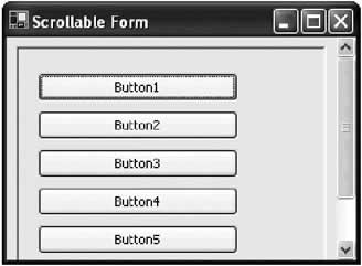
Figure 5-2: A scrollable form
| Note |
To get a scrollable form to display correctly, you may need to call the form's Refresh() method to update the window. In some tests, problems occurred when this method was not used. |
If Figure 5-2 looks a little strange, that's because it is. Scrollable forms make a few appearances in Windows applications (Microsoft Access is one example) but are relatively rare. They should be discouraged as unconventional. Instead, it probably makes more sense to use another class that derives from ScrollableControl, like Panel (see Figure 5-3).
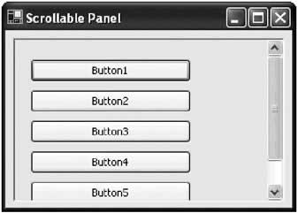
Figure 5-3: A scrollable panel
By default, scrollbars aren't shown unless a control is off the edge of the form, or you explicitly set the Boolean HScroll and VScroll properties. However, you can configure an AutoScrollMinSize, which specifies the required space, in pixels, between each control and the window border. If this minimum space is not provided, scroll bars are shown.
The Form class doesn't derive directly from ScrollableControl. Instead, it derives from the ContainerControl (which, in turn, derives from ScrollableControl). Like the ScrollablControl class, the ContainerControl class doesn't provide many members that you are likely use. It includes a ProcessTabKey() method that the .NET framework uses transparently to manage focus, a ParentForm property that identifies the form that contains this control, and an ActiveControl property, that identifies or sets the control that currently has focus.
Showing a Form
To display a form, you need to create an instance of the Form class and use the Show() or ShowDialog() method.
MainForm frmMain = new MainForm();
frmMain.Show();
The Show() method creates a modeless window, which doesn't stop code from executing in the rest of your application. That means you can create and show several modeless windows, and the user can interact with them all at once. When using modeless windows, synchronization code is sometimes required to make sure that changes in one window update the information in another window to prevent a user from working with invalid information.
The ShowDialog() method, on the other hand, interrupts your code. Nothing happens on the user interface thread of your application until the user closes the window (or the window closes in response to a user action). The controls for all other windows are "frozen," and attempting to click a button or interact with a control has no effect (other than an error chime, depending on Windows settings). This makes the window ideal for presenting the user with a choice that needs to be made before an operation can continue. For example, consider Microsoft Word which shows its Options and Print windows modally, forcing you to make a decision before continuing. On the other hand, the windows used to search for text or check the spelling in a document are shown modelessly, allowing the user to edit text in the main document window while performing the task. You can also use a different version of the ShowDialog() method that accepts a reference to a form in your application. The code in that form will be halted until the modal window is closed, but the user can use other windows in your application, if they exist.
And of course, you are probably already keenly aware that your application needs an entry point, typically in the form of a static Main method. This method creates an instance of the initial form and uses the Application class to start a message loop, ensuring that your application stays alive until this window is closed.
public static void Main()
{
 Application.Run(new MyForm());
}
This represents a basic piece of form infrastructure. In the code examples in this book, I rarely include the entry point or the Windows designer code, both of which can cloud the example at hand.
| Tip |
If you are designing a multithreaded application, it is possible to show windows on more than one thread. In this case, a modal window only stops the code on its thread, and your application may show more than one modal window at once. However, it is strongly recommended that multithreaded applications use one thread for user interface code. This prevents synchronization problems that can occur if a thread tries to access a user interface control that it did not create (and therefore does not legitimately own). |
Custom Dialog Windows
Often when you show a dialog window, you are offering the user a choice. The code that displays the window waits for the result of that choice, and then acts on it.
You can easily accommodate this design pattern by creating some sort of public variable on the dialog form. When the user makes a selection in the dialog window, this special variable is set, and the form is closed. Your calling code can then check for this variable and determine what to do next based on its value. (Remember, even when a form is closed, the form object and all its control information still exists until the variable referencing it goes out of scope.)
For example, consider the form shown in Figure 5-4, which provides two buttons: Cancel and OK.
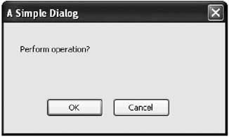
Figure 5-4: A simple dialog form
The form class provides a UserSelection property, which uses a custom enumeration to identify the action that was used to close the window:
public class DialogForm : System.Windows.Form
{
 // (Windows designer code omitted.)

 enum SelectionTypes
 {
 OK,
 Cancel
 }

 // This property must be public so the caller can access it.
 public SelectionTypes UserSelection;

 private void cmdOK_Click(object sender, EventArgs e)
 {
 UserSelection = SelectionTypes.OK;
 this.Hide();
 }

 private void cmdCancel_Click(object sender, EventArgs e)
 {
 UserSelection = SelectionTypes.Cancel;
 this.Hide();
 }
}
The code that creates the form shows it modally. It then checks the UserSelection property after the window is closed to determine what action the user selected:
DialogForm frmDialog = new DialogForm();
frmDialog.ShowDialog();

// The code uses a custom enumeration to make the code readable and less
// error-prone.
switch (frmDialog.UserSelection)
{
 case DialogForm.SelectionTypes.OK:
 // (Do something here.)
 break;
 case DialogForm.SelectionTypes.Cancel:
 // (Do something else here.)
 break;
}

// Release the form and all its resources.
frmDialog.Dispose();
This is an effective, flexible design. In some cases, it gets even better: You can save code by using .NET's built-in support for dialog forms. This technique works best if your dialog only needs to return a simple value like Yes, No, OK, or Cancel. It works like this: In your dialog form, you set the DialogResult of the appropriate button control to one of the values from the DialogResult enumeration (found, like all user interface types, in the System.Windows.Forms namespace). For example, you can set the Cancel button's result to DialogResult.Cancel, and the OK button to DialogResult.OK. When the user clicks the appropriate button, the dialog form is immediately closed, and the corresponding DialogResult is returned to the calling code. Best of all, you don't need to write any event handling code to make it happen.
Your calling code would interact with a .NET dialog window like this:
DialogForm frmDialog = new DialogForm();
DialogResult result;
result = frmDialog.ShowDialog();
switch (result)
{
 case DialogResult.OK:
 // The window was closed with the OK button.
 break;
 case DialogResult.Cancel:
 // The window was closed with the Cancel button.
 break;
}
The code is cleaner and the result is more standardized. The only drawback is that you are limited to the DialogResult values shown in the list below (although you could supplement this technique with additional public form variables that would only be read if needed).
- OK
- Cancel
- Yes
- No
- Abort
- Retry
- Ignore
Form Interaction
Once you create a form, it continues to exist until you end your application or explicitly call the Close() method. As with all controls, even when the control variable goes out of scope and is destroyed, the actual control continues to exist. However, without the form variable, your code has no way to access the form.
This isn't a problem if you code your forms independently, and place all the code that uses the form inside the appropriate Form class. This code can simply use the this reference to access the form (as this always points to the current instance of a class). However, things become a little trickier if you need to allow interaction between forms. For example, if you want to configure a control on one form using the code inside another form, you need to make sure you create and retain the required form variable, so it's available when you need it.
All this raises at least one good question: where should you store the references to a form that you might need later? Once common choice is to create a special global class that does little more than provide a reference to the forms in your application. The following code presents one such example that retains static references to two forms. Remember, static members are always available, so you won't need to create an instance of the AppForms class.
public class AppForms
{
 public static Form frmMain;
 public static Form frmSecondary;
}
You can then refer to the forms you need to use in any code module with the following syntax:
AppForms.frmMain.Show();
Keep in mind that the AppForms class doesn't actually set the form references. You'll need to do that when you create and display the form. One easy way to automate this process is to insert a little code into the Form.Load event handler:
private void MainForm_Load(object sender, EventArgs e)
{
 // Register the newly created form instance.
 AppForms.frmMain = this;
}
This approach works well if every Form class is only created once. If you want to track multiple instances of the same form, you probably want to use a collection object in your AppForms class. The example below uses a Hashtable, which means that every form can be indexed in the collection with a key. If you don't need this ability, you could use the ArrayList object, or even create a custom collection class. Both collection types are found in the System.Collections namespace.
public class AppForms
{
 public static Form frmMain;
 public static Hashtable SecondaryForms = new Hashtable();
}
Forms can add themselves to this collection as needed:
private void SecondaryForm_Load(object sender, EventArgs e)
{
 // Register the newly created form instance.
 AppForms.SecondaryForms.Add(this);
}
When trying to read from variables like frmMain, you should also explicitly check if the value is null (in other words, it hasn't yet been created) before attempting to access the form object.
Of course, you should minimize the need for form interactions, as they complicate code unnecessarily. If you do need to modify a control in one form based on an action in another form (a common requirement when designing wizard-like features), create a dedicated method in the target form. That makes sure that the dependency is well identified, and adds another layer of indirection, making it easier to accommodate changes to the form's interface. Figures 5-5 and 5-6 show two examples for implementing this pattern. Figure 5-5 shows a form that triggers a second form to refresh its data in response to a button click. This form does not directly attempt to modify the second form's user interface; instead, it relies on a custom intermediate method called DoUpdate(). The second example, Figure 5-6, shows a case where more than one form needs to be updated. In this case, the acting form relies on a higher-level application method, which calls the required form update methods (perhaps by iterating through a collection of forms).
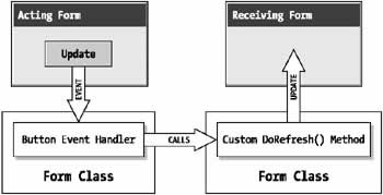
Figure 5-5: A single form interaction
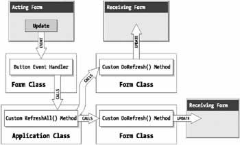
Figure 5-6: A one-to-many form interaction
| Note |
These rules don't apply for MDI applications, which have built-in features that help you track child and parent windows. Chapter 10 presents a few detailed examples of how MDI forms should interact with one another. |
Form Ownership
.NET allows a form to "own" other forms. Owned forms are useful for floating toolbox and command windows. One example of an owned form is the Find and Replace window in Microsoft Word. When an owner window is minimized, the owned forms are also minimized automatically. When an owned form overlaps its owner, it is always displayed on top. Table 5-6 lists the properties of the Form class that support owned forms.
|
Member |
Description |
|---|---|
|
|
|
|
Owner |
Identifies a form's owner. You can set this property to change a form's ownership, or release an owned form. |
|
|
|
|
OwnedForms |
Provides an array of all the forms owned by the current form. This array is read-only. |
|
|
|
|
AddOwnedForm() and RemovedOwnedForm() |
You can use these methods to add or release forms from an owner. It has the same result as setting the Owner property. |
The following example (shown in Figure 5-7) loads two forms, and provides buttons on the owner that acquire or release the owned form. You can try this sample (included in code download for this chapter with the project name FormOwnership) to observe the behavior of owned forms.
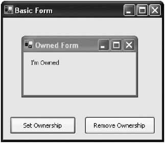
Figure 5-7: An owned form tester
public class Owner : System.Windows.Forms.Form
{
 // (Windows designer code omitted.)

 private OwnedForm frmOwner = new OwnedForm();

 private void Owner_Load(object sender, System.EventArgs e)
 {
 this.Show();
 frmOwned.Show();
 }

 private void cmdAddOwnership_Click(object sender, System.EventArgs e)
 {
 this.AddOwnedForm(frmOwned);
 frmOwned.lblState.Text = "I'm Owned";
 }

 private void cmdReleaseOwnership_Click(object sender, System.EventArgs e)
 {
 this.RemoveOwnedForm(frmOwned);
 frmOwned.lblState.Text = "I'm Free!";
 }
}
Note that for this demonstration, the lblState control in the owned form has been modified to be publicly accessible (by changing the access modifier from internal to public). As described in the form interaction section, this violates encapsulation and wouldn't be a good choice for a full-scale application.
Windows XP Styles
If you are using the Windows XP visual styles on your computer, you have probably already noticed an anomaly with .NET. Any .NET application you create in Windows XP uses the Windows XP styles for the nonclient area (such as the border and minimize/maximize buttons) but not for the actual form surface. Basic user interface elements, like buttons, check boxes, and radio buttons, still have the antiquated look that they've used since the early days of Windows 95.
Fortunately, you can enable Windows XP styles in your .NET applications. To do so, you need to create a special manifest file. This manifest file is an ordinary text file with the same name as your application, plus the extension .manifest (e.g., TheApp.exe would have the manifest file TheApp.exe.manifest—with what looks like two extensions). This file needs to go in the same directory as your program (typically, the binDebug subdirectory of the project directory, which is where the program is compiled during testing).
All the manifest file does is instruct Windows that your application should use the new version of the Comctl32.dll file, if available. This file is part of Windows XP and is used for the visual styles (it is also not redistributable to non-XP computers).
An example .manifest file is shown in the following, and is provided in the root directory of the code download for this book. You can copy this file exactly for your applications. Ideally, you should modify the name value (currently set to "TheApp"), but this change isn't necessary.
name="TheApp"
 type="win32" />
This gets you part of the way, but you also need to configure all your form's button-style controls, like Button, CheckBox, and RadioButton. These controls all have a FlatStyle property, which you must be set to System (not Standard) for Windows XP to supply its visual styles.
Once you are finished, run your application. The changes won't appear inside the development environment. Figure 5-8 shows the differences between the classic Windows look and Windows XP styles for some common controls.
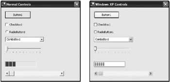
Figure 5-8: Windows XP visual styles
| Tip |
You can safely supply a manifest file for applications that run on older operating systems. If your application is executed on a non-Windows XP computer, the manifest file is harmlessly ignored, and the ordinary control appearance remains. |
Prebuilt Dialogs
.NET provides some custom dialog types that you can use to show standard operating system windows. The most common of these is the MessageBox class, which exposes a static Show() method. You can use this code to display a standard Windows message box (see Figure 5-9):
MessageBox.Show("You must enter a name.", "Name Entry Error",
 MessageBoxButtons.OK, MessageBoxIcon.Exclamation);
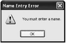
Figure 5-9: A simple message box
The message box icon types are listed in Table 5-7. The button types you can use with a message box are:
- AbortRetryIgnore
- OK
- OKCancel
- RetryCancel
- YesNo
- YesNoCancel
|
MessageBoxIcon |
Displays |
|---|---|
|
|
|
|
Asterisk or Information |
A lowercase letter i in a circle. |
|
|
|
|
Error, Hand, or Stop |
A white X in a circle with a red background. |
|
|
|
|
Exclamation or Warning |
An exclamation point in a triangle with a yellow background. |
|
|
|
|
None |
No icon. |
|
|
|
|
Question |
A question mark in a circle. |
In addition, .NET provides useful dialogs that allow you to show standard windows for opening and saving files, choosing a font or color, and configuring the printer. These classes all inherit from System.Windows.Forms.CommonDialog. For the most part, you show these dialogs like an ordinary window, and then inspect the appropriate property to find the user selection.
For example, the code for retrieving a color selection is as follows:
ColorDialog myDialog = new ColorDialog();

// Sets the initial color select to the current color,
// so that if the user cancels, the original color is restored.
myDialog.Color = shape.ForeColor;

myDialog.ShowDialog();

shape.ForeColor = myDialog.Color;
The dialogs often provide a few other properties. For example, with a ColorDialog you can set AllowFullOpen to false to prevent users from choosing a custom color, and ShowHelp to true to allow them to invoke Help by pressing F1. (In this case, you need to handle the HelpRequest event.)
The OpenFileDialog provides its own set of properties, which allow you to validate the user's selection, allow multiple files to be selected, and set the filter string used for allowed file extensions:
OpenFileDialog myDialog = new OpenFileDialog();

myDialog.Filter = "Image Files(*.BMP;*.JPG;*.GIF)|*.BMP;*.JPG;*.GIF" +
 "|All files (*.*)|*.*";
myDialog.CheckFileExists = true;
myDialog.Multiselect = true;

myDialog.ShowDialog();

string selectedFiles = "";
foreach (string file in myDialog.FileNames)
{
 selectedFiles += file + " ";
}

lblDisplay.Text = "You chose: " + selectedFiles;
The PageSetupDialog and PrintDialog behave slightly differently, because they allow the user to set multiple printing options at once. With .NET, you do not have to retrieve and apply these settings. Instead, you just set the PrintDocument object for the current document in the Document property, and all the appropriate settings are applied automatically when the user selects them.
PageSetupDialog myDialog = new PageSetupDialog();

myDialog.Document = myDocument;
myDialog.ShowDialog();
Also, with the PrintDialog, you need to make sure to examine the dialog result to decide whether the user has chosen to continue with the print operation.
PrintDialog myDialog = new PrintDialog();

myDialog.Document = myDocument;
DialogResult result = myDialog.ShowDialog();

if (result == DialogResult.OK)
{
 // (Initiate printing here.)
}
Table 5-8 provides an overview of the prebuilt dialog classes. Figure 5-10 shows a small image of each window type.
|
Class |
Description |
|---|---|
|
|
|
|
ColorDialog |
Displays the system colors and controls that allow the user to define custom colors. The selected color can be found in the Color property. |
|
|
|
|
OpenFileDialog |
Allows the user to select a file, which is returned in the FileName property (or the FileNames collection, if you have enabled multiple file select). Additionally, you can use the Filter property to set the file format choices, and use CheckFileExists to enforce validation. |
|
|
|
|
SaveFileDialog |
Allows the user to select a file, which is returned in the FileName property. You can also use the Filter property to set the file format choices, and use set the CreatePrompt and OverwritePrompt Boolean properties to instruct .NET to display a confirmation if the user selects a new file or an existing file, respectively. |
|
|
|
|
FontDialog |
Allows the user to choose a font face and size, which is provided in the Font property (and its color through the Color property). You can limit the size selection with properties like MinSize and MaxSize, and you can set ShowColor and ShowEffects to configure whether the user changes the font color and uses special styles like underlining and strikeout. |
|
|
|
|
PageSetupDialog |
Allows the user to configure page layout, page format, margins, and the printer. To use this dialog, simply place the PrintDocument object for the document you want to print in the PageSetupDialog.Document property. Then, all settings are automatically set in your PrintDocument object when the user accepts them. Additionally, you can use properties like AllowMargins, AllowOrientation, AllowPaper, and AllowPrinter to choose the elements of this dialog that are shown to the user. |
|
|
|
|
PrintDialog |
Allows users to select a printer, choose which portions of the document to print, and invoke printing. To use this dialog, simply place the PrintDocument object for the document you want to print in the PrintDialog.Document property. |
|
|
|
|
PrintPreviewDialog |
This is the only dialog that is not a part of standard Windows architecture. It provides a painless way to show a print preview—just assign the PrintDocument to the Document property and display the form. The same logic you write for handling the actual printing is used automatically to construct the preview. Alternatively, you can use the PrintPreviewControl to show the same preview inside one of your custom windows. |
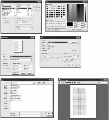
Figure 5-10: Common dialogs
 Companion Web Site
Splitting WindowsOne of the most recognizable user interface styles in applications today is the split window look (arguably popularized by Windows Explorer). In fact, split-window view applications are beginning to replace the former dominant paradigm of MDI, and Microsoft has led the change (although many developers, myself included, still favor MDI design for many large-scale applications). In .NET, split-window designs are refreshingly easy to create, which is a dramatic departure from most other programming environments. To create a split window requires just three easy steps:
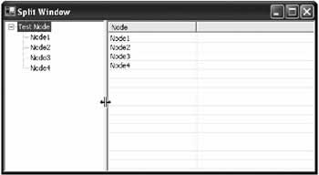
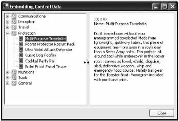
The example in Figure 5-19 shows this technique with a TreeView and a ListView. By moving the position of the splitter bar at runtime, the user can change the relative size of these two controls.
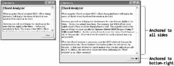
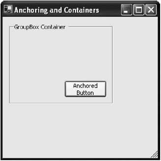
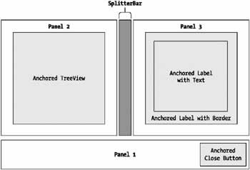
In this case, the window is somewhat claustrophobic. To improve the spacing, you can set a buffer using the form's DockPadding property. However, this won't add any extra spacing between the controls and the splitter bar—to add that, you need to anchor the ListView and TreeView in separate docked Panels, as you consider in the next example. You can also set the SplitterBar.MinSize property to configure the smallest size (in pixels) to which the first docked control can be resized. You can also set the SplitterBar.MinExtra property to configure the minimum size for the controls on the other side of the splitter. Docking with PanelsRather than docking specific controls, as in the preceding example, it's more common to dock two Panel controls, one on each side of the splitter bar. That way, you can include several controls together in the Panel, and fine-tune their spacing. You can then use anchoring to cause the controls inside the Panel to resize themselves to fit its contents. This is where docking and container controls really begin to become useful. Figure 5-20 shows an example taken from Chapter 9, which uses a customized TreeView/ListView explorer.
The panel on the left includes a single TreeView, but the panel on the right includes two label controls spaced inside a panel to give a pleasing border around the label text. (If the same window simply used a single label control with a border, the text in the label would sit flush against the border.) The horizontal rule and Close button at the bottom of the window aren't included in the resizable portion of the window. Instead, they are anchored in a separately docked panel, which is attached to the bottom of the form. To implement this design, a panel control is first docked to the bottom to hold the Close button. Then, the TreeView, SplitterBar, and ListView controls are docked to fill the upper portion of the window. The diagram in Figure 5-21 shows the docking.
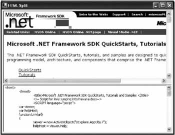
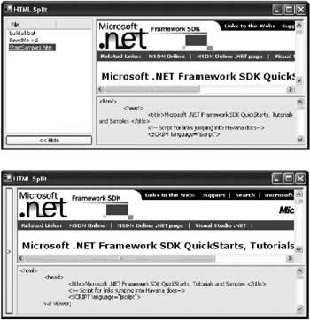
When designing this user interface, you may find that Visual Studio .NET is a little inflexible. If you dock the panels in the wrong order, you won't achieve the desired effect, and you'll need to copy all the controls to another form, and add the panels back one at a time in the correct docking order. Of course, the professional finished result is worth this minor aggravation. Other Split WindowsAnother reason to split a window is to provide two different views of the same data. Consider the example shown in Figure 5-22, which shows an HTML page using Microsoft's ActiveX web browser control and an ordinary text box. In this case, the splitter is docked to the top of the control, and becomes a horizontal bar.
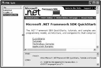
You could also add another vertical splitter to create a compound view. For example, consider Figure 5-23, which provides a list of HTML files the user can select from.
One of the best characteristics of docked designs is that they easily accommodate hidden or modified controls. For example, Figure 5-24 shows an alternate design that allows the file selection panel to be collapsed and then restored to its original size with the click of the button. The contents of the window automatically resize themselves to accommodate the additional portion when it is displayed.
The code for this operation is trivial:
private void cmdHide_Click(object sender, System.EventArgs e)
{
 pnlFileList.Visible = false;
 pnlShow.Visible = true;
}

private void cmdShow_Click(object sender, System.EventArgs e)
{
 pnlShow.Visible = false;
 pnlFileList.Visible = true;
}
This sample is included in the code for this chapter with the project name HTMLSplitWindow.
|
||||||||||||||||||
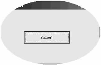
Irregularly Shaped FormsIrregularly shaped forms are often the trademark of cutting-edge consumer applications like photo editors, movie makers, and MP3 players. In the past, creating them required a fair bit of API wizardry. Now with .NET, creating a shaped form is almost effortless, thanks to the new GDI+ model that's included as part of the .NET framework. To create a simple shaped window in .NET, all you need to do is create a form, and assign a new shape to its Region property (this is the same process followed to create a custom shaped control). There is more than one way to create a Region, but the easiest is by using the GraphicsPath class, which allows you to build up a complex shape out of as many subshapes as you need. First, begin by importing the required GDI+ namespace: using System.Drawing.Drawing2D; You can then create and apply the GraphicsPath. The following example code defines an ellipse with the same bounds of the form. Once it's assigned to the Region property of the form, only the part of the form that fits inside the ellipse is displayed (see Figure 5-25).
private void ShapedForm_Load(object sender, System.EventArgs e)
{
 GraphicsPath path = new GraphicsPath();
 path.AddEllipse(0, 0, this.Width, this.Height);
 this.Region = new Region(path);
}
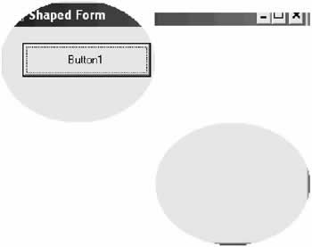
You can see part of the original window border at the top and bottom of the shaped form, and the single contained button in the middle. However, the form acts completely like an ellipse. For example, if you click in the cutout portion that the original rectangular form occupied (that is, just above the left edge of the ellipse), you will not select the form. Instead, you select whatever application is currently underneath the form. This convenience is a great step forward—with ordinary GDI code, shaped controls looked like shapes but still behaved like the original rectangles in many ways. You can also create a shaped form made up of a combination of shapes. In fact, these shapes don't even need to overlap! The following example illustrates a more unusual shaped form, shown in Figure 5-26:
private void ShapedForm_Load(object sender, System.EventArgs e)
{
 GraphicsPath path = new GraphicsPath();

 path.AddEllipse(0, 0, this.Width / 2, this.Height / 2);
 path.AddRectangle(new Rectangle(this.Width / 2, this.Top / 2,
 this.Width / 2, this.Top / 2));
 path.AddEllipse(this.Width / 2, this.Height / 2, this.Width / 2,
 this.Height  2);

 this.Region = new Region(path);
}
Shaped Form ContentThere are two problems you will quickly notice with shaped forms:
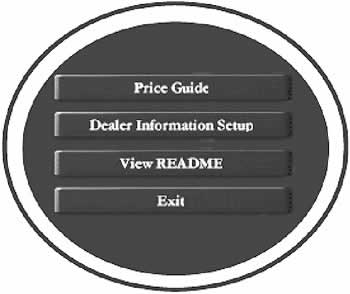
To handle these problems, you need to create your graphical content from scratch. You can accomplish this by using GDI+ to create owner-drawn controls, as you'll see in 13. An easier approach is just to design the appropriate images in a dedicated graphics program and import them into your .NET controls. For example, you can set the BackgroundImage property for the form to a picture that has the same shape you want to use, and includes a border. You can also substitute picture box controls for buttons. Figure 5-27 shows one such example.
To make the images behave like buttons, some additional logic is required to offset the button when it is clicked. The event handlers shown in the following are reused for the MouseDown and MouseUp events of all four buttons.
private void pic_MouseDown(object sender, System.Windows.Forms.MouseEventArgs e)
{
 PictureBox pic = (PictureBox)sender;
 pic.Top += 2;
 pic.Left += 2;
}

private void pic_MouseUp(object sender, System.Windows.Forms.MouseEventArgs e)
{
 PictureBox pic = (PictureBox)sender;
 pic.Top -= 2;
 pic.Left -= 2;
}
Additionally, the images are enhanced to support hot tracking. Whenever the mouse pointer positions itself above a button, a different image is displayed. This image looks the same as the normal button image, but has its text highlighted in yellow. The code to implement this technique simply retrieves the required picture from a ListView control.
private void pic_MouseEnter(object sender, System.EventArgs e)
{
 PictureBox pic = (PictureBox)sender;
 int imageIndex = int.Parse((pic.Tag.ToString()));
 pic.Image = imgSelectedButtons.Images[imageIndex];
}

private void pic_MouseLeave(object sender, System.EventArgs e)
{
 PictureBox pic = (PictureBox)sender;
 int imageIndex = int.Parse((pic.Tag.ToString()));
 pic.Image = imgNormalButtons.Images[imageIndex];
}
You can try this code by running the IrregularlyShapedForms project included with the code download for this chapter. Moving Shaped FormsAnother limitation of shaped forms is that they often omit the nonclient title bar portion, which allows the user to easily drag the form around the desktop. To remedy this problem, you need to add a control that takes over the responsibility for the form's title bar. For example, you could add a picture box or a label control. This control needs to handle the MouseDown, MouseUp, and MouseMove events, and reposition the form accordingly (Figure 5-28). The code is similar to that used in
private bool formDragging;
private Point pointClicked;

private void lblDrag_MouseDown(object sender,
 System.Windows.Forms.MouseEventArgs e)
{
 // Set drag mode on.
 formDragging = true;

 // Store the offset where the control was clicked.
 pointClicked = new Point(e.X, e.Y);
}

private void lblDrag_MouseMove(object sender,
 System.Windows.Forms.MouseEventArgs e)
{
 if (formDragging)
 {
 Point pointMoveTo;

 // Find the current mouse position in screen coordinates.
 pointMoveTo = this.PointToScreen(new Point(e.X, e.Y));

 // Compensate for the position the control was clicked.
 pointMoveTo.Offset(-pointClicked.X, -pointClicked.Y);

 // Compensate for the nonclient region (title bar).
 // This code is not necessary if you explicitly hide the title bar
 // by setting the form's BorderStyle to None.
 pointMoveTo.Offset(0, -25);

 // Move the form.
 this.Location = pointMoveTo;
 }
}

private void lblDrag_MouseUp(object sender,
 System.Windows.Forms.MouseEventArgs e)
{
 formDragging = false;
}
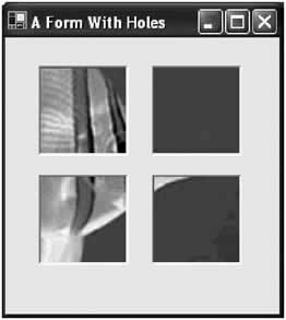
Forms with HolesThere's also one other approach to creating irregularly shaped forms. You can define a special color for the form that will automatically be cut out by setting the form's TransparencyKey property. For example, if you choose dark blue, all occurrences of dark blue in your form become invisible. This includes occurrences of the color in an image, a control, or even the form's background. In fact, these holes aren't just invisible—you can even click through them to activate a program underneath! Figure 5-29 shows an example from the online samples that contains several picture box controls that contain the TransparencyKey color as their background. At runtime, these picture boxes disappear.
|
|||||||||||||||
Visual InheritanceVisual inheritance is a fancy name for form inheritance, which is similar to the custom control pattern you use to create specialized .NET controls. Depending on how you use visual inheritance, you can really accomplish two things:
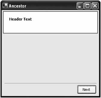
And, as with any type of inheritance, visual inheritance gives you many different ways to customize how the descendent class can use, extend, or override the inherited class. To create a simple example of form inheritance, you might create a wizard form like the one shown in Figure 5-30. It uses a blank header area for title text, a large surface area for additional content, and a Next button at the bottom. In this example (found in the code for this chapter under the project name VisualInheritance), the base form is named Ancestor.
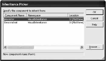
To create an inherited form that uses this form, you first need to compile the project (unless the form is already stored in a separate assembly from your project). Then, right-click the project item in the Solution Explorer and choose Add → Inherited Form. You'll be prompted to choose a new form name, and select the form you want to derive from (see Figure 5-31).
Of course, you don't actually need to use the wizard to create an inherited form. All you really need to do is create a Form class, and change the standard class declaration (which inherits from the System.Windows.Forms class) to inherit from your custom class. Make sure you use a fully qualified name that includes both the project namespace (in this case, VisualInheritance) and the form name. public class Descendent : Inherits VisualInheritance.Ancestor You'll notice that the inherited form contains all the controls that you defined in the original form, but it doesn't allow you to move them, change their properties, or add event handlers. You can, however, add new controls, write their event handlers, and change the size (or any other property) for your descendant form. In the basic example, this doesn't allow the flexibility you need. For example, the user needs to have some way to configure the label control in the title area and override the function of the Next and Previous buttons. Fortunately, this is all easy if you understand a few basics about inheritance.
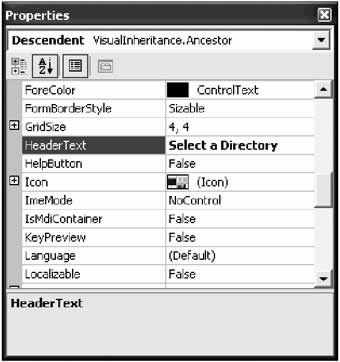
Making an Ancestor Control AvailableBy default, every control on the original ancestor form is declared with the Friend modifier. This keyword allows access to other forms in the same project, but it doesn't allow any access to your derived form. To change this state of affairs, simply modify the controls you want to configure to use the Protected modifier instead. You can change the declaration by looking through the form code, or you can use the Properties window, and look for the special Modifiers property. Once you've made this change, you'll find that you can configure any aspect of the inherited controls, including their appearance and position. The values used in the base form become the default values in the derived form, but any changes you make are recorded in the derived form's designer code and applied automatically when the form is created. Adding an Ancestor PropertyIn our wizard example, creating protected-level controls may not be the best approach. Quite simply, it allows too much freedom to change the original layout. Take the header text, for example. The creator of the derived form should be able to enter custom text into the control, but other details (like its font, color, and position) shouldn't be modifiable, as they risk compromising the standardized layout you've established. To code a better solution, you could create a special property in the base form. The client could then use this property to set the header text, without being allowed any greater degree of control.
public string HeaderText
{
 get
 {
 return lblHeader.Text;
 }
 set
 {
 lblHeader.Text = value;
 }
}
In your ancestor form, this property is available through code—and it also appears as value the user can set in the Properties window (see Figure 5-32). In fact, you can add other attributes to this property that configure the description it shows and the category it will appear in, but that topic is explored in Chapter 10.
Overriding an Event HandlerYour base form might also contain event-handling logic. If this logic is generic (for example, it simply closes the form) it is suitable for all descendants. In the case of your Previous and Next buttons, there clearly is no generic code that can be written. Instead, the descendant needs to override the event handling code. To accomplish this, you need to declare that the event handler can be overridden by marking it virtual in your ancestor form:
protected virtual void cmdNext_Click(object sender, System.EventArgs e)
{
 MessageBox.Show("Ancestor form event handler.")
}
You can then override the routine in your descendant form:
protected override void cmdNext_Click(object sender, System.EventArgs e)
{
 MessageBox.Show("Descendant form event handler.")
}
Note that you do not connect this code by adding an event handler. That's because the original routine (the one you are overriding) is already connected to the event. Another way to get around this situation is just to mark the control in the base form as protected. In this case, you don't need to include an ancestor event handler; instead, the derived form can write event-handling code directly. The side effect is that you lose your protection, and any other aspect of the control can also be modified in the derived form. In some cases, you might want to execute both the extra code in the descendant form, and the original code. You can accomplish this by using the base reference. The code that follows, for example, results in the display of two message boxes, one from the ancestor form, followed by one from the derived form.
protected override void cmdNext_Click(object sender, System.EventArgs e)
{
 // Call the original version.
 base.cmdNext_Click(sender, e);

 MessageBox.Show("Descendant form event handler.");
}
Finally, in some cases you might want to force an event handler to be overriden. For example, in our example a wizard form can't be considered complete unless it has the necessary event handling logic behind added to its next button. However, it's impossible to code this logic at the ancestor level. To force the derived class to override this event handler (as a precautionary measure), you can declare the event handler with the abstract qualifier. In this case, you can't add a method body. protected abstract void cmdNext_Click(object sender, System.EventArgs e); For this to work, the ancestor form class must also be declared abstract. public abstract class Ancestor : System.Windows.Forms.Form Be warned that this pattern can confuse the Visual Studio .NET IDE, and could even cause it to stop displaying your derived forms (although the code will work without a hitch). The best approach is to create a separate DLL assembly for your base forms, and add this as a reference to any client applications that want to inherit from these classes. As you master visual inheritance, you might want to expand the inheritance technique to include your custom controls. Chapter 7 is dedicated to this approach. |
||||||||||||||||||
The Last WordIn this chapter you've traveled from the basics of Windows forms-creating them, displaying them, and handling their interactions, to advanced techniques using shaped forms and visual inheritance. In many respects, these new developments hint at two of the themes I take up in the rest of the book. Shaped forms give just a taste of what you encounter in 13, which dive headfirst into GDI+. Visual inheritance provides a preview into some of the custom control designs you explore with control inheritance throughout this book. Both techniques represent the step from ordinary user interface programming to the more advanced techniques of a UI guru. |
|||||||||||||||
Modern Controls |
|||||||||||||||
Introduction
 Windows Forms and Custom Controls")
EAN: 2147483647
Pages: 142
