18.2. Adding Chart Elements You build every chart out of small components , like titles, gridlines, axes, a legend, and the bars, points, or exotic shapes that actually represent the data. And Excel lets you manipulate each of these details separately. That means you can independently change the format of a label, the outline of bar, the number of gridlines, and the font and color of just about everything. Figure 18-3 shows the different elements that make up a chart. They include: -
Title . The title labels the whole chart. In addition, you can add titles to the other axes. If you do, then you can select these titles separately. -
Legend . The legend identifies each data series on the chart with a different color. A legend's useful only when the chart contains more than one series. 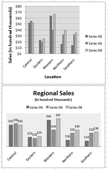 | Figure 18-2. This worksheet shows two copies of the same chart, each with a different layout. The chart at the top includes heavy gridlines, axis titles, and a legend on the right. The chart below has a chart title and places the legend at the top. It also has no gridlines and instead displays the series value above each column. | |
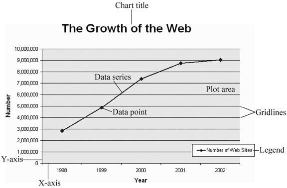 | Figure 18-3. Before you can begin tweaking your chart's formatting, you need to know the names of the different elements you'll find on a chart, all of which are labeled here. | |
-
Horizontal and Vertical Axes . An axis runs along each edge of the chart and determines the scale. In a typical two-dimensional chart, you have two axes: the category axis (typically on the bottom of the chart, running horizontally), and the value axis (typically on the left, running vertically). -
Plot Area . The plot area is the chart's background, where the gridlines are drawn. In a standard chart, the plot area is plain white, which you can customize. -
Chart Area . The chart area is the white space around the chart. It includes the space that's above, below, and to either side of the plot area. -
Gridlines . The gridlines are the lines that run across the plot area. Visually, you line the data up with the gridlines to get an idea of the value of each data point. Every chart starts out with horizontal gridlines, but you can remove them or add vertical gridlines. You can tell Excel how many gridlines to draw, and even how to format them. -
Data Series . The data series is a single set of data plotted on the chart across the category axis. In a line chart, for example, the data series is a single line. If a chart has multiple series, you'll often find it useful to format them separately to make them easier to differentiate or to emphasize which one's the most important. -
Data Point . A data point is a single value in a data series. In a line chart, a data point's a single dot, and in a column chart, a data point is a single column. If you want to call attention to an exceptionally important value, you can format a data point so it looks different than the rest of the series. Not all charts include all these elements. As you learned in Section 18.1.2, the layout you pick determines whether you begin with a chart title, a legend, gridlines in the background, and so on. However, in many cases you'll want to pick and choose exactly the elements you want. Excel lets you do this choosing with the buttons on the ribbon's Chart Tools Layout tab. The following sections show you how. 18.2.1. Adding Titles It doesn't matter how spectacular your chart looks if it's hard to figure out what the data represents. To clearly explain what's going on, you need to make sure you have the right titles and labels. An ordinary chart can include a main title (like "Increase in Rabbit Population vs. Decrease in Carrot Supplies") and titles on each axis (like "Number of Rabbits" and "Pounds of Carrots"). To show or hide the main title, make a selection from the Chart Tools Layout  Labels Chart Title list. Your options include: Labels Chart Title list. Your options include: -
Above Chart puts a title box at the very top and resizes the chart smaller to make room. -
Centered Overlay Title keeps the chart as is but superimposes the title over the top. Assuming you can find a spot with no data, you get a more compact display. -
None hides the title altogether. Once you select one of those options, you see the title box; you can click inside it and type in new text, as shown in Figure 18-4. 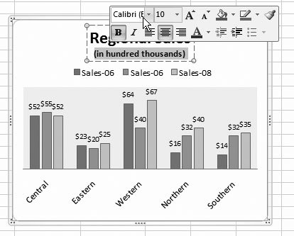 | Figure 18-4. You can type in whatever text you'd like for a chart title. If you select part of the text, a mini bar appears (sadly, of the alcohol-free variety), with formatting options for changing the font, size , color, and alignment. These commands are the same as in the Home Font section of the ribbon, but its way more convenient to reach them here. | |
You can just as easily add a title to each axis using the Chart Tools Layout Labels Axis Titles Primary Horizontal Axis Title and Chart Tools Layout Labels Axis Titles Primary Vertical Axis Title lists. Youll find options for showing your title, hiding it, and (in the case of a vertical axis), showing a title that's rotated to run neatly along the side of your chart.
Tip: As with almost all chart elements, you can also format titles by adding a border, a shadow effect, and a fancy background fill. To get these options, right-click the title, and then choose Format Chart Title. You'll learn more about these options throughout this chapter.
18.2.2. Adding a Legend Titles help explain a chart's overall purpose. Usually, titles indicate what a chart is comparing or analyzing. You may add a chart title like "Patio Furniture Sales" and the axis labels "Gross Revenue" and "Month of Sale" to a chart that shows how patio furniture sales pick up in the summertime. However, the category labels don't help you single out important data. They also don't let you point out multiple series (like the sales results in two different stores). You can fix this problem by adding additional labels or a legend . A legend is a separate box off to the side of the chart that contains one entry for each data series in a chart. The legend indicates the series name , and it adds a little sample of the line style or fill style that you've used to draw that series on the chart. Excel automatically adds a legend to most charts. If you don't already have a legend, you can choose a layout that includes one, or you can make a selection from the Chart Tools Layout Labels Legend list. Different selections let you position the legend in different corners of the chart, although true Excel pros just drag the legend box to get it exactly where they want it. Legends aren't always an asset when you need to build slick, streamlined charts. They introduce two main problems: -
Legends can be distracting . In order to identify a series, the person looking at the chart needs to glance away from the chart to the legend, and turn back to the chart again. -
Legends can be confusing . Even if you have only a few data series, the average reader may find it hard to figure out which series corresponds with each entry in the legend. This problem becomes more serious if you print your chart out on a printer that doesn't have the same range of colors as your computer monitor, in which case different colored lines or blocks may begin to resemble each other. If you don't want to use a legend for these reasons, you can use data labels instead, as described in the next section. 18.2.3. Adding Data Labels to a Series Data labels are labels that you attach to every data point in a series. This text floats just above the point, column, or pie slice that it describes, clearly identifying each piece of information. Data labels have unrivalled explaining powerthey can identify everything . The only possible drawback is that adding data labels to a chart that's already dense with data may lead to an overcrowded jumble of information. To apply data labels, choose a position from the Chart Tools Layout Labels Data Labels list. If you choose Chart Tools Layout Labels Data Labels Center on a column chart, each bars value appears as a number that's centered vertically inside the bar. On the other hand, if you choose Chart Tools Layout Labels Data Labels Outside End, the numbers appear just above the top of each column, which is usually more readable (Figure 18-5). 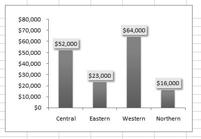 | Figure 18-5. Here, you can see how a value label adds information to a column chart. Even without the labels, you could still get this information by eyeing where the bar measures up to on the value axis on the left, but the labels make it a whole lot easier to get the information with a single glance. The labels have been customized slightly via the Format Data Labels dialog box to shrink their font size and add a simple box border with a shadow effect. | |
Tip: No matter how you choose to label or distinguish a series, you're best off if you don't add too many of these elements to the same chart. Adding too many labels makes for a confusing overall effect, and it blunts the effect of any comparison.
If you're in an adventurous mood, you can create even more advanced labels by choosing Chart Tools Layout Labels Data Labels More Data Label Options. The Format Data Labels dialog box appears, with a number of options for customizing data labels (Figure 18-6). 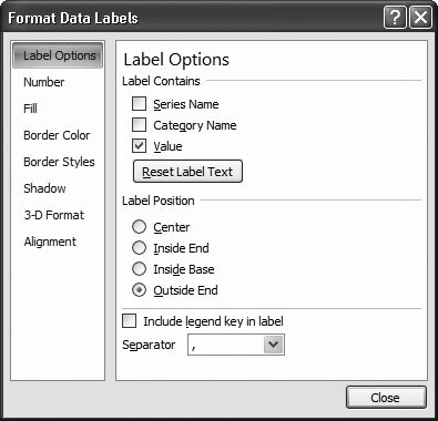 | Figure 18-6. The Format Data Labels dialog box is divided into several sections of settings. (You can see one setting at a time by picking from the list on the left.) For now, you're interested in the Label Options section. You'll learn how to use the other formatting settings, which apply to all chart elements, later in this chapter. | |
Using the Format Data Labels dialog box, you can choose the data label's position (just like you could from the Chart Tools Layout Labels Data Labels list). But the options under the Label Contains heading are more interesting, as they let you chose the information that appears in the label. Ordinarily, the information is simply the value of the data point. However, you can also apply a combination of values. Your exact options depend on the type of chart you've created, but here are all the possible choices: -
Series name . The series name identifies the series each data point comes from. Because most series have multiple data points, using this option means the same text repeats again and again. In a line chart that compares sales between two stores, using this option would put the label "Store 1" above each data point for the first store, which is probably overkill. -
Category name . The category name adds the information from the category axis. If you're using a line chart to compare how sales fluctuated month by month, then this option adds the month above every data point. Assuming you have more than one line in your line chart, this option creates duplicate labels, which crowds out the important information in your form. For that reason, category labels don't work very well with most charts, although you can use them to replace the legend in a pie or donut chart. -
Value . Value labels insert the data that corresponds with a data point. This data is the actual information in the corresponding cell in your worksheet. If you're plotting changing sales, this data is the dollar amount of sales for a given month. Value labels are probably the most frequently used type of label. -
Percentage . Percentage labels apply only to pie charts and donut charts. They're similar to value labels, except they divide the value against the total of all values to find a percentage. -
Bubble size . Bubble size labels apply only to bubble charts. They add the value from the cell that Excel used to calculate the bubble size next to each bubble. Bubble labels are quite useful in bubble charts because bubble sizes don't correspond to any axis, so you can't understand exactly what numeric value a bubble represents just by looking at the chart. Instead, you can judge relative values only by comparing the size of one bubble to another.
Note: In some charts (including XY scatter charts and bubble charts), the checkboxes "Category name" and "Value" are renamed to "X Value" and "Y Value", although they have the same effect as "Category name" and "Value."
When you use multiple items, you can also choose a character from the Separator list box to specify how to separate each piece of text in the full label (with a comma, space, semicolon, new line, or a character you specify). And if you want to display a mini square with the legend color next to the label, then choose "Include legend key in label" (although most people don't bother with this feature). Figure 18-7 shows more advanced data labels at work. 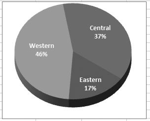 | Figure 18-7. Here's how you can combine percentage and category information to make a pie chart more readable and eliminate the legend altogether. | |
Tip: Wondering what your chart will look like? As you make changes, Excel updates the chart on the worksheet using its handy live preview feature. Just move the Format Data Labels dialog box out of the way to get a sneak peak before you confirm your choices.
18.2.4. Adding Individual Data Labels In simple charts, data series labels work well. But in more complex charts, data series labels can be more trouble than they're worth because they lead to chart overcrowding, particularly with line charts or any chart that has multiple series. The solution is to add labels to only a few data points in a seriesthose that are most important. Figure 18-8 illustrates the difference. 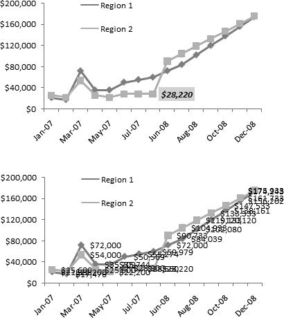 | Figure 18-8. Data point labels work particularly well with line charts and scatter charts because both these chart types are dense with information. The two examples here underscore that fact.
Top: Here, a single data point label indicates the point where the sales changed dramatically for the Region 1 office.
Bottom: Here's the mess that results if you add data labels to the whole Region 1 and Region 2 series. No amount of formatting can clear up this confusion. | |
To add an individual data label, follow these steps: -
Click the precise data point that you want to identify. This point could be a slice in a pie chart, a column in a column chart, or a point in a line chart . Selecting a data point is a little tricky. You need to click twicethe first click selects the whole series, and the second click selects just the data point you want. You'll see the handles appear around the specific column or point to indicate you've selected it, as shown in Figure 18-9. -
When you have the right data point selected, choose an option from the Chart Tools Layout Labels Data Labels list . These options work the same way they do when you format the whole series (Section 18.2.3), except now they apply only to the currently selected value. To remove a data label, click to select it, and then press Delete. If you want to add several data labels, you're best off adding all the data labels (as described in the previous section), and then deleting the ones you don't want. 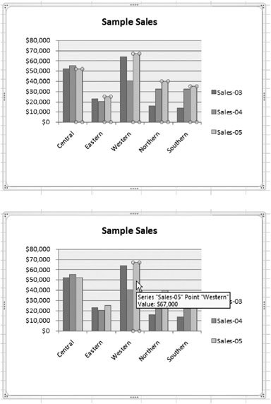 | Figure 18-9. Top: To select a single data point, click it twice. The first click selects the whole Sales-05 series.
Bottom: The second click gets just the data point you want, which is the Sales-05 data in the Western sales office. In some cases, you may not be able to tell which data point's the one you want, especially if you're creating a dense scatter chart. When that happens, just hover over the data point briefly to see a tooltip with the category, series, and value information. | |
Tip: If a data label doesn't have exactly what you want, you can click inside it and edit the text, just as you do with a chart title.
As with data series labels, right-clicking a data label gives you a choice of formatting options (choose Format Data Labels). It's almost always a good idea to format your labels so they stand out and don't crowd other information on the chart. Section 18.4 describes more about formatting chart elements.
Tip: Instead of using data labels, you can add arrows and text boxes anywhere on a chart to call out important information. To do so, you need Excel's drawing features, explained in the next chapter.
18.2.5. Adding a Data Table Trying to pack as much information as possible into a chartwithout cluttering it upis a real art form. Some charting aficionados use labels, titles, and formatting to highlight key chart details, and then use the data on the worksheet itself to offer a more detailed analysis. However, Excel also provides a meeting point between chart and worksheet that works with column charts, line charts, and area charts. It's called the data table . Excel's data table feature places your worksheet data under your chart, but lined up by category. You can best understand how this feature works by looking at a simple example, like the one in Figure 18-10. 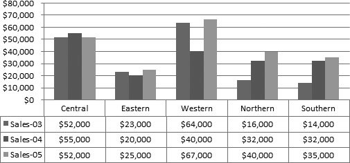 | Figure 18-10. This data table removes the need for a legend or data point labels. However, keep in mind that data tables don't work well with large amounts of data. | |
To add a data table, select your chart, and then choose Chart Tools Layout Labels Data Table Show Data Table. Or, if you want each series in the data table to have a small square next to it with the same color as the matching data series, then choose Chart Tools Layout Labels Data Table Show Data Table with Legend Keys. This way, you might not need a legend at all. |