Section 7.2. Images and Styles
The <img> tag supports a few optional attributes that you can use to control alignment and borders. But in the modern world, these attributes are considered obsolete, and you won't use them in this book. Instead, you'll learn the best way to position imageswith style sheets.
The following sections show all your image-alignment options, and help you practice some of the style sheet smarts you picked up last chapter.
7.2.1. Inline Images in Text
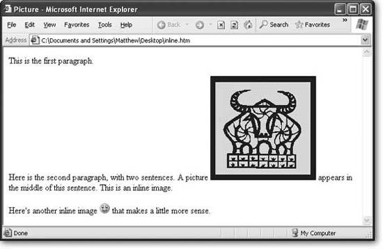
If you don't take any extra steps, every image you insert with an <img> tag is placed right into the flow of HTML text. The bottom edge is lined up with the baseline of the text that surrounds it (see Figure 7-8).
You can change the vertical alignment of text using the vertical-align property. Specify a value of top, middle, or bottom, depending on whether you want to line the picture up with the top, middle, or bottom of the line of text.
Here's an example with an inline style that uses the vertical-align property to line the picture up with the top of the line of text.
<img src="happy.gif" alt="Happy Face" style="vertical-align: top" >
This technique is worthwhile if you're trying to line up a very small picture (like a fancy bullet). However, it doesn't work very well with large images. That's because no matter which vertical-align option you choose, only one line of text of text can appear alongside the picture (as you can see in Figure 7-8). If you want to create floating pictures with wrapped text, read on (Section 7.2.3).
|
7.2.2. Borders
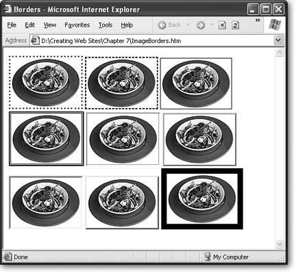
In Section 6.5 in Chapter 6, you considered the style properties that let you add and modify borders around text boxes. It should come as no surprise that you can use these borders just as easily around images.
For example, here's a style that applies a thin, grooved border to all sides of an image:
img.GrooveBorder { border-style: groove; border-width: 3px; } As with all style sheet rules, you need to place the rule in an internal style sheet in the current Web page or in an external style sheet that your page uses (see p. 138 for a discussion of the difference).
Notice that this style is given a class name (groove). That's because it shouldn't be automatically applied to every picture. Instead, you want to choose when to apply it by using the class attribute:
<img src="food.jpg" alt="A Meal" class="GrooveBorder" >
Figure 7-9 shows the basic border styles. Remember, you can change the thickness of any border to get a very different look.
|
7.2.3. Wrapping Text Around an Image
Using inline images is the simplest way to arrange pictures. When you use inline images, the pictures and the text are usually in separate parts of your Web page. You use paragraphs (<p>), line breaks (<br>), horizontal rules (<hr>), and other divisions to separate your images from your text. For example, you might decide to put a picture in between two paragraphs, like this:
<p>This paragraph is before the picture.</p> <p><img src="food.jpg" alt="A Meal"></p> <p>This paragraph is after the picture.</p>
Inline images are locked into place. They never move anywhere you don't expect.
However, sometimes you want a different effect. Instead of separating images and text, you want to put them alongside each other. For example, maybe you want your text to wrap around one side of a picture.
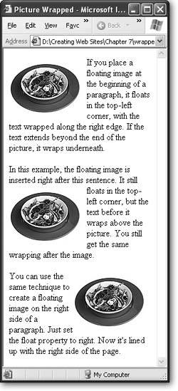
Images that have text wrapped on one side or the other are called floating images, because they float next to an expanse of text (see Figure 7-10). You can create a floating image using a CSS property named float . The value can be either left or right, which lines the image up on either the left or the right edge of the text.
img.FloatLeft { float: left; } | FREQUENTLY ASKED QUESTION Typical File Sizes for Images |
| How much disk space does a typical picture occupy ? There's no single answer to this question, because it depends on several factors, including the dimensions of the picture, the file format you use, the amount of compression you apply, and how well the picture responds to compression techniques. However, here are a few basic examples that you can keep in mind. The file size of a typical Web site logo is vanishingly small. Amazon's small logo (about 150 x 50 pixels) has a file size of a paltry 2 kilobytes (KB), which is less than most Web pages. Google's signature logo banner clocks in nearly as tiny, at 10 KB. Both are GIF files (Section 7.1.4). A picture can take up much more disk space. A small news picture in an article on the New York Times Web site rarely uses more than 20 KB. A typical eBayer includes a picture of her product that's 30 to 150 KB. At this size, the picture usually takes up a large portion of your browser window. However, that's nothing compared to the size the picture would need if you weren't using compression. For example, a 1-megapixel camera can take a raw, uncompressed picture of about 3,000 KB. In a Web page, you might compress this to 300 KB or less by using a JPEG file format with a lower quality level (see Section 7.1.5). Of course, the important number is how long it takes a Web visitor to download a Web page that has a picture. Obviously, this depends on the speed of their Internet connectiona broadband connection won't blink while grabbing a huge graphic, while a surfer on a relatively slow 56 K dialup modem can only get about 5 KB each second, meaning it takes about 20 seconds to see all of a 100 KB eBay picture. In Internet time, 20 seconds is a lifetime. The best advice for keeping your pictures small is to crop them to the right dimensions, use the right image format, and try lowering the quality level of JPEGs to get better compression. |
Notice that this image uses a class name. You probably don't want every image in your entire Web page to become a floating image, so it's always a good idea to use a class name. Here's an <img> that uses this class, followed by some text:
<p> <img src="food.jpg" alt="A Meal" class="FloatLeft" > If you place a floating image at the beginning of a paragraph, it floats in the top-left corner, with the text wrapped along the right edge. </p>
At the same time that you use the float attribute, it makes sense to adjust the margin settings to put a little breathing room between your image and the rest of the text:
img.FloatLeft { float: left; margin: 10px; } Figure 7-10 shows several floating images.
|
Tip: To get floating text to work the way you want, always put the <img> tag just before the text that should wrap around the image.
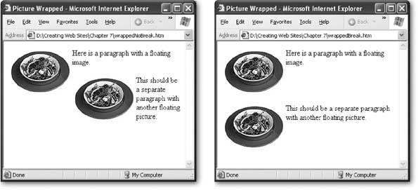
Wrapping text can get a little tricky, because the results you get depend on the width of the browser window. A wide browser might fit the text in just a couple of lines, allowing the rest of the page to bump up next to your floating graphic, which isn't what you want (see Figure 7-11). To prevent this sort of problem, you can use tables (discussed in Chapter 9), or you can manually stop wrapping at any point using the clear property in a line break (<br>) tag:
<br style="clear: both;">
Place this line at the end of the wrapped paragraph, like so:
<p> <img src="food.jpg" alt="A Meal" class="FloatLeft"> Here is a paragraph with a floating image. <br style="clear: both;"> </p> <p> <img border="0" src="food.jpg" class="FloatLeft"> This should be a separate paragraph with another floating picture. </p>
The <br> tag ensures that the next paragraph starts after any floating pictures (see Figure 7-11).
|
Based on these examples, you might think that the float property sends a picture to the left or right side of the page. But this isn't exactly what happens. Remember, in CSS each HTML tag on the page is treated as a container. When you create a floating image, the image actually goes to the left or right side of the containing element. In the previous examples, this means the image goes to the left or right of the paragraph, because the paragraph is the containing tag.
In this example, the paragraph takes the full width of the page. However, this isn't always the case. If you use style rules to put the paragraph into a padded note box, you'll get a completely different effect.
To try this out, you need to wrap the image and the paragraph in a <div> tag, like this:
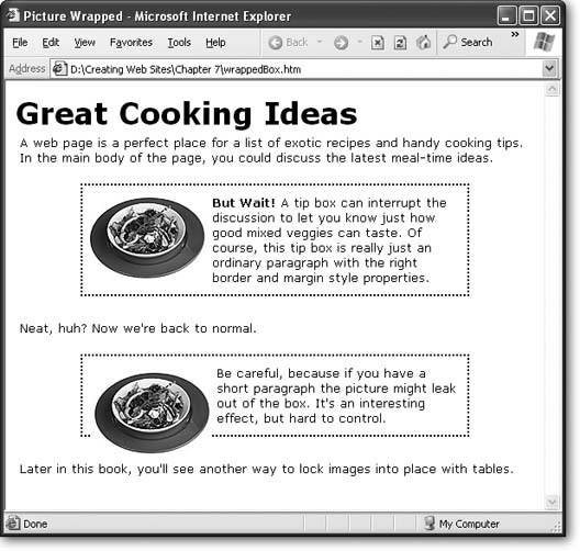
<div class="Box"> <p> <img src="food.jpg" alt="A Meal" class="FloatLeft"> <b>But Wait!</b> A tip box can interrupt the discussion to let you know just how good mixed veggies can taste. Of course, this tip box is really just an ordinary paragraph with the right border and margin style properties. </p> </div>
You can then apply a fancy border to the <div> tag through a style rule:
div.Box { margin-top: 20px; margin-bottom: 10px; margin-left: 70px; margin-right: 70px; padding: 5px; border-style: dotted; border-width: 2px } Figure 7-12 shows the result.
|
7.2.4. Adding Captions
Another nice touch is to give your pictures a caption above or below the image. You can easily do this with inline images (just put a line of text immediately above or after the picture, separated by a line break). However, it's not so easy when you have a floating image. In this case, you need to have your image and the caption text both float in the same way.
As it happens, the solution is quite easy. You simply need to take the FloatLeft style rule shown earlier (Section 7.2.3), and change the name from img.FloatLeft to .FloatLeft, so that it can be used with any tag:
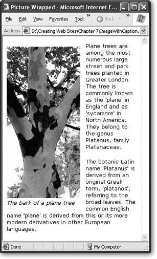
.FloatLeft { float: left; margin: 10px; } Next, you need to wrap the <img> tag and your text into a <span> tag. You can then make the entire <span> tag float, by using the FloatLeft style rule:
<span class="FloatLeft"> <img src="planetree.jpg" alt="Plane Tree"><br> <i>The bark of a plane tree</i> </span>
Figure 7-13 shows the result.
Note: The reason you use a <span> in this example instead of a <div> is because you can place a <span> inside other block elements, like paragraphs. The <div> element is designed to be placed on the outside (so it contains other block elements). In other words, by using a <span> tag, you can easily put your picture inside another paragraph.
7.2.5. Background Images
CSS makes it possible to set a background image that sits underneath the rest of the page content. This technique can be a little distracting, and so it's fallen out of favor with Web gurus in recent years . However, it's still worth considering if you want to add a really dramatic touch, and it's particularly handy for creating a "themed" Web site. For example, if you're creating a literary Web site, you could use a light parchment paper background. A Buffy fan site might put a darker cemetery image to good use.
Tip: Background images can make your Web site seem tacky. Be wary of using them for a r sum page or a professional business site. On the other hand, if you want to go a little kitschy, have fun!
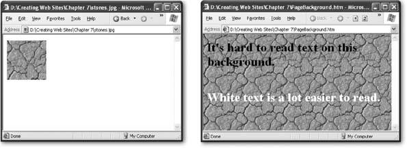
Background images are almost always tiled , which means a smaller picture is copied over and over again to fill the browser window (see Figure 7-14). There's no way you could use a single image to fill the browser window, because you have no way to know how wide and tall to make the picture. Even if you did, the picture you'd need to create would be ridiculously large, and downloading it would take an impractically long amount of time.
|
|
To take an image and use it to create a tiled background, you use the background-image style property. Your first step is to apply this style property to the <body> element, so that the whole page is affected. Next, you need to provide the file name of the image using the form url('filename') , as shown here:
body { background-image: url(/books/2/735/1/html/2/stones.jpg); } This takes the image stones.jpg and tiles it across the page to create your background.
Keep these points in mind when creating a tiled background:
-
Use the JPEG format (Section 7.1.4) when creating your background image file, since JPEGs can display the most colors of any of the Web-ready image formats.
-
Make your background light, so the text remains legible. (If you really must go dark, you can use white, bold text to stand out. But don't do this unless you're creating a Web site for a trendy new band or opening a gothic clothing store.)
-
Set the page's background color to match the image. For example, if you have a dark background picture with white writing, make the background color black. That way, if the image can't be downloaded, the text will still be visible.
-
Use small tiles to reduce the amount of time your visitors need to wait before they can see the page.
-
If your tiled image has an irregular pattern, make sure the edges line up. The left edge should continue the right edge, and the top edge should continue the bottom edge. Otherwise, when the browser tiles your image, you'll see lines where the tiles are stitched together.
Tip: The Web is full of common background images, like stars, blue skies and clouds, fabric and stone textures, fires, dizzying geometric patterns, borders, and much more. You can find these easily by searching on Google for "backgrounds," or head straight to top sites like www.grsites.com/textures (with over 5,000 backgrounds indexed by dominant color), www.backgroundcity.com, and www.backgroundsarchive.com.
7.2.5.1. Background "watermarks"
Most background images that you see on the Web have been created using tiling, but that's not your only option. Instead, you can take an image and place it at a specific position on your page. (Think, for example, "Top Secret and Confidential" splayed across your home page.) This is sometimes called a watermark . (The name stems from the process that's use to place a translucent logo on paper while the paper in still saturated with water.) To make a good watermark, you should use a background picture that's pale and unobtrusive .
To add a watermark to your page, you use the same background-image property you learned about above. However, you also need to add a few more style properties to the mix (see Table 7-2). First, you have to use the background-repeat property to turn off tiling. At the same time, it also makes sense to use the back-ground-position property to align your picture to one of the sides of the page or in the center.
Table 7-2. Background Image Properties
| Property | Description | Common Values | Oldest Supported Browsers | Can Be Inherited |
|---|---|---|---|---|
| background-image | The image file you want to show in the background. | A URL pointing to the image file, as in url('mypig. jpg'). | IE 3, Netscape 4 | No [1] |
| background-repeat | Whether or not the image should be tiled to fill the entire page. You can turn off tiling altogether, or turn it off in one dimension (so that images are tiled vertically but not horizontally, for example). | repeat repeat-x repeat-y no-repeat | IE 4, Netscape 4 | No |
| background-position | Where the image should be placed. Use this only if you aren't tiling the image. | top left top center top right center left center center right bottom left bottom center bottom right | IE 4, Netscape 6 | No |
| background-attachment | Whether the image should be fixed in place when the page is scrolled. Use this only if you aren't tiling the image. | scroll fixed | IE 4, Netscape 6 | No |
[1] Background pictures aren't inherited (Section 6.1.6). However, if you don't explicitly assign a background color to a tag, it's given a transparent background, which means the background of the containing tag will still show through
Here's an example that places a picture in the center of the Web page:
body { background-image: url(/books/2/735/1/html/2/smiley.jpg); background-repeat: no-repeat; background-position: center; } Note: The center of the document isn't necessarily the center of the window. If you have a long Web page and you position your image in the center, it won't appear until you scroll down.
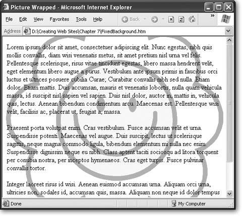
You can also turn off scrolling to give the rather odd effect of an image that's fixed in place (see Figure 7-15). For example, use this style to create a background image that sits squarely in the center of the window:
body { background-image: url(/books/2/735/1/html/2/smiley.gif); background-repeat: no-repeat; background-position: center; background-attachment: fixed; }
|
EAN: N/A
Pages: 135