A Bulletproof Approach
| While it makes perfect sense to create flexible, fluid layouts for the bulletproof example of this chapter, it's important to note that fixed-width CSS-based layouts also share many of the advantages that their non-width-restrictive siblings have. The main difference here is that fluid layouts can expand and contract along with the browser window, giving the reader some additional control. We'll be walking through the necessary steps to create fluid layouts with CSS, gathering up the reasons for doing so along the way. Let's get to it, starting with a simple two-column designwith a header and footer. THE MARKUP STRUCTUREInstead of using table cells to lay out the page's column structure, we'll instead use simple <div>s to divide the content into chunks. We'll also keep in mind an optimal content order while doing so (this will become more important when we talk about three-column designs later on). At its most basic, a simple two-column layout could be marked up easily like this: <div > <div > <h1>Header Goes Here</h1> </div> <div > ... content goes here ... </div> <div > ... sidebar goes here ... </div> <div > ... footer goes here ... </div> </div> <!-- end #wrap --> That's it. You can't get much simpler than that. Order-wise, this makes the most sense: header, content, sidebar, footer. We're thinking in terms of how this page will flow without CSS applied. So far, so good. I've added a wrapper <div> that surrounds the entire layout. This can often come in handy for various design purposes (as we'll discover further on). So, any time I'm building a CSS-based layout, I often start with a containing <div>, right off the bat. CREATING COLUMNS: FLOAT VS. POSITIONINGOne method for creating columns with CSS involves absolute positioning that is, using pixel coordinates on the screen to place elements in very specific locations. The biggest downside when using absolute positioning is the inability to have a footer clear the bottom of all columns. tip
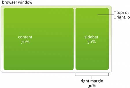
For instance, at its most basic, two columns (content and sidebar) might be created with positioning by giving the content <div> a left or right margin enough space to accommodate the sidebar. Using positioning, we could drop in the sidebar, giving it a width roughly equal to the content's margin, positioning it top and right (Figure 8.3). Figure 8.3. The right sidebar is dropped into the content's margin with positioning.
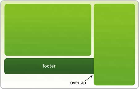
For example, we could write a few CSS rules to handle this: #content { width: 70%; margin-right: 30%; } #sidebar { position: absolute; top: 0; right: 0; width: 30%; } This code creates a margin that equals the width for the sidebar, and places that element using position: absolute;. This approach makes sense, and is easy to graspespecially for those just beginning with CSS-based layouts. But there is an important flaw when using this method: being unable to clear positioned elements. In other words, if the sidebar happens to be longer than the content column, then it would overlap any subsequent elements on the page (e.g., the footer in our markup example) (Figure 8.4). Figure 8.4. If the absolutely positioned column is longer than its neighbor, overlapping can occur.
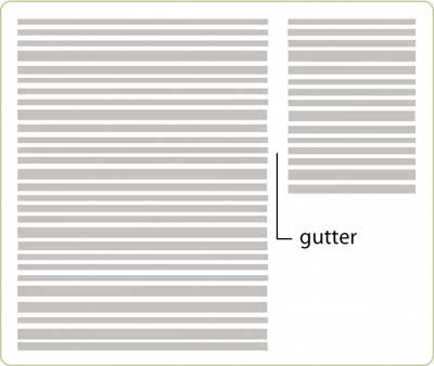
This happens because when position: absolute; is used on an element, it's taken out of the normal flow of the document. Other elements around it can't and won't be affected by its size or location on the page. For properly clearing footers that sit below multiple columns, this is a bummer. This lack of flexibility often steers CSS-savvy designers toward using the float property when building multicolumn layouts. Because floated elements can be cleared (as we explored in Chapter 4, "Creative Floating"), they are the best tool we have for taking control of columnar layouts. APPLYING STYLEWith floats chosen as the method for creating the columns, we want to divide up the two areas: content and sidebar using percentages. For this example, let's go with a 70/30 split (70% content and 30% sidebar). Our first step is to add a few background colors to the header, sidebar, and footer. This makes it a bit easier to distinguish the components as we go along. #header { background: #369; } #sidebar { background: #9c3; } #footer { background: #cc9; } Figure 8.5 shows the results, with the header, sidebar, and footer containers defined by their background colors. Figure 8.5. The layout looks like this before we float each column.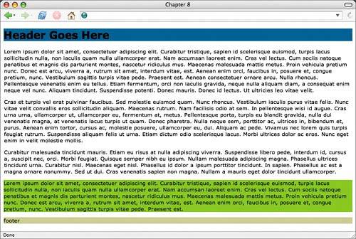 Next, let's do two things. First, we assign a width of 70% for the content column and 30% for the sidebar. We then float the content left while floating the sidebar right. This positions the two columns opposite each other. #header { background: #369; } #content { float: left; width: 70%; } #sidebar { float: right; width: 30%; background: #9c3; } #footer { background: #cc9; } Figure 8.6 shows what happens here, with the content and sidebar columns successfully formingbut notice the footer getting all caught up in the floats the precede it. Because the footer follows the sidebar in the markup, it's placed there. Additionally, the footer doesn't have a width specified; therefore, its background attempts to take over the entire width of the container. Figure 8.6. The footer gets tangled up in the floats that precede it.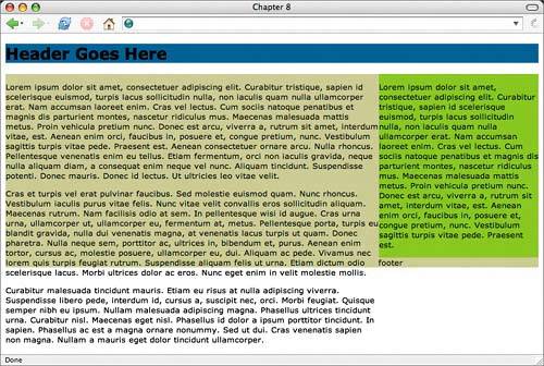 To fix this, we want to clear the footer from the floats that precede it in both directions. This ensures that the footer will always sit below the two columnsregardless of the length of either column. This is bulletproofing. #header { background: #369; } #content { float: left; width: 70%; } #sidebar { float: right; width: 30%; background: #9c3; } #footer { clear: both; background: #cc9; } And you can see in Figure 8.7, with the clear rule added, things are starting to look as they should. Figure 8.7. Because it clears both directions, the footer will always sit below the two columns.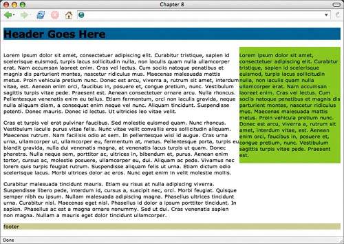 Already we have a flexible CSS-based layout. It may not look spectacular, but the foundation is there. If we expand or contract the window, the column widths will resize, always keeping the 70/30 proportion intact (Figure 8.8). Figure 8.8. The floated layout, shown here at three different window widths, always keeps the 70/30 proportion intact.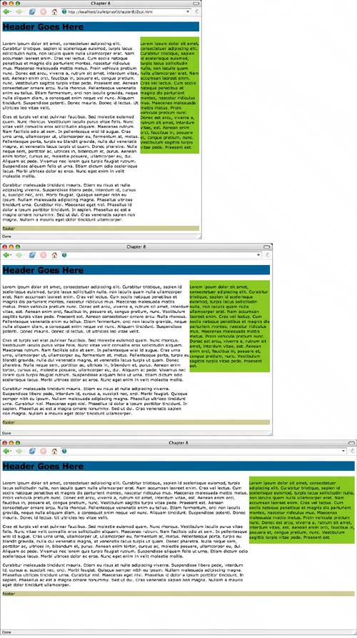 Both columns will grow or shrink, depending on the browser's window size. This is what a flexible CSS-based layout is all about: fluidity, giving the reader the power to control the layout's dimensions. Now that we have a solid base, let's move on to talk about the trickier aspects of fluid layouts. GUTTERSThe term gutter has been around for ages, and refers to the spacing between columns of text (Figure 8.9). Gutters become significantly more difficult when dealing with fluid column widths. In a fixed-width design, we're dealing with predictable widths in pixels, which makes it easier to calculate gutter widths along with columns. Figure 8.9. A gutter is the space between columns of text.
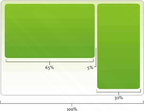
But with fluid columns, we have two options: use a percentage value for the gutter width as well as the column width, or add extra <div> elements to apply margins and padding separate from the column widths. The latter approach is certainly less optimal from a markup standpoint, yet it does provide an additional level of control that may be necessary for complex designs. More on this in a bit. An example of setting a percentage value gutter between our content and sidebar is to assign a right margin to the content, then subtract that value from the content's width. We always need the total percentage to equal 100% (Figure 8.10). #header { background: #369; } #content { float: left; width: 65%; margin-right: 5%; } #sidebar { float: right; width: 30%; background: #9c3; } #footer { clear: both; background: #cc9; } Figure 8.10. The percentages for columns and gutter could be divided in a two-column layout.
In the preceding rules, we've decreased the width of the content by 5%, and added that same amount as a right margin to set the gutter between columns. Figure 8.11 shows the results, with some additional white space between the content and sidebar. Figure 8.11. The space between columns will vary as the window width changes.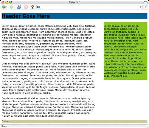 Keep in mind when using percentage value gutters that the space between columns will vary, depending on the window width. It will be smaller at narrow widths, and larger at wider widths. This could be a problem, depending on the design requirementsfor instance, if specific borders or background styles are attached to the columns that require a fixed space between them. For those instances, adding a second-level of container <div>s might be the best option, which we explore a little further on in this chapter. But if simplicity is what you're after, then using percentage margin values is the easiest option. COLUMN PADDINGA similar issue arises when you're setting padding on columns that have been specified with percentage widths. Because of the way padding is calculated (added to the width declared on the element, or in the case of IE5/Win, subtracted; see www.tantek.com/CSS/Examples/boxmodelhack.html) if you use anything but a percentage value for padding on the columns, the total width has a good chance of being over or under what you intend. This can throw off float layouts rather easily. For example, let's add 20 pixels of padding to the sidebar, to give it a chance to breathe a bit more: #header { background: #369; } #content { float: left; width: 65%; margin-right: 5%; } #sidebar { float: right; width: 30%; padding: 20px; background: #9c3; } #footer { clear: both; background: #cc9; } In a fixed-width layout, we can easily subtract those 20 pixels of padding on both sides of the column from the declared width. But in fluid-width layouts, we're using a percentage, and there's no way to specify a width of 30% minus 40 pixels. The box becomes larger than 30%, too large to sit opposite the content <div>, thus forcing it to sit below the content (Figure 8.12). Not so good. Figure 8.12. Adding a pixel amount of padding to a percentage-based width will often break the layout.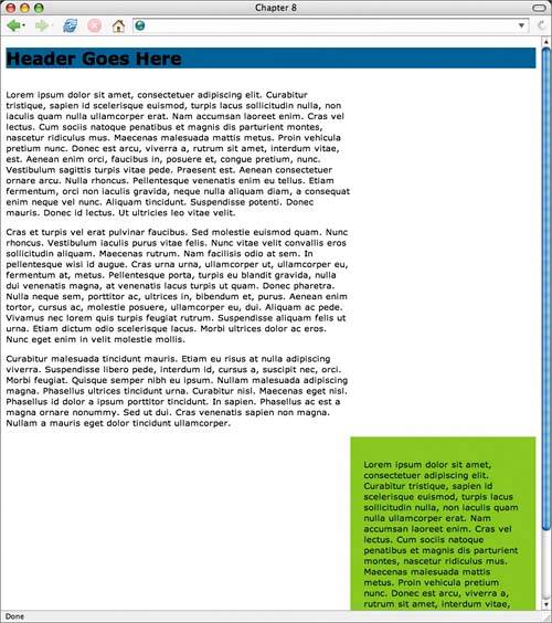 What are your options in a case like this?
Apply padding to inside elementsOne option is to apply padding to common block-level elements that you anticipate will live in the sidebar. For example, if paragraphs and lists are known to exist there, assign left and right padding to those elements: #sidebar p, #sidebar ul, #sidebar ol, #sidebar dl { padding-left: 20px; padding-right: 20px; } This padding will not affect the width of the sidebar itself, but the caveat here is that unforeseen elements could be added to the sidebar at a later date, and you as the designer would need to make sure this "catchall" declaration included them to ensure proper padding. This method can work for simple, predetermined content. But something a bit more bulletproof, with a tad more extra markup, would probably be a better choice. The extra <div> methodFor the "set it and forget it" mentality inside all of us, an extra <div> ensures that anything stuffed in the sidebar will have the proper padding without affecting the overall width of the column. For example, if in the markup we add a second <div> that sits just inside the sidebar: <div > <div> ... sidebar goes here ... </div> </div> we could then apply padding to that inner <div>, while keeping the width of 30% set on the outer one: #header { background: #369; } #content { float: left; width: 65%; margin-right: 5%; } #sidebar { float: right; width: 30%; background: #9c3; } #sidebar div { padding: 20px; } #footer { clear: both; background: #cc9; } Applying padding to the inner <div> won't affect the declared width of its parent wrapper. Now we can apply any value of padding we wish, and that padding will remain constant regardless of window width. Similarly, if we wanted a fixed-width gutter in between columns, we could also add an inner <div> to the content and assign right padding of any pixel amount we wished: <div > <div> ... content goes here ... </div> </div> So with the extra <div> in place, let's add 40 pixels of padding on the right to create a fixed gutter: #header { background: #369; } #content { float: left; width: 70%; } #content div { padding-right: 40px; } #sidebar { float: right; width: 30%; background: #9c3; } #sidebar div { padding: 20px; } #footer { clear: both; background: #cc9; } Figure 8.13 shows the results. At various window sizes, the padding on the sidebar as well as the 40-pixel gutter in between the columns remains intact as the column widths themselves expand and contract. Figure 8.13. We've assigned padding separately from column width.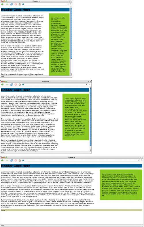 note
The downside to fixed-width gutters and padding is the additional, meaningless <div> in the markup. It's a trade-off to considerdo you need fixed padding or margins in your layout? Then it's probably worth the extra markup. If you're aiming for pure simplicity, then experiment with percentage values. SETTING MIN AND MAX WIDTHOne of the hurdles that designers face when building fluid layouts is line length. Giving readers the ability to stretch the layout as wide as they'd like is beneficial, but there comes a point when the line length of any given column can be so long that the text becomes difficult to read or so narrow that it breaks other aspects of the page's design. This is where the max-width and min-width CSS properties come into play. Setting a maximum or minimum width on a fluid layout will stop the columns from stretching or collapsing past a specified point. Unfortunately, they are unsupported in Internet Explorer. Ouch. But these are enhancements that are quick and easy to add for browsers that do support them. For example, in our test case, if we set a max-width on the <div > that contains the entire layout, we can ensure that the columns won't get unbearably wide: #wrap { max-width: 1200px; } Figure 8.14 shows our example with the max-width rule added. The layout is flexible, yet will stop at 1200 pixelseven if the window is stretched beyond that point. Figure 8.14. If the window width is increased past 1200 pixels, the layout will stop.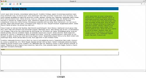 You could also choose to apply the max-width property on individual columns as well. For instance, to stop the content column at 600 pixels but allow the layout as a whole to expand further (Figure 8.15). #content { max-width: 600px; } Figure 8.15. If the content column is stretched beyond 600 pixels, the content will stop.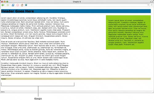 Conversely, we could also set a min-width on the entire layout (or individual columns) to prevent the design from compressing to an unreadable width: #wrap { max-width: 1200px; min-width: 600px; } Figure 8.16 shows the layout with the min-width rule added, locking the layout at 600 pixels when the window is sized below that value. Horizontal scroll bars will appear when the browser window is decreased below this amount. Figure 8.16. If the layout is decreased below 600 pixels, horizontal scroll bars will appear.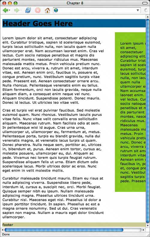 This behavior can be handy when a fixed-width object is contained within the column (such as an image) that would otherwise "poke out" when its column shrinks narrower than the object's width. For example, if we drop a 500-pixel-wide image into the content column but resize the window so that the content column is less than 500 pixels wide, we get some overlap with the sidebar (Figure 8.17)or worse, in some browsers this may break the layout entirely. Figure 8.17. Overlapping occurs when we drop in an image that is 500 pixels wide but resize the window so that the content column is less than 500 pixels wide.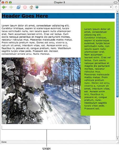 tip
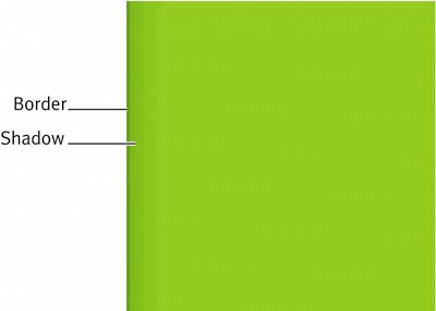
By experimenting with min-width on the containing <div> (just as we had with max-width) you'll prevent any overlap or layout damage. Um… at least in most browsers other than IE/Win. Again, these are simple additions that won't harm IE/Win, but will be highly beneficial for other browsersand crucial for managing fluid layouts. #wrap { max-width: 1200px; min-width: 750px; } SLIDING FAUX COLUMNSIf we look again at the example two-column layout we've been working with thus far throughout the chapter, you'll notice that while we've set a green background color on the sidebar, that background only extends as far as it has to. So, depending on the amount of content contained within that column, the column will appear to be a different length than the content column. Often, the appearance of equal-height columns is desired, with solid backgrounds and/or borders that define them. When using float layouts, there is no way to force a column height to match another. I wrote about one solution to this problem at A List Apart, in an article titled "Faux Columns" (www.alistapart.com/articles/fauxcolumns/, Figure 8.18). In the article, I describe a technique for faking equal-height columns for CSS-based layouts, using a tiled background image. Figure 8.18. The "Faux Columns" article, as seen at A List Apart, describes a technique for faking equal-height columns for CSS-based layouts, using a tiled background image.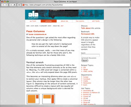 With this technique, the tiled image sits behind the columns and creates the illusion that the columns are the same height. This allows background colors, patterns, and borders to sit behind the layout and always reach the bottom of the page at the same place. However, this technique only works in fixed-width layoutswhere column widths are predetermined and built into the tiled image. Douglas Bowman (www.stopdesign.com/log/2004/09/03/liquid-bleach.html) and Eric Meyer (www.meyerweb.com/eric/thoughts/2004/09/03/sliding-faux-columns/) took this idea a step further, developing the "Sliding Faux Columns" approach, where the tiled image can slide around behind fluid-width columns, thus creating the equal-height effect while remaining flexible. Let's see how it works. Creating the background imageWhen creating the background image that will tile vertically, we want to make it wide enough to accommodate large screens (for those viewers who will expand the layout on their 200-foot-wide displays). Using a nice round number like 2000 pixels will work, and will make the math required to position the image easier. What we're looking to accomplish is a green background and border that will tile behind the sidebar all to the way down to the footer. We know that the sidebar's width is 30%, so if we take 30% of 2000 pixels, we get 600 pixels. Next, let's add a 600-pixel-wide green area to a white canvas of 2000 pixels wide by 100 pixels tall (Figure 8.19). The height here is irrelevant, since we'll tile this image vertically. Figure 8.19. This GIF image will be used to create the "faux columns." To this green area, we add a darker single-pixel border and a slight shadow on the left side (Figure 8.20). Figure 8.20. Here we zoomed in on the border and shadow that flanks the column's left side.
Positioning the imageNow, the magic happens when we position this background image on the <div > that contains the entire layout. By setting it to tile vertically, 70% from the left, the green background will always stay aligned behind the sidebar. More or less of this image will be shown depending on the window width. #wrap { max-width: 1200px; background: url(img/twocol-bg.gif) repeat-y 70% 0; } Figure 8.21 shows the results, with the green sidebar extending to the footer, as well as expanding and contracting along with the varying window width. Figure 8.21. Sliding Faux Columns in action.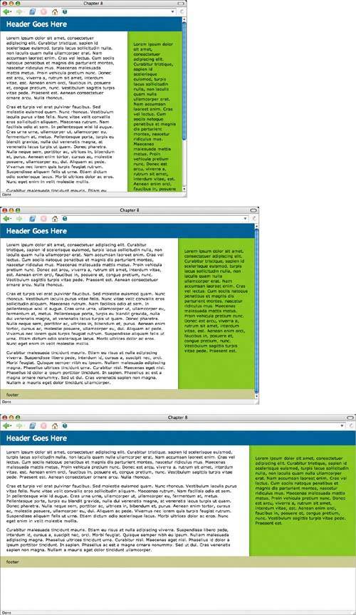 To better illustrate why this works, Figure 8.22 shows the window's "viewport" (the viewable area), with the invisible, unused portions of the 2000-pixel-wide background image sticking out each side. More or less of this image will be revealed as the window expands and contracts. Giving the image a "catchall" width of 2000 pixels is important here, because it ensures that even gigantic monitors will still be able to view the design as you intended. Figure 8.22. Portions of the 2000-pixel wide image are shown here with percentages.
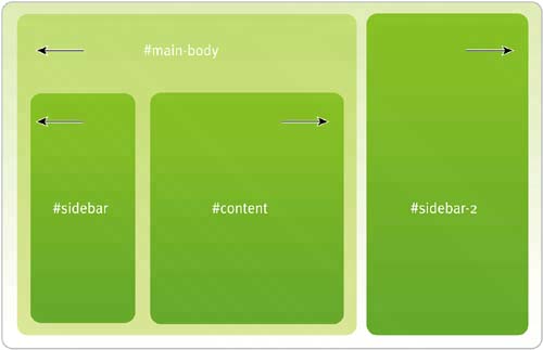
THREE-COLUMN LAYOUTSSo far, we've focused on two-column layouts. They're a bit easier to start with in order to grasp the important concepts. But let's move on now to discuss three-column layouts. Many of the same principles apply, with just a slightly more complex way of initially setting up the columns. Let's start with the slightly altered markup structure. The markup structureWhen creating three-columns layouts, we still want to take advantage of source orderingthat is, putting the main content first in the markup for the benefit of those with text browsers or screen readers. To do that, and to also ensure we can have a footer that clears all three columns at the bottom of the page, we'll use the float method as we did for the two-column layout. But in order to put the content first in the markup, we just need an extra containing <div> that wraps the content and left-hand sidebar only. The reasoning will become clear (ahem) in a minute. <div > <div > <h1>Header Goes Here</h1> </div> <div > <div > ... content goes here ... </div> <div > ... left sidebar goes here ... </div> </div> <!-- end #main-body --> <div > ... right sidebar goes here ... </div> <div > ... footer goes here ... </div> </div> <!-- end #wrap --> In order to achieve three columns here, let's break this down into two stages. First, we create two columns by floating #main-body and #sidebar-2 against each other. This is exactly what we did earlier for the two-column layout using #content and #sidebar. Next, we float #content to the right and #sidebar to the left. These two <div>s will make up the two columns that are both already floating to the left of #sidebar-2. Voilà! Now we have three columns, with the main content first in the markup. Figure 8.23 shows how the <div>s are set up, with the arrow illustrating the direction of the float. Notice that #main-body is floating left, while #content and #sidebar are opposing floats within it. Figure 8.23. Each <div> is floated in order to preserve the optimal content ordering.
It's this structure and float order that allows us to optimally control the order of the markup, while still being able to clear the columns with a full-width footer. Applying styleWith the markup in place, it's now just a matter of setting the floats and percentage widths for the individual columns. First, we assign a 70% width to #main-body (the left sidebar and content combined) and float it left, and assign 30% to #sidebar-2 and float it right. This will give us two columns to start with: #header { background: #369; } #main-body { float: left; width: 70%; } #sidebar { background: #9c3; } #sidebar-2 { float: right; width: 30%; background: #fc6; } #footer { clear: both; background: #cc9; } I've also assigned some background colors so that we can see where the pieces are ending up. Figure 8.24 shows #sidebar-2 in orange, while #sidebar (in green) sits below the main content. Figure 8.24. The right sidebar is floated against the content and left sidebar combined.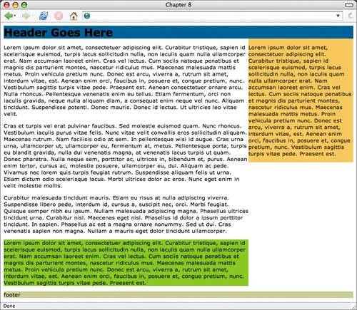 With two of the three columns in place, we can now float #content right and #sidebar left to finish the basic structure. We assign percentages to these columns as well, which are actually contained within 70% of the page's total width (in #main-body). #header { background: #369; } #main-body { float: left; width: 70%; } #content { float: right; width: 60%; } #sidebar { float: left; width: 40%; background: #9c3; } #sidebar-2 { float: right; width: 30%; background: #fc6; } #footer { clear: both; background: #cc9; } Figure 8.25 shows the results, with the three columns now in place. Figure 8.25. With floating complete, the three columns take their places.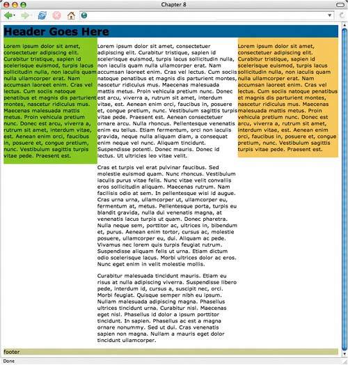 Gutters and paddingNow, you'll notice that we'll run into the same issues regarding gutters and padding that we talked about earlier. The tips that we discussed for two-column layouts apply to their three-column siblings as well. You can either divvy up the percentages between width and margins, or add extra wrapper <div>s to each column and specify padding separately from width. Use your best judgment here, taking into account the design requirements. Sliding Faux Columns for threeFaking equal-height columns (as we did using the Sliding Faux Columns technique earlier) becomes a little more complex when dealing with three flexible columns rather than twoit's not impossible, but requires an extra wrapper <div> around the entire layout and two background images. So, first we add that extra all-encompassing <div> just inside the already existing <div > around the layoutthis will allow us to reference the two background images needed to backdrop the two outer, flexible columns: <div > <div > ... rest of layout goes here ... </div> <!-- end #wrap-inner --> </div> <!-- end #wrap --> Next, we create two background images, based on the same principles that the two-column version used. Each image will be 2000 pixels wide to accommodate large screens. Since the right column is 30% wide, we know we'll need to make the background area for that column 600 pixels wide (30% of 2000). We call this image tHReecol-r.gif (Figure 8.26). Figure 8.26. This GIF image is used to sit behind the right sidebar. For the left column, its width is actually 40% of the 70% that the sidebar and content take up, combined. A little math tells me that 40% of 70% equals 28% of the total width. So for the left sidebar's background area, we'll use 28% of 2000, which equals 560 pixels. We'll also make the rest of this image transparent, so that when we stack this background image on top of the other, it won't obscure the right sidebar's background underneath it (Figure 8.27). Figure 8.27. When we stack our background image on top of the other, it won't obscure the right sidebar's background underneath it.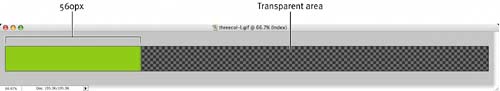 With the images completed, we're now ready to position them behind the two wrapper <div>s we have in the markup: #wrap { max-width: 1200px; background: url(img/threecol-r.gif) repeat-y 70% 0; } #wrap-inner { background: url(img/threecol-l.gif) repeat-y 28% 0; } note
You'll notice that we've placed the orange background image 70% from the left (just as we'd done with the two-column version earlier in the chapter) on the main #wrap, then placed the partially transparent image over that on the #wrap-inner at 28% from left (equaling the width of that left column). With the images in place, we now have a flexible, three-column layout, with "faked" equal-height, colored sidebars. Each column expands and contracts along with whatever size the browser window happens to be (Figure 8.28). Figure 8.28. Sliding Faux Columns in action on a three-column layout.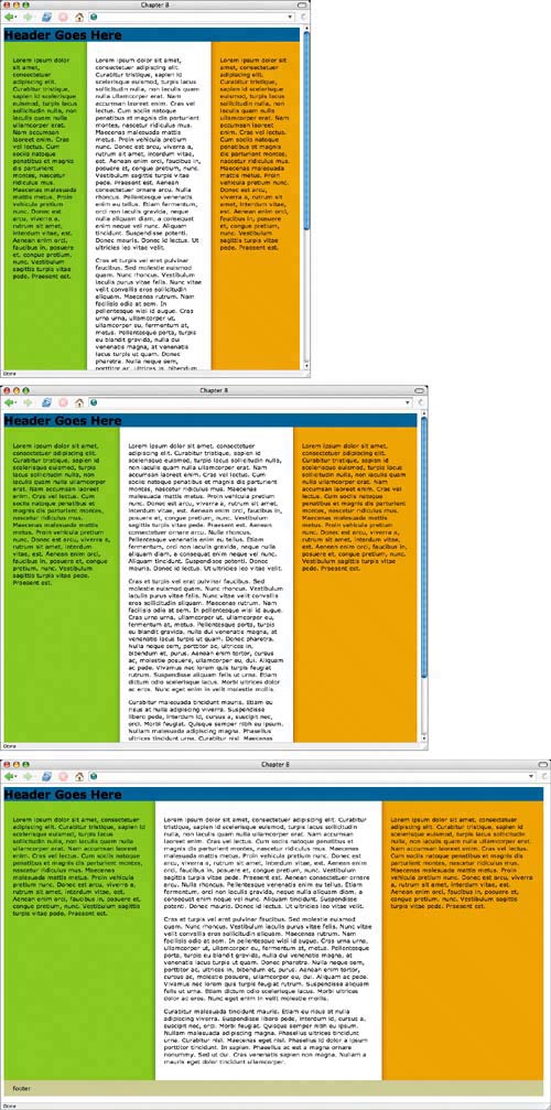 |

 Improving flexibility and protecting against worst-case scenarios with XHTML and CSS")
EAN: N/A
Pages: 97