Chapter 3: The Navi-key Story
|
|
Christian Lindholm
Origin of the Navi-key Concept
In 1995 the mobile phone business was at one of its turning points. Devices that were previously expensive and exclusive had begun to spread to ever-larger consumer populations, and a new user interface was needed to match the needs of the new customers. This user interface was supposed to be very approachable for first-time users who were neither familiar with nor interested in technology. At the same time it had to provide access to the full scope of functions required by GSM specification, already considerable at that time.
During the spring of 1995 Nokia also kicked off a project reconceiving user interface for a new business phone user interface of what later would become the Series 30 (two-softkey style, see Chapter 1) first introduced in Nokia 6110-GSM phone. At the time the very secret Communicator project was under way, attempting to combine a personal digital assistant (PDA) and a mobile phone. Everybody was very eager to work with these high-end products. A basic phone seemed so trivial somehow. Fortunately the project team had a couple of patient mentors, marketing manager Erik Anderson and design manager Mikko Palatsi, who knew that it would be the basic phone that would make the mobile revolution.
[1] Global System for Mobile Communications was originally a European digital system for mobile communications. It was first introduced in 1991. Now GSM has become the de facto standard in many regions around the world, serving more than 100 nations. The notable exception is the United States, where adoption of GSM is still in its infancy, and analog networks still dominate. More than 239 million people around the world use GSM networks. Technologically, GSM uses what is known as narrowband time division multiple access (TDMA), which allows eight simultaneous calls on the same frequency. GSM works primarily in three frequencies: GSM 900, GSM 1900, and GSM 1800. GSM 900 system is the most extensively used worldwide. GSM 1900 is primarily used in urban areas in the United States. GSM 1800 is primarily used in urban areas in Europe.
[2] A user interface design project and a team managed by the author, product manager Christian Lindholm, were set up.
Nokia had just launched an NMT phone called Ringo. Ringo had only a green send key for making calls or answering them, and a red end key for terminating calls. Furthermore, it was stripped of most other features, even down to the usual alpha printings on the number keypad, and memory was limited to 10 speed dials. Ringo was the ultimate in simplicity in our industry. It was so simple that people began referring to it as “the bimbo phone,” an allegedly humorous gibe at the ignorance of users. We were quite disappointed because Ringo was a very earnest attempt to make an easy-to-use phone for users put off by technology.
Meanwhile work continued on the business phone user interface (UI). Development was based on the two-softkey design of our previous GSM model, Nokia 2110. As we wanted to create two clearly different segments UI-wise, that solution was out of the question. And since the Ringo experiment led to too many limitations on user control, we knew that we had to look for something else for the new consumer phone.
We started brainstorming alternative ideas. Wilma was a concept based on a single softkey and a rotating mode key, similar to the ones found on cameras. Another minimalist concept with only three control keys—two softkeys and a clear key—was called David. David seemed wonderful at first . . . particularly if you were a power user on the development team. The problem with David was that the meaning of the softkey changed by timeout. We were constantly arguing about the length of timeout before key functions would swap.
Simulations of Wilma and David were completed for a world tour, and once it started, the inevitable occurred. Design manager Mikko Palatsi, the inventor of David, yelled in the usability test backroom behind a one-way mirror: “This is a catastrophe! We’ll never make this, they don’t get it!” And we didn’t. We didn’t build Wilma, ether. But although both concepts were buried, there was something that we really liked in the concept variants. The single softkey of Wilma seemed so elegant. David, in spite of its failure to beat Goliath this time, introduced the idea of a mobile phone UI without dedicated keys for starting and ending a call.
[3] Nordic Mobile Telephone is an analog system used in the Nordic countries.
After the experiments and lessons learned from the first round of concept creation, we were able to formulate the primary design drivers that we would try to adhere to.
-
As few keys as possible
-
No dedicated call handling keys
-
As many universally recognized keys as possible
Only a few keys were desirable because that would create an instant impression of ease-of-use at the point of purchase, increase perceived usability, and statistically reduce the number of possible wrong key presses. Minimizing the number of keys appeared simple, calm, and inviting.
Above all, we wanted to get rid of the dedicated call handling keys: green send key and red end key. These keys caused confusion for mobile phone novices who followed the logic familiar from landline phones. They tended to press either the red or the green key as if they were power toggles, in order to get a dialing tone. Since that did not work in the GSM network, they became flustered and were thwarted by the fundamental task of placing a call. This was a ridiculous flaw in mobiles. We aimed at getting around the dialing tone problem by removing the receiver symbols, as the green and red handset keys are powerful finger magnets. Users had to learn to punch in the number before trying to contact the network.
Armed with design drivers, our design team started playing around with several key combinations using a set of frequently performed tasks as a testbed—tasks such as saving, finding, and calling a particular number. The team also wanted to make selection adjustments brainless, like the mandatory manual network selection imposed by the GSM standard. While going through the task scenarios, it became obvious that it would be impossible to meet the GSM standard without a menu. Consequently, the new UI style for a consumer phone had to provide call handling as well as menu browsing and selection.
The design team ended up presenting a concept with three main control keys: a dynamic softkey, an arrow key, and a clear key.
Back then two softkeys were regarded as one too many, particularly if one does nothing more than backstepping. A single-softkey solution was visually clear and easy to localize. The key could be centered, and the user did not have to make a binary choice. The single softkey was such a graceful solution, and really focused on the user’s primary usage path. (For more about the design challenge softkeys represent, see Chapter 2.)
An arrow key seemed like a natural complement to the softkey. Consumers knew arrows from several other devices such as remote controls. We went so far in reducing the key count that we removed the up arrow as a means of scrolling backward. Because the menus were closed loops having only few items, it was possible to navigate a menu by one way scrolling. Backward scrolling was regarded as redundant functionality. The only arrow was pointing down, as we expected most people to have a mental model of scrolling down into a menu.
The C key (C for clearing) was also considered intuitive. It was very well known from previous Nokia phones and from all calculators. Only later did we discover a drawback—because our concept lacked a send key, users also found it intuitive to understand C as call.
In addition to the three main control keys, the concept had a separate power key and the standard 12-key numeric keypad. A phone that is not easy to turn on and off is flawed even before use, and thus we considered the power key an obvious prerequisite. Being able to turn the phone off quickly and without fumbling is important for polite phone manners and for privacy protection.
After some iteration with menu structures, we were ready to have the first PC-based simulation programmed using one softkey, a clear key, and a down arrow. We did the simulation at Nokia Research Center’s usability lab and immediately learned two things:
-
Users often scrolled past the desired menu option and needed to step back. Scrolling through the whole menu was a far too clumsy way to correct a minor and frequent error.
-
A single arrow key down offered no mental model for navigation in a menu. The users didn’t associate it with scrolling the items presented on the screen.
So we added an up arrow and ended up with four main control keys. Fortunately, no other major problems were found, and Navi-key user interface (Figure 3.1) was born.
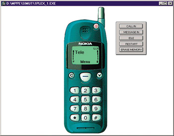
Figure 3.1: Screenshot picture of the first Navi-key simulation.
|
|
EAN: 2147483647
Pages: 142