How Can I Use CSS to Build a Two-Column Layout?
|
| < Day Day Up > |
|
The answer is several ways. To get you started, and to help you understand the fundamental difference between two of the most popular methods (float and positioning), I've decided to focus on four different options—all of which result in a two-column layout with a header on top and footer at the bottom.
My hope is that by using this chapter as a guide, you can begin to build the framework for sites that contain many of the rest of this book's examples.
Each of the four methods that we'll focus on take place between the <body> and </body> tags of the document, and I've introduced the markup structure that we'll be using at the beginning of each method.
To give you an idea of the entire page structure that surrounds the methods, let's outline what else would be included:
<!DOCTYPE html PUBLIC "-//W3C//DTD XHTML 1.0 Transitional//EN" "http://www.w3.org/TR/xhtml1/DTD/xhtml1-transitional.dtd"> <html xmlns="http://www.w3.org/1999/xhtml" lang="en" xml:lang="en"> <head> <title>CSS Layouts</title> <meta http-equiv="Content-Type" content="text/html; charset=utf-8" /> </head> <body> ...method examples... </body> </html>
And to give you a general idea of the layout we're aiming for throughout each method, take a look at Figure 12-1 for a visual overview of the columnar layout we'd like to achieve.
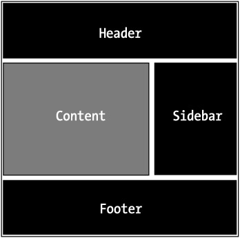
Figure 12-1: Wireframe of the intended two-column layout
Let's get started by introducing the first method that utilizes the float property.
Method A: Floating the Sidebar
<div > ...header content here... </div> <div > ...sidebar content here... </div> <div > ...main content here... </div> <div > ...footer content here... </div>
The preceding example is the markup we'll be using to create a columnar layout with CSS using the float property. We've divided our page elements into logical segments using <div> tags—each of which have a unique id attached to them:
-
#header: Contains a logo, navigation, etc.
-
#sidebar: Contains extra contextual links and information
-
#content: Contains the main body of text and focus of the page
-
#footer: Contains copyright information, credits, ancillary links, etc.
Sectioning off these elements of the page enables us to take full control of the layout. By applying a few CSS rules, we'll have a two-column layout working in no time.
Styling the Header and Footer
The first step we'll take in making our structure a columned layout is to add some background color and padding to the header and footer. This will make it a bit easier to visualize.
#header { padding: 20px; background: #ccc; } #footer { padding: 20px; background: #eee; } Adding the preceding CSS to Method A's structure will give us what's found in Figure 12-2. I've added a bit of faux content to fill out the sections.
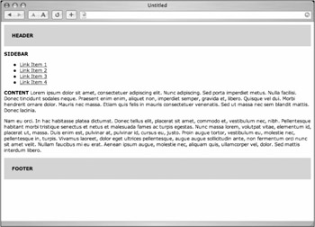
Figure 12-2: Adding style to the header and footer
Within these declarations for #header and #footer you could, of course, continue to add styles that are unique to those sections such as font-family, color, link colors, etc. Now let's create two columns.
Floating the Sidebar
The essence of Method A is that it uses the float property to place the #sidebar to either side of the content <div>. For this example, we'll be placing it to the right of the content, but the reverse would work as well.
The key to floating the #sidebar is that it must appear before the content <div> in the markup. This way, the sidebar's top will line up with the content area's top.
We'll add the float property to the #sidebar as well as give it a width of 30 percent and a background color:
#header { padding: 20px; background: #ccc; } #sidebar { float: right; width: 30%; background: #999; } #footer { padding: 20px; background: #eee; } Figure 12-3 shows us the results of adding the preceding CSS. You can see that the sidebar sits on the right, with the content area flowing around it.
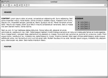
Figure 12-3: Floating the #sidebar to the right of the content
True Columns
We could stop right there, but as Figure 12-3 shows, we don't exactly have a two-column layout just yet. To finish the effect, we'll give the #content <div> a right margin of the same width as the right column, effectively creating a right column space for the #sidebar to fit in.
The CSS added would be as simple as
#header { padding: 20px; background: #ccc; } #sidebar { float: right; width: 30%; background: #999; } #content { margin-right: 34%; } #footer { clear: right; padding: 20px; background: #eee; } Notice that we've given the right margin 4 percent more than the width of the #sidebar. This will give us some extra space between the two columns. Figure 12-4 shows us the results as viewed in a browser, where you can see that by adding a right margin to the content <div>, it creates the illusion of a second column.
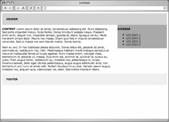
Figure 12-4: A two-column layout
Also of note is that we've added a clear: right; rule to the #footer declaration. This is important, and will ensure the footer will always appears below the sidebar and content areas—regardless of the height of either column. The footer will clear any floats that come before it.
We now have a working two-column layout, and can easily add more padding, backgrounds, borders, and other elements to the existing CSS declarations to make it look more appealing.
 |
We've been using percentage widths for the columns thus far, essentially creating a flexible-width layout (the columns will expand and contract depending on the user's window width). We could also easily use pixel amounts for the columns for a fixed-width layout as well, but need to be aware of IE/Windows' misinterpretation of the CSS box model when adding margins and padding to either column. More on the box model and successful workarounds can be found in "The box model problem" in the "Extra credit" section for this chapter.
|
Method B: The Double Float
<div > ...header content here... </div> <div > ...main content here... </div> <div > ...sidebar content here... </div> <div > ...footer content here... </div>
One downside to using Method A is that in order to float the sidebar, we're having to place it in before the content <div> in the markup. Unstyled viewers, text browsers, screen readers, and other devices that don't support CSS will show (or read) the sidebar's content before the main page content. Not exactly ideal.
We can still use the float method and get around this problem by swapping the positions of the content and sidebar <div>s in the markup (as can be seen earlier), and then floating each to opposite sides with CSS:
#header { padding: 20px; background: #ccc; } #content { float: left; width: 66%; } #sidebar { float: right; width: 30%; background: #999; } #footer { clear: both; padding: 20px; background: #eee; } By floating the two <div>s apart from each other, we can order the source in the optimal fashion—content before sidebar content in the markup—yet still achieve the same results shown in Figure 12-4.
Clear Both
It's also important to set your clear property in the #footer declaration to both, so that regardless of the length of either column, the footer will always appear below the columns.
The results should appear identical to Figure 12-4, yet the order of the markup has been improved.
Method C: Floating the Content
<div > ...header content here... </div> <div > ...main content here... </div> <div > ...sidebar content here... </div> <div > ...footer content here... </div>
There is one more method worth mentioning that uses a single float property and still places the content <div> before the sidebar in the markup.
This time, we'll be floating the content <div> to the left and giving it a width that's less than 100 percent. This will open up enough space for the sidebar to fit nicely on the right.
The CSS
The CSS that's needed for Method C is as basic as it gets—with a single float property, a desired width for the content area, and a small margin between the two columns.
#header { padding: 20px; background: #ccc; } #content { float: left; width: 66%; } #sidebar { background: #999; } #footer { clear: left; padding: 20px; background: #eee; } Notice that we need not define a width for the sidebar, as it will just fill in the remaining width that the content <div> doesn't use (in this case 34 percent).
Background Woes
Figure 12-5 shows us the results. Oops. In some popular browsers, the background color of the sidebar will show through underneath the content area. Because the sidebar isn't assigned a specific width, it wants to expand as wide as the browser window.
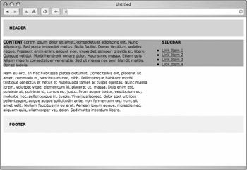
Figure 12-5: Floating the content, with the sidebar's background color showing through
We can avoid this by adding a left margin to the sidebar that equals the width of the content area. We'll actually make the margin a bit larger than the content's width so as to add some white space between columns.
#header { padding: 20px; background: #ccc; } #content { float: left; width: 66%; } #sidebar { margin-left: 70%; background: #999; } #footer { clear: left; padding: 20px; background: #eee; }
Plain and Simple
Alternatively, if no background color is required by the design, then the left margin isn't necessary. Figure 12-6 shows the layout results with the entire #sidebar declaration removed and a small right margin added to the content <div>. Both columns share whatever default background color is specified for the page.
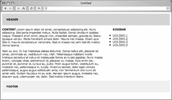
Figure 12-6: Floated content with background color omitted
The CSS would be reduced to
#header { padding: 20px; background: #ccc; } #content { float: left; width: 66%; margin-right: 6%; } #footer { clear: left; padding: 20px; background: #eee; }
|
In addition to adding a left margin (or omitting a background color), there exists an alternate way of achieving colored columns using a background image instead—and I'll reveal this little secret in the "Extra credit" section at the end of this chapter.
|
In addition to using the float property, we can also create a columnar layout using positioning. Let's take a look at the final option, Method D.
Method D: Positioning
<div > ...header content here... </div> <div > ...main content here... </div> <div > ...sidebar content here... </div> <div > ...footer content here... </div>
For Method D, we'll use the same markup structure, and right off the bat we'll order the <div>s the most efficient way—with the content coming before the sidebar. Unstyled viewers or readers will receive the content first, the sidebar second. When using positioning, the order of the markup becomes independent from the location where the elements appear on the page.
Predictable Height
The CSS will look somewhat similar to that used in the first three methods. The first difference will be assigning a pixel value height to the header. We'll need a predictable height in order to position the sidebar later.
I'm using an arbitrary value here—and this would change depending on the contents that you needed to contain in the header, such as a logo and/or navigation, search form, etc.
#header { height: 40px; background: #ccc; } #footer { padding: 20px; background: #eee; }
Space for the Column
Next, let's give the #content <div> a right margin, much like we did in the previous methods. This will leave the space for the right column, which we'll drop in by using absolute positioning, rather than floating.
#header { height: 40px; background: #ccc; } #content { margin-right: 34%; } #footer { padding: 20px; background: #eee; }
Drop in the Sidebar
Finally, we'll place the #sidebar <div> in the margin of the #content area using absolute positioning. We'll also zero out any default margins and/or padding that the browser may place on the entire page perimeter. This will give our positioning coordinates equal value across all browsers.
body { margin: 0; padding: 0; } #header { height: 40px; background: #ccc; } #content { margin-right: 34%; } #sidebar { position: absolute; top: 40px; right: 0; width: 30%; background: #999; } #footer { padding: 20px; background: #eee; } By specifying position: absolute, we can use the top and right coordinates to drop the #sidebar right where we want it (see Figure 12-7).
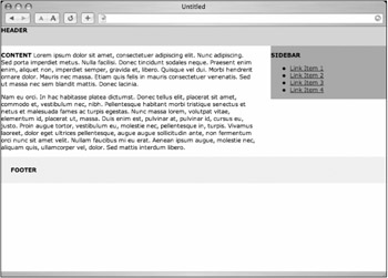
Figure 12-7: Two-column layout using positioning
We're saying, "Put the #sidebar <div> 40 pixels from the top of the browser window and 0 pixels from the right side of the browser window." Alternative properties we could have used for coordinates are bottom and left.
The Footer Issue
When floating columns as in the previous methods, we could use the clear property to ensure that the footer extends the entire width of the browser window, regardless of how tall the content or sidebar columns are.
With positioning, the sidebar is taken out of the normal flow of the document, so that in the event that the sidebar was ever longer in length than the content area, it would overlap the footer (see Figure 12-8).
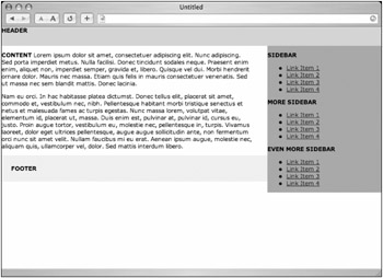
Figure 12-8: Overlapping sidebar and footer
One solution to this problem that I've often used is to give the footer the same right margin that the content area has, effectively extending the right column past the footer as well as the content.
The CSS would be adjusted like so:
body { margin: 0; padding: 0; } #header { height: 40px; background: #ccc; } #content { margin-right: 34%; } #sidebar { position: absolute; top: 40px; right: 0; width: 30%; background: #999; } #footer { margin-right: 34%; padding: 20px; background: #eee; } This solution can look odd on pages with short content and long sidebars—but hey, it works. The results can be seen in Figure 12-9, where the overlapping of the sidebar and footer is avoided.
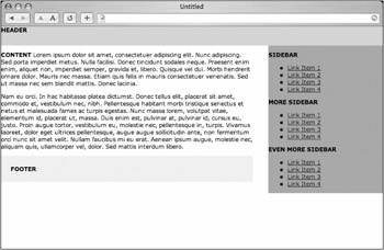
Figure 12-9: Footer with margin-right matching the content area
Three's Company
But what if we'd like a three-column layout? No problem, and it's very easy to add when using positioning. What we'll need to do is add a left margin for the content and footer areas for whatever width that we'd like the third column to be.
The additional sidebar can sit anywhere we'd like in the markup, since we'll use positioning once again to place it.
Let's say that we've added a second sidebar, called #sidecolumn. We'll add the following CSS rules to make room for it, and then position it on the left.
body { margin: 0; padding: 0; } #header { height: 40px; background: #ccc; } #content { margin-right: 24%; margin-left: 24%; } #sidecolumn { position: absolute; top: 40px; left: 0; width: 20%; background: #999; } #sidebar { position: absolute; top: 40px; right: 0; width: 20%; background: #999; } #footer { margin-right: 24%; margin-left: 24%; padding: 20px; background: #eee; } What we've done here is opened up a left margin on the content and footer areas (to avoid overlap), just as we've done previously for the right sidebar. Then we've dropped in a new #sidecolumn using absolute positioning—placing it 40 pixels from the top and 0 pixels from the left.
You'll notice that we've changed the widths a bit to allow for that third column. Because we're using percentages, these layouts will expand and contract proportionately depending on the browser's width. Alternatively, you could also assign pixel widths to any or all of these columns to achieve a fixed-width layout.
Figure 12-10 shows the results as viewed in a browser—a flexible, three-column layout created with CSS and absolute positioning.
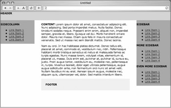
Figure 12-10: A flexible three-column layout using positioning
|
| < Day Day Up > |
|
EAN: 2147483647
Pages: 119