The Font-Weight Property
| The font-weight property specifies the weight of the desired font within the current family.
This property has nine levels of weight:
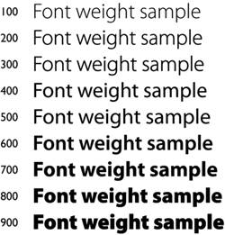
Two of the values, bolder and lighter, select a weight that is relative to the parent's weight. The font-weight property is a superset of what is available for most families. Few families have the equivalent of all nine different weights. Hence, many of the CSS weight values result in the same font. On the other hand, some families, such as the Adobe's Multiple Master fonts, have an almost unlimited range. For those families, the browser selects nine of the possible weights and assigns them to the nine values. Numerical values are used because we felt that descriptive words, other than normal and bold, could be potentially confusing. This is because no universal naming system for fonts exists. For example, a font that you might consider bold could be described, depending on the font, as Roman, Regular, Book, Medium, Semi-Bold, Demi-Bold, or numerous other names. These names are generally meaningful mainly within the family that uses them and differentiate fonts within that family. Outside that family, a name may have a different meaning. So, you cannot necessarily gauge the weight of a font from its name. In CSS1, the value normal (400) will have the weight that is normal for the specified font. What it means for another font may differ. Figure 5.15 gives examples of the nine weights. These are only samples. Exactly what you get if you select a value of, say, 300 depends on the font you use, but Figure 5.15 helps you get some idea of how the weights vary. Figure 5.15. Numerical values of the font-weight property. The following are descriptions of the nine numerical values:
The bolder and lighter values select a weight that is relative to the parent's weight. For example, consider this style sheet: P { font-weight: normal } /* same as 400 */ H1 { font-weight: 700 } /* same as bold */ STRONG ( font-weight: bolder }In this example, a STRONG element that appears in either the P or H1 element will be bolder than its parent. However, the weight of STRONG when it appears in the P element may be less than its weight in the H1 element. This is because the parent elements' weights differ. In this case, we say "may" because, as previously mentioned, the font used also plays a role in how bold type looks. For more information on how fonts are assigned to the numerical scale for each font, we recommend you check the CSS specifications. |
EAN: 2147483647
Pages: 215