The Font-Size Property
| The font-size property specifies the size of the font:
This property has four possible types of values:
The first two types are general types of values that can be used on many CSS properties. The last two types are sets of keywords that are particular to the font-size property. The "Length" ValueWhen a property accepts length values, all units described in the "Length units" section can be used. This includes absolute units (mm, cm, in, pt, pc), relative units (em, ex), and the pixel unit (px). Here are some examples: BODY { font-size: 12pt } PRE { font-size: 0.4mm } H1.chapter { font-size: 16px }Traditional paper-based design specifies the size of a font in absolute units, most often in points, but when working with Web pages, the use of absolute units for specifying sizes is not advised because, for example, quality differences in screens will make some sizes difficult to read, and the font size you request may not be available on a particular browser. (Scaling may cause them not to align perfectly with the screen pixels.) It's better to use one of the relative units instead: H1 { font-size: 1.2em }On all properties except font-size, the em unit refers to the font size of the element itself. This makes it possible to make the border as thick as the size of the font, for example. However, when used on the font-size property, the em unit has to refer to something else. So, instead of referring to the font size of the element itself, the em unit refers to the font size of its parent. In the previous example, the font size of H1 elements is set to 1.2 times the font size of its parent. A similar example is given in Chapter 3, "The amazing em unit and other best practices" (where the em unit is the hero). The "Percentage" ValueOn the font-size property, using percentages is equivalent to using the em unit. In this case, because the em is the font size of the parent element, a value of 120% is exactly the same as a value of 1.2em. Another context-dependent method for specifying the font size is thus to use percentages. A percentage value gives an element the size of the parent's font times the percentage. Thus, 120% gives a size that is 20 percent more than the size of the parent element, while 80% gives a size that is 80 percent of the parent element's size. For example, if the parent element size is 12pt, a 120% value results in a size of 14.4pt, while an 80% value results in a size of 9.6pt. Here is an example: H1 { font-size: 120% }This example is equivalent to the previous example using the em unit. The "Absolute-Size" ValueThe absolute-size value is an index to a table of font sizes that is computed and kept by the browser. These sizes are expressed as keywords, as follows:
These sizes form an increasing range. For computer screens, the CSS2 specification suggests a number of different sizes (e.g., the large size should be about 1.2 times as big as the medium, and the small size should be about 0.9 times as big as the medium). That is, if the medium version of a font is 10pt, the large version would be about 12pt. Different media may use or need different scaling factors. Figure 5.12 gives the table's keywords and a representative example of each. Figure 5.12. Comparison of the values of the size table.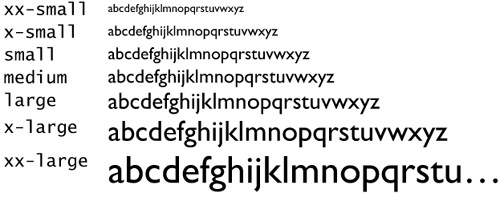 Here's an example usage of the absolute value of the font-size property: H1 { font-size: xx-small }The "Relative-Size" ValueThe relative-size value lets you specify the size in a context-dependent manner. The value has two keywords: larger and smaller. The keywords are interpreted relative to the table of font sizes mentioned in the previous section and the font size of the element's parent element. Specifying one of these keywords is a safe way to provide for context-dependent size changes. For example, suppose the parent element has a font size of medium. If you then set the font-size property on the child element to larger, that is, larger than medium, the resultant size of the child is large, which is the next value in the table of size values. Here's the code for doing this: BODY { font-size: medium } H2 { font-size: larger } P { font-size: smaller }BODY has a font size of medium. H2, as a child element of BODY, is one size larger than BODY; that is, large. P is one size smaller than BODY, which is small. |
 Designing for the Web")
EAN: 2147483647
Pages: 215