List Controls
| You can use several different types of ASP.NET server controls to display data in list form. All controls have in common that they are bound to a data source and that they produce one item ”an entry ”for each record in the data source. This section shows you how to use the Repeater and DataList controls. The one that's not mentioned is the Table control ”most readers already use tables, and the control that's offered doesn't go much beyond HTML tables. Using the Repeater ControlThe Repeater ASP.NET server control is a data-bound container control that produces a list of individual items. You use templates to define the layout of individual items. When the page is run, the control repeats the layout for each item in the data source. (We go much deeper into this control in Chapter 10 where we databind to data sources.) The Repeater ASP.NET server control is a basic container control that enables you to create custom lists out of any data available to the page. The control does not have an inherent look. For example, it does not by default create a vertical list of data or a table. Instead, you create templates to provide the layout for the control. When the page runs, the Repeater control loops through the records in the data source and renders an item (or alternating item) for each record. Because the Repeater control has no default look, it is useful for creating virtually any kind of list. Examples of how you can use the Repeater control to display information include in a table (grid), in a comma-delimited list (for example, "a, b, c, d, ...") , and in a bulleted list or numbered list. TemplatesTo use the Repeater control, you create templates that define the layout of the control's content. Templates can contain any combination of HTML text and controls that are valid on a Web Forms page. The Repeater control supports the following templates:
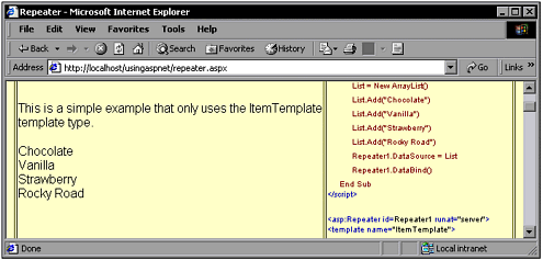
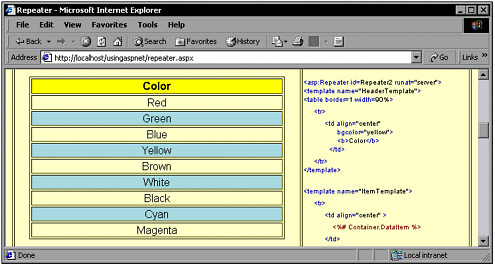
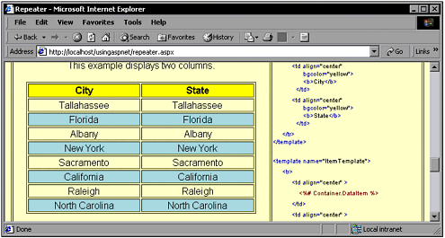
Data BindingThe Repeater control must be bound to a data source through its DataSource property or it does not render. The control can use as a data source any class that supports the ICollection or IEnumerable interface. You also can use data sources such as the SQLDatSetCommand and ADODataSetCommand classes. You also can bind to simpler structures, such as an array of type ArrayList . When data binding, you specify a data source for the Repeater control as a whole. You then can bind individual controls in the templates to the container, which provides a way to automatically bind to the record currently displayed. Alternatively, you can bind a control in a template directly to a data source, which is useful if you want the control to display data other than what is in the current record. For example, if a template contains a ListBox control, the list box might display data from a data source different from the one for the current record. When the page runs, you call the Repeater control's DataBind method to get the records that are to be displayed. You call the method again each time you need to refresh the data being displayed (for example, in an event-handling method). EventsThe Repeater control supports two events. One of them, the ItemCreated event, gives you a way to customize the item-creation process. For example, you might conditionally set style object properties for new items as they are created. The other event, ItemCommand , is raised in response to button clicks in individual items. The event is designed to enable you to embed a Button , LinkButton , or similar control in an item and have your code notified if a user clicks the button. When users click a button in an item, its event is forwarded to the Repeater control. You can use this event to help you build custom functionality by setting a button's Command property to a value you need and then testing for it in the ItemCommand event handling method. Adding a RepeaterThe following code shows how to add an easy repeater to an .aspx page. First, an ArrayList is created and populated in the Page_Load() method, which is bound to the Repeater control. <script language="vb" runat="server"> Sub Page_Load(Sender As Object, Args As EventArgs) Dim List As ArrayList List = New ArrayList() List.Add("Chocolate") List.Add("Vanilla") List.Add("Strawberry") List.Add("Rocky Road") Repeater1.DataSource = List Repeater1.DataBind() End Sub </script> Adding the control to the page is easy. Simply declare the asp:Repeater control, and then specify the templates that you want to use. The following example is very simple; the template outputs each data item followed by a <BR> tag. Note that after the template, the </asp:Repeater> tag follows . <asp:Repeater id=Repeater1 runat="server"> <template name="ItemTemplate"> <%# Container.DataItem %> <br> </template> </asp:Repeater> This example can be found in the www.UsingASP.net Web site, and Figure 6.8 shows it in action. Figure 6.8. This example is simple and implements only ItemTemplate . Note The www.UsingASP.net Web site includes an example with ItemTemplate . You can see this online example in Figure 6.8. The second Repeater example is, at its beginning, similar to the preceding example. The Page_Load() method sets up an ArrayList with some data. It then binds the list to the Repeater control. This code is as follows: <script language="vb" runat="server"> Sub Page_Load(Sender As Object, Args As EventArgs) Dim List2 As ArrayList List2 = New ArrayList() List2.Add("Red") List2.Add("Green") List2.Add("Blue") List2.Add("Yellow") List2.Add("Brown") List2.Add("White") List2.Add("Black") List2.Add("Cyan") List2.Add("Magenta") Repeater2.DataSource = List2 Repeater2.DataBind() End Sub </script> Most of the time, you're going to want a more sophisticated look to your repeating data. The example that follows shortly adds some complexity to the preceding example. First, it uses a HeaderTemplate so that the data has a heading that looks different. Actually, the HeaderTemplate does more than set its color to yellow; it adds the beginnings of a <table> . Another addition is the use of an AlternatingItemTemplate . This alternates the normal ItemTemplate look with another that's a light blue color. You can see how much better this looks in Figure 6.9. Figure 6.9. This example uses AlternatingItemTemplate for a more pleasing look. <asp:Repeater id=Repeater2 runat="server"> <HeaderTemplate name="HeaderTemplate1"> <table border=1 width=90%> <tr> <td align="center" bgcolor="yellow"><b>Color</b></td> </tr> </HeaderTemplate> <ItemTemplate name="ItemTemplate2"> <tr> <td align="center" > <%# Container.DataItem %> </td> </tr> </ItemTemplate> <AlternatingItemTemplate name="AlternatingItemTemplate1"> <tr> <td align="center" bgcolor="lightblue"> <%# Container.DataItem %> </td> </tr> </AlternatingItemTemplate> <FooterTemplate name="FooterTemplate1"> </table> </FooterTemplate> </asp:Repeater> Note The www.UsingASP.net Web site includes an example with AlternatingItemTemplate . You can see this online example in Figure 6.9. Your Repeater control can have multiple columns with some planning on your part. If each ItemTemplate contains a table with multiple columns, then creating and using multiple columns is easy. You simply put the data into the correct columns. The following code shows an example that populates an ArrayList , binds the data to a DataList , and then uses a DataList to display multiple columns. The example can be seen running in Figure 6.10. Figure 6.10. Multiple columns are easy to implement. <script language="vb" runat="server"> public class PositionData Dim _City as string Dim _State as string public Sub New(city as string, state as string) _City = city _State = state End Sub public Sub PositionData(city as string, state as string) _City = city _State = state End Sub public ReadOnly Property City as string Get return _City End Get End Property public ReadOnly Property State as string Get return _State End Get End Property End Class Sub Page_Load(Sender As Object, Args As EventArgs) Dim List3 As ArrayList List3 = New ArrayList() List3.Add(new PositionData("Tallahassee", "Florida")) List3.Add(new PositionData("Albany", "New York")) List3.Add(new PositionData("Sacramento", "California")) List3.Add(new PositionData("Raleigh", "North Carolina")) Repeater3.DataSource = List3 Repeater3.DataBind() End Sub </script> <asp:Repeater id="Repeater3" runat="server"> <HeaderTemplate> <table border="1" width="90%"> <tr> <td align="center" bgcolor="yellow"> <b>City</b> </td> <td align="center" bgcolor="yellow"> <b>State</b> </td> </tr> </HeaderTemplate> <ItemTemplate> <tr> <td align="center"> <%# DataBinder.Eval( Container.DataItem, "City" ) %> </td> <td align="center"> <%# DataBinder.Eval( Container.DataItem, "State" ) %> </td> </tr> </ItemTemplate> <AlternatingItemTemplate> <tr> <td align="center" bgcolor="lightblue"> <%# DataBinder.Eval( Container.DataItem, "City" ) %> </td> <td align="center" bgcolor="lightblue"> <%# DataBinder.Eval( Container.DataItem, "State" ) %> </td> </tr> </AlternatingItemTemplate> <FooterTemplate> </table> </FooterTemplate> </asp:Repeater> Using the DataList ControlThe DataList ASP.NET server control provides you with a flexible, full-featured control for displaying information from data sources. The DataList control displays database information in a format that you can control very precisely using templates and styles. The DataList control is useful for displaying rows of database information. Optionally, you can configure the DataList control to enable users to edit or delete information. You also can customize the control to support other functionality such as selecting rows. The DataList control displays rows of data as items in the list. You use templates to define the layout of the items by including HTML text and controls. For example, you might use a Label ASP.NET server control in an item to display a field from the data source. Data BindingThe DataList control must be bound to a data source. If the control is not bound, the control will not be rendered on the page. The DataList control can use as a data source any class that supports the ICollection interface. In practical terms, this means that you can use any type of data source that you can create using the Visual Studio data designers. You also can use data sources that you can add to your page from the Toolbox, such as the SQLDatSetCommand and ADODataSetCommand classes. You also can bind to simpler structures, such as an array of type ArrayList . When binding data, you specify a data source for the DataList control as a whole. When you add individual controls to the control ”for example, labels or text boxes in list items ”you in turn bind them to the container, namely the DataList control. Templates for Control LayoutIn the DataList control, you use templates to define the layout of your information. The DataList control supports the following templates:
As a minimum, you must define an ItemTemplate layout. To support editing, you would add an EditItemTemplate . Other templates are optional. StylesTo specify the appearance of items in a template, you can set the template's style. For example, you might specify that
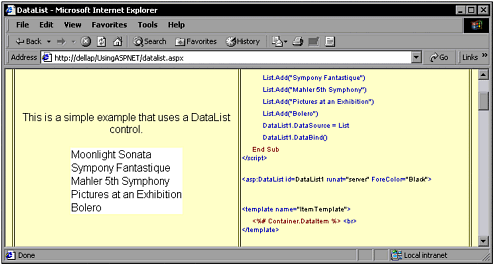
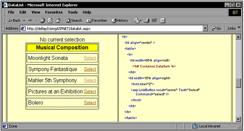
EventsThe DataList control supports six events. One of them, the ItemCreated event, gives you a way to customize the item-creation process. For example, you might conditionally set style object properties for new items as they are created. The remaining events are raised in response to button clicks in list items. They are designed to help you respond to the most commonly used functionality for the DataList control: editing items, deleting them, updating the edited items, and canceling edits. When users click a button in an item, its event surfaces to the container ”the DataList control. The exact event that the button raises depends on the Command property of the button that was clicked. For example, if the Command property of a button is edit , the button causes an EditCommand event to be raised. If the Command property is delete , the button causes a DeleteCommand event to be raised, and so on. The DataList control also supports a generic ItemCommand event that is raised when users click a button that doesn't have a predefined property such as edit or delete . You can use this event for custom functionality by setting a button's Command property to a value you need and then testing for it in the ItemCommand event handling method. Adding a DataListI've started out with a simple example that binds an ArrayList to a DataList control. The code that creates the ArrayList , adds the data, and then binds the data is in the Page_Load() method and can be seen as follows: <script language="vb" runat="server"> Sub Page_Load(Sender As Object, Args As EventArgs) If not IsPostBack Then Dim List As ArrayList List = New ArrayList() List.Add("Moonlight Sonata") List.Add("Sympony Fantastique") List.Add("Mahler 5th Symphony") List.Add("Pictures at an Exhibition") List.Add("Bolero") DataList1.DataSource = List DataList1.DataBind() DataList2.DataSource = List DataList2.DataBind() End If End Sub </script> To keep this first example simple, I used only an ItemTemplate to display the data in the DataList . A single ItemStyle was used to set the background color to white. You can see this example in Figure 6.11. Figure 6.11. This example is a simple implementation of a DataList control. <asp:DataList id=DataList1 runat="server" ForeColor="Black" AutoPostback="true"> <template name="ItemTemplate"> <%# Container.DataItem %> <br> </template> <property name="ItemStyle"> <asp:TableItemStyle BackColor="White"> </asp:TableItemStyle> What do you do if you want to let users choose from the DataList data? That's easy with ASP.NET. You can add a LinkButton control to DataList templates. These controls embed links that fire events you can handle. In the following example, I created a more complex DataList , and in the ItemTemplate I added a LinkButton control. This offers users the capability to select each member of the DataList . The LinkButton control has an attribute named CommandName that is set to a value of "select" . This surfaces control up to the DataList control. The DataList control services the OnItemCommand event. It's set to fire off a call to a method named DataList2_ItemCommand() . When the LinkButton is selected, it passes a "select" command back up to the DataList control. The DataList control then fires off the DataList2_ItemCommand() method. The DataList2_ItemCommand() method then acts on the selection. You can see this example in Figure 6.12. Figure 6.12. In this example, users can make selections. <script language="vb" runat="server"> Dim List As New ArrayList Sub Page_Load(Sender As Object, Args As EventArgs) List.Add("Moonlight Sonata") List.Add("Sympony Fantastique") List.Add("Mahler 5th Symphony") List.Add("Pictures at an Exhibition") List.Add("Bolero") If Not IsPostBack Then DataList2.DataSource = List DataList2.DataBind() End If End Sub Sub DataList2_ItemCommand(Sender As Object, Args As DataListCommandEventArgs) DivText.innerText = "A selection was made" End Sub </script> <p><div id="DivText" runat="server">No current selection</div> <form runat="server"> <asp:DataList id=DataList2 runat="server" ForeColor="Black" SelectedItemStyle-BackColor="yellow" OnItemCommand="DataList2_ItemCommand" > <template name="HeaderTemplate"> <table border=1 width=100%> <tr> <td width=100% align="center" bgcolor="yellow"><b>Musical Composition</b></td> </tr> </template> <template name="ItemTemplate"> <tr> <td align="center" > <table> <tr> <td width=85% align=left> <%# Container.DataItem %> </td> <td width=15% align=right> <font size="2"> <asp:LinkButton runat="server" Text="Select" CommandName="select" /> </font> </td> </tr> </table> </td> </tr> </template> <template name="SelectedItemTemplate"> <tr> <td align="center" bgcolor="red"> <table> <tr> <td width=85% align=left> <%# Container.DataItem %> </td> <td width=15% align=right> <font size="2"> Select </font> </td> </tr> </table> </td> </tr> </template> <template name="FooterTemplate"> </table> </template> </asp:DataList> </form> |
EAN: 2147483647
Pages: 233