Creating Style Sheets for Handhelds
| You can create an entirely independent style sheet that will only be used for your Web page when it is viewed in a telephone, PDA or other handheld device. To create a style sheet for handhelds:
Figure 13.6. Add the screen value to your regular style sheets so that their properties are not applied to your handheld style sheet. Figure 13.7. Here's what our example looks like when pointed to a blank handheld style sheet. This document produced an error when it overloaded on the image files at the end of the document. We'll hide them on the next page. |
 Tips
Tips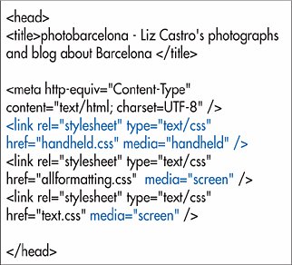

 Visual QuickStart Guide")
EAN: 2147483647
Pages: 340