Building the Image
|
|
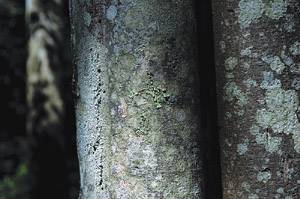
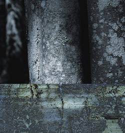
| The spotlight and subtle gradations were what originally drew me to the Two Trees photo, as well as the strong vertical divisions which imposed structure and order to the composition (see Figure
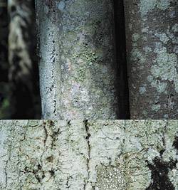
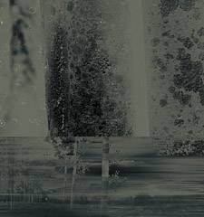
Adding Tree BarkAs I began building images for the Tuscany suite for this book, I decided to focus on designs that were more square in proportion. As a result, I began thinking about adding a lower horizontal section to the image to square it off. Thus I added more canvas, increasing the entire image size from 2354 x 1578 pixels to 2354 x 2513 pixels. The thing that jumps out from the top Two Trees photo is the clarity and detail in the bark texture, so I decided to go with that and explore the patterning that comes from bark textures. I opened the second Tree Bark photo and pasted it into the image. With the Tree Bark layer active, I created a selection and clicked the Add Layer Mask button in the Layers palette to restrict the layer only to the lower rectangle. By default, layer masks are linked to the original layer when they are created. I clicked the chain link icon between the image and mask thumbnail in the Layers palette to deactivate the link, separating the mask and image information. This allowed me to click the Tree Bark thumbnail and reposition it with the Move tool, dragging the bark texture within the lower rectangle until I found a crop that worked for the composition (see Figure
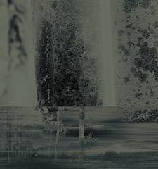
Going GrayscaleAt this point, the texture juxtapositions were working well, but I felt that the color was distracting. The pale green of the bark texture was overt and just way too dominant. In addition, the entire color palette was very close in value, with the grays, greens, and browns of the upper layer running so close together. Adding the greenish yellow bark texture to the bottom felt divergent and even more disconnected. My first move to address this problem was to reduce the top region of the composite to black and white in an effort to let the texture and detail of the Two Trees layer stand on its own. After setting black as the foreground color and white as the background, I added a Gradient Map adjustment layer by selecting Gradient Map from the Adjustment Layer icon in the Layers palette. When you do this, a dialog box appears showing a gradient using the current foreground and background color setwhich in this case converted the image to black and white. I clicked OK in the dialog box to apply the gradient. Because adjustment layers apply their effects to everything beneath them in the Layers palette, I needed to restrict this effect to only the larger Two Trees layer. I created a clipping mask by holding down the Option key (the Alt key in Windows) and clicking the line in the Layers palette between the Two Trees layer and the adjustment layer itself. (You can also do this by selecting Layer, Create Clipping Mask from the menu bar.) Figure
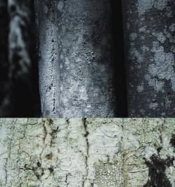
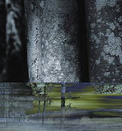
Blurring the BarkPart of the problem with the bark section was that it was just too much of a two-dimensional surface. It was flat and didn't have much depth. To address this deficiency, I duplicated the layer by dragging the Tree Bark layer to the New Layer icon in the Layers palette. With the mask link still deselected, I used the Move tool to drag the bark image within the lower rectangle until I found a complimentary section of texture. With the new layer still active, I selected Filter, Blur, Motion blur to open the Motion Blur dialog box. I set the Angle to 0° and moved the distance slider to 560 pixels to create an extreme horizontal blur. To combine it with the lower layer, I set the blurred layer's opacity to 78% and selected Difference from the Blending Mode drop-down menu in the Layers palette (see Figure
More LandscapeThe piece was feeling more cohesive, but it felt like the message was getting lost. I started thinking about combining a more expansive landscape image with the bottom bark texture, exploring the extremes of close-up photography and normative landscape images and how they communicate the sense of place in different ways. I added the Birch Panorama photo across the bottom of the composition, scaling it to fit the horizontal image using the Free Transform tool. To make it work with the monochromatic palette of that portion of the image, I applied another gradient map by selecting Image, Adjustments, Gradient Map. This time I selected black and a pale green/yellow that keyed off the color of the bark texture in the Tree Bark layer. By selecting Gradient Map from the Image, Adjustments menu, the effect is applied directly to the layer rather than in a separate adjustment layer. I dragged the Birch Panorama layer between the bark and blur layers and set the opacity to 78% to combine the three layers. This left additional vertical space around the Birch Panorama layer. Rather than creating distortion by stretching the entire image up, I selected the Clone Stamp tool and cloned parts of the Birch Panorama layer, extending the vertical of the central birch tree and adding a top to the group of trees on the left. The resulting combination lets the landscape combine effectively with the Tree Bark Blur layer, inferring strong motion and interesting coloration. The bark texture fills in the gap at the top right where the lower rectangle meets the Two Trees layer (see Figure
Adding a Mocha GradientI have to confess that at this point I got stuck. It's easy to sit here after the fact and show you how everything came together, but in the actual flow of the design, this point was a problem. I tried countless combinations of images and effects, but nothing seemed to pull it together. The move that finally pushed it over the top was the addition of a peculiar inverted gradient map that ranged from a mocha coffee color to black. I created a Gradient Map adjustment layer just as I had before when converting the Two Trees layer to black and white. The difference in this case is that I clicked the gradient strip in the Gradient Map dialog box to launch the Gradient Editor (shown in Figure
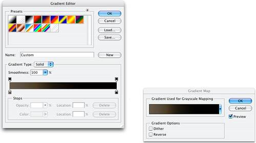 The Gradient Editor allows you to create custom gradients by adding additional colors and controlling the blending range as the colors flow together. The gradient bar that runs along the bottom of the Gradient Editor represents the new gradient. Clicking anywhere beneath the gradient bar inserts a square with an arrow called a color stop. Double-clicking a stop launches the Color Picker so that you can select the color for that stop. After exploring various monochromatic options, I settled on a smooth two-color gradient that ranged from mocha to black. Remember that in the Gradient Editor, the color stop on the left maps to the blacks in the image and the color stop on the right maps to the whites. Thus, by double-clicking the color stop on the left and selecting a color with an RGB value of R106, G96, B79, I converted the deepest blacks in the image to a pale mocha brown. I then double-clicked the right color stop and selected black as the color, pushing black into the brightest whites area (see Figures
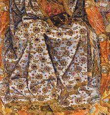
Adding the Virgin's SkirtThe final elements that completed the image are the star-like circular shapes that seem to float around the upper-left region of the image. These shapes echo the textures and shapes in the tree bark, while adding a dynamic accent that carries an innate specificity and attention to detail, without being overtly realistic or referential. They were pulled directly from the skirt in the Assumption of the Virgin photo I took in the Montepulciano Cathedral (see Figure
The resulting pattern had some artifacts and fringe details from other parts of the skirt, so I deleted those using the Eraser tool until only the dots remained. When the pattern was sufficiently cleaned up, I copied the image and pasted it into the composition, dragging it into position in the upper-right corner. The final step was to add a layer mask to the dot pattern layer and fade some of the dot circles. To do this, I selected a brush with black as the foreground color, and set the opacity in the toolbar to 59%. I painted various sections of the pattern layer to achieve the final atmospheric effect, completing the image (see Figure
|
|
|
EAN: 2147483647
Pages: 141