Compositional Building Blocks
| Most people have a vague idea about what composition is, and some may even have an idea about what "good" composition is. Whatever your familiarity and comfort level may be with this subject, I'm going to encourage you to throw out any rigid, predetermined rules about what good composition is, and to adopt a more flexible, modular approach to the subject. The problem with most formalist approaches to composition is that they're too limited and repetitive. They seldom consider the full expressive range of the subject, or assist in communicating the subtle nuance of the photographer's message. And although these definitions might produce images that are technically sound, they often act as barriers to creating images that have real power or deliver a unique, personal message. Instead, approach good composition as an intuitive puzzle for which you need to find the right combination of tools to use on your subject to convey your message. Rather than learning a few rules about the Greek Golden Mean or the Rule of Thirds, open yourself up to new forms of expression. In addition, continue to explore ways of combining elements in new and unexpected ways.
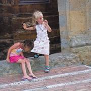
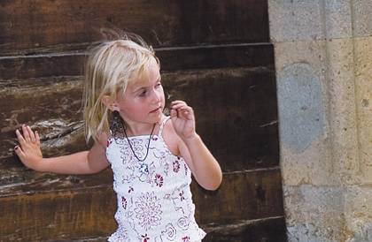
 Thinking About the SubjectWhat is your subject? What are you trying to capture and express? Is it a person, landscape, or even an aesthetic element such as a texture or shape? If your subject is an object (that is, a noun), your approach to composition is going to be much more formal and direct. Compose the image in an interesting way, expose properly, and keep the subject sharp. All that's left is finding a suitable frame for your Eiffel Tower picture, preferably one that matches the couch. The one caveat to the "noun as subject" axiom is when shooting people. Because people are capable of a wide range of expression and feeling, it's almost impossible to separate these emotions from the physical body. When photographing a human subject, an interesting dynamic occurs. There is a strong impulse on the part of the artist and audience to orient themselves in relation to the subject in the photo. What are they thinking or feeling? Do they see me? Are they a threat? Could I run if they attacked me? Could I reach them to provide comfort? Your goal in shooting most people-as-subject images is to get the viewer to connect with the subject in some way. If they're asking these kinds of questions, you've succeeded, and the image is likely to be compelling and memorable.
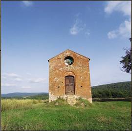
Thus, when you're shooting a person, it's important to decide how you want the viewer to interact with the subject. What is the balance between intimacy and detachment, or the overall level of identification and accessibility? The most abstract type of subject involves trying to express an idea or concept. What if your subject is speed, or rage, or fidelity? Concepts that function as adjectives are often expressed abstractly. It's easy to imagine an abstract image that conveys speed, for example. In addition, emotional concepts are often communicated through color, whether it be the rage and passion of red, or blue's calm and serenity. The list that follows breaks down the compositional building blocks at your disposal as you compose a picture. You should think about how to combine them in a way that best communicates your message. The subject sets the tone for the composition, which you respond to as you choose a viewpoint that orients the viewer within the scene. Finally, you make perceptual choices around light, color, or focus that reveal more or less of the subject and determine the subject's accessibility. Orienting the ViewerThe very act of capturing an image creates a window or frame that the viewer looks through as they encounter the image. The size and shape of the image (its frame), as well as the perspective and viewpoint, all conspire to orient the viewer with the subject. Frame Geometry and SizeThe standard height-to-width ratio used by your camera's viewfinder is a pleasing and flexible format that grew out of the photographer's preoccupation with the landscape. In addition, you can also turn the camera on its side and shoot a full figure, getting head and feet in the frame without too much trouble. Think about whether you're trying to isolate your subject in full view, or whether there's a specific area within your subject that's drawing your attention. In Figure
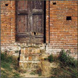
One last point is to think about the size at which you will print the image. Today's large-format inkjet printers can make prints as wide as 72 inches, and dozens of feet long. Printing an image larger than life tends to abstract it and has a disorienting effect on the viewer. Conversely, small prints tend to objectify your subject, literally giving the viewer the sense that they can pick it up and put it in their pocket. Both of these approaches distance the viewer from the subject and force them to interact on more of a conceptual or technical level, rather than an emotional one. CroppingAlthough you should thoughtfully compose images in your camera's viewfinder, the fact remains that you should consider cropping any image that's worth printing and framing. Cropping allows you to reconsider the decisions you made while you were shooting, refining the areas of emphasis within the composition. Cropping is reductive in nature; it can only make the image smaller and take away some of the shot. As you crop, consider two main questions: Do I want to change the aspect ratio? Does the image become more clear and concise if I zoom in and eliminate areas that are superfluous or unnecessary? The main aspect ratio options include a horizontal or vertical orientation; a panoramic, standard photo frame; and a square. Horizontal images are more narrative and communicate more of a sense of time, while vertical images tend to emphasize and isolate the subject. These are not specific measured frame sizes; they simply refer to the general shape of the frame and how that shape effects how we view the subject. We'll touch more on these characteristics later in the chapter.
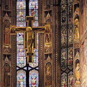
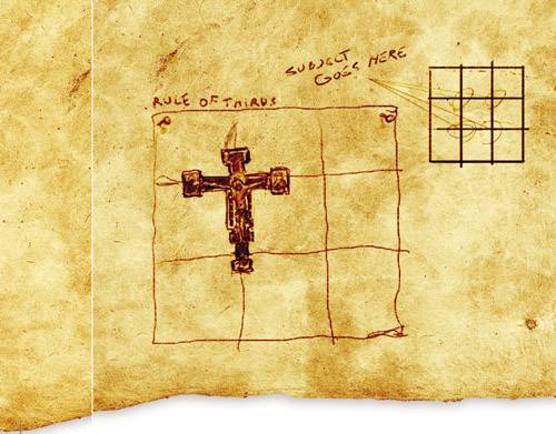
ViewpointAs the viewer looks at the scene, is their eye level above the scene or below it? The answer to this question plays a key psychological factor in how the image is felt and perceived. Position yourself lower and shoot up at the subject or landscape to give the subject a sense of dominance or power. Shooting down on the subject can have the inverse effect, making the subject feel more accessible and perhaps even vulnerable. Lens PerspectiveMost people think about the lens they want to use only when they need to zoom in or out from their subject. But it's important to remember that the focal length determines the perspective in the scene, making things look normal or distorted. Wide lenses with short focal lengths tend to stretch the scene at the edges of the frame, while creating a feeling of extra distance between the viewer and the subject (think of the rear-view mirror on your car, where "objects are closer than they appear"). For a more intimate look, try a telephoto or zoom lens. Although these long lenses bring you in closer to the subject, they also flatten and compress the space, reducing the sense of depth in the image. Stick to medium lenses with focal lengths of 40mm80mm for image perspective that looks the most natural. Dividing the FrameAsk most people to define image composition, and they usually describe some process of organizing the subject within the frame, perhaps alluding to geometric divisions and proportions. "Don't put the subject right in the middle," they'll say. "Make it more interesting." In many instances, they'd be correct with this definition, but on the other hand, some of my best pictures have centered the subject right in the middle of the frame. If the right subject is combined with the proper frame proportions and message, any rule can be effectively broken. But as the old adage goes, you need to learn the rules before you can break them, so consider the list that follows as an overview of methods for arranging the picture plane. The Rule of ThirdsThe Rule of Thirds is a well-known compositional technique that divides the picture plane into a matrix that looks like a tic-tac-toe board. The idea is to place the subject or focal point at one of the four intersections of lines to create a good composition. This is an acceptable approach that achieves its purpose of keeping the subject out of the center of the frame. In Figure
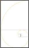
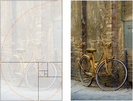
The Greek Golden MeanThe Greek Golden Mean is an analytical system for creating geometric divisions that are well proportioned and inherently pleasing. There are tons of things you could learn about this system, including its discovery by the Greek mathemetician, Eulid; the fact that it's responsible for many repeating spiral forms in nature; and that its ratio of 1:1.618 is the same basic proportion behind the faces we instinctively consider the most beautiful. The diagram in Figure
Angles and PointersIn addition to defining geometric divisions in the image frame, objects and shapes can also serve as visual pointers to lead the viewer through the composition. A country road is an obvious path that leads the eye into a scene, although any shape can suggest a direction for the eye to follow. This concept is discussed in more detail later in this chapter, but keep it in mind as a compositional building block that's at your disposal. Presenting the SubjectAt this point, we've looked at how to orient the viewer in the scene, lead his or her eye through the composition, and divide the frame into interesting and pleasing proportions. Although these factors contribute to the viewer's approach to the image, we still have the question of the subject itself, and how it is depicted by the composition. How we depict the subject, or rather, how we allow the viewer to perceive the scene, has a huge impact on the emotional state of the viewer. If the lighting in the image is clear and vibrant, the viewer's reaction is likely to be positive and cheerful. Desaturated and cloudy conditions usually have an opposite effect, and dark and hazy lighting can create a sense of discomfort or fear. Depth of FieldDepth of field was covered in some detail in the Chapter 3, "Focus and Depth of Field," and it is mentioned here as a compositional device. Used properly, depth of field can help to isolate your subject in sharp detail, while blurring unwanted distractions. The eye moves quickly past areas that are out of focus and is attracted to the areas of sharp focus and detail. As a result, you can use depth of field as a type of compositional pointer to lead the viewer through the composition. ColorThe way you use color has a tremendous impact on the overall look and feel of the image. Color can be used to set the tone for the entire image, impacting the overall quality of light in the scene. In this sense, it is the temperature of the color that often has the most impact, either through the warm light of an evening sunset or the cool light of a misty morning.
Color intensity can also play a role in image perception and compositional control. An image that is color dominant, with highly saturated colors that jump off the page, immediately takes on a graphic feel because the color intensity draws attention to the overall shapes of the objects. Conversely, when the color saturation is lower, the tonality of the light and shadows tends to dominate, and the scene can take on a patina or nostalgic glow. Thus, in highly saturated images, the overt object shapes and edges can create directional pointers that lead the eye through the image. Finally, think about using color contrast as a way to draw the eyes to the primary subject area. Because our eyes are immediately drawn to high-contrast areas, treat the subject with a contrasting color. If the majority of the image is primarily green, and the subject is red, the subject will demand the viewer's attention. You can contrast color areas with intensity (saturation), hue (color), or value (shades and tints).
ContrastIn the sense of presenting your subject, I'm specifically referring to tonal contrast in the scene. In general, high-contrast images sacrifice detail in the shadows in exchange for highly delineated edges and a graphic look and feel. In some cases, you might want to shift to a low-contrast emphasis so that the scene takes on a supple and sensuous feel, with tonal gradations that are subtle and soft. Contrast has a huge impact on how the image feels, and how quickly it unfolds for the viewer. In addition, think about the requisite level of detail that the shot requires; high-contrast treatments sacrifice a fair amount of information. When to ComposeNow that your head is full of all these compositional options, you might be asking exactly how you're supposed to remember them all, or when you're supposed to deploy them. The good news is that there's no single answer for that, and if you miss applying them at the shooting phase, you can often deploy them later. There's no question that you need to be thinking and using solid compositional strategies as you're looking through the viewfinder and taking pictures. As you look at your previews, assess how the image looks and make adjustments, reshooting if necessary. When you look at your images in Photoshop, you can apply additional sharpening and focus effects while pushing the color or contrast relationships in the image. The thing to remember is that you must employ a discerning eye at all phases of the creative process; while shooting, previewing, and in Photoshop. |


EAN: 2147483647
Pages: 141