Descriptive Statistics and Data Displays
Overview
Purpose of these tools
To provide basic information about the distribution and properties of a set of data
Deciding which tool to use
- Statistical term conventions, p. 105, covers standards used for symbols and terminology in statistical equations. Review as needed.
- Measures of Central Tendency, p. 106, covers how to calculate mean, median, and mode. Calculate these values manually for any set of continuous data if not provided by software.
- Measures of Spread, p. 108, reviews how to calculate range, standard deviation, and variance. You will need these calculations for many types of statistical tools (control charts, hypothesis tests, etc.).
- Box plots, p. 110, describes one type of chart that summarizes the distribution of continuous data. You will rarely generate one by hand, but will see them often if you use statistical software programs. Review as needed.
- Frequency plot/histogram, p. 111, reviews the types of frequency plots and interpretation of patterns they reveal. Essential for evaluating the normality; recommended for any set of continuous data.
- Normal Distribution, p. 114, describes the properties of the "normal" or "bell-shaped" distribution. Review as needed.
- Non-Normal Distributions/Central Limit Theorem, p. 114, reviews other types of distributions commonly encountered with continuous data, and how you can make statistically valid inferences even if they are not normally distributed. Review as needed.
Statistical term conventions
The field of statistics is typically divided into two areas of study:
- Descriptive statistics represent a characteristic of a large group of observations (a population or a sample representing a population).
- Ex: Mean and standard deviation are descriptive statistics about a set of data
- Inferential Statistics draw conclusions about a population based upon analysis of sample data. A small set of numbers (a sample) is used to make inferences about a much larger set of numbers (the population).
- Ex: You'll use inferential statistics when hypothesis testing (see Chapter 9)
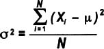
Parameters are terms used to describe the key characteristics of a population.
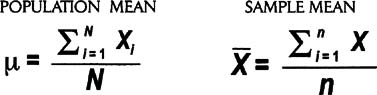
- Population parameters are denoted by a small Greek letter, such as sigma (σ) for standard deviation or mu (μ) for mean
- The capital letter N is used for the number of values in a population when the population size is not infinite
In most cases, the data used in process improvement is a sample (a subset) taken from a population..
- Statistics (also called "sample statistics") are terms used to describe the key characteristics of a sample
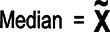
- Statistics are usually denoted by Latin letters, such as s, X (often spelled out as Xbar in text), and
 (spelled out as X-tilde)
 - The lowercase letter n is used for the number of values in a sample (the sample size)
In general mathematics as well as in statistics, capital Greek letters are also used. These big letters serve as "operators" in equations, telling us what mathematical calculation to perform. In this book, you'll see a "capital sigma" in many equations:
∑ (capital sigma) indicates that the values should be added together (summing)
Measures of central tendency (mean, median, mode)
Highlights
- Central tendency tells you how tightly data cluster around a central point.
- The three most common measures of central tendency are mean (or average), median, and mode.
- These are measures of central tendency, not a measure of variation. However, a mean is required to calculate some of the statistical measures of variation.
Mean average
The mean is the arithmetic average of a set of data.
- To calculate the mean, add together all data values then divide by the number of values.
- Using the statistical conventions described on p. 105, there are two forms of the expression—one for a population mean and the other for a sample of data:
Median
The median is the midpoint of a ranked order set of data.
To determine the median, arrange the data in ascending or descending order. The median is the value at the center (if there is an odd number of data points), or the average of the two middle values (if there is an even number of data points). The symbol for the median is X with a tilde (~) over it.
Mode
The mode of a set of data is the most frequently observed value(s).
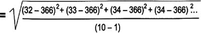
Scores from 10 students arranged in ascending order:
- 32, 33, 34, 34, 35, 37, 37, 39, 41, 44
- Mean: Xbar = (32 + 33 + 34 + 34 + 35 + 37 + 37 + 39 + 41 + 44) / 10 = 36.6
- Median: X-tilde = (35 + 37) / 2 = 36
- Mode: There are two modes (34 & 37)
| Tips |
|
Measures of spread (range, variance, standard deviation)
Highlights
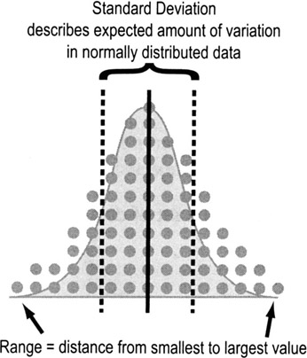
- Spread tells us how the data are distributed around the center point. A lot of spread = high variation.
- Common measures of spread include range, variance, and standard deviation.
- Variation is often depicted graphically with a frequency plot or histogram (see p. 111).
Range
Range is the difference between the largest and smallest values in a data set.
- The Min is the smallest value in a data set
- The Max is the largest value in a data set
- The Range is the difference between the Max and the Min
- Ex: Here are ten ages in ascending order: 32, 33, 34, 34, 35, 37, 37, 39, 41, 44
- Min = 32, Max = 44
- Range = Max − Min = 44 − 32 = 12
Variance
Variance tells you how far off the data values are from the mean overall.
- Calculate the mean of all the data points, Xbar
- Calculate the difference between each data point and the average (Xi—Xbar)
- Square those figures for all data points
- This ensures that you'll always be dealing with a positive number—otherwise, all of the values would cancel each other out and sum to zero
- Add the squared values together (a value called the sum of squares in statistics)
- Divide that total by n-1 (the number of data values minus 1)
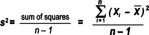
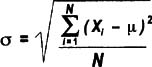
Note that the equation above follows statistical conventions (p. 105) for describing sample statistics. Variance for a population uses a sigma as shown here.
Though more people are familiar with standard deviation (see below), variance has one big advantage: it is additive while standard deviations are not. That means, for example, that the total variance for a process can be determined by adding together the variances for all the process steps.
- So to calculate a standard deviation for an entire process, first calculate the variances for each process step, add those variances together, then take the square root. Do not add together the standard deviations of each step.
A drawback to using variance is that it is not in the same units of measure as the data points. Ex: for cycle times, the variance would be in units of "minutes squared," which doesn't make logical sense.
Standard deviation
Think of standard deviation as the "average distance from each data point to the mean." Calculate the standard deviation for a sample or population by doing the same steps as for the variance, then simply taking the square root. Here's how the equation would look for the 10 ages listed on the previous page:
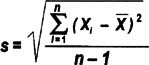
Just as with variance, the standard deviation of a population is denoted with sigma instead of "s", as shown here:
The standard deviation is a handy measure of variability because it is stated in the same units as the data points. But as noted above, you CANNOT add standard deviations together to get a combined standard deviation for multiple process steps. If you want an indication of spread for a process overall, add together the variances for each step then take the square root.
Boxplots
Highlights
- Boxplots, or box-and-whisker diagrams, give a quick look at the distribution of a set of data
- They provide an instant picture of variation and some insight into strategies for finding what caused the variation
- They allows easy comparison of multiple data sets
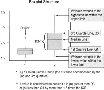
To use boxplots…
- Boxplots are typically provided as output from statistical packages such as Minitab (you will rarely construct one by hand)
- The "box" shows the range of data values comprising 50% of the data set (the 2nd and 3rd quartiles)
- The line that divides the box shows the median (see definition on p. 107)
- Single-line "whiskers" extend below and above the box (or the left and right, if the box is horizontal) showing the width of the 1st and 4th quartiles, and lowest and highest values
- Data values that fall far from other data values in the set are plotted separately and labeled as outliers
- Often, outliers reflect errors in recording data
- If the data value is real, you should investigate what was going on in the process at the time
Frequency plot (histogram)
Purpose
To evaluate the distribution of a set of data (to learn about its basic properties and to evaluate whether you can apply certain statistical tests)
When to use frequency plots
- Any time you have a set of continuous data. You will be evaluating the distribution for normality (see p. 114), which affects what statistical tests you can use.
- Ex: When dealing with data collected at different times, first plot them on a time series plot (p. 119), then create a histogram of the series data. If the data are not normally distributed, you cannot calculate control limits or use the "tests for special causes."
Types of frequency plots
Though they all basically do the same thing, there are several different types of frequency plots you may encounter:
- Dot plot
Dot plots display a dot (or other mark) for each observation along a number line. If there are multiple occurrences of an observation, or if observations are too close together, then dots will be stacked vertically.
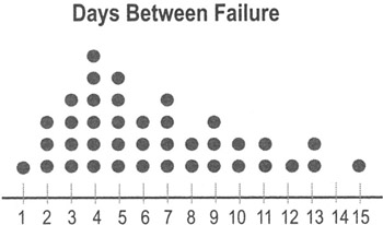
- Dot plots are very easy to construct by hand, so they can be used "in the field" for relatively small sets of data.
- Dot plots are typically used for data sets with fewer than 30 to 50 points. Larger data sets use histograms (see below) and box plots (see p. 110).
- Unlike histograms, dot plots show you how often specific data values occur.
- Histogram
Histograms displays bars representing the count within different ranges of data rather than plotting individual data points. The groups represent non-overlapping segments in the range of data.
- Ex: All the values between 0.5 and 1.49 might be grouped in an interval labeled "1," all the values between 1.5 and 2.49 might be grouped in an interval labeled "2," etc.
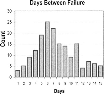
How to create a histogram
- Take the difference between the min and max values in your observations to get the range of observed values
- Divide the range into evenly spaced intervals
- This is often trickier than it seems. Having too many intervals will exaggerate the variation; too few intervals will obscure the amount of variation.
- Count the number of observations in each interval
- Create bars whose heights represent the count in each interval
Interpreting histogram patterns
Histograms and dot plots tell you about the underlying distribution of the data, which in turn tells you what kind of statistical tests you can perform and also point out potential improvement opportunities.
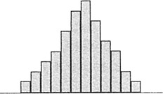
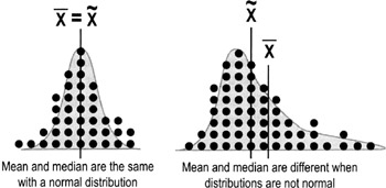
- This first pattern is what a normal distribution would look like, with data more-or-less symmetric about a central mean.
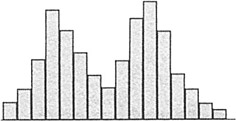
- A histogram with two peaks is called bimodal. This usually indicates that there are two distinct pathways through the process. You need to define customer requirements for this process, investigate what accounts for the systematic differences, and improve the pathways to shift both paths towards the requirements.
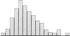
- You may see a number of distributions that are skewed—meaning data values pile up towards one end and tail off towards the other end. The pattern is common with data such as time measurements (where a relatively small number of jobs can take much longer than the majority). This type of patterns occurs when the data have an underlying distribution that is not normal or when measurement devices or methods are inadequate. If a non-normal distribution is at work, you cannot use hypothesis tests or calculate control limits for this kind of data unless you take subgroup averages (see Central Limit Theorem, p. 114).
Normal distribution
In many situations, data follow a normal distribution (bell-shaped curve). One of the key properties of the normal distribution is the relationship between the shape of the curve and the standard deviation (σ for population; s for sample).
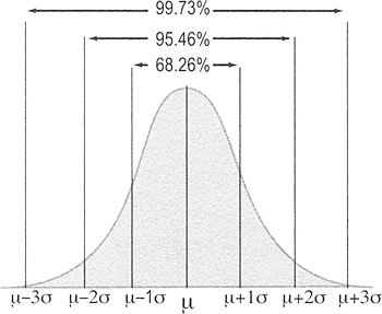
- 99.73% of the area under the curve of the normal distribution is contained between −3 standard deviations and +3 standard deviations from the mean.
- Another way of expressing this is that 0.27% of the data is more than 3 standard deviations from the mean; 0.135% will fall below −3 standard deviations and 0.135% will be above +3 standard deviations.
To use these probabilities, your data must be random, independent, and normally distributed.
Non normal distributions and the Central Limit Theorem
Highlights
- Many statistical tests or inferences (such as the percentages associated with standard deviations) apply only if data are normally distributed
- However, many data sets will NOT be normally distributed
- Ex: Data on time often tail off towards one end (a skewed distribution)
- You will still want to use a dot plot or histogram to display the raw data
- However, because normality is a requirement for many statistical tests, you may want to convert non-normal data into something that does have a normal distribution
- The distribution of the averages (Xbars) approaches normality if you take big enough samples
- This property is called the Central Limit Theorem
- Calculating averages on subsets of data is therefore a common practice when you have an underlying distribution that is non-normal
Central Limit Theorem
Regardless of the shape of the parent population, the distribution of the means calculated from samples quickly approaches the normal distribution as shown below:
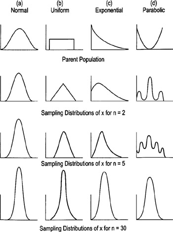
Practical Rules of Thumb
- If the population is normal, Xbar will always be normal for any sample size
- If the population is at least symmetric, sample sizes of 5 to 20 should be OK
- Worst-case scenario: Sample sizes of 30 should be sufficient to make Xbar approximately normal no matter how far the population is from being normal (see diagrams on previous page)
- Use a standard subgroup size to calculate Xbars (Ex: all subgroups contain 5 observations, or all contain 30 observations)
- The sets of data used to calculate Xbar must be rational subgroups (see p. 125)
The Lean Six Sigma Pocket Toolbook A Quick Reference Guide to Nearly 100 Tools for Improving Process Quality, Speed, and Complexity
- Using DMAIC to Improve Speed, Quality, and Cost
- Working with Ideas
- Value Stream Mapping and Process Flow Tools
- Voice of the Customer (VOC)
- Data Collection
- Descriptive Statistics and Data Displays
- Variation Analysis
- Identifying and Verifying Causes
- Reducing Lead Time and Non-Value-Add Cost
- Complexity Value Stream Mapping and Complexity Analysis
- Selecting and Testing Solutions
EAN: N/A
Pages: 185
- Chapter V Consumer Complaint Behavior in the Online Environment
- Chapter VII Objective and Perceived Complexity and Their Impacts on Internet Communication
- Chapter VIII Personalization Systems and Their Deployment as Web Site Interface Design Decisions
- Chapter XV Customer Trust in Online Commerce
- Chapter XVIII Web Systems Design, Litigation, and Online Consumer Behavior
