Executing Corporate Strategy with Lean Six Sigma
Overview
“A good managerial record is more a function of which boat you get into rather than how effectively you row” [1]
Warren Buffett
Over the last decade, more and more companies are accepting the principles illustrated by the Value Mountain (Figure 1.2, reprinted on the next page), a graph based on actual stock market data. The main lesson is that the principal driver of shareholder value is Return on Invested Capital (ROIC). (In the nonprofit sphere, the names change to capital generation and maximizing stakeholder benefits, but the process of achieving the goals is identical.)
Thinking about ROIC is probably most familiar to senior executives and P&L managers, but it is an area of knowledge that forms a central premise of Lean Six Sigma: that decisions about investing Black Belt resources should be based on an understanding of maximum potential value creation in the organization. For that reason, it is crucial that Champions become expert in ROIC analysis, and helpful if everyone along the value chain is at least familiar with the underlying concepts.
Given the lessons demonstrated by the graph, the question is how can we identify and prioritize projects based on maximizing ROIC and revenue growth. The process reviewed in this chapter has been proven to work in practice, and is much more effective than implementations in which projects are selected solely by Black Belts or first-line management.
Figure 1.2: The Value Mountain (reprinted from Chp 1)
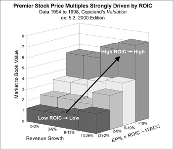
This graph is used to illustrate why ROIC is so critical to shareholder value. The spread of ROIC% minus the Cost of Capital% is so important that it has a special name, Economic Profit% (EP%), a factor you’ll see referenced several times in this chapter. As shown in this figure, if EP% = 0 (that is, ROIC% is equal to the cost of Capital%), the company trades at about book value. If EP% is 5% or greater (ROIC% exceeds the cost of capital by 5–10%), the company trades at 4 to 5 times book value. If, in addition, revenue growth exceeds 10% each year, the company will trade at 7 times book value or higher.
[1]Berkshire-Hathaway Annual Report of 1985
Applying Value Based Management to Project Selection
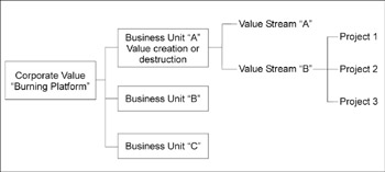
The flow from high-level strategy to individual projects requires an understanding of where and how value is created in your organization. The sequence, as depicted in Figure 4.1 (next page), is to:
- Identify the burning platforms of shareholder value creation at both a corporate and business unit level
- Identify value streams within the business units that have the greatest potential for increasing shareholder value
- Identify and prioritize projects within each value stream that will maximize value (Black Belt resources within each business units will be focused on these projects)
Maintaining the links between levels is the only effective way of measuring results at the bottom line and assuring that the business unit managers will support Lean Six Sigma and make it “the way we do business” instead of an additional task. Most companies will have performed some if not all of the initial work described below as part of their annual strategy planning. This is not a book on valuation or strategy, but we’ll summarize the process in full to show how value can be carried seamlessly from corporate strategy to Black Belt project execution.
Figure 4.1: From Strategy to Projects
Stage 1 Identifying the Burning Platform of shareholder value creation
The backdrop for the analysis presented in this chapter is that your organization knows what its biggest competitive or strategic challenges are. Every company is in competition for customers (to drive revenue); public companies also compete for shareholders (to drive share price). How well your company is doing on both these fronts can be determined by comparing your performance to that of your competitors.
There are two elements to this analysis:
- Corporate shareholder value analysis, which will reveal the potential for shareholder value creation
- Business unit analysis for determining the Economic Profit and revenue growth of different components of your business
Step 1A Corporate Shareholder Value Analysis
The general idea behind this analysis is to use data available in public records to compare how your company is performing in the marketplace at the broadest level. Table 4.1 (see below) shows the most common indicators included in such an analysis. For our purposes in using this as part of a drive towards selecting Lean Six Sigma projects, the most important figure is Economic Profit% (calculated as the % change in ROIC minus the (weighted) % cost of capital) as an overall indicator of company performance, and Growth Rate.
|
Strategic |
You |
Competitor |
Competitor |
Competitor |
|
s |
|
|
|---|---|---|---|---|---|---|---|---|
|
Economic |
||||||||
|
Profit % |
||||||||
|
Growth |
||||||||
|
Rate |
||||||||
|
Market |
||||||||
|
to Book |
||||||||
|
Owner |
||||||||
|
Earnings/ |
||||||||
|
Profit |
When you plot your own figures versus that of your competitors, you’ll come up with a customized version of Figure 1.2, as shown in Figure 4.2, next page. You’ll probably want to plot share price movement for your nearest competitors or similar kinds of companies over the last three years, as well as project where you think your share price can move to if you achieve your the strategic vision (through Lean Six Sigma).
By comparing your value to similar kinds of companies, you will generally find opportunities. An analysis of similar “conglomerate” type companies drove ITT Industries’ Lean Six Sigma process. The CEO said:
“We noticed in our analysis that while some companies get a conglomerate discount, there are others like GE, who got a conglomerate premium. And guess what? It all depends on performance, and if we could get our performance up, we felt we’d be able to earn those types of premiums. We had to convince our management teams that even though they were doing well in their individual industries, when you measured them against multi-industry, premier peers—the GEs, Danahers, ITWs of the world—we were mediocre. That’s how we started Value Based Six Sigma.”
Figure 4.2: Identifying Your Burning Platforms
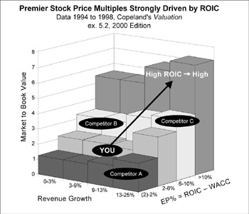
You can use the Value Mountain to highlight your competitive challenges vs. your competitors. On the graph, Revenue Growth is included because it affects shareholder value through the benefits of future Economic Profits. Add these additional profits and investments to compute the future Economic Profit %.
Like the companies depicted in Figure 1.3 (p. 16), ITT’s stock has more than doubled in a time period when the S&P has dropped.
Step 1B Business Unit Analysis
The data that needs to be taken at the business unit level is the same as at corporate, assuming you can find “pure play” competitors to compare against your unit’s business (they have a single line of business similar to your own for which data are available). So you would fill in Table 4.1 for each business unit, adding in data on relative Gross Margin and SG&A% (Selling, General, and Administrative costs). This will tell the CEO how much value is being created or destroyed by the business unit. Economic Profit % by customer and geography should also be analyzed at the business unit level.
Outcome of Stage 1
The data analysis at the corporate level should allow you to determine, at the broadest level, what the biggest factors are that you need to be concerned with in order to drive shareholder value (revenue growth, ROIC, etc.). Looking at the same kind of data at the business unit level allows you to focus in on those units that are contributing most to the problem (i.e., perhaps it’s just one division that is holding back overall corporate value growth). The next step is to dive down one more level, to look at the value streams within the targeted business units and determine where your improvement investment would have the biggest impact.
Stage 2 Mapping the value streams with highest potential for increasing shareholder value
Most business units offer many different products and services that often do not share common value streams. One option, of course, would be to simply launch a lot of projects throughout the unit. But you can be much more effective in your resource investment if you figure out how each value stream in a business unit contributes to value creation or destruction. Value streams are usually defined within a business unit by product or service type, and include suppliers’ processes and internal processes, and extend to customers and often their processes. (In this context, a value stream is defined as an entire process that transforms supplier inputs into outputs that satisfy a customer need.)
The metric to look at first is once again Economic Profit, this time segmented out by value stream. When you arrange the results in descending order of value creation vs. value destruction, you end up with a waterfall diagram like that shown in Figure 4.3 (see p. 109).
One note if you do this type of analysis yourself: the allocation of overhead cost and invested capital can be challenging if performed in detail. For the purposes here, it’s just as effective to use a reasonable estimate with ranges of values as a first step. This will give you a directionally correct answer (whether the value stream is destroying or creating value). This analysis usually detects large discrepancies in Economic Profit; there are clear winners and losers.
The Right Fiscal Indicator: Profit After Tax or Owner Earnings?
The discussion in the accompanying text provides empirical reasons for placing Voice of the customer (Critical-to-Quality) measures and ROIC center stage in any process for making strategic choices about where to invest Lean Six Sigma resources.
But ROIC as it traditionally calculated
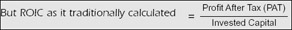
has a significant flaw: We have recently seen companies inflating Profit After Tax (PAT) by classifying current costs as investments such as Capex or Inventory, or claiming false revenue that inflates accounts receivable.
The alternative? Buffett defines owner earnings as the cash that is generated that can be used for the benefit of shareholders for
- reinvestment in the business (if ROIC > WACC, growth opportunity)
- valid acquisitions (Purchase price < NPV of target)
- repurchase of shares (Market price < NPV of business)
- dividends to the shareholders (when none of the above pertain)
His formula for owner earnings (from Berkshire Hathaway Annual Report 1986) is:
Owner Earnings = (PAT) – (Capex) + (D&A) – (Increase in working capital)
Since Capex fluctuates, it’s best to use an average of three years.
A company that attempts to hide current expense in either Capex, inventory, or receivables may be found out by Owner Earnings (unless the transactions are not on the balance sheet, e.g., Enron). Thus in computing ROIC, replace PAT with Owner earnings. A company that is able to reduce working capital, receivables, and Capex accelerates the velocity with which investments are transformed to cash inputs at a given revenue level.
It’s true that the Owner Earnings equation does not yield the (deceptively) precise figures of GAAP (e.g., Capex is an average). Despite this problem, owner earnings, not the GAAP figure, is more relevant for valuation purposes—both for investors in buying stocks and for managers in buying entire businesses. We agree with John Maynard Keynes’ observation:
“I would rather be vaguely right than precisely wrong.”
But Figure 4.3 represents only half the story. As you may recall from Chapter 3, another component of “value” is the potential for revenue growth. This is measured as attractiveness to customers and Economic Profit of the market. In fact, Figure 3.1 was based on the same five value streams. In that chart, the profitability of each value creator was compared to its competitive position (based on market data). The size of the circle indicated the relative revenue of each offering. Combining the two gives us a more complete picture, as shown in Figure 4.4. These charts are based on actual data. After completing this analysis, the company decided to:
- Sell (or shut down) Value Stream E, which loses out on both sides of the analysis: The left-hand graph in Figure 4.4 shows thatvalue stream E generates the largest negative Economic Profit (EP); the right-hand graph shows that it is also at a significant competitive disadvantage and has relatively small revenue in an industry that has aggregate negative EP. Barring some breakthrough there are much better opportunities to invest improvement resources. While Lean Six Sigma emphasizes the need to listen to the Voice of the Customer, this shows one situation where the customers’ business will never earn a positive economic profit. Companies have to consider whether effort applied to a Value Stream like E would be better applied to a different set of customers, products, or geographies. If that is the case, then they should make a graceful exit from that business and focus improvement efforts on businesses that can earn a positive economic profit. (If E is a whole division, the company should consider offering it for divestiture, as discussed later in this chapter.)
- Undertake a major initiative to improve the position of value stream D, which, though it showed negative EP, was at an advantaged position. Though value stream D was competing in an unprofitable industry overall, customers preferred D to the market competition. This meant that D was a value stream well worth studying to determine if non-value-add costs comprised a significant portion of total costs. If yes, an investment in cutting waste and costs could move them into strong Economic Profit position and capitalize on their already strong competitive position. (In fact, the company did use Value Stream Mapping to identify which activities within operation D were creating the most waste and delay, then applied basic Lean and Six Sigma tools to those areas in priority order.)
Figure 4.3: “Waterfall” of Value Stream Assessment
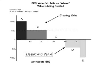
This company calculated Economic Profit for each of five value streams within one business unit, then plotted the results in order of decreasing EP%. The X axis is the amount of invested capital. The Y axis is the Economic Profit, which is defined as the difference between the ROIC% and the cost of capital. The width and direction of the bars indicate the net assets of each value stream and whether it is creating or destroying value. In this case, value stream A has relatively little invested capital (the bar is narrow) but the highest EP%. Overall, value streams A and B are creating value, C is neutral, and D and E are destroying value.
Figure 4.4: Combined Economic Profit Analysis
Value stream analysis (Fig 4.3) with strategic position analysis (Fig 3.1)
- Invest in making value stream C more competitive. C was in the opposite position to D: neither creating nor destroying value, but lagging in a market sector that was profitable. The company didn’t need to worry as much about removing wastes and costs as in making sure that brand line C was more responsive to the Voice of the Customer. Such VOC input could help them determine whether enhancements to current offerings or additional new offerings would give them competitive advantage. (Approaches for improving customer focus were discussed in Chp 3; also see Chp 14 for a discussion of Design for Lean Six Sigma.)
- Monitor value streams A and B for any weakening of their competitive position or market sector. The Voice of the Customer and competitive analyses demonstrated to the company just how important these brand lines were to their financial and market strength. Another way to look at it is that any current improvement opportunities in value streams A and B are not as critical to the company overall as those represented by the other brand lines. As we all know, however, market conditions can change rapidly, so the company must maintain its vigilance to protect these valuable business lines.
The right boats for this business unit, in Buffett’s words? Applying Lean Six Sigma to value streams D and C would likely have the best chance of generating significant improvement in ROIC and value.
Outcomes of the value stream analysis
As illustrated by the example below, an analysis of the type just described will allow you to focus on the value streams that are in the worst shape (destroying shareholder value). Diving down another level once again, the next step is to continue sharpening your focus.
STOP! Check that list of priorities
The process described in this chapter does not account for strategic initiatives that cannot be easily tied to current bottom line shareholder value, such as the need to improve safety, reduce product liability, address environmental hazards, and so on. Lean Six Sigma methods can be applied equally to such priorities, but since they won’t typically surface in an analysis of ROIC and Economic Profit, you’ll need to add them to the mix before you decide which value streams to map. In addition, some value streams may have negative EP currently, but strong future EP. In this case, you must supplement the use of EP with Net Present Value (NPV) analysis, which is found by comparing the discounted value of future E (see p. 16 for a discussion of “discounted” values).
Stage 3 Prioritizing projects (finding the Time Traps)
Once you have selected the value streams that have the highest value potential, the final step is identifying specific projects within a targeted value stream and prioritize them based on the likely benefit.
If your organization is already using Six Sigma, the temptation will be to simply apply data-driven management and the DMAIC process to make improvements. However, one of the themes of this book is that people working in service functions haven’t been trained to identify some of the biggest causes of process opportunities—problems that would be better addressed by adding Lean techniques, the elimination of non-value-add cost, and the reduction of the complexity of the offering. (When was the last time you heard someone say, “we have too much work-in-process” or “I’m concerned about our non-value-add costs” or “lead time is suffering from variation in demand” or “I think we have too much offering complexity”? These are insights that traditional Six Sigma tools did not address.)
So part of the challenge in answering the question of how to improve a value stream is to find a method that will help expose Lean and complexity opportunities that we don’t know we have, as well as capture what would be considered Six Sigma opportunities.
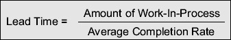
Fortunately, there is a universal metric that represents speed, quality, and complexity problems: time. Understanding how to analyze how time is spent in a value stream is therefore a crucial skill in completing the final link from corporate strategy to improvement projects.
Time The universal currency of improvement
Through the analysis discussed earlier in this chapter, you will have narrowed your field of vision to a few value streams that have the biggest negative impact or drain on shareholder value. The next question is, to which of the activities within a selected value stream should you first apply Lean Six Sigma tools? Here are some clues from the various disciplines that integrated into this book:
Clue #1: Lessons from Little’s Law about WIP. Little’s Law, introduced in Chapter 2, clearly demonstrates that if you have lots of work-in-process (WIP), you will have a slow process. (Remember that WIP can mean anything in process, from reports and calls to emails, requests, and even customers.) The more WIP you have, the more:
- non-value-add cost will punish the income statement
- invested capital will punish the balance sheet
- and together they punish ROIC and shareholder value
So we’re linking value destruction to WIP and hence to delays in the process. Lean tells us that long setup times, downtime, and poor flow cause delay and WIP… but that’s not all.
Clue #2: Think about the impact of quality on time. Here’s a question for you: assume a process has a 10-day lead time and no quality problems. If it suddenly is plagued by 10% defects, what would be the impact on lead time and the amount of work-in-process? You might think the answer is that lead time would also increase by 10%. But in fact the impact is much worse: lead time will increase by 38% and the number of things-in-process will increase by 54%! Thus we can say that an activity within a process that is producing 10% defects will be the source of enormous downstream time delay and non-value-add cost. Here again, a process problem (in this case poor quality) shows up in time delay.
Clue #3: Don’t forget complexity: We’ll go into details later in this chapter and in Chapter 5, but the complexity of your offerings (the numbers and varieties of your services/products) generally increases non-value-add cost, number of “things in process” (WIP) and time delay (there’s that time word again) more than any other single cause.
In short, almost any process problem you could name—defects, WIP, low productivity, process flow complexity—results in added time delays to a process. Hence time is the universal currency of improvement. The obvious conclusion is that calculating the time delay injected by each activity in a process will lead us to the worst quality, speed, and complexity issues that create non-value-add cost and capital. Making the process less costly and faster can only aid revenue growth and further enhance value.
From Time to Time Traps
You might recall a metric introduced in Chapter 2 called Process Cycle Efficiency (PCE), the ratio of value-add time to total lead time in any process. Experience shows that in any process with a PCE of 10% or less (90% of processing time is spent in delays and non-value-add work) that fewer than 20% of the activities (the Time Traps) cause 80% of the delay in lead time.
Time Traps therefore give us a way to use time to focus our improvement efforts. Just as the discussion above indicates, the size of a Time Trap is the result of…
- Delays due to process inefficiencies: As we’ve discussed several times with the Lockheed Martin procurement operation, factors such as the setup time and repeated learning curves can lead to low productivity in output per day per person.
- Variation in supply and demand: Some service activities only process one kind of offering, and have no significant setup time or learning curves. An example given in Lean Six Sigma is a hotel clerk checking in guests. There is practically no setup time, and only one priority job responsibility (checking in guests). In that example, it became clear that if the clerk could check in the guest in exactly 5 minutes, and if guests arrived exactly every 7 minutes, there would be no queue time—guests could be checked in immediately without having to wait in line. However, if there is any variation in the arrival of guests or difficulty in check-in (as there always is!), queue time delays would start to pile up and guests could end up waiting in line 8 or more minutes to get service. (See sidebar.)
- Variation in process capacity: In any unimproved process, capacity likely varies greatly from day to day or even hour to hour due to issues such as downtime (of computers, other equipment), absenteeism, and so on. So a customer order that might speed through a process one day could experience lots of delay at some other time.
How variation affects delay time and WIP
A hotel case study in the original Lean Six Sigma book was based on a situation where a hotel clerk could check in 68% of guests between 3 and 7 minutes (one s around an average of 5 minutes), but where guests usually arrived every 4 to 10 minutes (one s around average of 7 minutes). With this amount of variation, inevitably one or more guests might keep arriving at 4 minute intervals when it’s taking the clerk 7 minutes to check in a difficult guest. As a result, on average, guests waited in queue 8.5 minutes before they experienced the 5 minutes of value-add service. (Refer back to Fig 2.13 “Effect of Variation on Queue Time” to see a visual depiction of this situation.)
Surveys have shown that hotel check-in time is a leading cause of customer dissatisfaction. A satisfied customer returns to the hotel chain an average of three times per year, a dissatisfied customer generally never returns… but tells three friends about the experience. There is thus high revenue leverage in satisfied customers, and, more specifically, in improving check-in time. Chapter 2 discussed ways to temporarily increase capacity so that fluctuations in WIP (here, the number of customers waiting to be checked in) didn’t adversely affect lead time.
- Quality-related delays: As described above, quality problems (defects) have a nonlinear effect on the WIP (number of things in process), non-value-add cost, and delay time.
Focusing on Time Traps is therefore a powerful metric that allows us to simultaneously pick up problems resulting from poor quality and un-Lean practices. The challenge is to first identify the Time Traps, then determine whether the cause of the delay is most likely a quality problem (requiring application of Six Sigma tools), a speed problem (requiring Lean), or a complexity problem (requiring complexity-reduction strategies).
Finding the Time Delays Pinpointing Time Traps for improvement efforts
If only 20% of activities are the Time Traps—the biggest inhibitors of shareholder value—how do we find and eliminate them? There are three schools of thought:
- “Blind Hog” theory: Some Japanese companies (and some Lean consultants in America) use the approach of launching scores or even hundreds of Kaizens (intense improvement events) per year. Eventually, you will hit the “Herbie” or Time Trap (see sidebar), and be able to reduce lead times. In Texas, we have a saying,
“Even a blind hog can find an acorn if he roots around an oak tree long enough.”
Kaizen improvement events can accelerate the DMAIC process, but they are far more effective when directed towards prioritized problems.
- Target large concentrations of WIP and apply your intuition: Eliyahu Goldratt espoused this approach of simply looking for the biggest stacks of WIP in your process (the longest queues) and applying process knowledge to see how to reduce that WIP. But sometimes WIP piles up far downstream from the Time Trap that injected the delay (see Lean Six Sigma, p. 45, for an example). In the Lockheed Martin procurement example, the biggest non-value-add cost problem was in the factory’s productivity, far downstream from the purchasing department where the shortages that caused the delays arose (and where the problems were ultimately fixed). So simply attacking the point at which the delay is most visible won’t necessarily get you where you want to go.
- Time Trap Analysis: You can take your chances with a Blind Hog approach, hope you get lucky by targeting WIP… or you can actually calculate where delays are largest based on demand, processing time, and setup time (see sidebar, below).
Time Traps are not always capacity constraints
In his book The Goal (which introduced the Theory of Constraints), Eliyahu Goldratt picturesquely referred to the source of delays in a process (the constraints) as the “Herbies” in reference to a single portly Boy Scout who held up the whole troop. Subsequent advances have led to the distinction between capacity constraints (which limit total output) and Time Traps (which insert the longest delays in the process).
One of the counterintuitive results of Lean analysis is that these two factors—capacity constraints and Time Traps—are not always the same. That is, the biggest source of delays is not in the areas traditionally considered as capacity bottlenecks. Many organizations have added capacity (people and/or machines) in an attempt to reduce lead time. It is true, as shown by Little’s Law (see Chp 2), that adding capacity will increase the completion rate and therefore reduce lead time:
However, adding capacity is expensive. What Little’s Law also shows us is that we can get far more leverage by reducing WIP, which requires an investment of intellectual capital rather than financial capital (the ongoing expense of additional people and equipment).
Many companies are satisfied with the second approach described above, but Lean Six Sigma encourages us to a more rigorous use of data to make such important managerial decisions.
That’s why the next section of this chapter describes Time Trap Analysis, a process that uses data to go from the ROIC drivers identified in Stage 2 to specific projects that will improve the Time Traps hindering the performance of those drivers. The procedure is to…
- Create a complexity value stream map on the selected value driver to capture the flow of work and quantify waste and delays
- Pinpoint the biggest Time Traps
- Identify projects to eliminate Time Traps (using Lean, Six Sigma, and/or complexity reduction tools)
One word of caution for the math-phobes: some of the calculations described below use algebra (though we’ve included only simplified versions here). However, it behooves every manager to be familiar with the concepts being applied here even if they don’t want to learn the math. You should seriously consider training your Champions and some Black Belts on how to perform the more detailed Time Trap Analysis—otherwise you will be lacking rigor in the final link from strategy to projects. (Any company can access the details of the calculations described below, at www.profisight.com, free of charge.)
Time Trap Analysis Step 1 Create a complexity value stream map
As the name implies, a complexity value stream map (CVSM) is a tool that combines three elements:
- process flow
- data on how time is spent
- data reflecting how many different types of services/products flow through the value stream (the complexity)
A traditional value stream map (VSM) depicts the basic process(es) in a value stream, with activities classified into two or three categories: value-added work, non-value-added work, and business non-value-added work. (See sidebar, next page, for definitions.)
There are several ways to visually separate value- and non-value-added work on the process map that will be the foundation of a complexity value stream map. One method is using color coding; other methods include dividing the page into columns (VA vs. BNVA vs. NVA) and placing the step icons in the appropriate columns.
Distinguishing Value-Added from Non-Value-Added work
It’s human nature for all of us who work in managerial, administrative, and professional processes to think that everything we do is “value added.” That’s why its so difficult for us to see the waste in processes we work on everyday. Use the questions below to help people in your organization to start refining their sensitivity to waste:
(A) Value Add (VA)(also called “Customer Value Add”): the work that contributes what your customers want out of your product or service (and that they would pay for if they knew about it).
- Does the task add a desired function, form, or feature to the product or service?
- Does the task enable a competitive advantage (reduced price, faster delivery, fewer defects)?
- Would the customer be willing to pay for this activity, or prefer us over the competition if he or she knew we were doing this task?
(B) Business Non-Value-Add (BNVA): activities that your customer doesn’t want to pay for (it does not add value in their eyes) but that are required for some reason (often for accounting, legal, or regulatory purposes). In addition to customer value add, the business or regulatory agencies may require you to perform some functions which add no value from the customers perspective:
- Is this task required by law or regulation?
- Does this task reduce financial risk?
- Does this task support financial reporting requirements?
- Would the process break down if this task were removed?
(Recognize that the work generating these costs is really non-value-add but you are currently forced to perform. You need to be vigilant in making sure such work really is required, eliminating it as soon as you can; work to minimize costs on any such work you cannot eliminate.)
(C) Non-value-add (NVA): work that adds no value in the eyes of your customers and that they would not want to pay for, nor is it required for BNVA purposes.
- Does the task include any of the following activities: rework, expediting, multiple signatures, counting, handling, inspecting, setup, downtime, transporting, moving, delaying, storing.
- Taking a global view of the Supply Chain, having made these improvements. Will the faster lead time and lower costs create higher revenue and consume existing capacity? If not, the excess capacity is non-value-add and should be eliminated.
Reflecting the complexity in a value stream
Traditional value stream maps evolved as part of the Toyota Production System (which gave rise to all the current Lean techniques used in both service and manufacturing). If you have ever read books about value stream mapping (e.g., Learning To See), you know that they just follow the flow of one product family through the process. That meant it missed any delays due to product complexity. Further, the environment was “simple” by most standards—dealing with highly repetitive offerings, all following the same path (= little product or process complexity), with less than 10% variation in total demand per month. In contrast, most companies face different realities:
- Significant and growing complexity in their services and products (with no organizational effort to reduce complexity)
- Much more than 10% variation in demand per offering
- Process flows that slow down because of a few activities
Because traditional value stream maps only look at one service/product family, they miss the delays and non-value-add costs caused by the realities listed above:
- the congestion where work requests, products, information, etc., from different process flows impinge on a single activity
- queue time caused by variation in demand rates and service times
- complexity of the offering
The need for looking at the flow of all the services or products can be illustrated graphically. Figure 4.5 shows the flow diagram of just one family of offerings flowing through a process.
Figure 4.5: Traditional Value Stream Map
But this company actually has a number of product families that flow through the same process. Figure 4.6 (next page) shows a random sample of just 15% of these offerings. By showing all of those families on the same diagram, we can find areas of congestion that occur around a few activities, which doesn’t show up in Figure 4.5. The new diagram qualitatively indicates that a few activities—the places where all the lines converge—may be major sources of delay, the Time Traps.
Figure 4.6: All Product Flows
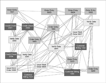
In this example, the Time Traps occur where many products flow through a single step. Such traps can be found only by considering the flow of all the services or products (not just one family, as is done in traditional value stream mapping), as well as variation in demand, and complexity. As you’ll see, complexity-value stream data includes variation in demand, the number of different services performed at an activity, and the flows of all products or services in the process.
Creating a Complexity VSM
Creating a complexity value stream map begins the same way as any other process mapping exercise: you need to create a diagram showing the overall flow of work through the processes that comprise the value stream. As in basic flowcharting, it is essential to have employees who work in the process physically follow the work as it flows from activity to activity instead of relying on opinions about how people think the processes flow. For each process step, you’ll want to collect the following data (including calculations of the average and standard deviation):
- Estimated Cost per Activity: This is the total cost, not the cost-per-offering. (The latter approach is called activity-based costing, ABC, and is quite complicated and time consuming. For the purposes here, the total costs are sufficient because we intend to entirely eliminate any non-value-add activity.)
- Process Time (P/T): Value-add time per unit for each type of service or product.
- Change-over time: Any time that lapses between changing from one service or product to another, including the time it takes someone to get up to full speed after switching tasks (a learning curve cost).
- Queue Time: The time things spend waiting to be processed.
- Takt Time: The demand rate of customers for each type of service or product.
- Complexity: Number of different services or products processed at the activity.
- Uptime: Time worked per day minus breaks and interruptions.
- Defects and rework: Raw counts (and or percentages) of the time and cost needed to “fix” defective services or products at each activity.
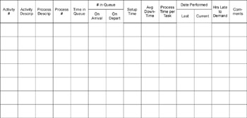
A data form like that shown in Figure 4.7 is helpful in collecting the needed data. It also lists all the offerings being processed at the activity so that the complexity can be quantified as an opportunity for improvement. It includes an estimate of the variation in each average, which is an important driver of queue time.
Figure 4.7: Sample Process Data Collection Form
From this data you are able to compute all the parameters needed to determine which activity (the Time Trap) is causing the longest delay in the process. Moreover, you can determine how much improvement will result from applying a Lean Six Sigma tool or complexity reduction.
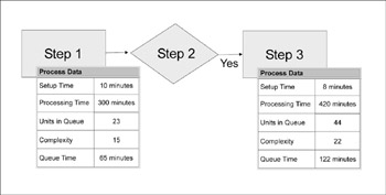
Adding this data to the basic flow map results in a diagram like Figure 4.8. From this activity-level data, you can compute process cycle efficiency, lead time, and variation, which in turn will allow you to prioritize the Time Traps, and calculate cost reduction and revenue growth opportunity, as we’ll discuss below.
Figure 4.8: Completed Value Stream Map (Excerpt)
Collect data long enough to cover all product/service flows
Data collection has a special role in value analysis. As noted above, Time Traps are not the same as capacity constraints—and without data, you won’t be able to tell the difference. So the core work in Time Trap analysis is having someone record and log sample process data daily for a week or more, long enough to encompass all the various complexities of the targeted area. This eliminates the major shortfall of traditional value stream mapping: only looking at the flow of one offering.
Time Trap Analysis Step 2 Converting CVSM data into information
Even once you have all the data needed to generate a CVSM, you’re only part way towards the answers you need. Knowing where a Time Trap is doesn’t tell you why. For example, before Lockheed Martin completed the analysis of their procurement delays (having buyers spend an entire day on one customer before moving on to the next), anything could have been at fault—defects and rework or a host of other problems. In this case it turned out to be primarily Lean-related issues (setup time and learning curves), but they didn’t know that up front.
The data you need to pinpoint likely whys were collected when you did the complexity value stream map. What you need now is a calculation that can convert that data into information. This is harder than it may sound at first because processes are so complicated: my colleagues and I have invested a great deal of time and energy in coming up with a solution, a simplified version of which is described below. The derivation of this formula and its implications are the subjects of three US patents2 and over 100 pages of derivation (but as noted above, you can obtain free complexity value stream software from www.profisight.com).
Finding the Cause of Time Traps: Using the Waste Driver Equation
By now, you should know that the delays (and hence waste) in any process are the result of many factors: setup time, rework, absenteeism, offering complexity, etc. That’s why the equation used to find the source of delays needs to be complicated. Here what it looks like[2]:

|
Where… |
.l=total demand |
S=Setup time |
|
P=Processing Time |
H=Human downtime |
|
|
M=Machine downtime |
SR=setup time to do rework |
|
|
X=defect rate |
The simplified equation at the right is useful to understand the relative power of the reduction of complexity, setup time, quality etc. The complete equation also takes into account the effect of downtime, absenteeism, variation in service times and demand per offering.
Most people use complexity value stream mapping software, which employs the complete equation, to perform these calcutions. This will allow you to play “what if” simulations of the relative impact on lead time, WIP, and non-value-add cost versus improving quality, reducing setup, and/or reducing complexity (e.g., “if we could reduce delays in order taking, what impact would that have on overall lead time? if we could prevent defects in the application form, what impact would that have?). Later in this chapter and in Chapter 5 we will make the connection between large amounts of WIP to non-value-add cost.
There are two primary outputs from this formula, the first of which is the basis for deriving the Waste Driver equation, and the second of which helps to expose the causes of Time Traps (and the resulting WIP):
- Time Delay diagram: a graph that shows how long it takes someone to cycle through all the tasks associated with a given process
- Cost driver analytic: shows the relative impact of quality vs. Lean problems in your value stream
We’ll look at the time delay diagram first (because it helps pinpoint Time Traps) and the cost driver analytic later in this chapter (because it helps uncover the causes of those Time Traps).
Time Delay Diagrams
In any processes where employees can control when they work on any individual item—as opposed to customer-facing operations where they cannot keep customers waiting—there will almost always be work in queue. Employees will generally work on one task or activity they deem high priority, switch to another task, and so on. The formula presented above can be used to generate a time delay diagram (first shown in Figure 2.10 and reprinted here), which captures time spent on each task and on the time in between tasks:
Figure 2.10 [Reproduced here]
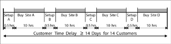
In the Lockheed Martin procurement example discussed previously, the buyers processed all of one site’s requests (regardless of urgency) because it was time consuming to switch between computer systems. This caused delays in serving other customers, lots of WIP, and non-value-add costs. In this process, setup was the activity that had the longest turnover time and is the highest priority Time Trap (the 2nd Law of Lean Six Sigma).
Is queue time wasted time?
A value stream map will almost always reveal that the work spends most of its time sitting around waiting to be worked on (“in queue”). Some people argue that it isn’t costing the company to have work in queue, so why should it be considered non-value-add cost? There are a couple of reasons: First, if work is in queue, that means there is some end-product or service that can’t be delivered—which either causes disruptions internally or delays revenue. Second, generally the work is “in queue” for non-value-add activities—review, rework, wait for approval, etc. So not only is the delay potentially costing you revenue, the things-in-process are waiting for work your customers would not pay for if they had a choice!
By adding together the delay times between activities and sorting the results from largest to smallest, you can generate a Pareto chart of Time Traps (which we’ll show later in this chapter).
Time Trap Analysis Step 3 Linking improvement projects to Time Traps
The focusing work associated with going from CEO strategy to Lean Six Sigma projects is now complete: you’ve identified specific activities (Time Traps) in targeted value streams within a business unit that are most inhibiting shareholder value. The next (and last) step is figuring out what to do about those Time Traps. The two options are:
- You can bring together people who work on the process and ask them to apply their process knowledge to brainstorm ways to eliminate delays from the Time Trap
- You can add more rigor by performing a cost driver analysis
As before, using the more rigorous approach is preferred because it provides the stronger link between the projects ultimately chosen for implementation and the CEO strategy. And everything you need to do for a cost driver analysis was also capture when you created a CVSM.
Cost Driver Analysis
The Waste Driver equation discussed above is simplified because, for example, it uses average demand per product or service when in fact the real formula incorporates actual demand, setup, processing time, and quality per offering type. However, even with this simplified version, some interesting deductions follow from the formula:
- Setup time (S) has a linear impact on WIP, as it appears only in the numerator. Cut the setup in half, and you can cut WIP in half!
- Quality is embedded in several factors, including X = defect rate. Quality has a huge impact because as X gets larger, the equation denominator gets smaller, and WIP explodes.2
- Complexity is in the numerator, as is setup, but as N (the number of different offerings) increases, the activity is driven up the learning curve and S, P, X all increase. Thus complexity of the offering may have more impact on WIP and non-value-add cost than all others combined.
These conclusions are even better illustrated on a graph (Figure 4.9). The various lines depict the impact of setup time and learning curves, and the combined effect of all three improvements.
Figure 4.9: Cost Driver Analysis
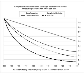
On this chart, the X axis shows the effect of:
- Making significant Lean gains (reducing all setup times and learning curves by 50%), or
- Substantially improving quality (reducing rework from 10% to ~0% (i.e., to 6 s levels), or
- Reducing offering complexity by 50%. You can see the potentially greater impact of quality problems and the even greater impact of complexity on costs.
Because the waste formula incorporates many sources of delays, we can use the cost driver analysis output to help us decide on an improvement approach, which typically will be some combination of:
- It could be primarily a quality problem (requiring basic Six Sigma process improvements)
- It could be a speed problem (requiring Lean techniques)
- It could be the result of product/service complexity (requiring standardization or optimization, which will be discussed in Chp 5)
Figure 4.10 (next page), for example, shows the Pareto chart that was mentioned but not shown above, where the biggest Time Traps are listed in descending order. Once the cost driver analysis is complete, you can add the suggested improvement approaches for addressing each Time Trap. Conclusion: If you dramatially reduce setup time, the WIP and cost of complexity are significantly reduced.
Reality is even more complex
While the equation illustrates the relative importance of complexity, it actually understates its impact on the number of things in process and non-value-add cost. When average demand is replaced by real demand, we often find that 80% of the demand is driven through 20% of the offerings. In the rigorous equations, the non-value-add cost generally increases by more than 25%. The reason is that services or products that are infrequently offered either get in the way of, or have to wait behind, the more frequently worked offerings. Moreover, the variation in these quantities is greater for less frequently worked offerings.The equation on page 123 therefore underestimates the amount of WIP. Hence the results of Queuing theory show that non-value-add cost will be further increased. Math-philes who want to learn the details of this fascinating subject are referred to www.profisight.com where the technical papers, calculation methods, software aids, and patents reside.
[2]This equation is part of a method protected by US Patent 519041. The full derivation of all equations is available from www.profisight.com.
Value Creation Through Acquisitions and Divestitures
In addition to implementing Lean Six Sigma projects targeted at Time Traps, there are other ways for companies to improve shareholder value, such as acquisitions and divestitures. The value analysis procedure outlined above is equally applicable in such situations.
Figure 4.10: Pareto Chart of Time Traps with suggested improvements
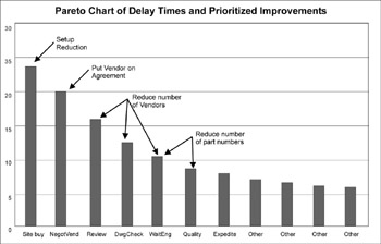
In this case, the Lean Six Sigma tool “setup reduction” was the most important first step in reducing the lead time to place orders (an issue identified as customer Critical-to-Quality). This and the next few steps allowed the removal of several non-value-add steps, reducing process complexity. Reducing the number of vendors and part numbers—used to reduce the complexity of the offering—did not occur until after several Lean-inspired changes were made. (Chapter 5 will have examples where reducing the internal offering complexity through standardization was the highest priority.)
Most corporations will have opportunities to create growth through acquisitions that are synergistic with and strengthen their core business. A survey has shown that most firms who make acquisitions spend 92% of their Due Diligence efforts on legal, accounting, reps and warranties, etc.—non-operational (and largely “service”) issues. In fact when acquisitions fail, 85% of the time it is due to operations and management issues. Yet the service functions that comprise M&A departments seldom receive the benefit of any continuous improvement process.
Because Lean Six Sigma staff learn how to perform value diagnostics, they are an ideal complement to traditional due diligence. For example, my firm helped a client with three operational due diligence efforts. Now, with every proposed acquisition, the Due Diligence team autonomously seeks to understand or document…
- How well the company responds to the Voice of the Customer
- The competitive position in the market
- Value creation and estimates of non-value-add costs
- Present state ROIC and future state (based on estimates of the impact of removing non-value-add work/costs)
- Detailed operational synergies
- An estimate of the owner earnings of the business past and next 3 years
- Management team dynamics
The goal of the effort is to understand the real value of the business versus the intrinsic value of the currency offered (stock or cash) and what risks are attendant. This operational due diligence process has never failed to influence the price offered by the M&A officer and the comfort zone of winning and losing. In one case, operational due diligence caused the intrinsic value to be lowered. The seller refused the offer, only to return six months later to accept the price.
Lean Six Sigma value calculations are also useful in the reverse situation, when a company is considering divestiture. As we saw in Figure 4.4, some operations in a business may hold little hope of generating economic profit. The challenge is to extract the highest value from the market. For example, ITT formerly owned a $4 billion automotive division that was earning 9% operating profit, which would seem to be a good margin. However, because the business was so capital intensive, it could not earn an acceptable Economic Profit. Application of Lean Six Sigma helped increase the profits in the division, which was subsequently sold at a favorable price. This allowed ITT to pay down debt and make a number of strategic synergistic acquisitions that generate positive economic profit in an industry with good aggregate economic profit.
Conclusion
Because of its origins in operational improvement, Lean Six Sigma is often perceived as something that happens only in operations. But the principles of customer-focus, defect- and waste-reduction, improving speed, and reducing complexity are applicable at all levels of the organization… even the executive suite… and all processes.
The development of a strategic view of shareholder value increase is greatly enhanced by the capabilities, methods, and metrics of Lean Six Sigma. When applied to service applications, Lean Six Sigma allows the reduction of overhead costs that add no value from the perspective of the Voice of the Customer. Lean Six Sigma can also materially aid the strategic functions of acquisition and divestiture in any company.
Part I - Using Lean Six Sigma for Strategic Advantage in Service
- The ROI of Lean Six Sigma for Services
- Getting Faster to Get Better Why You Need Both Lean and Six Sigma
- Success Story #1 Lockheed Martin Creating a New Legacy
- Seeing Services Through Your Customers Eyes-Becoming a customer-centered organization
- Success Story #2 Bank One Bigger… Now Better
- Executing Corporate Strategy with Lean Six Sigma
- Success Story #3 Fort Wayne, Indiana From 0 to 60 in nothing flat
- The Value in Conquering Complexity
- Success Story #4 Stanford Hospital and Clinics At the forefront of the quality revolution
Part II - Deploying Lean Six Sigma in Service Organizations
- Phase 1 Readiness Assessment
- Phase 2 Engagement (Creating Pull)
- Phase 3 Mobilization
- Phase 4 Performance and Control
Part III - Improving Services
EAN: 2147483647
Pages: 150
- The Four Keys to Lean Six Sigma
- Key #1: Delight Your Customers with Speed and Quality
- Key #3: Work Together for Maximum Gain
- Making Improvements That Last: An Illustrated Guide to DMAIC and the Lean Six Sigma Toolkit
- The Experience of Making Improvements: What Its Like to Work on Lean Six Sigma Projects
