ToolBar
Most Windows applications have a toolbar. In this section you'll learn how to implement one using the .NET Framework class library. Being that it's so common, you would expect a control and you would be right. The ToolBar control is so easy to implement that I thought I would include a discussion on adding an icon ImageList to a control as well.
Implementing a toolbar requires a control (ToolBar) and a component (ToolBarButton). The basic idea is to place all your ToolBarButtons on your ToolBar and then place the ToolBar on the Form.
The ToolBar control has a few overall toolbar configuration properties. These properties work in conjunction with those of the ToolBarButtons to get the final look and feel of the toolbar. Here are some of the more commonly used ToolBar properties:
-
Appearance is a ToolBarAppearance enum that represents the appearance of the toolbar. The ToolBar supports the appearances Flat and Normal, which has a 3D look. The default is Normal.
-
AutoSize is a Boolean that represents whether the ToolBar automatically adjusts itself based on the size of the button and ToolBar's docking style. The default is true.
-
Buttons is a ToolBarButtonCollection that represents a collection of all ToolBarButtons that make up the ToolBar.
-
ButtonSize is a Size object that represents the size of the ToolBar's buttons. The default is the larger of a width of 24 pixels and a height of 22 pixels, and the size large enough to accommodate the button's image or text.
-
DropDownArrows is a Boolean that represents whether drop-down buttons display a down arrow. If it is true, the user must click the arrow to bring up the drop-down menu associated with the button. When it is false, clicking the button displays the menu. The default is false.
-
ImageList is a collection of bitmaps, icons, and metafiles that will be used to display the images on the ToolBar. The default is null or no image list.
-
ImageSize is a Size object that represents the size of all the ToolBar's images within the ImageList.
-
ShowToolTips is a Boolean that represents whether tool tips are displayed for all buttons when the mouse passes over them. The default is false.
-
TextAlign is a ToolBarTextAlign that represents how the text is aligned on the button on the ToolBar. The text can be aligned either to the Right or Underneath. The default is Underneath.
The ToolBarButton properties focus on configuring the toolbar buttons themselves. As you can see by the properties that follow, the ToolBarButton accepts both text and icons. A text-only toolbar is rather boring (thus the addition a little later of image lists and icons), but mixing text and an icon sometimes looks okay—it really depends on how often you expect a user to see your application and how obvious you can make the functionality of your buttons with just a graphic. Here are some of the more common ToolBarButton properties:
-
DropDownMenu is a Menu object that represents a menu associated with the drop-down button. The default is null or no menu.
-
Enabled is a Boolean that represents whether the button is enabled. The default is true.
-
ImageIndex is a zero-based Int32 index to the ToolBar::ImageList associated with the current ToolBarButton that represents the position of the image for the button. The default is -1 or no image will appear on the button.
-
Parent is a ToolBar object that represents the parent ToolBar for the current button.
-
Pushed is a Boolean that represents whether a toggle-style button is in the pushed state. The default is false.
-
Style is a ToolBarButtonStyle that represents the style of the button. The styles available are DropDownButton, PushButton, Separator, and ToggleButton. The default is PushButton.
-
Text is a String that represents the text displayed on the button.
-
ToolTip is a String that represents the ToolTip associated with the button.
-
Visible is a Boolean that represents whether the button is visible. The default is true.
The code in Listing 10-5 builds a toolbar with two toolbar buttons: a happy face and a sad face. At the right of each is a text label, though most probably your toolbars will not have much text on them. When you click either of the buttons, the label in the body of the form is updated with the ToolTip of the button.
Listing 10-5: An Emotional Toolbar
 |
namespace ToolBarEx { using namespace System; using namespace System::ComponentModel; using namespace System::Collections; using namespace System::Windows::Forms; using namespace System::Data; using namespace System::Drawing; public _gc class Form1 : public System::Windows::Forms::Form { public: Form1(void) //... protected: void Dispose(Boolean disposing) //... private: System::Windows::Forms::ToolBar * toolBar; private: System::Windows::Forms::ToolBarButton * ttbHappy; private: System::Windows::Forms::ToolBarButton * ttbSad; private: System::Windows::Forms::Label * label; private: System::Windows::Forms::ImageList * imageList; private: System::ComponentModel::IContainer * components; void InitializeComponent(void) { this->components = new System::ComponentModel::Container(); System::Resources::ResourceManager * resources = new System::Resources::ResourceManager(_typeof(ToolBarEx::Form1)); this->toolBar = new System::Windows::Forms::ToolBar(); this->ttbHappy = new System::Windows::Forms::ToolBarButton(); this->ttbSad = new System::Windows::Forms::ToolBarButton(); this->imageList = new System::Windows::Forms::ImageList(this->components); this->label = new System::Windows::Forms::Label(); this->SuspendLayout(); // // toolBar // System::Windows::Forms::ToolBarButton* _mcTemp_1[] = new System::Windows::Forms::ToolBarButton*[2]; __mcTemp_1[0] = this->ttbHappy; __mcTemp_1[1] = this->ttbSad; this->toolBar->Buttons->AddRange(_mcTemp_1); this->toolBar->DropDownArrows = true; this->toolBar->ImageList = this->imageList; this->toolBar->Location = System::Drawing::Point(0, 0); this->toolBar->Name = S"toolBar"; this->toolBar->ShowToolTips = true; this->toolBar->Size = System::Drawing::Size(292, 44); this->toolBar->TabIndex = 0; this->toolBar->TextAlign = System::Windows::Forms::ToolBarTextAlign::Right; this->toolBar->ButtonClick += new System::Windows::Forms::ToolBarButtonClickEventHandler(this, toolBar_ButtonClick); // // ttbHappy // this->ttbHappy->ImageIndex = 0; this->ttbHappy->Text = S"Happy"; this->ttbHappy->ToolTipText = S"Happy Face"; // // ttbSad // this->ttbSad->ImageIndex = 1; this->ttbSad->Text = S"Sad"; this->ttbSad->ToolTipText = S"Sad Face"; // // imageList // this->imageList->ImageSize = System::Drawing::Size(32, 32); this->imageList->ImageStream = (dynamic_cast<System::Windows::Forms::ImageListStreamer * > (resources->GetObject(S"imageList.ImageStream"))); this->imageList->TransparentColor = System::Drawing::Color::Transparent; // // label // this->label->Location = System::Drawing::Point(88, 120); this->label->Name = S"label"; this->label->TabIndex = 1; // // Form1 // this->AutoScaleBaseSize = System::Drawing::Size(6, 15); this->ClientSize = System::Drawing::Size(292, 270); this->Controls->Add(this->label); this->Controls->Add(this->toolBar); this->Name = S"Form1"; this->Text = S"An Emotional ToolBar"; this->ResumeLayout(false); } private: System::Void toolBar_ButtonClick(System::Object * sender, System::Windows::Forms::ToolBarButtonClickEventArgs * e) { label->Text = e->Button->ToolTipText; } }; } |
The process for creating a ToolBar within Visual Studio .NET is relatively straightforward, once you know how to do it. The steps are as follows:
-
Drag and drop the ToolBar from the Toolbox to the form within the design view.
-
Within the ToolBar's Properties dialog box, click the ellipses button next to the Buttons property. This will bring up a dialog box similar the one shown in Figure 10-5.
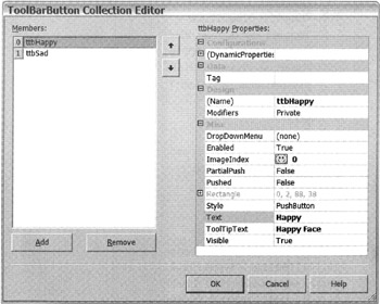
Figure 10-5: The ToolBarButton Collection Editor dialog box -
Click the Add button and then update the ToolBarButton properties as appropriate.
-
Repeat step 3 for all the buttons.
-
Click the OK button.
I could have stuck to the text-only theme of the rest of the chapter, but text-only toolbars simply don't make sense. When is the last time you saw a text-only toolbar? Doesn't happen too often, does it?
The process of creating an ImageList is extremely easy with Visual Studio .NET, though behind the scenes a lot is taking place. The steps to create an ImageList are as follows:
-
Drag and drop an ImageList to the form you want to place images on.
-
Within the ImageList property, click the ellipses button next to the Images property. This will bring up a dialog box similar to the one shown in Figure 10-6.
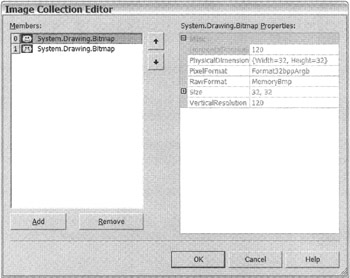
Figure 10-6: The Image Collection Editor dialog box -
Click the Add button and then navigate to and open the image file within the present Open File dialog box.
-
Repeat step 3 for all desired images.
-
Click the OK button.
Once you have added the images to the ImageList, there are three ImageList properties that you may need to configure:
-
ColorDepth is a ColorDepth object that represents the color depth of the icon. The default is 4-bit color so most likely you will want to change this property.
-
ImageSize is a Size object that represents the size of the images contained in the list. The default is 16x 16 but the maximum is 256 256. Note that all images in the list are the same size.
-
TransparentColor is a Color object that represents the transparent color. You probably will be able to ignore this property, as the default is Transparent.
Now that the ImageList is available, it will be selectable from the drop-down list of all controls within the form that use ImageLists. For a control to get access to the ImageList, simply select the ImageList from this drop-down list. In the case of the preceding example, you would select the ImageList within the ToolBar control.
The final step is to update the ImageIndex within the ToolBarButton property (see Figure 10-6) to the desired image.
What happens behind the scenes is not quite as easy, and it's fortunate that you don't have to worry about it. First, the ImageList that you created is added to the Form1.resx file. At the same time, code is also added to the Form1.h file for the ToolBar to access the ImageList and add images to the ToolBarButtons. Next, when the program is compiled, the ImageList is serialized and placed within a resource file. The resource file then gets embedded in the executable assembly.
If you examine the code added to the Form1.h file to get access to the ImageList, you will notice that program actually gets the ImageList from the executable assembly:
System::Resources::ResourceManager * resources = new System::Resources::ResourceManager(_typeof (ToolBarEx::Form1)); //... this->imageList->ImageStream = (dynamic_cast<System::Windows::Forms::ImageListStreamer * > (resources->GetObject(S"imageList.ImageStream")));
You will examine resources and how the preceding code works in much more detail in Chapter 17.
Figure 10-7 shows what ToolBarEx.exe looks like when you execute it.
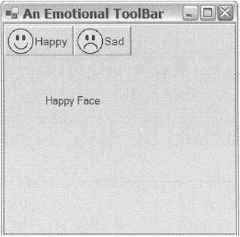
Figure 10-7: The emotional toolbar
EAN: 2147483647
Pages: 169