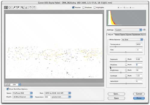
Camera Raw Setup
| The first order of business is to set up Camera Raw to make it work the way you want it to. To do that, you must open a raw image, because until you actually launch Camera Raw you can't do anything with it. Size the Camera Raw window by dragging the handle at the lower-right corner so that you can see a decent-sized image preview, with the controls conveniently placed. If most of your images are verticals, you may prefer a narrower Camera Raw window than if you mostly shoot horizontals. While the screen shots in this book show Camera Raw at its minimum size, I like to size the Camera Raw window to fill the entire screen. PreferencesNext, make sure that Camera Raw's Preferences are set to behave the way you want them to. There's no right or wrong answer to how the Preferences should be set other than that they should produce the behavior you want. You can open Camera Raw's Preferences either by choosing Preferences from the Camera Raw menu or by choosing Camera Raw Preferences in Bridge from the Bridge menu (Mac) or the Edit menu (Windows). Camera Raw's Preferences are pretty straightforward. You only have two settings to worry aboutwhere to save settings and how to apply sharpening.
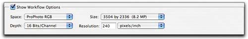
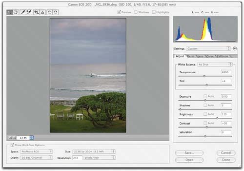
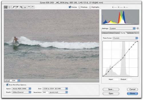
If either preference is set incorrectly, you'll need to redo all of your work once you've set them the way you want, so always make sure that they're set the way you think they areit will save time in the long run. Workflow settingsThe workflow settings govern the color space, bit depth, size, and resolution of the converted image. They're called "workflow settings" because you'll typically change them to produce different types of output. For example, when you want to create JPEGs for online viewing or review, it would make sense to choose sRGB as the color space, 8-bit for bit depth, the smallest size for your camera for size, and 72 ppi for resolution. But to produce images for large prints, you'd probably switch to a wider color space, use 16-bit for bit depth to accommodate further editing in Photoshop, the largest size supported for your camera, and 240 ppi for resolution. The workflow settings are recordable in actions, so once you've learned your way around, you can easily incorporate the workflow settings you want in batch processesI'll discuss building actions for batch processes in Chapter 9, Exploiting Automation. Four different menus make up the workflow settings (see Figure 5-1). Figure 5-1. Camera Raw workflow settings
You can't load and save workflow settings as you can image settings, but you can record workflow settings in actions that you can then use for batch processing. The Size and Resolution settings are sticky per camera model, so always check to make sure that they're set the way you need them. Evaluating ImagesBefore starting to edit a raw image, it's always a good idea to do a quick evaluation. Is the image over- or underexposed? Does the subject matter fall within the camera's dynamic range, or do you have to sacrifice highlights or shadows? Camera Raw offers three features that help you evaluate the raw image and answer these questions.
If an image is too dark or too light, you need to decide whether to fix it by adjusting Exposure or Brightness. If it's too flat, you need to decide whether to increase the Contrast or add snap to the shadows with the Shadows control. Camera Raw's histogram aids these decisions by showing at a glance what's happening at the extreme ends of the tone scale.
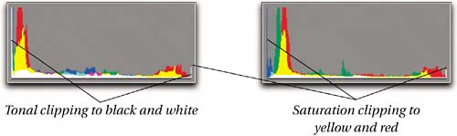
The histogramCamera Raw's histogram is simply a bar chart that shows the relative populations of pixels at different levels. The colors in the histogram show what's going on in each channel. White in the histogram means that this level has pixels from all three channels. Red, green, and blue mean that this level has pixels from these individual channels. Cyan means that this level has pixels from the green and blue channels, magenta means this level has pixels from the red and blue channels, while yellow means that this level has pixels from the red and green channels. (If it's easier, you can think of cyan as "no red," magenta as "no green," and yellow as "no blue.") Spikes at either end of the histogram indicate clippingwhite pixels mean that all three channels are being clipped, and colored ones indicate clipping in one or two channelssee Figure 5-2. Figure 5-2. Clipping and the histogram
The histogram can help you determine whether or not the captured scene fits within the camera's dynamic range. If there's no clipping at either the highlight or the shadow end, it clearly does. If there's clipping at both ends, it probably doesn't. If there's clipping at only one end, you may be able to rescue highlight or shadow detail (if you want to) by adjusting the Exposure slider. The histogram also shows clipping in individual channels. Typically, clipping in one or two channels indicates one of two conditions.
Image previewThe main function of the image preview is, of course, to show you how the converted image will appear. But it also offers a couple of indispensable tricks in the form of the highlight clipping display and shadow clipping display offered by using the Option key in conjunction with the Exposure and Shadows sliders, respectively. Hold down the Option key, and then hold down the mouse button on either slider to see the clipping display. The display updates dynamically as you move the slider, so it's useful for editing as well as evaluation.
While the histogram shows you whether or not clipping is taking place, the clipping displays show you which pixels are being clipped. If you want to evaluate clipping on single pixels, you'll need to zoom in to 100% view. Camera Raw does its best to show you clipping at lower zoom percentages, but it's only completely accurate at 100% or higher zoom levels. RGB readoutThe RGB readout lets you sample the RGB values of the pixel under the cursor. At 100% or lower zoom percentages, the readout always reports the average of a five-by-five sample of screen pixels. At higher zoom levels, the readout is an average of five by five actual image pixels, which is the minimum sample size. The RGB readout helps you distinguish between, for example, a yellow cast and a green one, or a magenta cast and a red one. Sample an area that should be close to neutral. If the blue value is lower than red and green, it's a yellow cast; if the green value is higher than red and blue, it's a green cast. If you need to keep track of important colors in the image, you can use the color sampler tool to place up to nine color samplers, so including the RGB cursor readout you can track 10 sets of color values should you need to. The evaluation processThe first thing I do is simply to look at the image. I set my Camera Raw defaults with Use Auto Adjustments turned offI need to be able to see the effects of bracketing rather than having Camera Raw normalize all my exposures, and I'm neither good enough nor bad enough to benefit from the auto adjustments. At default settings, images usually look flat, and are often too bright or too dark.
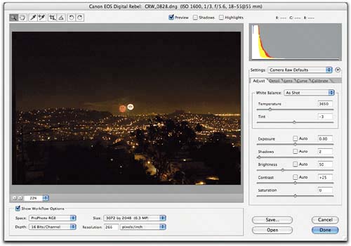
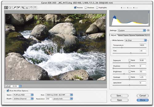
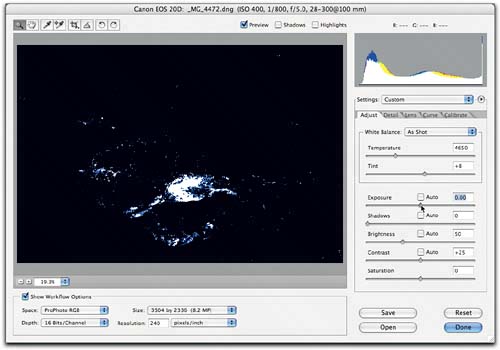
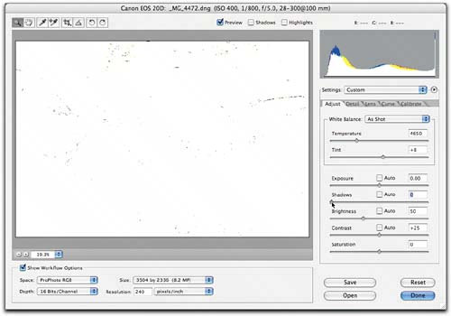
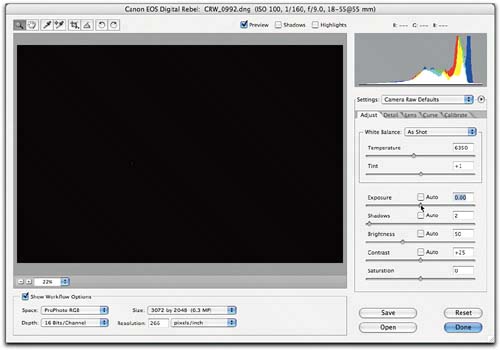
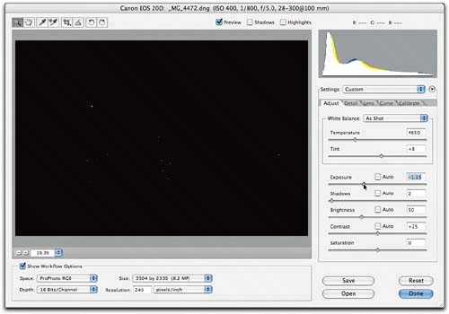
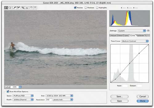
Figure 5-5 shows the evaluation process for several different images, with a variety of exposures. In the next section, I'll edit these images. Figure 5-5. Evaluating imagesThis image is overexposed, as evidenced by the preview and histogram.
The Exposure clipping display confirms the overexposure.
The Shadows clipping display shows that no important shadow detail is being clipped. This image is a good candidate for highlight recovery with the Exposure slider.
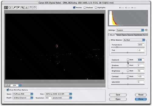
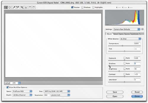
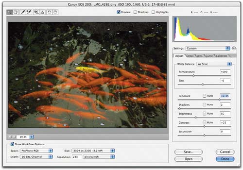
This image is considerably underexposed, as shown by the preview and the histogram.
The Shadows clipping display shows no significant clipping, so I'll brighten the image by increasing the Exposure value, and keep a careful watch on the shadow noise.
This image is flat and a little washed-out, but it's actually a decent exposure that lies comfortably inside the camera's dynamic range. I'll add contrast by reducing the Brightness, raising the Shadows, and increasing the Contrast slider.
This image appears flat and washed-out, but the histogram and clipping displays show that the entire dynamic range was captured without clipping. I'll fix it using the Shadows, Brightness, and Contrast sliders, and fine-tune with the Curve tab.
This image may appear underexposed, but it's doing a reasonable job holding the window highlights, and the Shadows clipping display reveals no important clipping.
I'll start my edits by redistributing the midtones using the Brightness slider.
This image is a bit underexposed, but the main problems are that it's too cold, and the midtones need brightening.
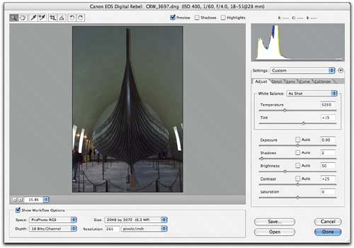
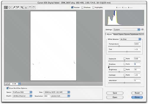
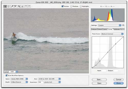
Editing ImagesAt last, we come to the heart of the matterediting raw images! I always start with the controls in the Adjust tab, followed by those in the Curve tab. Then I zoom in and check for noise that needs adjusting with the Detail tab, and for chromatic aberration that needs adjusting in the Lens tab. Normally, I don't make adjustments to individual images in the Calibrate tab, reserving it for fine-tuning the response of specific cameras; but on occasion, it can be a handy creative tool, too. The Adjust tab contains the controls that let you set the overall contrast and color balance for the image, and it's always where I start. A simple rule of thumb that has served me well over the years is to fix the biggest problem first. In the case of raw images, this almost always boils down to adjusting tone or adjusting white balance. If the image needs a major (more than 0.25-stop up or down) exposure adjustment, it's better to do that before setting the white balance, because the exposure adjustment will probably affect the white balance. If the image needs little or no exposure adjustment, I usually set white balance first. Highlight recoveryThe biggest problem in the first image from Figure 5-5 was overexposure, so I'll start by trying to recover the highlights with the Exposure slidersee Figure 5-6. Figure 5-6. Highlight recovery with the Exposure sliderThe Exposure clipping display shows that a -1.15-stop Exposure correction gets rid of all the highlight clipping except for a handful of specular highlights. A larger correction doesn't improve anything, so I commit to Exposure -1.15.
The Exposure correction produces the result shown in Figure 5-7. Figure 5-7. The recovered highlightsThe Exposure tweak recovers a great deal of highlight data, but it inevitably darkens the image.
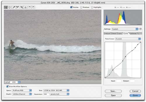
Next, I need to adjust the Brightness and Contrast sliders to counteract the darkening effect of the Exposure adjustment, as shown in Figure 5-8. Figure 5-8. Brightness and Contrast adjustmentsRaising the Brightness value counteracts the darkening effect of the Exposure adjustment. Reducing the Contrast slider preserves the recovered highlight detail.
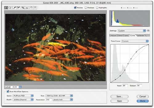
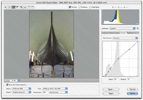
Tip Don't Be Afraid to Reduce Contrast. Many photographers are hesitant to reduce the value of a slider labeled "Contrast," but if you're looking to brighten the dark three-quarter tones without affecting the midtones, reducing the Contrast value will do a better job than increasing the Brightness value. If you're worried about the image going flat, rest assured that you can put plenty of punch back into the shadows using either the Shadows slider or the Curve tab. In the case of this image, leaving the Contrast slider at default, or increasing the Contrast value, would have a much greater effect on the highlights (due to the high Brightness value) than on the darker tones, and would actually undo some of the highlight recovery! At this point, I'm happy with the white balance, so I'll leave it "As Shot." I want to fine-tune the highlight detail with the Curve tab, so rather than adjusting the Shadows slider to punch the blacks, I'll leave it as is and handle the shadows, as well as the highlights, in the Curve tab, as shown in Figure 5-9. Figure 5-9. Fine-tuning with the Curve tabMost of the points on this curve are anchor points to prevent the other curve points from bending the curve in undesirable ways. This curve adds detail to the highlights, makes a slight tweak to the midtone contrast, and darkens the shadows.
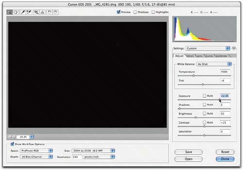
Zooming in to 200% view, I check for noise and lens problems, but find none. I'm done, so I click the Done button to make Camera Raw write the settings into the DNG file, and update Bridge's thumbnail and preview. (If I'd used a proprietary raw filein this case, a Canon .CR2the settings would be written to the Camera Raw database or to a sidecar .xmp file, depending on Camera Raw's Preferences setting.) All I'll have to do to this image in Photoshop is sharpening, which I do with my sharpening tool of choice, PhotoKit Sharpenerit offers finer control than Camera Raw's Sharpness slider, as do virtually all Photoshop sharpening techniques. UnderexposureMoving on to the second image from Figure 5-5, we'll look next at handling a significantly underexposed image. Underexposed images often present bigger problems than do overexposed ones, because they contain much less dataremember, half of the captured data lies in the brightest f-stopso you need to stretch the data that is there to cover the entire tonal range. That means you need to watch out for posterization and shadow noise. As with the previous example, I start with the Exposure slidersee Figure 5-10. Figure 5-10. Checking Exposure clippingThe Exposure clipping display shows a tiny clipped highlight at +2.35, so I set the Exposure to that value, producing the result shown below right.
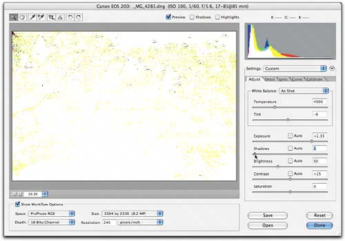
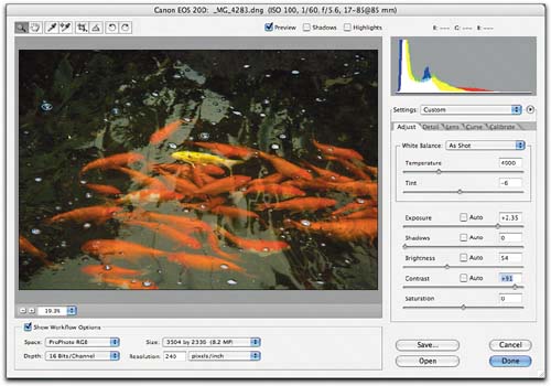
Next, I check for Shadow clipping, and adjust the Shadows, Brightness, and Contrast sliderssee Figure 5-11. Figure 5-11. Shadows, Brightness, and Contrast adjustmentsAt my customized default setting of 2, the Shadows clipping display shows a fair bit of clipping, so I back it off to zero. Then I increase Brightness to 60, and Contrast to 91, to produce the result shown below right.2
The reason for backing off the Shadows slider isn't to preserve any important shadow detailthere really isn't anybut to avoid any posterization that may end up biting me where I'd rather not be bitten! The relatively large Contrast move darkens the shadows and compresses the highlights. I kept the Brightness move quite small, because the further Brightness is set from its default, the more asymmetrical the effect of Contrast on shadows versus highlights. I'll tweak contrast with the Curve tab nextsee Figure 5-12. Figure 5-12. Curve tab adjustmentsThe curve adjustment adds a little extra contrast, with more control than the Contrast slider can provide.
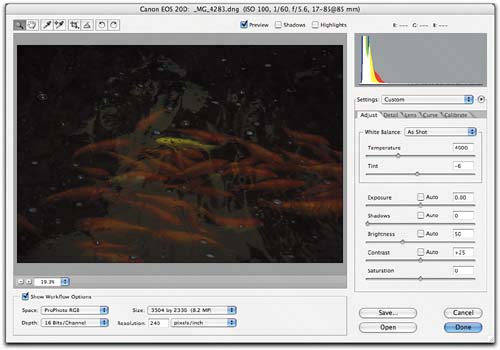
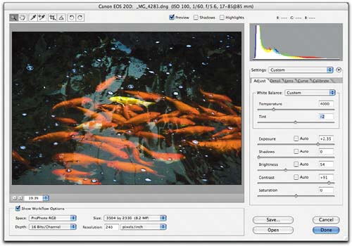
The Curve tab tweaks complete the tonal adjustments, but I'll revisit the Adjust tab to tweak the white balancethe image is a little yellow-green. In many cases, I'll adjust an image's white balance before making tonal adjustments, but on an image like this, the huge tonal moves may alter the white balance, which is why I left it until now. See Figure 5-13. Figure 5-13. White balance adjustmentsBringing down the Temperature slider from 4900 to 4000 Kelvins and raising the Tint slider value from -6 to -2 eliminates the yellow cast from the reflections, and makes the yellow fish pop.
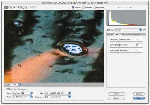
With tone and white balance adjustments complete, it's time to zoom in and inspect the image for noise and chromatic aberration. I don't expect to find the latterthe image was shot at the longest focal length of the lensbut I'll be surprised if I don't find some noise extending well up into the tonal range since the image was more than two stops underexposed. So I'll switch to the Detail tab, and zoom in to 200% viewsee Figure 5-14. Figure 5-14. Noise reduction with the Detail tab
The default Color Noise Reduction value of 25 does a good job of eliminating color noise, but there's a good deal of luminosity noise in the midtones, requiring an unusually high Luminance Smoothing value of 30.
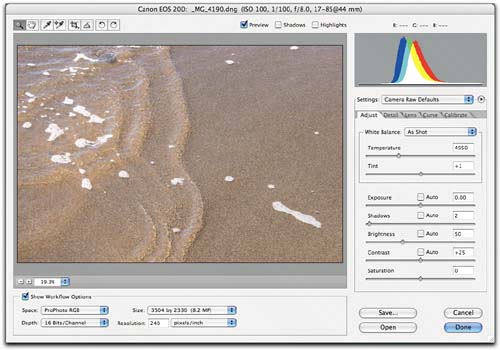
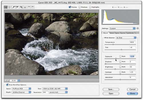
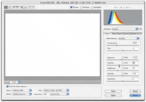
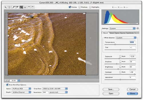
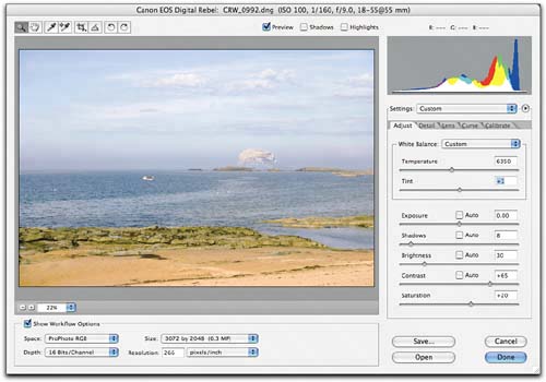
On any given camera, while color noise may extend higher into the tonal range at higher ISO speeds, the required correction tends to remain constant, so it makes sense to incorporate that correction in your Camera Raw Default Settings for that camera. Luminance noise, however, is a different story. With optimal exposures, Luminance noise tracks fairly well with ISO speedfaster speeds need more correction. But as this image demonstrates, it's also very much related to exposureunderexposedimages are always noisier than optimally exposed onesso the setting for Luminance Smoothing is image-dependent. Tone mappingYou may never have to deal with exposure errors as large as the ones in the two previous examples, but even if your exposures are always spot-on, you'll almost certainly need to tweak the tone mapping in a good many images. Figure 5-15 shows a case in point. Figure 5-15. Initial evaluationThe Exposure clipping display shows slight highlight clipping when Exposure is set to zero.This image has plenty of headroom at the shadow end, so it's quite safe to reduce the Exposure and eliminate the clipping.
If the image exceeded the dynamic range of the sensor, I'd accept the minor highlight clipping, but in this case there's plenty of room at the shadow end, so I reduce the Exposure value to -0.30 to eliminate the clipping, producing the result shown in Figure 5-16. Figure 5-16. The Exposure adjustmentThe -0.30 Exposure adjustment ensures that I'll hold the highlights, but does little to improve the image's appearance.
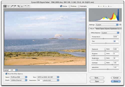
The next step is to care of the shadow endcurrently, there's nothing even close to a true black in the image. So I'll check the Shadows clipping display and set a more useful Shadows valuesee Figure 5-17. Figure 5-17. Shadows clipping displayThe Shadows clipping display shows that I can run the Shadows slider up to around 38 before any clipping occurs.
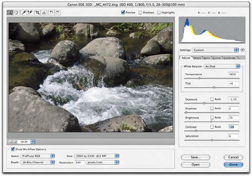
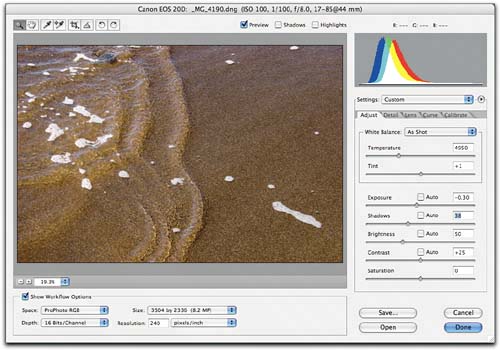
Adjusting the Shadows slider produces the image shown in Figure 5-18. Now the image covers the full dynamic range, so I can concentrate on distributing the tonal information. Figure 5-18. The Shadows adjustmentThe Shadows tweak helps considerably, but the image is now dark, and it's still flat.
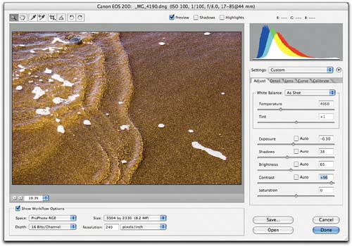
Two quick moves with the Brightness and Contrast sliders produce the much-improved result shown in Figure 5-19. Figure 5-19. Brightness and Contrast adjustmentsRaising Brightness to 65 and Contrast to 96 produces this much-improved result.
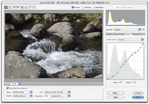
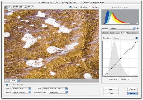
I'll use the Curve tab to add snap to the highlightssee Figure 5-20. Figure 5-20. Highlight adjustment with the Curve tabZooming in far enough to see detail, I tweak the highlight end of the curve to add a little contrast in the highlights.
The image is very close to being done. It shows no noise or lens problems, but I decide that a small white balance tweak would help, and that the image would really work better with a 4x5 aspect ratio, so I tweak the white balance and apply the preset 4 to 5 crop (by choosing it from the crop tool's drop-down menu and dragging) to produce the result shown in Figure 5-21. Figure 5-21. The final imageRaising the Temperature value from 4950 to 5250 warms the image slightly. I apply a 4 by 5 crop to tighten up the composition.
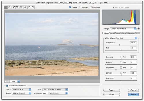
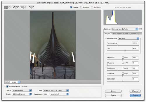
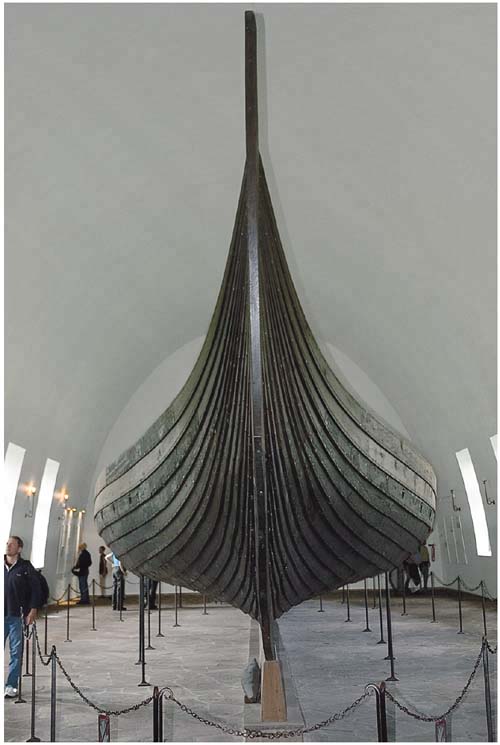
A glance back to Figure 5-15 shows that this image has come a long way, but it may seem that it took a lot of work to get there. In fact, the entire editing process took less than two minutes to accomplish. (I wasn't explaining my reasoning process as I went along.) So I'll offer a similar example, this time concentrating on the physical rather than the mental process. Figure 5-22 shows a well-exposed image that's nevertheless washed-out and flat. Figure 5-22. A flat imageThe image at my default settings for the camera
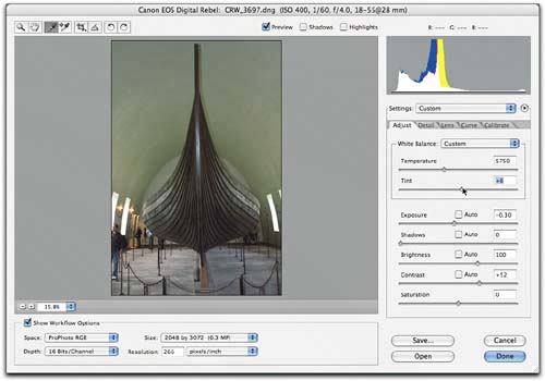
Option-clicking the Exposure slider shows a scant handful of pixels on the prow of the boat that are clipped in only the red channel. The Exposure value is fine, so I proceed with the quick moves shown in Figure 5-23. Figure 5-23. A series of quick moves,I Option-drag the Shadows slider until I see a hint of clipping.
I press Tab until the Brightness field is active, then press Shift-down arrow twice to set Brightness at 30. I press Tab once more to highlight the Contrast field, then press Shift-up arrow to set Contrast to 65.
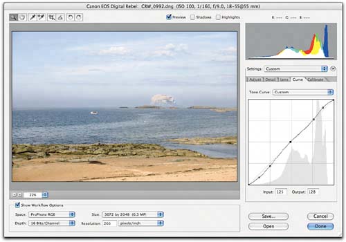
I press Command-Option-4 to go to the Curve tab. I Command-click on the top of the distant rock to set a curve point, and nudge it with the up arrow key. I press Control-Shift- Tab twice to activate the midtone curve point, and press left arrow three times.
I press Command-Option-1 to return to the Adjust tab, press Tab until the Saturation field is highlighted, then press Shift-up arrow twice to set Saturation to +20.
The image is a little green, so I press Tab until the Tint field is highlighted, then I press the up arrow key four times to set the Tint to +5.
I check for any noise or lens problems at 200% view, but find none, so I press Return to click the Done button. Camera Raw writes the settings into the DNG file and updates Bridge's thumbnail and preview. Camera Raw navigationNo one, myself included, knows all the keyboard shortcuts built into Photoshop! But I strongly recommend absorbing the following small set of shortcuts for Camera Raw.
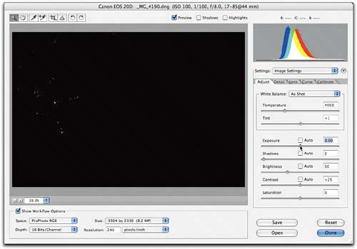
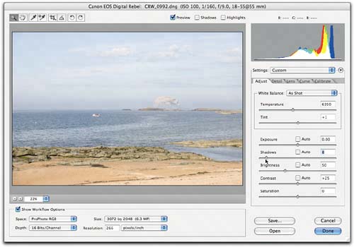
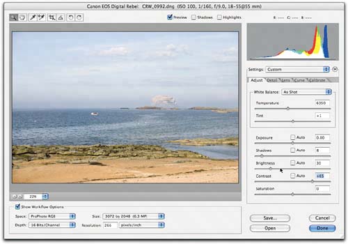
If you master these shortcuts, you'll find that you can power your way through images very quickly indeed. I'll attempt to demonstrate that in the next example. Fast Camera RawFigure 5-24 shows a series of adjustments done in the Adjust tab and the Curve tab. The top image shows the Camera Raw Default settings, the middle one shows the adjustments made in the Adjust tab, and the bottom one shows the adjustments made in the Curve tab. Let's look at these in detail. Figure 5-24. Fast adjustmentsThe image at Camera Raw defaults is dark and muddy, but the windows are actually blown out, so the image needs a reduction in Exposure and a big increase in Brightness.
I reduced the Exposure slightly to put detail back in the edges of the windows, increased Brightness to brighten the midtones, then I added Contrast. Finally, I adjusted the Temperature and Tint values.
The curve adjustments brightened the midtones a little further, and improved the shadow contrast.
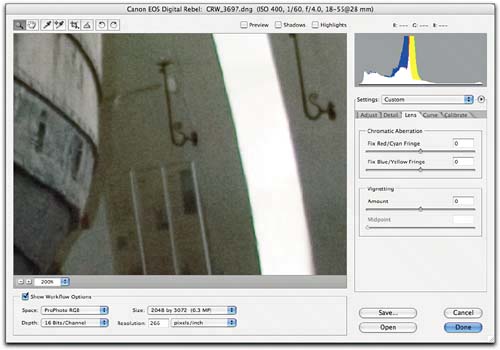
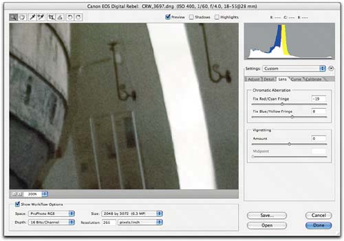
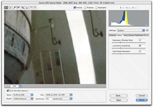
The first adjustment, as usual, was to the Exposure sliderI set it to -0.30 to avoid the windows being featureless white blobs by Option-dragging the slider until the clipping went away. Then I pressed Tab to highlight the Brightness field, and Shift-up arrow five times to set the Brightness to 100. I pressed Tab again to highlight the Contrast field, then Shift-up arrow twice to set the Contrast to 55. This proved a little too harsh in the highlights, so I pressed the down arrow key three times, examining the image after each keystroke, until I got a Contrast value of 52, which I accepted. Next, I adjusted the Temperature slider, pressing Shift-Tab six times to move the focus from the Contrast field to the Temperature field. Shift-up arrow changed the Temperature value from 5250 ot 5750. This left the floor looking distinctly magenta, so I pressed Tab once to get to the Tint field, then pressed Shift-down arrow to reduce the Tint to 5. This looked very slightly green, so I pressed the up arrow key once to increase the Tint value to 6. This completed the Adjust tab work, so I pressed Command-Option-4 to move to the Curve tab. I started out by brightening the midtones. I pressed Control-Tab four times to highlight the midtone curve point, then Shift-left arrow followed by left arrow five times until I arrived at the adjustment I wanted. To improve the contrast in the dark areas on the bottom of the longship, I pressed Control-Shift-Tab to move to the next lower point on the curve, and nudged it to the left with the left arrow. Then I pressed Control-Shift-Tab again to get to the next lower point on the curve, and nudged it down with the down arrow. This bent the curve too sharply, flattening the contrast, so I added a point by clicking in-between the two points I'd just adjusted. Then I dragged it with the mouse until the curve segment between the two adjacent points was almost straight. (My hand was on the mouse rather than the keyboard, so dragging the curve point made sense.) The complete set of adjustments took less than a minute, and probably 10 seconds of that time was spent looking at the results of the tweaks and evaluating them before proceeding to the next adjustment. Checking detailsNext, I checked for lens and noise problems, and found both. Zooming in to 200% view (by pressing Command-+), I noticed some slight chromatic aberration along the high-contrast edges of the window, along with the luminosity noise I expected from an ISO 400 capture. Figure 5-25 shows the required adjustments. Figure 5-25. Checking detailsAt 200% view, both chromatic aberration and luminosity noise are clearly visible.
Using the tips on the previous page, I adjusted the chromatic aberration sliders to remove the color fringing.
I raised the Luminance Smoothing value to eliminate the noise.
Camera Raw's Lens tab offers extraordinarily effective corrections for chromatic aberration. They work by resizing the red and blue channels in relation to the green in an intelligent manner. Photoshop's new Lens Correction filter does a reasonably good job on converted images, but it's a little slower, and it's harder to use because it lacks the convenience features mentioned in the two tips that follow this paragraph. Mainly, though, the best place to fix the chromatic aberration is in the raw file, because then every image you derive from the raw has already had the correction applied. I switched to the lens tab by pressing Command-Option-3, and made the chromatic aberration adjustments by Option-dragging the sliderssee the second tip, below. Tip Turn Off Sharpening. To see the color fringes clearly and to judge the optimum settings for the sliders, turn off any sharpening you've applied with the Sharpness slider in the Detail tab. The color fringes are usually most prominent along high-contrast edges, and sharpening applies a halo to such edges that makes it harder to see exactly where the color fringes start and end. Tip Option-Drag the Sliders to Hide the Other Channel. Red/cyan fringing is usually much easier to see than blue/yellow fringing, but chromatic aberration is almost always a combination of both. Holding down the Option key as you drag either of the Chromatic Aberration sliders hides the channel that isn't being affected by the adjustment, making it much easier to apply exactly the right amount of correction to both channels. Switching to the Detail tab, I raised the Luminance Smoothing value until the luminance noise had all but disappeared. All noise-reduction technologies present a trade-off between noise reduction and sharpness, and Camera Raw's is no exception. In this case, setting Luminance Smoothing to 25 reduced the noise to the point where it won't appear in prints. To eliminate it completely would have required a considerably higher setting that would likely have done as much harm as good. Camera Raw limitationsYou can accomplish a great deal in Camera Raw, but one thing you cannot do is selective correction, which this image needsthe mixed-lighting situation leaves the ceiling with an unappetizing yellow-green cast, and there's simply no way to fix that in Camera Raw without breaking something else in the image. I also prefer to sharpen images in Photoshop rather than using Camera Raw's relatively unsophisticated Sharpness adjustment. Figure 5-26 shows the final image, selectively corrected and sharpened in Photoshop. Figure 5-26. Checking detailsThe final image after selective color correction and sharpening in Photoshop. I created a rough selection of the vaulted ceiling using Color Range, refined it by painting in QuickMask mode, then I used Hue/Saturation to desaturate the selected area. I used the history brush to put back some color around the light fixturesmasking them would have taken much longerthen I used PhotoKit Sharpener to sharpen the image.
Exposure or Brightness? With the extended range of correction offered by the Brightness control, it may seem that Exposure and Brightness can produce similar results. It's true that either one can produce a superficially similar appearance, but they differ in the way they affect the highlight data, and in the way they influence the behavior of the Contrast slider and the Curve tab. Figure 5-27 shows a dark image that needs some brightening. Figure 5-27. A dark imageThis image is dark and muddy, so it needs some brightening.
But I shot the image a few minutes after sunset. I want to preserve the subdued light, and convey the impression of the fading day. Camera Raw's Use Auto Adjustment doesn't helpsee Figure 5-28. Figure 5-28. Auto Adjustment
Figure 5-29 shows two superficially similar renderings of the image, but when you look closely you'll see that the slight contrast adjustment (raising Contrast from its default value of 25 to 30) has a very different effect on the two different renderings. Figure 5-29. Exposure or Brightness?These two renderings may appear superficially similar, but they differ in an important way. The upper image has the Exposure set to +1.95 and the Brightness set to zero, so the data-rich highlight region gets stretched, while the midtone is darkened, forcing more bits into the shadows.
The lower image has Exposure set to 0.00 and Brightness set to 110, so the highlight region gets compressed, while the relatively data-poor shadow region gets stretched up into the midtones.
The big difference between the two renderings is the way they distribute the captured bits. In the image adjusted by increasing Exposure and reducing Brightness, the Exposure adjustment stretches all the captured bits to cover a wider tonal range, then the Brightness adjustment darkens the midpoint and forces more bits into the shadows while stretching the highlight range. This is a Good Thing, because as I explained in "Exposure and Linear Capture" back in Chapter 1, Digital Camera Raw, digital cameras capture a great deal more information in the highlights than they do in the shadows. In the version with Exposure at 0 and Brightness at 110, the opposite is happeningthe data-rich highlight region is compressed, and the data-poor shadow region is stretched, by the Brightness adjustment. As you'll shortly see, this is a Bad Thing! When I attempt to fine-tune the contrast using the Curve tab, the differences become more obvious. Figure 5-30 shows the highlight detail from both versions with the Curve tab at its default Medium Contrast setting. Figure 5-30. Highlight detail at Curve tab default settingThe image adjusted with the Exposure slider, top, has a lot more detail in the waves than the image adjusted with the Brightness slider, bottom.
When I attempt to pull detail out of the highlights, I find that it's very easy to do so with the image that had the Exposure adjustment applied, and more or less impossible to do so with the one that had no Exposure adjustment but relied on the Brightness slider instead. The Exposure-adjusted image lets me easily shape the highlights with a couple of curve points, while in the other rendering, the best I can achieve is to change the overall shade of graythe highlight compression induced by the Brightness move makes it impossible to pull out highlight detail without wrecking the overall contrast. See Figure 5-31. Figure 5-31. Highlight detail after curve adjustmentI can extract much more highlight detail from the image adjusted with the Exposure slider, top, than I can from the image adjusted with the Brightness slider, bottom.
In the shadow range, the difference is, if anything, even greater. The image with the Exposure adjustment shows much more detail, simply because it has more levels describing the shadow values than does the image without the Exposure adjustment. The curve adjustments shown in Figure 5-32 are quite gentle on both images, but on the one without the Exposure adjustment I'm fighting posterization, and there's almost no detail in the grass, on the tree trunks, or in the leaves. Figure 5-33, on the next page, shows the images after the curve adjustments. The image with the Exposure adjustment has much better overall contrast and detail. Figure 5-32. Shadow detail after curve adjustmentThe image adjusted with the Exposure slider, top, preserves detail without pushing the contrast too far. The bottom image, without the Exposure adjustment, is on the verge of posterization.
Figure 5-33. The final imagesThe final renderings of the image. The top image, which has the Exposure adjustment, shows better contrast and detail throughout the tonal range.
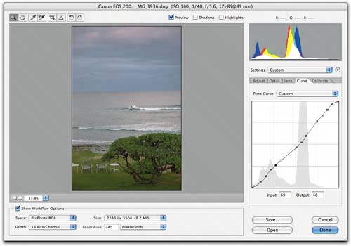
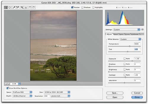
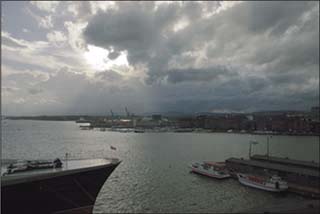
Many different combinations of Camera Raw adjustments can produce superficially similar results, but one combination invariably works better than the others. If this example is puzzling to you, revisit "Exposure and Linear Capture" in Chapter 1, Digital Camera Raw, and "Image Editing and Image Degradation" in Chapter 2, How Camera Raw Works. The approach that works best is always the one that makes most efficient use of the bits. If you make a practice of thinking about how you're moving the bits around as you operate the Exposure, Shadows, Brightness, and Contrast sliders, and you stretch and squeeze the right tonal ranges, you'll be able to accomplish fine-tuning with the Curve tab very easily. Creative white balanceOften, we want an accurate white balance. In a studio shoot, probably the easiest way to get one is to include a Macbeth ColorChecker in the first shot, click-balance on the second-to-lightest gray patch, then apply that white balance to all the other images in the shootsee "Synchronize Settings," later in this chapter, for an easy way to do so. But the white balance controls are also wonderful creative tools. Photoshop's PhotoFilter adjustment lets you approximate the effect of different white balances on converted images, but Camera Raw's white balance tools produce more natural-looking results with less image degradation, so if you want to take liberties with the white balance, Camera Raw is by far the best place to do so. The image we've been looking at for the past several pages is a good candidate for some radical white balance reinterpretation. The Temperature slider provides the basic adjustment for warming and cooling, while the Tint control operates on the color axis that's perpendicular to the Temperature slider. You can think of Temperature as approximately blue to yellow-orange, and Tint as approximately green to magenta-red. Figure 5-34 shows the image after a significant warming adjustment. Figure 5-34. A warming adjustmentA radical warming adjustment. This edit entails not only raising the Temperature value from the As Shot value of 6800 to 9500, but also increasing the Tint value from 6 to 30.
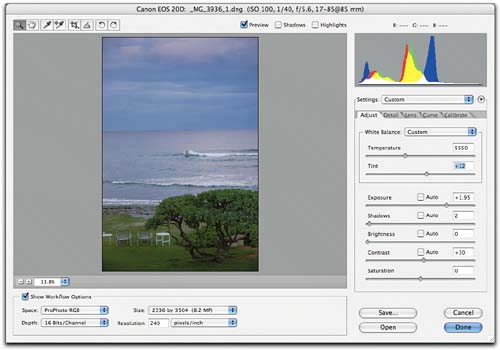
The same image lends itself equally well to a very different, much colder interpretation that appears equally plausible but tells a very different storysee Figure 5-35. Figure 5-35. A cooling adjustmentA radical cooling adjustment. I changed the Temperature value from the As Shot value of 6800 to 5500, and increased the Tint value from 6 to 12.
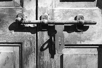
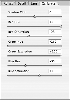
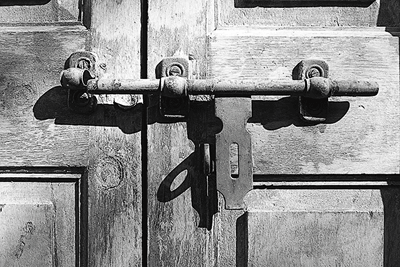
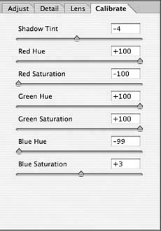
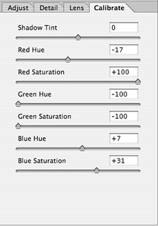
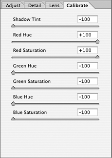
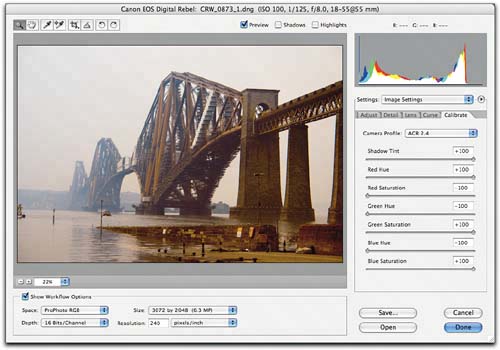
The Calibrate tabI've already covered the intended use of the Calibrate tab controlsfine-tuning the color rendering for a specific camerain detail earlier in this chapter. Here I'll look at some creative uses of the controls. One non-obvious use of the Calibrate tab, which I must credit to Adobe evangelist, raconteur, bon vivant and demomeister Russell Brown, is in color-to-grayscale conversions. Start by reducing the Saturation control in the Adjust tab to -100, and then move to the Calibrate tab. The Hue sliders control the panchromatic response, while the Saturation controls let you modulate the strength of the Hue controls' effect. Figure 5-36 shows examples of different black and white conversions, along with the settings that produced them. Note that the ideal values will vary from camera to camera, but the ones shown here should get you in the ballpark. Figure 5-36. Color to grayscale©2002 Jeff Schewe Color image Starting with the color image, reduce the Saturation slider in the Adjust tab to zero to get a grayscale image, and then adjust the Calibrate controls to vary the panchromatic response.
©2002 Jeff Schewe
Orange contrast
©2002 Jeff Schewe
Deep red contrast
©2002 Jeff Schewe
Green contrast
©2002 Jeff Schewe
Blue contrast
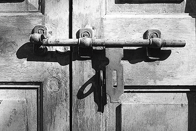
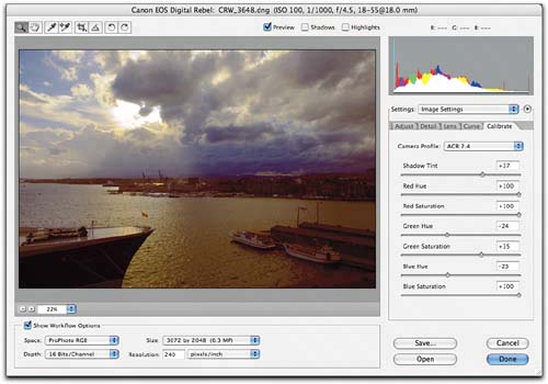
These conversions approximate the use of traditional color filters, but you aren't limited to this approachyou can create intermediate settings or make image-specific conversions. If you're going for natural color, it's probably a bad idea to use the Calibrate controls as selective color correction toolsselective color corrections are better left for Photoshopbut you can certainly use them for creative color effects like the one in Figure 5-37! Figure 5-37. Creative Calibrate
The image before (above) and after some radical Calibrate tab adjustments (right).
The image before (above) and after some radical Calibrate tab adjustments (right).
|


EAN: N/A
Pages: 112