Setting Object Properties Using the Properties Window
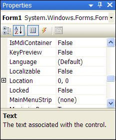
| When developing the interface of a project, you'll spend a lot of time viewing and setting object properties using the Properties window (see Figure 2.8). The Properties window contains four items:
Figure 2.8. Use the Properties window to view and change properties of forms and controls. Selecting an Object and Viewing Its PropertiesThe drop-down list at the top of the Properties window contains the name of the form with which you're currently working and all the objects on the form (the form's controls). To view the properties of a control, select it from the drop-down list or find it on the form and click it. Remember that you must have the pointer item selected in the toolbox to click an object to select it. Viewing and Changing PropertiesThe first two buttons in the Properties window (Categorized and Alphabetic) enable you to select the format in which you view properties. When you select the Alphabetic buttonthe selected object's properties appear in the Properties window in alphabetical order. When you click the Categorized button, all the selected object's properties are listed by category. The Appearance category, for example, contains properties such as BackColor and BorderStyle. When working with properties, select the view you're most comfortable with and feel free to switch back and forth between the views. The Properties pane of the Properties window is used to view and set the properties of a selected object. You can set a property in one of the following ways:
By the Way Many properties can be changed by more than one of these methods. For example, color properties supply a drop-down list of colors, but you can enter a numeric color value as well. To better understand how changing properties works, follow these steps:
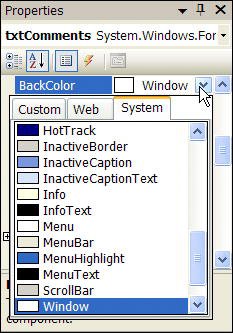
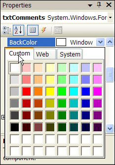
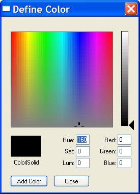
By simply clicking a property in the Properties window, you can easily tell the type of input the property requires. Working with Color PropertiesProperties that deal with colors are unique in the way in which they accept values, yet all color-related properties behave the same way. In Visual C# 2005, colors are expressed as a set of three numbers, each number having a value from 0 to 255. A given set of numbers represents the red, green, and blue (RGB) components of a color, respectively. The value 0,255,0, for example, represents pure green, whereas the value 0,0,0 represents black and 255,255,255 represents white. In some cases, colors have also been given specific names that you can use. (See Hour 18 for more information on the specifics of working with color.) A color rectangle is displayed for each color property in the Properties window; this color is the selected color for the property. Text is displayed next to the colored rectangle. This text is either the name of a color or a set of RGB values that define the color. Clicking in a color property causes a drop-down arrow to appear, but the drop-down you get by clicking the arrow isn't a typical drop-down list. Figure 2.10 shows what the drop-down list for a color property looks like. Figure 2.10. The color drop-down list enables you to select from three sets of colors. The color drop-down list is composed of three tabs: Custom, Web, and System. Most color properties use a system color by default. Hour 5, "Building FormsThe Basics," goes into great detail on system colors. I only want to mention here that system colors vary from computer to computer; they're determined by the user when he right-clicks the desktop and chooses Properties from the desktop's shortcut menu. Use a system color when you want a color to be one of the user's selected system colors. When a color property is set to a system color, the name of the system color appears in the property sheet. The Custom tab, shown in Figure 2.11, is used to specify a specific color, regardless of the user's system color settings; changes to system colors have no effect on the property. The most common colors appear on the palette of the Custom tab, but you can specify any color you want. Figure 2.11. The Custom tab of the color drop-down list lets you specify any color imaginable. By the Way The colors visible in the various palettes are limited by the number of colors that can be produced by your video card. If your video card doesn't support enough colors, some will appear dithered, which means they will appear as dots of colors rather than as a true, solid color. Keep this in mind as you develop your applications: What looks good on your computer might turn to mush if a user's display isn't as capable. The bottom two rows in the Custom color palette are used to mix your own colors. To assign a color to an empty color slot, right-click a slot in one of the two rows to access the Define Color dialog box (see Figure 2.12). Use the controls on the Define Color dialog box to create the color you want, and then click Add Color to add the color to the color palette in the slot you selected. In addition, the custom color is automatically assigned to the current property. Figure 2.12. The Define Color dialog box enables you to create your own colors. The Web tab is used in web applications to pick from a list of browser-safe colors. You can, however, use these colors even if you're not creating a web application. Viewing Property DescriptionsIt's not always immediately apparent just exactly what a property is or doesespecially for new users of Visual C#. The Description section at the bottom of the Properties window shows a simple description of the selected property. To view a description, click a property or value area of a property. For a more complete description of a property, click it once to select it and then press F1 to display Help about the property. You can hide or show the Description section of the Properties window at any time by right-clicking anywhere within the Properties window (other than in the value column or on the title bar) to display the Properties window shortcut menu and choosing Description. Each time you do this, you toggle the Description section between visible and hidden. To change the size of the Description box, click and drag the border between it and the Properties pane. |

EAN: 2147483647
Pages: 248