MATHEMATICS OF COLOR IN COMPUTER GRAPHICS
|
|
Now you might think it strange that I've added a section on the mathematics of color, but it's important to understand how color is represented in computer graphics so that you can manipulate it effectively. A color is usually represented in the graphics pipeline by a three-element vector representing the intensities of the red, green, and blue components, or for a more complex object, by a four-element vector containing an additional value called the alpha component that represents the opacity of the color. Thus we can talk about rgb or rgba colors and mean a color that's made up of either three or four elements. There are many different ways of representing the intensity of a particular color element, but shaders use floating point values in the range [0,1].
I should also point out that when dealing with colors, particularly with some of the subtleties that we'll be getting into with shaders, you should understand the gamut of the target device. This is the nasty edge where our beautiful clean mathematics meets the real world. The gamut of a device is simply the physical range of colors the device can display.
Typically, a high-quality display has a better gamut than a cheap one. A good printer has a gamut that's significantly different from a monitor's. One of the issues that I had to deal with in generating the images for this book was getting the printed materials looking like the displayed images generated by the shaders. If you're interested in getting some color images for printing, you'll have to do some manipulation on the color values to make the printed image look like the one your program generated on the screen. You should also be aware that there are color spaces other than the RGB color space shaders use. HSV (hue, saturation, and value) is one that's typically used by printers, for example.
One of the gods of 3D graphics is a guy named Mike Abrash. He's the guy to blame for sending many of us on the road to 3D graphics as a career. In one of his early magazine articles [ABRASH 1992], he tells a story about going from a 256-color palette to hardware that supported 256 levels for each RGB color–16 million colors! What would we do with all those colors? He goes on to tell of a story by Sheldon Linker at the eighth Annual Computer Graphics Show on how the folks at the Jet Propulsion Lab back in the 1970s had a printer that could print over 50 million distinct colors. As a test, they printed out words on paper where the background color was only one color index from the word's color. To their surprise, it was easy to discern the words—the human eye is very sensitive to color graduations and edge detection. The JPL team then did the same tests on color monitors and discovered that only about 16 million colors could be distinguished. It seems that the eye is (not too surprisingly) better at perceiving detail from reflected light (such as from a printed page) than from emissive light (such as from a CRT). The moral is that the eye is a lot more perceptive than you might think. Twentyfour bits of color really isn't that much range, particularly if you are performing multiple passes. Round-off error can and will show up if you aren't careful!
An example of the various gamuts is shown in Figure 2.9. The CIE diagrams are the traditional way of displaying perceived color space, which, you should note, is very different from the linear color space used by today's graphics hardware. The colored area is the gamut of the human eye. The gamuts of printers and monitors are subsets of this gamut.
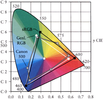
Figure 2.9: The 1931 CIE diagram shows the gamuts of the eye and the lesser gamuts of output devices.
Multiplying Color Values
Since shaders allow you to do your own color calculations, you need to be aware of how to treat colors. The calculation of the color of a particular pixel depends, for example, on the surface's material properties that you've programmed in, the color of the ambient light, the color of any light shining on the surface (perhaps of the angle of the light to the surface), the angle of the surface to the viewpoint, the color of any fog or other scattering material that's between the surface and the viewpoint, etc. No matter how you are calculating the color of the pixel, it all comes down to color calculations, at least on current hardware, on rgb or rgba vectors where the individual color elements are limited to the [0,1] range. Operations on colors are done piecewise–that is, even though we represent colors as rgb vectors, they aren't really vectors in the mathematical sense. Vector multiplication is different from the operation we perform to multiply colors. We'll use the ⊗ symbol to indicate such piecewise multiplication.
Colors are multiplied to describe the interaction between a surface and a light source. The colors of each are multiplied together to estimate the reflected light color–this is the color of the light that this particular light reflects off this surface. The problem with the standard rgb model is just that we're simulating the entire visible spectrum by three colors with a limited range.
Let's start with a simple example of using reflected colors. In the section on lighting, we'll discover how to calculate the intensity of a light source, but for now, just assume that we've calculated the intensity of a light, and it's a value called id. This intensity of our light is represented by, say, a nice lime green color. Thus
![]()
Let's say we shine this light on a nice magenta surface given by cs.
![]()
So, to calculate the color contribution of this surface from this particular light, we perform a piecewise multiplication of the color values.
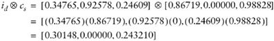
This gives us the dark plum color shown in Figure 2.10. You should note that since the surface has no green component, that no matter what value we used for the light color, there would never be any green component from the resulting calculation. Thus a pure green light would provide no contribution to the intensity of a surface if that surface contained a zero value for its green intensity. Thus it's possible to illuminate a surface with a bright light and get little or no illumination from that light. You should also note that using anything other than a full-bright white light [1,1,1] will involve multiplication of values less than one, which means that using a single light source will only illuminate a surface to a maximum intensity of its color value, never more. This same problem also happens when a texture is modulated by a surface color. The color of the surface will be multiplied by the colors in the texture. If the surface color is anything other than full white, the texture will become darker. Multiple texture passes can make a surface very dark very quickly.
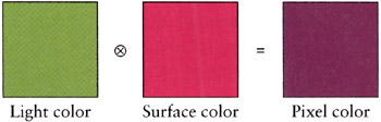
Figure 2.10: Multiplying (modulating) color values results in a color equal to or less than (darker) the original two.
Given that using a colored light in a scene makes the scene darker, how do you make the scene brighter? There are a few ways of doing this. Given that color multiplication will never result in a brighter color, it's offset a bit since we end up summing all the light contributions together, which, as we'll see in the next section, brings with it its own problems. But if you're just interested in increasing the brightness on one particular light or texture, one way is to use the API to artificially brighten the source–this is typically done with texture preprocessing. Or, you can artificially brighten the source, be it a light or a texture, by adjusting the values after you modulate them.
Dealing with Saturated Colors
On the other hand, what if we have too much contribution to a color? While the colors of lights are modulated by the color of the surface, each light source that illuminates the surface is added to the final color. All these colors are summed up to calculate the final color. Let's look at such a problem. We'll start with summing the reflected colors off a surface from two lights. The first light is an orange color and has rgb values [1.0,0.49,0.0], and the second light is a nice light green with rgb values [0.0,1.0,0.49].
Summing these two colors yields [1.0, 1.49, 0.49], which we can't display because of the values larger than one (Figure 2.11).
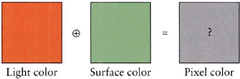
Figure 2.11: Adding colors can result in colors that are outside the displayable range.
So, what can be done when color values exceed the range that the hardware can display? It turns out that there are three common approaches [HALL 1990]. Clamping the color values is implemented in hardware, so for shaders, it's the default, and it just means that we clamp any values outside the [0,1] range. Unfortunately, this results in a shift in the color. The second most common approach is to scale the colors by the largest component. This maintains the color but reduces the overall intensity of the color. The third is to try to maintain the intensity of the color by shifting (or clipping) the color toward pure bright white by reducing the colors that are too bright while increasing the other colors and maintaining the overall intensity. Since we can't see what the actual color for Figure 2.11 is, let's see what color each of these methods yields (Figure 2.12).
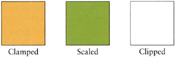
Figure 2.12: The results of three strategies for dealing with the same oversaturated color.
As you can see, we get three very different results. In terms of perceived color, the scaled is probably the closest though it's darker than the actual color values. If we weren't interested in the color but more in terms of saturation, then the clipped color is closer. Finally, the clamped value is what we get by default, and as you can see, the green component is biased down so that we lose a good sense of the "greenness" of the color we were trying to create.
Clamping Color Values
Now it's perfectly fine to end up with an oversaturated color and pass this result along to the graphics engine. What happens in the pipeline is an implicit clamping of the color values. Any value that's greater than one is clamped to one, and any less than zero are clamped to zero. So this has the benefit of requiring no effort on the part of the shader writer. Though this may make the rendering engine happy, it probably isn't what you want. Intuitively, you'd think that shining orange and green lights on a white surface would yield a strong green result. But letting the hardware clamp eradicates any predominant effect from the green light.
Clamping is fast, but it tends to lose fidelity in the scene, particularly in areas where you would want and expect subtle changes as the light intensities interact, but end up with those interactions getting eradicated because the differences are all getting clamped out by the graphics hardware.
Scaling Color Values by Intensity
Instead of clamping, you might want to scale the color by dividing by the largest color value, thus scaling the rgb values into the [0,1] range. In the example from Figure 2.11, the final color values were [1.0,1.49,0.49] meaning our largest color value was the green, at 1.49. Using this approach, we divide each element by 1.49, yielding a scaled color of [0.671,1.0,0.329]. Thus any values greater than one are scaled to one, while any other values are also scaled by the same amount. This maintains the hue and saturation but loses the intensity. This might not be acceptable because the contrast with other colors is lost, since contrast perception is nonlinear and we're applying a linear scaling. By looking at the three results, you can see there's a large difference between the resulting colors.
Shifting Color Values to Maintain Saturation
One problem with clamping or scaling colors is that they get darker (lose saturation). An alternative to scaling is to maintain saturation by shifting color values. This technique is called clipping, and it's a bit more complicated than color scaling or clamping. The idea is to create a gray-scale vector that runs along the black-white axis of the color cube that's got the same brightness as the original color and then to draw a ray at right angles to this vector that intersects (i.e., clips) the original color's vector. You need to check to make sure that the grayscale vector is itself within the [0,1] range and then to check the sign of the ray elements to see if the color elements need to be increased or decreased. As you are probably wondering, this can result in adding in a color value that wasn't in the original color, but this is a direct result of wanting to make sure that the overall brightness is the same as the original color. And, of course, everything goes to hell in a handbasket if you've got overly bright colors, which leave you with decisions about how to nudge the gray-scale vector into the [0,1] range, since that means you can't achieve the input color's saturation value. Then we're back to clamping or scaling again.
ColorSpace Tool
The ColorSpace tool is a handy tool that you can use to interactively add two colors together to see the effects of the various strategies for handling oversaturated colors. You simply use the sliders to select the rgb color values for each color. The four displays in Figure 2.13 show the composite, unmodified values of the resulting color (with no color square) and the clamped, clipped, and scaled color rgb values along with a color square illustrating those color values.
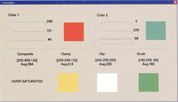
Figure 2.13: The ColorSpace tool interface.
Negative Colors and Darklights
You may be wondering, if I can have color values greater than the range in intermediate calculations, can I have negative values? Yes, you can! They are called "darklights" after their description in an article [GLASSNER 1992] in Graphic Gems III. Since this is all just math until we pass it back to the graphics hardware, we can pretty much do anything we want, which is pretty much the idea behind programmable shaders! Darklights are nothing more than lights in which one or more of the color values are negative. Thus instead of contributing to the overall lighting in a scene, you can specify a light that diminishes the overall lighting in a scene. Darklights are used to eliminate bright areas when you're happy with all the lighting in your scene except for an overly bright area. Darklights can also be used to affect a scene if you want to filter out a specific rgb color. If you wanted to get a night vision effect, you could use a darklight with negative red and blue values, for example, which would just leave the green channel.
|
|
EAN: 2147483647
Pages: 104