Flash MX Component Customization
| Based on our preliminary look at components we decided to use components where possible in the jukebox. We weighed the pros and cons of using components versus creating our own UI elements and decided that components would be the best option for developing the jukebox. Creating our own UI elements would take far too much time and wouldn't beat the functionality and features that come with the components. The components that we'll be using include the Ticker, IconButton, PushButton and ListBox. As is, the appearance of the components is comprised of varying tones of gray using the _sans font. The appearance is generic yet subtle enough to add as is to some sites but for our purposes we decided that we'd like the components to blend in as much as possible with the rest of site rather than mixing the gray tones with our primarily corporate blue tones and the _sans font with our Verdana font. Since these changes are related to UI, I asked Kevin to look into customizing the colors and text so that they are consistent with the rest of the Web site.
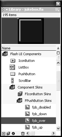
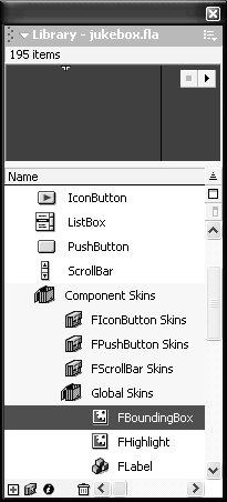
CustomizingBased on Kevin's research into component re-skinning, the components in the jukebox will be modified through the Library. In the Library, each component has a skins folder located in the Library folder Flash UI Components > Component Skins (Figure I-3.1). Figure I-3.1. PushButton Skins in the Library.
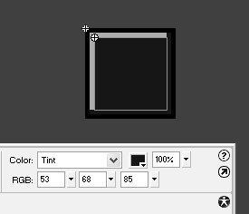
For example, the PushButton skins are in the FPushButton Skins folder. Each symbol in the folder is named for the state of the button. Modifications to a particular state can be done in symbol-edit mode. Once in symbol-edit mode, the component state is broken down into symbols, which can be modified using the Property inspector. Within each component state are a number of different edges, borders, and face colors that can be modified (Figure I-3.2). Figure I-3.2. PushButton skin in symbol-edit mode.
In addition to modifying the colors of the individual component skins, we need to change the background color and font. Both of the symbols to make these changes can be found in Library > Flash UI Components > Component Skins > Global Skins (Figure I-3.3). Figure I-3.3. The Global Skins folder in the Library contains symbols to change the background color and font.
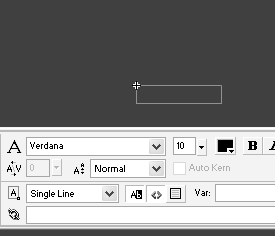
To modify the background color of all components, the FBoundingBox symbol needs to be updated with the new color. Changing the color of this symbol involves the same procedure as modifying the other component skins. To change the font, the FLabel symbol can be modified in symbol-edit mode (Figure I-3.4). Figure I-3.4. FLabel in symbol-edit mode.
For the jukebox, we'll change the font to Verdana and set the size to 10. We'll also want the font to be white and bold, but unfortunately, making these two changes to FLabel aren't reflected throughout the components. Therefore, we'll have to make the changes globally using ActionScript: globalStyleFormat.textColor=0xffffff; globalStyleFormat.textBold=true; globalStyleFormat.applyChanges(); Based on our experience with Flash MX components, we've discovered that, as with the rest of ActionScript, there are always a few ways of doing things. For the jukebox components, we had to play around a little with the font settings to get everything right. In the end, we'll use a combination of changes through the Library and using ActionScript. |
EAN: 2147483647
Pages: 114