Section 16.2. CSS for DHTML
16.2. CSS for DHTMLFor DHTML content developers, the most important feature of CSS is the ability to use ordinary CSS style attributes to specify the visibility, size, and precise position of individual elements of a document. Other CSS styles allow you to specify stacking order, transparency, clipping region, margins, padding, borders, and colors. In order to do DHTML programming, it is important to understand how these style attributes work. They are summarized in Table 16-2 and documented in more detail in the sections that follow.
16.2.1. The Key to DHTML: Absolute PositioningThe CSS position attribute specifies the type of positioning applied to an element. Here are the four possible values for this attribute:
Once you have set the position attribute of an element to something other than static, you can specify the position of that element with some combination of the left, top, right, and bottom attributes. The most common positioning technique is to specify the left and top attributes, which specify the distance from the left edge of the containing element (usually the document itself) to the left edge of the element and the distance from the top edge of the container to the top edge of the element. For example, to place an element 100 pixels from the left and 100 pixels from the top of the document, you can specify CSS styles in a style attribute as follows: <div style="position: absolute; left: 100px; top: 100px;"> The containing element relative to which a dynamic element is positioned is not necessarily the same as the containing element within which the element is defined in the document source. Since dynamic elements are not part of normal element flow, their positions are not specified relative to the static container element within which they are defined. Most dynamic elements are positioned relative to the document (the <body> tag) itself. The exception is dynamic elements that are defined within other dynamic elements. In this case, the nested dynamic element is positioned relative to its nearest dynamic ancestor. If you wish to position an element relative to a container that is part of the normal document flow, use position:relative for the container and specify a top and left position of 0px. This makes the container dynamically positioned but leaves it at its normal place in the document flow. Any absolutely positioned children are then positioned relative to the container position. Although it is most common to specify the position of the upper-left corner of an element with left and top, you can also use right and bottom to specify the position of the bottom and right edges of an element relative to the bottom and right edges of the containing element. For example, to position an element so that its bottom-right corner is at the bottom-right of the document (assuming it is not nested within another dynamic element), use the following styles: position: absolute; right: 0px; bottom: 0px; To position an element so that its top edge is 10 pixels from the top of the window and its right edge is 10 pixels from the right of the window, and so that it does not scroll with the document, you might use these styles: position: fixed; right: 10px; top: 10px; In addition to the position of elements, CSS allows you to specify their size. This is most commonly done by providing values for the width and height style attributes. For example, the following HTML creates an absolutely positioned element with no content. Its width, height, and background-color attributes make it appear as a small blue square. <div style="position: absolute; top: 10px; left: 10px; width: 10px; height: 10px; background-color: blue"> </div> Another way to specify the width of an element is to specify a value for both the left and right attributes. Similarly, you can specify the height of an element by specifying both top and bottom. If you specify a value for left, right, and width, however, the width attribute overrides the right attribute; if the height of an element is over-constrained, height takes priority over bottom. Bear in mind that it is not necessary to specify the size of every dynamic element. Some elements, such as images, have an intrinsic size. Furthermore, for dynamic elements that contain text or other flowed content, it is often sufficient to specify the desired width of the element and allow the height to be determined automatically by the layout of the element's content. In the previous positioning examples, values for the position and size attributes were specified with the suffix "px," which stands for pixels. The CSS standard allows measurements to be done in a number of other units, including inches ("in"), centimeters ("cm"), points ("pt"), and ems ("em"a measure of the line height for the current font). Pixel units are most commonly used with DHTML programming. Note that the CSS standard requires a unit to be specified. Some browsers may assume pixels if you omit the unit specification, but you should not rely on this behavior. Instead of specifying absolute positions and sizes using the units shown above, CSS also allows you to specify the position and size of an element as a percentage of the size of the containing element. For example, the following HTML creates an empty element with a black border that is half as wide and half as high as the containing element (or the browser window) and centered within that element: <div style="position: absolute; left: 25%; top: 25%; width: 50%; height: 50%; border: 2px solid black"> </div> 16.2.2. CSS Positioning Example: Shadowed TextThe CSS2 specification included a text-shadow attribute to produce sophisticated drop-shadow effects under text. This attribute was implemented by the Safari browser, but not by any other major browser vendor, and it has been removed from CSS2.1, to be reconsidered for CSS3. You can achieve shadowed text effects even without text-shadow, however. You simply need to use CSS positioning and be willing to repeat desired text: once for the actual text and once (or more than once) for the shadow or shadows. The following code produces the output shown in Figure 16-2: <div style="font: bold 32pt sans-serif;"> <!--shadows look best on big text--> <!-- Shadowed text must be relatively positioned, so we can offset the --> <!-- the shadows from its normal position in the flow --> <span style="position:relative;"> <!-- These are 3 shadows of different colors, using absolute positioning --> <!-- to offset them different amounts from the regular text --> <span style="position:absolute; top:5px; left:5px; color: #ccc">Shadow</SPAN> <span style="position:absolute; top:3px; left:3px; color: #888">Shadow</SPAN> <span style="position:absolute; top:1px; left:1px; color: #444">Shadow</SPAN> <!-- And this is the text that casts the shadow. We use relative --> <!-- positioning so that it appears on top of its shadows --> <span style="position:relative">Shadow</SPAN> </SPAN> | No Shadow <!-- For comparison, here is some nonshadowed text --> </div> Figure 16-2. Shadowed text with CSS positioning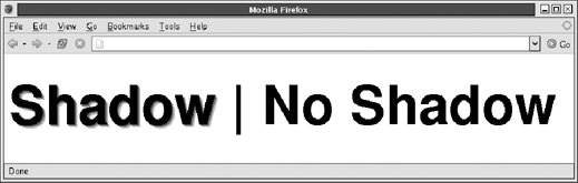 Adding CSS shadows manually as was done here is cumbersome and violates the principle of separating content from presentation. You can fix this problem with a bit of unobtrusive JavaScript. Example 16-2 is a JavaScript module named Shadows.js. It defines a function Shadows.addAll() that scans the document (or a portion of the document) for tags that have a shadow attribute. When it finds such a tag, it parses the value of the shadow attribute and uses DOM scripting to add shadows to the text contained within the tag. As an example, you can use this module to produce the output shown in Figure 16-2: <head><script src="/books/2/427/1/html/2/Shadows.js"></script></head> <!-- include module --> <body onload="Shadows.addAll();"> <!-- add shadows on load --> <div style="font: bold 32pt sans-serif;"> <!-- use big fonts --> <!-- Note the shadow attribute here --> <span shadow='5px 5px #ccc 3px 3px #888 1px 1px #444'>Shadow</span> | No Shadow </div> The code for the Shadows.js module follows. Note that, for the most part, this is a DOM scripting example that happens to use CSS in an interesting way. With the exception of one line, this example does not script CSS itself: it simply sets CSS attributes on the document elements it creates. Later in the chapter I'll detail more techniques for CSS scripting. Example 16-2. Creating shadowed text with unobtrusive JavaScript
16.2.3. Querying Element Position and SizeNow that you know how to set the position and size of HTML elements using CSS, the question naturally arises: how can you query the position and size of an element? You might want to use CSS positioning to center a DHTML pop-up "window" on top of some other HTML element. In order to do this, you need to know the position and size of that element. In modern browsers, the offsetLeft and offsetTop properties of an element return the X and Y coordinates of the element. Similarly, the offsetWidth and offsetHeight properties return the width and height. These properties are read-only and return pixel values as numbers (not as CSS strings with "px" units appended). They mirror the CSS left, top, width, and height attributes but are not part of the CSS standard. For that matter, they are not part of any standard: they were introduced by Microsoft in IE 4 and have been adopted by other browser vendors. Unfortunately, the offsetLeft and offsetTop properties are not usually sufficient by themselves. These properties specify the X and Y coordinates of an element relative to some other element. That other element is the value of the offsetParent property. For positioned elements, the offsetParent is typically the <body> tag or the <html> tag (which has an offsetParent of null) or a positioned ancestor of the positioned element. For nonpositioned elements, different browsers handle the offsetParent differently. Table rows are positioned relative to the containing table in IE, for example. In general, therefore, the portable way to determine the position of an element is to loop through the offsetParent references, accumulating offsets. Here is code you might use: // Get the X coordinate of the element e. function getX(e) { var x = 0; // Start with 0 while(e) { // Start at element e x += e.offsetLeft; // Add in the offset e = e.offsetParent; // And move up to the offsetParent } return x; // Return the total offsetLeft } A getY() function can be written by simply substituting offsetTop for offsetLeft. Note that in the previous code, the values returned by functions such as getX() are in document coordinates. They are compatible with CSS coordinates and are not affected by the position of the browser scrollbars. In Chapter 17 you'll learn that the coordinates associated with mouse events are window coordinates, and must be added to the scrollbar positions to convert to document coordinates. There is one shortcoming of the getX() method shown above. You'll see later that the CSS overflow attribute can be used to create scrolled regions within a document. When an element appears within such a scrolled region, its offset values do not take the scrollbar positions of that region into account. If you use this overflow attribute in your web pages, you may need to use a more sophisticated offset computation function, like this one: function getY(element) { var y = 0; for(var e = element; e; e = e.offsetParent) // Iterate the offsetParents y += e.offsetTop; // Add up offsetTop values // Now loop up through the ancestors of the element, looking for // any that have scrollTop set. Subtract these scrolling values from // the total offset. However, we must be sure to stop the loop before // we reach document.body, or we'll take document scrolling into account // and end up converting our offset to window coordinates. for(e = element.parentNode; e && e != document.body; e = e.parentNode) if (e.scrollTop) y -= e.scrollTop; // subtract scrollbar values // This is the Y coordinate with document-internal scrolling accounted for. return y; } 16.2.4. The Third Dimension: z-indexYou've seen that the left, top, right, and bottom attributes can specify the X and Y coordinates of an element within the two-dimensional plane of the containing element. The z-index attribute defines a kind of third dimension: it allows you to specify the stacking order of elements and indicate which of two or more overlapping elements is drawn on top of the others. The z-index attribute is an integer. The default value is zero, but you may specify positive or negative values. When two or more elements overlap, they are drawn in order from lowest to highest z-index; the element with the highest z-index appears on top of all the others. If overlapping elements have the same z-index, they are drawn in the order in which they appear in the document so that the last overlapping element appears on top. Note that z-index stacking applies only to sibling elements (i.e., elements that are children of the same container). If two elements that are not siblings overlap, setting their individual z-index attributes does not allow you to specify which one is on top. Instead, you must specify the z-index attribute for the two sibling containers of the two overlapping elements. Nonpositioned elements (i.e., elements with default position:static positioning) are always laid out in a way that prevents overlaps, so the z-index attribute does not apply to them. Nevertheless, they have a default z-index of zero, which means that positioned elements with a positive z-index appear on top of the normal document flow and positioned elements with a negative z-index appear beneath the normal document flow. Note, finally, that some browsers do not honor the z-index attribute when it is applied to <iframe> tags, and you may find that inline frames float on top of other elements regardless of the specified stacking order. You may have the same problem with other "windowed" elements such as <select> menus. Old browsers may display all form-control elements on top of absolutely positioned elements, regardless of z-index settings. 16.2.5. Element Display and VisibilityTwo CSS attributes affect the visibility of a document element: visibility and display. The visibility attribute is simple: when the attribute is set to the value hidden, the element is not shown; when it is set to the value visible, the element is shown. The display attribute is more general and is used to specify the type of display an item receives. It specifies whether an element is a block element, an inline element, a list item, and so on. When display is set to none, however, the affected element is not displayed, or even laid out, at all. The difference between the visibility and display style attributes has to do with their effect on elements that are not dynamically positioned. For an element that appears in the normal layout flow (with the position attribute set to static or relative), setting visibility to hidden makes the element invisible but reserves space for it in the document layout. Such an element can be repeatedly hidden and shown without changing the document layout. If an element's display attribute is set to none, however, no space is allocated for it in the document layout; elements on either side of it close up as if it were not there. (visibility and display have equivalent effects when used with absolute- or fixed-position elements because these elements are never part of the document layout anyway.) You'll typically use the visibility attribute when you are working with dynamically positioned elements. The display attribute is useful, for example, when creating expanding and collapsing outlines. Note that it doesn't make much sense to use visibility or display to make an element invisible unless you are going to use JavaScript to dynamically set these attributes and make the element visible at some point! I'll show you how to do this later in the chapter. 16.2.6. The CSS Box Model and Positioning DetailsCSS allows you to specify margins, borders, and padding for any element, and this complicates CSS positioning because you have to know how the width, height, top, and left attributes are calculated in the presence of borders and spacing. The CSS box model provides a precise specification. It is detailed in the paragraphs that follow and illustrated in Figure 16-3. Figure 16-3. The CSS box model: borders, padding, and positioning attributes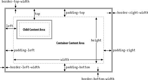 Let's begin with a discussion of the border, margin, and padding styles. The border of an element is a rectangle drawn around (or partially around) it. CSS attributes allow you to specify the style, color, and thickness of the border: border: solid black 1px; /* border is drawn with a solid, black 1-pixel line */ border: 3px dotted red; /* border is drawn in 3-pixel red dots */ It is possible to specify the border width, style, and color using individual CSS attributes, and it is also possible to specify the border for individual sides of an element. To draw a line beneath an element, for example, simply specify its border-bottom attribute. It is even possible to specify the width, style, or color of a single side of an element. Figure 16-3 illustrates this: it includes border attributes such as border-top-width and border-left-width. The margin and padding attributes both specify blank space around an element. The difference (an important one) is that margin specifies space outside the border, between the border and adjacent elements, and padding specifies space inside the border, between the border and the element content. A margin provides visual space between a (possibly bordered) element and its neighbors in the normal document flow. Padding keeps element content visually separated from its border. If an element has no border, padding is typically not necessary. If an element is dynamically positioned, it is not part of the normal document flow, and its margins are irrelevant. (This is why no CSS margin attributes are illustrated in Figure 16-3.) You can specify the margin and padding of an element with the margin and padding attributes: margin: 5px; padding: 5px; You can also specify margins and paddings for individual sides of an element: margin-left: 25px; padding-bottom: 5px; Or you can specify margin and padding values for all four edges of an element with the margin and padding attributes. You specify the top values first and then proceed clockwise: top, right, bottom, and left. For example, the following code shows two equivalent ways to set different padding values for each of the four sides of an element: padding: 1px 2px 3px 4px; /* The previous line is equivalent to the following lines. */ padding-top: 1px; padding-right: 2px; padding-bottom: 3px; padding-left: 4px; The margin attribute works in the same way. With this understanding of margins, borders, and padding, let's now look at some important details about CSS positioning attributes. First, width and height specify the size of an element's content area only; they do not include any additional space required for the element's padding, border, or margins. To determine the full on-screen size of an element with a border, you must add the left and right padding and left and right border widths to the element width, and you must add the top and bottom padding and top and bottom border widths to the element's height. Since width and height specify the element content area only, you might think that left and top (and right and bottom) would be measured relative to the content area of the containing element. This is not the case, though. The CSS standard specifies that these values are measured relative to the outside edge of the containing element's padding (which is the same as the inside edge of the element's border). This is all illustrated in Figure 16-3, but let's consider an example to make this clearer. Suppose you've created a dynamically positioned container element that has 10 pixels of padding all the way around its content area and a 5-pixel border all the way around the padding. Now suppose you dynamically position a child element inside this container. If you set the left attribute of the child to "0 px", you'll discover that the child is positioned with its left edge right up against the inner edge of the container's border. With this setting, the child overlaps the container's padding, which presumably was supposed to remain empty (since that is the purpose of padding). If you want to position the child element in the upper left corner of the container's content area, you should set both the left and top attributes to "10px". 16.2.6.1. Internet Explorer quirksNow that you understand that width and height specify the size of an element's content area only and that the left, top, right, and bottom attributes are measured relative to the containing element's padding, there is one more detail you must be aware of: Internet Explorer versions 4 through 5.5 for Windows (but not IE 5 for the Mac) implement the width and height attributes incorrectly and include an element's border and padding (but not its margins). For example, if you set the width of an element to 100 pixels and place a 10-pixel padding and a 5-pixel border on the left and right, the content area of the element ends up being only 70 pixels wide in these buggy versions of Internet Explorer. In IE 6, the CSS position and size attributes work correctly when the browser is in standards mode and incorrectly (but compatibly with earlier versions) when the browser is in compatibility mode. Standards mode, and hence correct implementation of the CSS box model, is triggered by the presence of a <!DOCTYPE> tag at the start of the document, declaring that the document adheres to the HTML 4.0 (or later) standard or some version of the XHTML standards. For example, any of the following three HTML document type declarations cause IE 6 to display documents in standards mode: <!DOCTYPE HTML PUBLIC "-//W3C//DTD HTML 4.0//EN"> <!DOCTYPE HTML PUBLIC "-//W3C//DTD HTML 4.0 Strict//EN"> <!DOCTYPE HTML PUBLIC "-//W3C//DTD HTML 4.0 Transitional//EN" "http://www.w3.org/TR/html4/loose.dtd"> This distinction between standards mode and compatibility mode (sometimes called "quirks mode") is not unique to Internet Explorer. Other browsers also rely on <!DOCTYPE> declarations to trigger strict standards compliance and, in the absence of this declaration, default to backward-compatible behavior. Only IE has such an egregious compatibility problem, however. 16.2.7. Color, Transparency, and TranslucencyThe discussion of borders included examples that specified border colors using the English names of common colors such as "red" and "black." The more general syntax for specifying colors in CSS is to use hexadecimal digits to specify the red, green, and blue components of a color. You can use either one or two digits per component. For example: #000000 /* black */ #fff /* white */ #f00 /* bright red */ #404080 /* dark unsaturated blue */ #ccc /* light gray */ In addition to specifying border colors using this color notation, you can also specify text color with the CSS color attribute. And you can specify the background color of any element with the background-color attribute. CSS allows you to specify the exact position, size, background color, and border color of elements; this gives you a rudimentary graphics capability for drawing rectangles and (when the height and width are reduced) horizontal and vertical lines. I'll return to this topic in Chapter 22, which covers how to use CSS positioning and DOM scripting to draw bar charts. In addition to the background-color attribute, you can also specify images to be used as the background of an element. The background-image attribute specifies the image to use, and the background-attachment, background-position, and background-repeat attributes specify further details about how this image is drawn. The shortcut attribute background allows you to specify these attributes together. You can use these background image attributes to create interesting visual effects, but those are beyond the scope of this book. It is important to understand that if you do not specify a background color or image for an element, that element's background is usually transparent. For example, if you absolutely position a <div> over some existing text in the normal document flow, that text will, by default, show through the <div> element. If the <div> contains its own text, the letters may overlap and become an illegible jumble. Not all elements are transparent by default, however. Form elements don't look right with a transparent background, for example, and tags such as <button> have a default background color. You can override this default with the background-color attribute, and you can even explicitly set it to "transparent" if you desire. The transparency we've been discussing so far is all-or-none: an element either has a transparent background or an opaque background. It is also possible to specify that an element (both its background and its foreground content) is translucent. (See Figure 16-4 for an example.) You do this with the CSS3 opacity attribute. The value of this attribute is a number between 0 and 1, where 1 means 100% opaque (the default) and 0 means 0% opaque (or 100% transparent). The opacity attribute is supported by the Firefox browser. Earlier versions of Mozilla support an experimental variant named -moz-opacity. IE provides a work-alike alternative through its IE-specific filter attribute. To make an element 75 percent opaque, you can use the following CSS styles: opacity: .75; /* standard CSS3 style for transparency */ -moz-opacity: .75; /* transparency for older Mozillas */ filter: alpha(opacity=75); /* transparency for IE; note no decimal point */ 16.2.8. Partial Visibility: overflow and clipThe visibility attribute allows you to completely hide a document element. The overflow and clip attributes allow you to display only part of an element. The overflow attribute specifies what happens when the content of an element exceeds the size specified (with the width and height style attributes, for example) for the element. The allowed values and their meanings for this attribute are as follows:
While the overflow property allows you to specify what happens when an element's content is bigger than the element's box, the clip property allows you to specify exactly which portion of an element should be displayed, whether or not the element overflows. This attribute is especially useful for scripted DHTML effects in which an element is progressively displayed or uncovered. The value of the clip property specifies the clipping region for the element. In CSS2, clipping regions are rectangular, but the syntax of the clip attribute leaves open the possibility that future versions of the standard will support clipping shapes other than rectangles. The syntax of the clip attribute is: rect(top right bottom left) The top, right, bottom, and left values specify the boundaries of the clipping rectangle relative to the upper-left corner of the element's box. For example, to display only a 100 x 100-pixel portion of an element, you can give that element this style attribute: style="clip: rect(0px 100px 100px 0px);" Note that the four values within the parentheses are length values and must include a unit specification, such as px for pixels. Percentages are not allowed. Values may be negative to specify that the clipping region extends beyond the box specified for the element. You may also use the auto keyword for any of the four values to specify that the edge of the clipping region is the same as the corresponding edge of the element's box. For example, you can display just the leftmost 100 pixels of an element with this style attribute: style="clip: rect(auto 100px auto auto);" Note that there are no commas between the values, and the edges of the clipping region are specified in clockwise order from the top edge. 16.2.9. Example: Overlapping Translucent WindowsThis section concludes with an example that demonstrates many of the CSS attributes discussed here. Example 16-3 uses CSS to create the visual effect of scrolling, overlapping, translucent windows within the browser window. Figure 16-4 shows how it looks. The example contains no JavaScript code and no event handlers, so there is no way to interact with the windows (other than to scroll them), but it is a useful demonstration of the powerful effects that can be achieved with CSS. Example 16-3. Displaying windows with CSS
The major shortcoming of this example is that the stylesheet specifies a fixed size for all windows. Because the titlebar and content portions of the window must be precisely positioned within the overall window, changing the size of a window requires changing the value of various positioning attributes in all three rules defined by the stylesheet. This is difficult to do in a static HTML document, but it would not be so difficult if you could use a script to set all the necessary attributes. This topic is explored in the next section. Figure 16-4. Windows created with CSS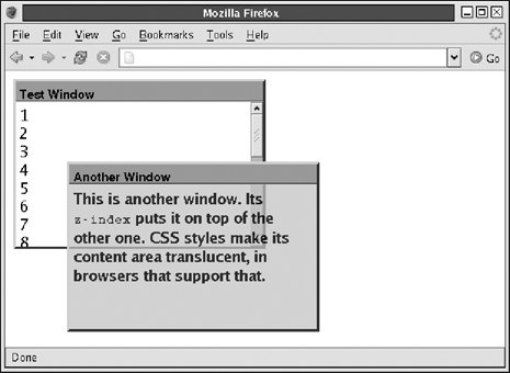 |
EAN: 2147483647
Pages: 767