| Microsoft Graph 11 called MSGraph in this book is a 32-bit, OLE 2.0 mini-server application (Graph.exe) that's identical to Access 2002's Graph.exe, Access 2000's Graph9.exe and Access 97's Graph8.exe. An OLE mini-server is an application that you can only run from within an OLE container application, such as Access 2003. Word 2003 and Excel 2003 also use MSGraph, which originated as the charting component of Microsoft Excel 5.0. Microsoft encourages use of the PivotChart control for new Access applications, but there's no "PivotChart Wizard" to lead you through the steps to design a PivotChart. The AutoForm: PivotChart option generates a databound form with a PivotChart that you must configure manually, as described in Chapter 12, "Working with PivotTable and PivotChart Views," and in more detail in the "Working with PivotChart Forms," section near the end of this chapter. The sections that follow describe how to use Access's Chart Wizard to add graphs and charts to conventional (Jet) Access 2003 forms and reports. Access data projects (ADP) don't support the Chart Wizard, which generates a Jet crosstab query to use as its final data source. As mentioned in Chapter 11, "Creating Multitable and Crosstab Queries," SQL Server doesn't support the Jet SQL TRANSFORM and PIVOT keywords for crosstab queries. Sections later in the chapter describe how to add bound PivotChart and PivotTable controls to Jet- and SQL Server-based forms and reports. Creating the Query Data Source for the Graph Most graphs required by management are the time-series type. Time-series graphs track the history of financial performance data, such as orders received, product sales, gross margin, and the like. Time-series graphs usually display date intervals (months, quarters, or years) on the horizontal x-axis sometimes called the abscissa and numeric values on the vertical y-axis also called the ordinate. Choosing Data Sources for Summary Queries In smaller firms, the numerical data for the y-axis comes from tables that store entries from the original documents (such as sales orders and invoices) that underlie the summary information. Queries sum the numerical data for each interval specified for the x-axis. Detail data for individual orders or invoices, such as that found in the sample Order Details table, often is called a line-item source. Because a multibillion-dollar firm can accumulate millions of line-item records in a single year, larger firms usually store summaries of the line-item source data in tables; this technique improves the performance of queries. Summary data often is referred to as rolled-up data or, simply, rollups. Rollups of data on mainframe computers often are stored in client/server databases running under Unix or Windows 2000+/NT to create data warehouses or data marts. Although rolling up data from relational tables violates two of the guiding principles of relational theory don't duplicate data in tables and don't store derived data in tables databases consisting solely of rolled-up data are very common. As you move into the client/server realm with ADP and SQL Server, you're likely to encounter many rollup tables derived from production online transaction-processing (OLTP) databases. Note The Developer, Standard, and Enterprise Editions of Microsoft SQL Server 2000 include Microsoft Analysis Services, formerly called OLAP services. OLAP is an acronym for online analytical processing, which manipulates multidimensional data from production databases. OLAP can operate directly on OLTP databases, but it's more common to roll up online data into OLAP data structures, often called cubes, and then perform analysis on the cubes.
Designing a Query Based on OLTP Tables Northwind Traders is a relatively small firm that receives very few orders, so it isn't necessary to roll up line-item data to obtain acceptable query performance on a reasonably fast (Pentium III or better) computer. The Chart Wizard handles time-series grouping for you, so you don't need to base your chart on a crosstab query. To create a summary query designed specifically for use with the Chart Wizard, follow these steps: In the Database window, open a new query in Design view, and add the Categories, Products, Order Details, and Orders table to the query. Drag the CategoryName field of the Categories table to the first column. Enter the expression Amount: CCur([Order Details].[UnitPrice]*[Order Details].[Quantity] * (1 -[Order Details].[Discount])) in the second column's Field row. Note The CCur VBA function is required to change the field data type to Currency when applying a discount calculation. Tip With the cursor in the Field row of the second column, press Shift+F2 to open the Zoom window to make entering the preceding expression easier. Drag the ShippedDate field of the Orders table to the third column. Add an ascending sort on this column. Add the criterion Between #1/1/1997# And #12/31/1997# to the ShippedDate column to include only orders shipped in 1997. This example uses the year 1997 instead of 1998 because data is available for all 12 months of 1997. Save your query with the name qry1997SalesChart (see Figure 18.1). Figure 18.1. This query calculates the net value of all Northwind orders shipped in 1997 classified by product category. 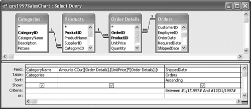  Click the Run button to test your query (see Figure 18.2), and then close it. Click the Run button to test your query (see Figure 18.2), and then close it.
Figure 18.2. The query returns a row for each date on which an order was shipped and provides the total amount of the sale for the product categories. 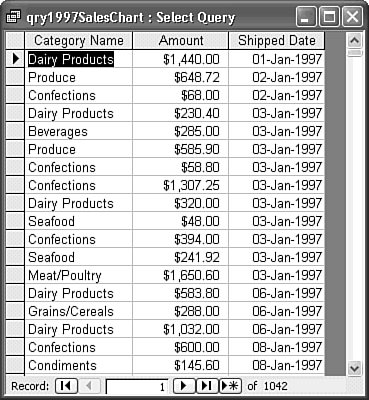
The design of the qry1997SalesChart query is a typical sample data source for time-series graphs and charts you generate with MSGraph as well as PivotCharts. Using the Chart Wizard to Create an Unlinked Graph It's possible to create a graph or chart by choosing Insert, Object and selecting Microsoft Graph Chart in the Object Type list, but the Chart Wizard makes this process much simpler. You can use the Chart Wizard to create two different classes of graphs and charts: Unlinked (also called nonlinked) line graphs display a line for each row of the query. You can also create unlinked stacked column charts and multiple-area charts. Linked graphs or charts are bound to the current record of the form in which they are contained and display only a single set of values from one row of the table or query at a time.
This section shows you how to create an unlinked line graph based on a query. The "Changing the Graph to a Chart" section describes how to use MSGraph to display alternative presentations of your data in the form of bar and area charts. In the later "Creating a Linked Graph from a Jet Crosstab Query" section, you generate a graph that's linked to a specific record of a query result set. To create an unlinked graph that displays the data from the qry1997SalesChart query, follow these steps:  Click the Database window's Forms shortcut, click New, select Chart Wizard in the list box, and select qry1997SalesChart in the drop-down list (see Figure 18.3). Click OK to launch the Chart Wizard. Click the Database window's Forms shortcut, click New, select Chart Wizard in the list box, and select qry1997SalesChart in the drop-down list (see Figure 18.3). Click OK to launch the Chart Wizard.
Figure 18.3. Select the Chart Wizard in the New Form list, and select the query for the graph or chart in the drop-down list. 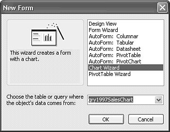 In the first Wizard dialog, click the >> button to add all three fields to your graph (see Figure 18.4). Click Next to move to the second dialog. Figure 18.4. Time-series charts require at least date and value columns (ShippedDate and Amount, respectively). Creating a multiple-line chart requires a classification field (CategoryID) to provide the data for each line. 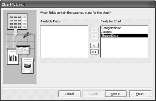 Click the Line Chart button, shown selected in Figure 18.5. Click Next. Figure 18.5. A line graph is the best initial choice for data presentation, because lines make it easy to determine whether the data meets reasonableness tests. 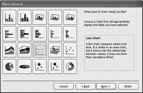 Note This book uses the term graph when the presentation consists of lines, and chart for formats that use solid regions such as bars, columns, or areas to display the data. The Wizard designs a crosstab query based on the data types of the query result set. In this case, the Chart Wizard makes a mistake by assuming you want months in the legend box and product categories along the graph's horizontal x-axis (see Figure 18.6). Figure 18.6. Time-series graphs and charts almost always plot time on the horizontal axis, but the Chart Wizard's initial design puts classifications (CategoryName) on the x-axis. 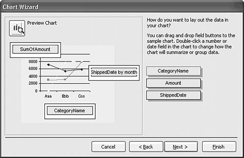 You want the categories in the legend and the months of 1997 across the x-axis. Drag the CategoryName button from the right side of the dialog to the drop box under the legend to the right of the chart, and drag the ShippedDate button to the drop box under the x-axis. The button title, partly obscured, is ShippedDate by Month (see Figure 18.7). Figure 18.7. Drag the date column button from the right to the x-axis and the classification column button to the legend. The Wizard's default time-series interval is month. 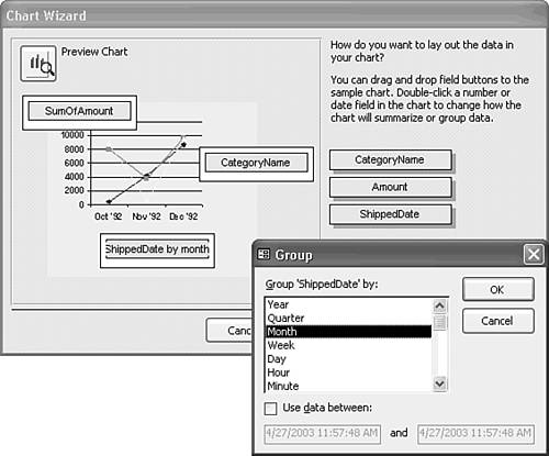 Tip You can double-click the ShippedDate by Month button and select from a variety of GROUP BY date criteria, ranging from Year to Minute, and specify an optional range of dates (refer to Figure 18.7). Marking the Use Date Between check box lets you add a WHERE DateValue BETWEEN #StartDate# AND #EndDate# clause to the crosstab query's SQL statement. Click the Preview Chart button to display an expanded but not full-size view of your graph. The size relationship between objects in Chart Preview isn't representative of your final graph or chart. Click Close. Click the Next button to go to the fourth and final Chart Wizard dialog. Type 1997 Monthly Sales by Category in the text box to add a title to your graph. Accept the default Yes, Display a Legend option to display the Category legend (see Figure 18.8). Figure 18.8. The last Wizard dialog's default options are satisfactory for most graphs and charts. If your source query doesn't have a classification column, you don't need a legend. 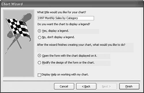 Accept the remainder of the defaults, and click Finish to display the initial graph layout in Form view (see Figure 18.9). Figure 18.9. The Wizard makes a poor guess at the size of the form and the unbound object frame needed to display the elements the Wizard generates. 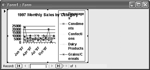 Note In the miniature version of the graph illustrated by Figure 18.9, some month labels are missing and the legend crowds the graph and label. You fix these problems in the next section of this chapter, "Modifying the Design Features of Your Graph."  Click the Design View button and increase the size of your graph to at least 5.5 inches wide by 3.5 inches high (see Figure 18.10). Click the Design View button and increase the size of your graph to at least 5.5 inches wide by 3.5 inches high (see Figure 18.10).
Figure 18.10. The Data page of the unbound object frame that contains the chart lets you check the crosstab query's SQL statement and set the Enable and Locked properties. Graph.exe's version number is 11, but the Class version (8) hasn't changed since Office 97. 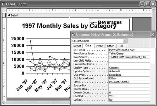 Click the Data tab of the Properties dialog, and make sure the Enabled property value of the unbound object frame (OLEUnbound0) is set to Yes and the Locked Property is set to No (the defaults). The chart is in an unbound object frame, so you don't need form adornments for record manipulation. Select the form, click the Format tab of the Properties window, and set the Scroll Bars property of the form to Neither, the Record Selectors to No, and the Navigation Buttons to No. Use the sizing handles of the unbound object frame to create a 1/8-inch form border around the frame. Leaving a small form area around the object makes the activation process more evident. Save your form with a descriptive name, such as frm1997SalesByCategoryChart. Return to Form view in preparation for changing the size and type of your graph.
Jet SQL The Wizard writes the following Jet crosstab query to generate the data for the chart: TRANSFORM Sum([Amount]) AS [SumOfAmount] SELECT (Format([ShippedDate],"MMM 'YY")) FROM [qry1997SalesChart] GROUP BY (Year([ShippedDate])*12 + Month([ShippedDate])-1), (Format([ShippedDate],"MMM 'YY")) PIVOT [CategoryName]; The GROUP BY clause permits display of monthly data for multiple years, which isn't applicable to the example query. The Format expression generates x-axis labels, such as Jan '97. SQL Server's T-SQL doesn't support Jet SQL's TRANSFORM...PIVOT statements, so you can't use the Chart Wizard with ADP. You can, however, write T-SQL statements to emulate a crosstab query, so it's possible to use the Insert Object approach to adding a MSGraph chart or graph to forms of ADP. |
 For an example of the SQL Server equivalents of Jet crosstab queries, see "Emulating Jet Crosstab Queries with T-SQL," p. 918. For an example of the SQL Server equivalents of Jet crosstab queries, see "Emulating Jet Crosstab Queries with T-SQL," p. 918.
Tip When you complete your design, set the value of the Enabled property for the form to No so that users of your application can't activate the graph and alter its design. It's also a good practice to set the values of the Allow Datasheet, PivotTable, and PivotChart View properties to No.
Modifying the Design Features of Your Graph Graph.exe is an OLE 2.0 mini-server, so you can activate MSGraph in place and modify the design of your graph. MSGraph also supports Automation, which lets you use VBA code to automate design changes. This section shows you how to use MSGraph to edit the design of the graph manually, as well as how to change the line graph to an area or column chart. To activate your graph and change its design with MSGraph, follow these steps:  Display the form in Form view and then double-click the graph to activate MSGraph in place, which opens a Datasheet window that displays the values returned by the crosstab query (see Figure 18.11). A diagonally hashed border surrounds the graph; MSGraph's menus replace or supplement those of Access 2003. (The activation border is missing from the left and top of the object frame if you didn't create some additional space on the form around the object frame in step 12 of the preceding section.) Display the form in Form view and then double-click the graph to activate MSGraph in place, which opens a Datasheet window that displays the values returned by the crosstab query (see Figure 18.11). A diagonally hashed border surrounds the graph; MSGraph's menus replace or supplement those of Access 2003. (The activation border is missing from the left and top of the object frame if you didn't create some additional space on the form around the object frame in step 12 of the preceding section.)
Figure 18.11. Activating the unbound object frame grafts MSGraph's menu commands to Access's and opens the Datasheet window. 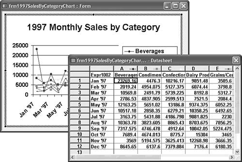 Note Menu commands of an OLE server or mini-server added to those of the container application are called grafted menus or object menus. The process that adds the menu commands is called menu negotiation. Change the type family and font size of your chart's labels and legend to better suit the size of the object. Double-click the graph title to open the Format Chart Title dialog. Click the Font tab, set the size of the chart title to 12 points (see Figure 18.12), clear the Auto Scale check box, and then click OK to close the dialog. Figure 18.12. MSGraph has properties dialogs for most of its objects, including chart titles, legends, and axes. Reduce the font size of the Chart Title object to 12 points, and clear the Auto Scale check box to retain the font size regardless of the object frame's dimensions. 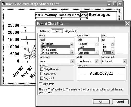 Double-click the legend to open the Format Legend dialog, set the size of the legend font to 9 points, and clear the Auto Scale check box. The y-axis labels should be smaller and formatted as currency, so double-click one of the labels on the y-axis to display the Format Axis dialog. Set the font size to 9 points, and clear the Auto Scale check box. Click the Number tab, select Currency in the Category list, and enter 0 in the Decimal Places text box (see Figure 18.13). Click OK to close the Format Axis dialog. Figure 18.13. Reduce the font size of the y-axis labels to 9 points and apply currency formatting in the Format Axis dialog. 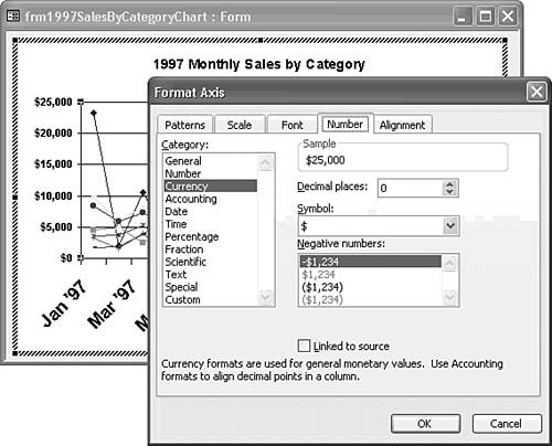 The default font size for axis labels at a graph size of 6.5 x 3.5 inches is 15.25 points, which causes MSGraph to label the x-axis diagonally. Double-click the x-axis and change its font size to 9 points, also clearing the Auto Scale check box. Click OK to close the dialog and apply the new format. Resize the elements of the graph to take maximum advantage of the available area within the unbound object frame. Click the Chart Title and drag it to the top of the frame. Click an empty area in the graph to select the Plot Area, which adds a shaded rectangle around the region, and increase its size. Click the form region outside the graph to deactivate MSGraph, and then save your changes. Your line graph now appears as shown in Figure 18.14. Figure 18.14. The modified graph design corrects the poor choices the Wizard makes for title, axis, and legend font sizes. 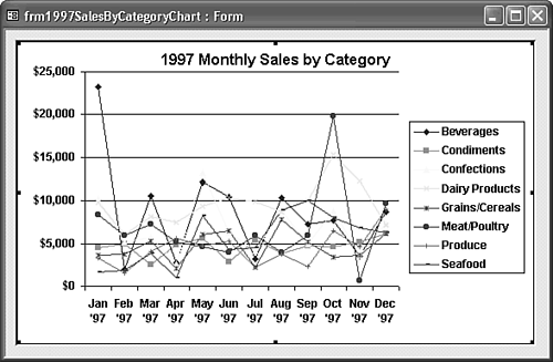
Depending on the use of the graph or chart, consider increasing its size to increase the accuracy of data interpretation for users. If you plan to print the chart, you can increase the width to about 6.5 inches and the height to about 4.5 inches without changing the default printing margins. You can save vertical space by deleting the chart title and changing the form's Caption property to that of the deleted title. The figures in the following sections reflect these design changes. Changing the Graph to a Chart You might want to change the line graph to some other type of chart (such as area or stacked column) for a specific purpose. Area charts, for example, are especially effective as a way to display the contribution of individual product categories to total sales. To change the line graph to another type of chart, follow these steps: Double-click the graph to activate it and then choose Chart, Chart Type to open the Chart Type dialog with the Standard Types page active. Select Area in the Chart Type list (see Figure 18.15). Figure 18.15. MSGraph's Chart Type dialog offers many more choices of chart and graph styles than the Chart Wizard.  Tip You can preview your chart by clicking and holding down the left mouse button on the Press and Hold to View Sample button. Select the stacked area chart as the Chart Sub-type (the middle chart in the first row refer to Figure 18.15). Click OK to change your line graph into an area chart, as shown in Figure 18.16. The contribution of each category appears as an individually colored area, and the top line segment represents total sales. Figure 18.16. The stacked area chart shows the contribution of each category to total sales. 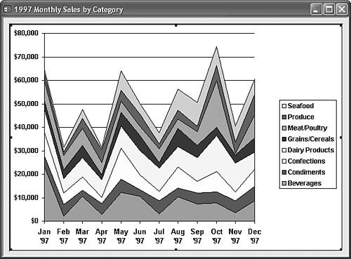 To convert the area chart into a stacked column chart, choose Chart, Chart Type to display the Standard Types page of the Chart Type dialog. Select Column in the Chart Type list, and then select as the Chart Sub-Type the stacked column chart shown selected in Figure 18.17). Figure 18.17. You can select a 3D stacked column chart, but conventional 2D column charts are easier to interpret. 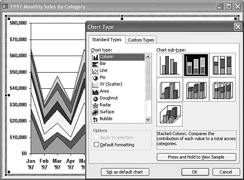 Click OK to close the Chart Type dialog. Your stacked column chart appears as shown in Figure 18.18. Figure 18.18. A stacked column chart is a less-dramatic alternative to a stacked area chart. 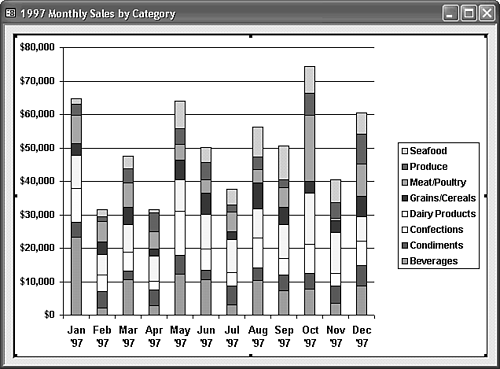 Another subtype of the area chart and stacked column chart is the percentage distribution chart. To create a distribution-of-sales graph, repeat steps 4 and 5 but select the 100% Stacked Column picture (the third thumbnail in the top row) with equal column heights as the Chart Sub-type. Click OK to close the Chart Type dialog. Because you previously set the format of the y-axis to eliminate the decimals, you need to change the format of the y-axis manually to Percentage. Double-click the y-axis to open the Format Axis dialog and click the Number page (refer to Figure 18.13). Select Percentage in the Category list, make sure that Decimal Places is set to 0, and then click OK to apply the format. Your chart appears as shown in Figure 18.19. Figure 18.19. A 100% stacked column shows the distribution of sales by category. 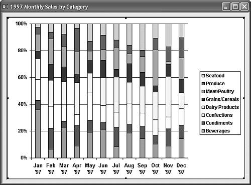 Change the Chart Type back to a line graph in preparation for the linked graph example of the later section, "Creating a Linked Graph from a Jet Crosstab Query." Change the y-axis format to Currency, click inside the form region outside the object frame to deactivate the graph, and then save your form.
Of the four types of charts demonstrated, most users find the area chart best for displaying time-series data for multiple values that have meaningful total values. |