Features You May Not Notice
|
| < Day Day Up > |
|
There are some new features in FreeHand MX that won't be apparent because they're either working in the background or they're part of the new MX way of working. If you have experience with FreeHand, you may think some tools are missing, but they've just been moved to a new location.
Image alpha channel support
If you're a Photoshop user, you know that an alpha channel is a black and white layer that allows the display of transparent areas, opaque areas, and the shape of an object. Previous versions of FreeHand did not work well with bitmaps containing alpha channels. That's now a thing of the past. You can import documents with alpha channels, and you can also export your own alpha channels. This isn't an answer to all your problems with alpha channels, but it's a good start. If you import a bitmap from Fireworks or Photoshop that has an alpha channel, everything will look and function as you would expect when you have the Display Alpha Channel option turned off in the Object panel. Turn that option on, however, and white areas in your alpha channel act as masks, and those portions of the image appear as "normal." It's as though you used the Punch Xtra on the image. Black areas in the alpha channel let the pixels become missing in action and transparent. Keep in mind these are the black and white areas of the alpha channel, not the image itself. You can apply live effects, such as shadows, beveling, and so on, to the image whether Display Alpha Channel is on or off. FreeHand is a vector-based drawing program, so you shouldn't be surprised that you cannot edit the alpha channel on an imported bitmap.
Now for the good part: You can make a mask in FreeHand and place it on the Background layer (or any other nonprinting layer beneath the separator bar). Export the file as a TIFF, PSD, PNG, or GIF, and the mask becomes an alpha channel when opened in Fireworks or Photoshop. Keep your head about you, though, if you're creating masks in multiple programs. In Fireworks, white areas of the mask become transparent areas in the image, but in FreeHand (and Photoshop) black areas are transparent. You can create gradient fills or grayscale blends to make the mask. Use it to set a line of text that you want to have set in the background color of your Web page when you haven't decided what color that will be yet, or will change it occasionally. Make the mask and leave the area transparent so the background color shows through.
PDF export updates
FreeHand's PDF export produces Adobe Acrobat formatted files that support CMYK, RGB, grayscale, and monochrome bitmaps. Some things haven't changed. For example, you can't export custom or PostScript fills or strokes, arrowheads, or textured fills. Text effects (underscore, inline, shadows, and so on) and overprinting are ignored. Any EPS images are ignored unless they have a TIFF preview. In that case, the TIFF preview is exported instead of the EPS. Alpha channel transparency is lost. FreeHand can also open PDF files, but be prepared to do a little work. Text blocks may be separated into individual blocks; reconnect them using common text tools and techniques. Sometimes the page show up as a single object with graphics pasted inside. Choose Edit ® Cut Contents to edit everything normally.
Save Location Default enhancement
FreeHand 10 saddled users with a default location for new files when they were saved. Now, FreeHand MX uses the application folder as the default location for a brand new document. If you navigate to another folder and save the file, successive saves or save as commands will place the file into the new folder–not the application folder. On the Mac, FreeHand is now in complete sync with the General Controls Panel settings.
Output Area
Previous versions of FreeHand had a Print Area tool. This feature has been upgraded and is now called the Output Area tool, and it is part of the Tools panel. Selecting the tool changes the cursor by adding a dashed-line rectangle to the Pointer tool. Drag a selection on the document to print only that area. The area is defined by a red dashed outline with solid red handles on the sides and corners of the rectangle. The selection can go across several pages, or include only a tiny section of a single page. Move the cursor over one of the bounding edges to turn the cursor into a grabber hand. Then you can move the Output Area anywhere in the document. Resize the rectangle by selecting and dragging any of the corner points. The Output Area rectangle will remain in view until you deselect it by clicking the Output Area tool on the desktop. The rectangle itself does not print.
If you drag a selection through a text block and across a graphic, it prints as though the area were cut out with a pair of scissors. Anything on the pasteboard is printed, so between pages you can place notes, alternate graphics, or comments about the page or layout. You must select Print Output Area in the FreeHand MX Print dialog box (Figure 14-1). There you have the further option to show page borders that may be in the selection area. These options are not available unless you've created a selection with the Output Area tool.
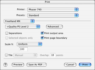
Figure 14-1: The Output Area options in the Print dialog box
Output Area also works when you are exporting certain types of files. Those file types include all the flavors of EPS, plus SWF, PDF, and PSD. Even if you have made a selection, the entire document will be exported in other file formats.
Printing news
You can see the changes FreeHand has made in the Print dialog box for Macintosh OS X in Figure 14-1. It is assumed that you will be printing a composite image, but if you need separations, all you need to do is click the Separations button. The Advanced button replaces the Setup button used in previous versions of FreeHand, and contains the same information (see Chapter 13 for that discussion).
New Page button
It's a really small thing, but the addition of the New Page button in the bottom-left corner of the application window is welcome. A single click adds a new page to the document. The button lies between the pop-up Page selector and the View Mode menu; its icon is a dog-eared document with a plus sign. When you click it, a new page the same size and orientation of the page you're currently working on is created. If you want a button to duplicate a page, you can install one in your Main menu or Tools panel through Windows ® Toolbars ® Custom ® Pages. That button has been there for a while, but is generally overlooked.
Swap object for symbol
If you've ever made a symbol in FreeHand that you would like to use to replace objects that are already in place in your document, this little addition will be good news for you. Select an object or instance in the document (or a group of them), and then choose a symbol in the Library. Click the Swap Symbol button at the bottom of the Library, or choose Swap from the Library's pop-up Options menu, and all the elements become instances of the chosen symbol. The swapped symbol assumes the size and aspect ratio of the object or instance that was selected. For instance, if you had a symbol that was a perfect circle, and you swapped it in place of a capital letter "I" the circle would become a tall ellipse. There's no way to maintain the aspect ratio. Along the same line of reasoning, if you modified an object with the 3D Rotation tool — for example, turned a rectangle into a trapezoid — and then swapped that object for a circular symbol, the symbol fits itself to the bounding box of the object. In this case, not a trapezoid, but the rectangle that the trapezoid occupies.
Pantone libraries updates
PANTONE colors can be confusing if you are sharing FreeHand files with someone using an older version of FreeHand. You may specify a PANTONE color in CMYK values that doesn't match what your colleague has, and the program has set the values in both cases. You might blame Macromedia, but the responsibility lies with PANTONE. Over the years they have constantly striven to keep up with computer and ink technology. Thankfully, FreeHand MX has the latest and greatest range of PANTONE colors: 14 separate libraries from Hexachrome to metallics, pastels, and solid to ProSim EURO. Of course, Macromedia retained libraries from Munsell, TOYO, and the DIC Color Guide.
Mac-specific features in FreeHand MX
FreeHand 10 was the first drawing application to be completely OS X-ready. Unfortunately, as hard as both Apple and Macromedia worked, neither were really ready for prime time. However, Macintosh OS X 10.2 and FreeHand MX have had a year to work out many bugs. For one thing, FreeHand adopted the Carbon Event Manager, which increases the overall efficiency of the operating system. In the Classic Event Manager, applications are forced to poll the operating system for events. If there weren't any events available at the time for the application, the polling process was wasted CPU time. With the Carbon Event Manager, the application goes to sleep until an event is ready for it. The application uses only as much time as necessary, and the responsiveness of the operating system increases.
FreeHand is placed inside an Application Bundle, which gives FreeHand access to the localization and internationalization tools that OS X makes possible. However, the application seems less complex to the user. Under previous versions of the OS, it was really easy for a user to drag the FreeHand application away from vital resources (such as shared libraries and support files). Now you'll have a tougher time finding a way to separate the application from support files because they're hidden inside the package.
There were a few fixes in the printing department as well; all of these items have been fixed in FreeHand MX. When running FreeHand 10 on OS X, FreeHand cannot tell the difference between a PostScript printer and a non-PostScript printer when the printer is chosen in the Print dialog box. The Print Preview had a marquee that was low and to the left, giving an erroneous preview. Clipping paths with curves had unnecessary flatness when printed to a non-PostScript printer. Finally, if you accessed the Print Setup dialog box several times, a bug in OS X caused a crash. Fixes and the new look make FreeHand printing more streamlined and easier for newer users to comprehend.
Central European and Simplified Chinese font support
FreeHand 10 had a bug in Windows 2000 and higher that disallowed Baltic, Central European, Cyrillic, Greek, and Turkish font sets. This bug has been eliminated so the fonts are available now. Additionally, FreeHand supports Simplified Chinese.
Open documents
For power users who want to test the bursting strength of their computers, FreeHand MX lets you open more than a dozen documents at one time.
Resizable file dialogs
On both Windows and Macintosh machines you can resize the Open, Save As, Import, Export, Export Again, and Send (Windows only) dialog boxes. It's nice to be able to read entire filenames at times, or make the box smaller to see something of a reference on the desktop. All you have to do is grab the gripper corners in the right bottom of the dialog boxes. The Save As box on the Mac must be expanded to reveal the gripper corner.
Spell Checker change
You probably won't perceive a difference, but FreeHand has changed to the WinterTree Dictionaries for the spell-checking feature. This provides consistency across the entire Studio MX product line.
Toolbox reorganization
Macromedia spent quite a bit of time assessing the Toolbox, and which tools should be more accessible than others. You may have to look a little farther for some tools if you're a FreeHand veteran. Novice or veteran, the reorganization makes sense, and after a session or two you won't have trouble finding things. Some tool groups have changed from FreeHand 10, and others remain the same. Any tool icons that have a small downward-pointing triangle in the bottom right have other tools nested. Just hold down the mouse, and the other tools pop up. Select these tools by dragging the mouse over the needed tool and letting go of the mouse. If you use a digital tablet, you slightly drag the mouse on a tool icon to open the other tools in the set. This can take a bit of getting used to, as it's easy to slide the pen tip over a tool that activates the pop-up menu. When that happens, you must choose a tool before the menu will go away.
The Pen tool is nested with the Bezigon tool. The Line tool is nested with the Arc and Spiral tool. The Pencil tool nests with the Variable Stroke Pen tool and the Calligraphic Pen tool, and the Rectangle and Polygon tools are nested together. The Scale tool is grouped with other transformational tools: the Rotate, Skew, and Reflect tools. The Freeform tool is connected to the Roughen and Bend tools. The 3D Rotation, Fisheye Lens, and Perspective tools are nested; the new Extrude tool is hooked up with the Smudge and Shadow tool; and the new Blend tool is grouped with the Chart tool, Mirror tool, and Graphic Hose tool.
In addition, any of the tools that have an inverted "L" shape in the top-right corner of their icon have a dialog box connected with them that is activated by double-clicking the tool icon.
JPEG thumbnail preview
Windows users and artists operating Macs on OS X have the option of choosing JPEG or BMP as a file format for Export thumbnail previews. These previews are shown in the Open menus; the size of the preview can be adjusted by the user. If you choose to have JPEG thumbnails, you can further adjust the quality of the image in the top of the Preferences ® Export window as shown in Figure 14-2.
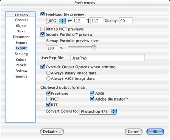
Figure 14-2: The Mac version of the Export Preferences thumbnail preview controls
Drawing Changes in FreeHand MXThere are whole new ways of looking at the way you draw in FreeHand MX. Smart Cursors have raised their IQ, and you don't need the Shift key to constrain a path or regular object any more. Vector and bitmap effects are very useful for the personalization of your drawing style, or just to add a little pizzazz to your work. The new Object panel and new effects do have a learning curve, but it's short, and once you get the hang of it, you'll really enjoy the way the program flows.
Pointer activity
A small circle appears near the pointer when it is within selection distance of a path. When a mouse-click will select a point on a path, a black square appears near the pointer cursor. The range that determines when the cursor will occur is called the Pick Distance, and can be changed in the Preferences dialog box. Distances from 1- to 5-pixels are usually sufficient, but you're best off with a setting of 3 pixels for Pick Distance and Snap To Distance.
Auto Constrain
You don't have to hold down the Shift key to constrain ellipses to circles, rectangles to squares, and straight lines to 45-degree increments any longer. With the new Auto Constrain feature, all you have to do is drag the cursor close to a 45-degree angle, and simple geometric shapes become circles or squares. As you near a 45-degree angle, the cursor is accompanied by a large, blue dot, and you have a perfect circle or square at that time. The line tool snaps to 45-degree increments, and the dot occurs at the end of the path.
If you change the constrain angle (Constrain has moved to File ® Document Settings ® Constrain), the dot still occurs when the cursor reaches 45-degrees from its starting point, but the object is auto-constrained to the angle you set. Holding down the Shift key provides circles and squares on the constrained angle. You must hold down the Shift key to constrain the Line tool to a custom angle.
Anti-alias view
For quite a while Macromedia has heard people ask for an anti-alias view for vector objects. Finally, it has been implemented in FreeHand MX. The old Flash Anti-alias view had a few problems in the integrity of the paths it showed. Flash Anti-alias is no longer in the program. The Anti-alias option can be turned on or off (Enable Anti-alias) in the Redraw section of the Preferences dialog box on Windows or Mac OS X machines. However, it is not available for OS 9 Macs.
Vector Live Effects
One of the new classes of effects in FreeHand MX is called Vector Live Effects. Any object or live text can be given these effects, including Bend, Duet, Expand Path, Ragged, Sketch, and Transform. You'll be using these when you want a freer look to your work. For a great place to start experimenting, import the Vector Effects from the Styles panel. All these effects are contained within the new Properties ® Object panel and can be combined for even more creative appearances. I encourage you to tear the default effects apart so you can see how they work and why. Here's what the individual effects do:
-
Bend — On a geometric shape or free-form object, each point in the object gains control handles creating an inner curve between points, with an equally severe outer arc, as you can see in Figure 14-3. This object started out as a circle, then the Bend was applied, and the object ungrouped. The top point of the circle was raised, and a control handle was extended to the right.
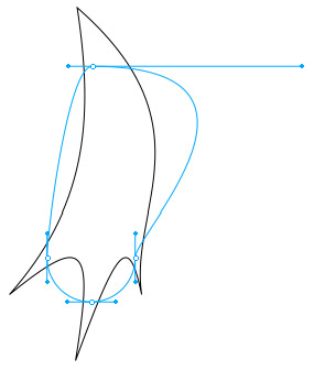
Figure 14-3: Notice where the Bend's points are in relation to the final line. The line with the live points on it will not print.In Figure 14-4, you see a circle, a square, and the word "FreeHand." The Bend effect has a negative value on the circle, square, and text on the top line. The circle, square, and middle text (in the right half of the figure) all have a positive bend. The bottom text has a positive bend, but the X-distance has been shifted to the right. The values used here are pretty extreme at 50 or –50. You can get some good-looking effects with other values. Notice how the fills go to the original graphic's edges, not the vector effect's edge.
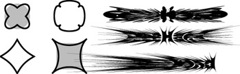
Figure 14-4: The Bend effect is great for creating an exciting starburst, comet trail, or bug splat. -
Duet — Essentially, this is the Mirror tool used as an effect. Figure 14-5 shows a leaf shape (selected) with the Duet effect applied with the settings in the Object panel. It's important to note that the Copies field has an input of 5. You might think, then, that there should be six leaf shapes in the figure, but FreeHand makes the first copy directly beneath the original path, leaving the original path available for other trans- formations and effects. Change the X and Y values to precisely locate the copies.
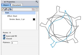
Figure 14-5: The Duet effect multiplies your artwork. -
Expand Path — This effect is similar to the way the Expand Path Xtra works, except it's in the Object panel and therefore can enjoy other effects added to it. Figure 14-6 shows the circle and square with a Direction of Both, the Width is 8-points, and the square is filled with a light gray tone. Note that the fill goes to the original shape, not either of the paths. The text is set to Outside Only, with a width of 2 points.

Figure 14-6: The Expand Path effect -
Ragged — To get this effect in FreeHand 10 or earlier, you added points, and used the Roughen Xtra. Now it's easier to apply from the Object panel instead of navigating menus or searching for Xtra buttons, and you have the advantage of making multiples for a really rough look. In Figure 14-7 all elements but the top text have a Size of 10 and a Frequency of 10. The top circle has been given a Rough edge, and 1 copy. The top square has a Smooth edge, but 3 copies. Moving to the lower circle, you see a Smooth Uniform edge, and a fill. The bottom square is Rough, with 3 copies, and is also filled.
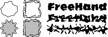
Figure 14-7: The Ragged effectThe text at the top is Rough with a Size of 4, a Frequency of 15, and 1 copy. The middle text is Smooth, and the bottom text is Smooth Uniform. Regular Uniform creates almost star-like shapes.
-
Sketch — This effect is one of the more versatile, in my opinion. I tend to be pretty tight in my illustration, and this will certainly loosen up my style. The circle in Figure 14-8 has an Amount of 10, with just 1 copy, and has been made Open. The same values were applied to the square, but it was filled. Notice how the odd-even fill takes over, and how random the square's sketchiness is. Text was given an Amount of 7, and set to Closed. Values above 7 (on this bit of text) made the type unreadable, but this would suffice for a grunge look.
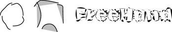
Figure 14-8: Loosen up your artwork with the Sketch effect. -
Transform — Choosing this effect brings the Transform panel into the Object panel. You can rotate, skew, scale, move, and mirror your selection here. The results are the same as if you had created the transformation with the Xtra, only they're tied to all the other effects within the panel. See Figure 14-9 for an example of how the Transform effect can be used. This simple illustration involves scale, skew, move, rotate, and multiple copies.
Figure 14-9: You can get carried away with the Transform effect.
Raster effects
You can apply multiple effects to an object with vector or raster effects. You can only apply an effect to multiple selected objects if they have the same type of stroke and fill. The objects can have any type of fill (or they all have no fill) as long as they all have a fill. The fill can be basic or a gradient. All the objects must have the same type of stroke (or no stroke), but it can be of any weight or color. To get around these limitations, you can select several objects and group them. Then you can apply effects, but if you ungroup the group, all the effects are lost and must be re-created from scratch.
When you click the Effects button in the Object panel, you'll see that the Effects menu is divided into a top and bottom half. Vector effects own the top half (explained above). Raster effects dominate the bottom. Here, you can add effects that were available only through Photoshop or Fireworks (or Illustrator) before. These effects include drop shadows, inner and outer glows, blurring, sharpening, bevels, and embossing. The names of these effects have no relationship to the vector effects of the same names. These effects must be rasterized on export and print. Unlike vector art, rasterized artwork is resolution dependent, and you have to determine the output resolution of the document. You handle this through the entries you make in File ® Document Settings ® Raster Effects Settings. There, you select a resolution of 72-, 144-, or 300-dpi, and have the option to choose Optimal CMYK Rendering. In order to work more freely without the wait for screen redraws, you can set the resolution at 72-dpi while you're working, and change it to 300-dpi if you are going to print the document. The screen image is pretty coarse at 72-dpi, but with a Gaussian blur on a large object, the redraw time can be reduced significantly. Because FreeHand users are not used to this type of effect capability, it may take some getting used to.
-
Bevel and Emboss — You have a choice of inner and outer bevels and embossing and the style of edge: smooth, flat, rippled, and so on. Examples are shown in Figure 14-10.

Figure 14-10: Examples of the types of bevels and embossing you can apply -
Blur — If you feel the need to blur a vector object or a bitmap, you can use a simple blur or a Gaussian blur just as you would in Fireworks or Photoshop. This image "editing" can be done on a TIFF or EPS that you created with the Convert To Image command, as well as imported on graphics. Figure 14-11 shows standard and Gaussian blurs.

Figure 14-11: Make people think they need glasses with blur effects. -
Shadows and Glows — Where would we be without drop shadows these days? Now you can apply them plus inner and outer glows and shadows. You can even choose a color for the shadow, which makes it easier to create seamless effects on top of bitmaps or other colored objects. See Figure 14-12 for shadow examples.

Figure 14-12: Live shadow and glow effects -
Transparency — This feature is similar to the Transparent Fill feature, but now you can create gradient masks, and feathering. See some of these effects in Figure 14-13.

Figure 14-13: Transparency effects including a gradient mask on the text
New tools and tool changes
The action of the Pen tool has changed significantly, including a path preview. A digital tablet will allow you to have pressure-sensitive drawing again (it was inoperable in FreeHand 10 on a Mac). Brush attributes have been enhanced, and there's a new Eraser tool that's pretty neat. The new Blend tool supplies greater control over blends between objects, and rounded corners have never been easier to make. There's a new Cone gradient fill for some really neat effects, and a whole new way of working with polygons. The list goes on and on. Let's start with the drawing tools.
Pen tool changes
The Pen tool still has "Smart Cursors," but they've been simplified substantially from FreeHand 10. The first feature you'll want to check out is the Pen Preview. Double-click the Pen tool icon in the Toolbar to find this option. When it's selected, a blue path follows the cursor from the last point placed, in a rubber band fashion, showing you how the path will look if you click the mouse to add a point. If you're experienced with Béziér curves, this may annoy you. Turn it off. However, if you like a preview of coming events, leave it on.
When you have the Pen tool selected and there is not a path with a point selected, the Smart Cursor shows an "X," indicating that you will be starting a new path when you place the next point. After the first point, the cursor is the normal pen point until you move the cursor over an existing path. At that time, the cursor gains a small open circle. If you have View ® Snap To Objects on, the cursor creates a large circle on the path itself, indicating that you will be placing the point exactly on the path. Moving the Pen cursor over an existing point places a black square near the cursor regardless of whether the path is selected or the Pen is drawing a path.
If you have Snap To Objects or Snap To Point on, the cursor changes from an "X" icon to a buttonhole icon until the cursor is out of the snap-to range. At that point, the buttonhole disappears and you won't see it again. The buttonhole indicates that the path will close with the next mouse click. With either of the two snap-to options turned on, the buttonhole cannot show up again because the hierarchy of the Smart Cursors puts the buttonhole cursor beneath Snap To Point or Object cursors. So, if you want to know — visually — that you're about to close a path, you must have both snap-to options off.
The modifier keys have changed as well. To add a point to a path, you must hold down the Alt (Option) key, which adds a plus sign to the cursor. If you want to remove a point, pressing the same key creates a minus sign beside the cursor, and a click deletes the point, leaving the rest of the path as it is. If you select a path and click the Pen tool on the path without the Alt (Option) key, you start a new path. If you want to add or adjust Béziér curve handles, hold down the Alt (Option) and Control (Command) keys at the same time, and drag from the point or adjust the handle.
Calligraphic stroke
Although this sounds as if it belongs in the Toolbox, it doesn't. Instead, it can be a part of any stroke you draw with any tool. You can think of it as a variation on the brush, but it does much more. This new addition is located in the Object ® Stroke menu. Click the stroke branch of the tree, and choose Calligraphic from the stroke type menu. The Stroke panel looks like Figure 14-14.
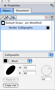
Figure 14-14: The Calligraphic Stroke offers many options with just the default selection.
With the default stroke, you have the world's best digital "Speedball" D-style pen point, but the fun doesn't stop there. By changing numbers in the vertical and horizontal scale fields, you can change the width and height of the stroke's shape. Rotate the thumbwheel to change the angle of the stroke. Figure 14-15 shows the same drawing with variations in scaling and angle of the default stroke.
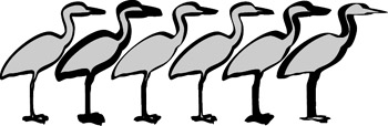
Figure 14-15: Variations are quick and painless with the Calligraphic Stroke.
To see some of the fun stuff, create a simple (single) shape and copy it to the Clipboard. Open the Calligraphic dialog box and click the Paste button. The graphic you just drew is now the stroke you will draw with. You can apply the stroke to anything you draw, even as the outline to text that you converted to paths. Figure 14-16 shows examples of what you can do with calligraphic text outlines. The top example is the text in Century Schoolbook Bold Italics. The second version has the default Calligraphic Stroke applied with a value of 5 for both width and height, and an angle of 135 degrees, giving the text a "Speedball," hand-lettered appearance. The third example shows an angle of 0-degrees, and 100 for width and height. The stroke has gray color, and the fill was applied (black) and moved above the stroke in the Object panel. This version appears as if you had applied the Expand Stroke Xtra to the text. The bottom text has the same setup as the one above it, only the angle was changed to 135 degrees, and both values are set to 100.
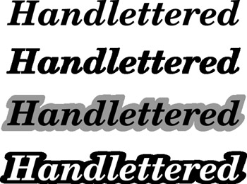
Figure 14-16: Simple examples of the Calligraphic Stroke on text
One value of using this method on an object or text is that you can get a fluid, almost organic look to the stroke without duplicating the path itself. Another reason to use the Calligraphic Stroke is to get the artwork away from a "computer generated" look. The option of pasting your own shapes into the stroke panel makes it even more personal and something you can work into your drawing style.
Brush enhancements
Admittedly, FreeHand 10's brushes had problems in the corners. The code that made the brushwork caused the brush to overlap itself in tight corners, which brought the odd-even-fill into play, causing unsightly corners. FreeHand MX has fixed the corners to a large degree. Figure 14-17 shows a shape with tight corners, and you can see how well the brush (the brushes shape is shown in the center) conforms to the outer path.

Figure 14-17: Brushes hug the corners tighter in FreeHand MX.
Eraser tool
What if you had a tool that would cut through a vector object and instead of slicing the paths, actually removes a swath of the object? Now you have this in the Eraser tool. It has a user-defined width, and when you pass it over a selected vector object, it cuts the path in two places, and heals the cuts, retaining the fill and stroke attributes. Figure 14-18 shows three ways the Eraser tool can be used with a Wacom graphic tablet. The pressure-sensitive settings are shown above the three different ways the tool works. Starting outside the object and cutting into the object makes a simple closed path. By holding down the Alt (Option) key, you can constrain the tool to a straight path. In the middle example, the pen started with greater pressure than when it ended, causing the wedge-shaped cut resulting in two separate objects. The right example used pressure sensitivity to cut a hole inside the object. When you release the mouse, the object becomes a compound path. If you choose Modify ® Split, you would have three separate shapes in this example.
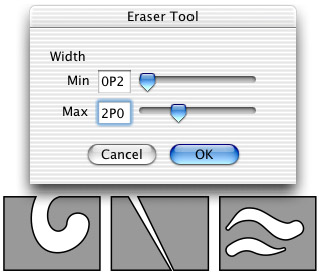
Figure 14-18: The Eraser tool is versatile. From left to right, it created a single closed path, a pair of closed paths, and a composite path.
The Eraser tool can be used in its most simple application to cut an object into two pieces with a straight constant-width path. You can also use it to make a jigsaw puzzle with pieces that can be removed. It works only on vector paths (open or closed), however, so if you want to apply some special effects on text, you have to convert it to paths first.
Blend tool
Blending has changed in FreeHand MX. The Modify ® Blend command still works as it did previously. But, with the addition of the Blend tool, you may not use the menu command much anymore. Select the Blend tool and click an object. Then click a second object. They automatically blend together (with a default of 25-steps). Click another object and the blend continues between the last two objects. The objects can have any kind of fill, stroke, or effect (both vector and raster) and the blend works. Although, place a drop shadow on one object, and have no effect on another object, and use the Blend tool to create a blend. The entire blended group has the drop shadow, excepting the object that had no effect in the first place. As with a "normal" blend, to dismantle the blend, you must ungroup it. That leaves you with the original two objects, and a single group with the blended steps. If you want to make changes in the objects, delete the middle group, make the modifications, and run the blend again.
But wait, there's even more! If you use the Modify ® Blend command, the object on the bottom of the stacking order always remains at the bottom of the blend. With the Blend tool, the object you select first goes to the bottom of the blend, regardless of its stacking order in the document. As shown in Figure 14-19, the objects that are being blended have a special set of point indicators, including one that indicates a key point that is connecting to a corresponding key point in the other object. When the blend has been done, you can Alt (Option) select an end object, and move the key point to another point on the object. This simple addition to the process solves many problems with blends twisting and turning the wrong way.
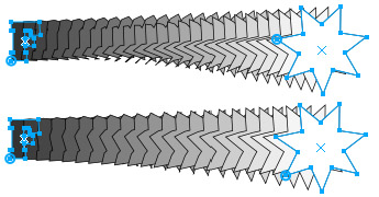
Figure 14-19: Key points appear and can be moved when objects are selected with the Blend tool.
Extrude tool
You can extrude any FreeHand shape, including live text in FreeHand MX. After the extrusion is complete, double-click in the center of the object to bring up an encompassing circle. The circle has a small triangle shape that indicates the zero point. When you first click and drag outside the circle, the object rotates around the axis pointing to the vanishing point. Click inside the circle and drag to cause the object to tumble. At that point, the vanishing point still applies, but you control movements in a hit-and-miss way. However, as you can see in Figure 14-20, there are text input fields for the vanishing point, the three axes' rotation coordinates, object placement, and length of the extrusion. The three buttons show various attributes for object (this panel), lighting, and bevel/twist.
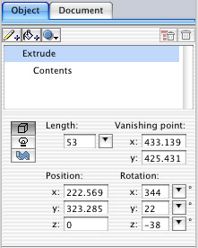
Figure 14-20: The Extrude panel determines many factors of the extrusion.
If you have multiple objects that you've extruded and would like them to have the same vanishing point, select all the extruded objects and choose Modify ® Extrude ® Share Vanishing Points. A new vanishing point will appear under the cursor when you click it on the page. All the objects will point to the new common vanishing point. Lighting on an extrusion is limited, but adequate, with two sets of nine light sources each. You get to choose all you want, as long as you want only two lights, but you can vary the intensity of each light. Figure 14-21 shows a few objects with fairly simple extrusions, including live, editable text and a hole through an object. Effects, such as glows and shadows, are based on the entire outline of the object and its extrusion, so realistic drop shadows may have to be constructed as a separate object beneath the extrusion.
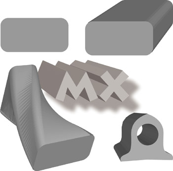
Figure 14-21: Examples of extruded objects and live text
All objects must be filled before making the extrusion, or you end up with a wireframe rendering. At the time of this writing, you cannot change the color of an object after it has been extruded. Choose a fill color before using the Extrude function, or the object will only consist of any stroke you have applied. If the object has a fill and a stroke, only the face of the original object will have a stroke, the extrusion will just have a shaded fill. Bitmaps can't be extruded. Instead, take the bitmap and the extrusion into Fireworks and distort the bitmap to fit the face of the extrusion. Then bring the distortion back into FreeHand and place it on the extrusion.
Simple Object manipulations
Although we could have discussed this topic in the Panels section, it has more to do with drawing than with organization. Use the Rectangle tool to draw a rectangle. Choose the Subselect tool (white pointer) and select the rectangle. A diamond-shaped point appears at the corners of the rectangle. Click and drag those points to make instant, symmetrical rounded corners. That would have been enough for me, but Macromedia took it a couple steps further in the Object panel. Choose the Rectangle item in the Object panel, and notice the corner options you have to choose from (Figure 14-22). Keep Uniform selected (default) and any changes you make in the panel are applied to each corner. Deselect it to make individual corner changes. The eight fields indicate the radius of the corners. Padlock icons allow or prevent changes to corner adjustments. The nicest touch is the group of icons in the center that enable you to make "innie" corners instead of radiused corners.
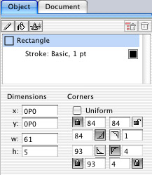
Figure 14-22: The Rectangle information panel allows individual corner development.
As shown in Figure 14-23, a rectangle can take several shapes. The original rectangle is shown in the top left. Rounded corners have been added with the Subselect tool in the top-right example. In the bottom left, Uniform was selected and an inside radius was created by clicking one of the corner buttons in the Rectangle panel. The last example on the bottom right has had various adjustments made through the Rectangle panel, and the rounded corners were modified by entering numbers in the panel and using the Subselect tool to move the corner points.
Figure 14-23: Rounded corners are really a snap in FreeHand MX.
The Rectangle isn't the only simple object that you can manipulate. How about ellipses? If you draw an ellipse in FreeHand MX and then choose the Subselect tool, a diamond and square handle show up on top of each other at the top of the ellipse. Click the mouse on them and drag left or right to take a wedge out of the ellipse, but leave a containing shape. It's as if someone stole a piece of pie. If you want, you can deselect the Closed option and just remove an arc from the ellipse. But what good is all of this going to be to you? Well, beyond making pie charts, Pac Man characters, or fortune cookies, you can use other information available in the document window. Figure 14-24 shows an ellipse and the Object panel fields. All the good names for things were taken, so the two points on the ellipse that you are able to move are called the dot and the diamond, after their shapes. In line with the standard Cartesian alignment, zero is the center point on the right side of the circle. The dot is vertical (by default); therefore in the Arc text field, the number is 90 degrees. The diamond is also vertical by default, but here it has been rotated midway to the zero point by entering 45 in the diamond Arc field. Under the Dimensions heading, "x" and "y" indicate the coordinates of the bottom-left corner of the ellipse's bounding box; "w" and "h" are the dimensions of the ellipse in the current document units of measure. If you are a technical illustrator, it won't take you long to work out the details of using this panel to the utmost.
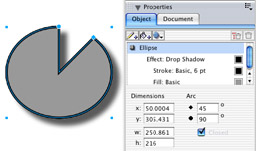
Figure 14-24: Elliptical modifications are easy to handle through the Object panel.
Polygonal controls
Okay, your appetite for simple object manipulation has been whetted, here's the main course. Click and hold the Rectangle icon in the Toolbar and select the Polygon tool when it appears in the pop-up menu. If you double-click this icon, you get the standard Polygon dialog box where you can change the number of sides/points and shape of the polygon. But you don't have to use this dialog box if you don't want to. Instead, draw a polygon on the page and change the number of points to 10 in the Object panel. The Object panel displays a new set of parameters that you've never seen before. In fact, these parameters are so new that they don't even have names–it's like the "artist formerly known as Prince." As a substitute for names, the outer point of a polygon receives a diamond icon, and the mid-point between outer points has a dot icon. What the heck, I think it's pretty safe to say that most artists are visually oriented, and we don't need names for things anyway. Choose the Subselect tool and click the polygon to make the diamond and dot icons appear on the polygon itself. When a single diamond or dot is clicked and dragged with the mouse, the entire array of diamonds or dots move as a unit. You can extend them, bring them toward the center, or rotate them at will. As you do so, changes are updated in the Object panel, and if you know exactly what you want to do, you can input numbers in the diamond and dot text fields to create change in the polygon.
But wait, there's more! Just because a polygon's point starts life on the outside of the shape doesn't mean it has to stay there. The dot points can be dragged outside the diamond points to extend the size of the polygon in one simple click and drag. Obviously, the diamond points can be dragged inside the dot points as well. When you rotate the points so they overlap each other, a complex shape is created, and you can invoke or deselect Odd And Even Fill to create even more complex designs (see Figure 14-25). The diamond and dot control is effective even after skewing, scaling, or rotating the polygon.
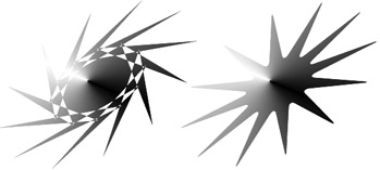
Figure 14-25: Twelve-point polygons with different settings in the Object panel
You've seen that you can add points and shift them around. What else is new? How about radiused corners — or fillets? Notice the corner icons at the bottom of the diamond and dot columns in the Object panel. By placing numbers in these fields, you can turn outside corners into blunt ends, and sharp inside corners into smooth, transitional paths.
Connector lines
If you are the organized type, or you need to show the relationship between elements, the Connector tool will be the highlight of FreeHand MX. It's simple to operate. Select the Connector tool, click an object, and click another object. A connector line joins the two objects with a straight-lined path to which you may apply arrowheads to either end, as with any other path. The tool has its limitations. All lines are right-angled between objects, there are no "angled" lines available, whether you utilize the Constrain feature or not. The connecting line will be "dog-legged" unless both objects are centered on each other (see Figure 14-26). Working with regular shapes, such as rectangles and circles, provides the best results, because the connecting lines start and end at the center of the bounding box of each object. Therefore, if you have an irregular-shaped object, the connecting line may not contact the edge of the object itself. You use this tool to draw map callouts, labels, and organization charts, but because the connector lines pass between pages, you can also use it to show the progression through a FreeHand HTML site setup.
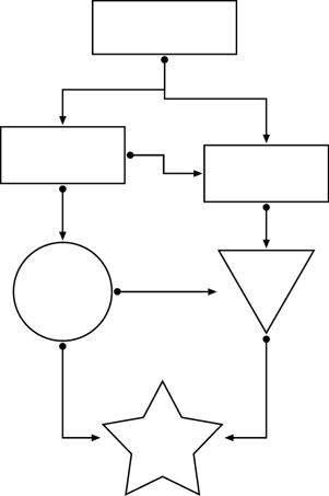
Figure 14-26: Connector lines make organization a snap, but precise alignment is necessary.
Gradient fill handles
Say good bye to the old thumbwheel for gradient fills, and say hello to the new Show Fill Handles option on the Pointer and Subselect tools. Double-click either of those tools to set the option for both tools. Then when you add a gradient fill to an object–and have Fill: Gradient (Linear, Radial, and so on) selected in the Object panel — a new fill handle shows up over the filled object.
A dashed line connects the two handles. One handle has a small black diamond. Click and drag this handle to move the entire range of the gradient around the object. The second handle is a black square, slightly larger than the diamond handle. This handle can be moved around the object, but it maintains the diamond handle as its center point. The square handle can be moved away from the diamond to stretch the amount of gradient, or moved toward the diamond to shorten the width of the gradient. But best of all, you can move the square handle around the diamond handle to change the direction of the gradient. This means you can see the path of the gradient and make visual decisions instead of the old hit-and-miss adjustments of the thumbwheel.
Gradient fill enhancements
If you like to use gradient fills, FreeHand MX has some additional toys to play with, called Behaviors. These attributes control the way the gradient fills an object, and they come in four flavors: Normal, Repeat, Reflect, and Auto size. It helps if you turn on the Show Fill Handles option for the Pointer and Subselect tools so you can see what's going on with the various behaviors.
If you choose Normal (the default), the gradient is business as usual. You can move the Gradient Fill handles around to change the way the gradient looks. Auto Size brings the control handles to a zero setting where the gradient is aligned to the page horizontally and vertically. There are no fill handles to work with, only the center point, but you can it move it within or outside the object. The Repeat behavior causes the gradient to begin and end at the terminus of the gradient fill handles. The handles can be rotated and moved around the document in a normal manner. Finally, the Reflect behavior (shown on the sphere in Figure 14-27) adds a reflection to the darker end of the gradient. Add a drop shadow and you've almost got 3-D.
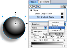
Figure 14-27: The Gradient Fill Behaviors enhance gradients with a mouse-click.
Multiple attributes
For the life of FreeHand, a path is drawn, then stroked and filled. If you wanted to do something else with the path you had to clone or copy and paste the path before you could make modifications. Things have changed in FreeHand MX. Now when you draw a path, it's only the beginning. You can apply multiple strokes, fills, and raster and vector effects all from the same path, through the controls in the Object panel. Unless it changes from the beta state of the program, gradients rotate with an object when transformed — that is, if you've decided to use the gradient indicative of a light source, the light source rotates as you rotate the object, so you have to adjust the gradient handles.
It's a matter of selecting the path in the Object panel and choosing various attributes. Then you can add a path or add a fill to the original path and place different attributes on it. Do it again and again until you have it right. When you're done, it's just a single object with all the effects you've applied to it. Figure 14-28 shows a path with several attributes. Alongside the path is the Object panel showing how the Object tree looks. Notice that the glows and shadows are fully transparent and react naturally to the Cone gradient beneath the sphere. The really nice thing about the multiple attribute arrangement is that you move only one object. There's no grouping, joining, or anything else. If you see an attribute you don't like, select it in the Object tree and click the Trash icon. None of the other attributes will change.
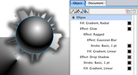
Figure 14-28: You can add multiple attributes to fills and strokes in the Object panel.
Reposition while drawing
Adobe Photoshop has let you reposition a selection before committing it to the Pasteboard for a couple years now. It's really easy to get used to. Just drag your selection with any of the selection tools and while the mouse is down, press the Spacebar. Any further movements of the mouse drag the selection; they don't change the shape of the selection until you release the Spacebar.
Snap To Objects
Before, you could only snap a point to another point, using Snap To Point. Now you'll be able to align objects and points perfectly to each other, anywhere along a path. Hover the Pen, Bezigon, or Line tool over a path, and the cursor gains a small circle, and a large dot appears on an object. This dot indicates that the next point will be placed directly on the path of the object beneath the cursor. The snap distance is 8 pixels by default. To change it choose Preferences ® General — you're best off with a setting of 3. The feature gets even better when you select an object somewhere on its path and move the object over another path or object (see Figure 14-29). The same circle and dot appear, showing you exactly where the objects will intersect. You can turn Snap To Point on or off in the View menu. The range that determines when an object snaps to a guide or an object is set under the Snap To Distance field in the Preferences ® General dialog box. The default is 8 pixels.
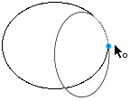
Figure 14-29: Align objects and points anywhere on a path with Snap To Objects.
Using panels
Of all the improvements to FreeHand, changes to the panels are the most evident and possibly the most useful — especially if you work on a small screen. All the panels are contained (at least when you first open the program) in a single panel that runs the full height of the right side of the monitor. It looks similar to the rest of the Studio MX setup. But, there's one great advantage if you're on a Windows machine, in that there's a tiny box and triangle in the separator bar that contains the panels. Click that triangle, and all the panels fly off the monitor completely, leaving only the 6-pixel-wide separator bar running down the right edge of the screen. Click the triangle again, and the whole shebang flies out. There are five panels, including Properties, Assets, Layers, Mixer and Tints, and Answers. You can move them up and down the stacking order by grabbing the gripper buttons on the left side and dropping the panel where you want it. A white triangle hides or shows the contents of the panel when clicked.
To remove a panel from the main group, grab the gripper buttons and drag the panel onto the desktop. If you want a tabbed panel out on its own, or included within another panel grouping, choose Group (name of tab) With from the panel Options menu and choose the new location. If you attempt to move a tab, you'll see a window with specific instructions on how to move the tabbed panel. You will quickly tire of this message; there's a box to check to halt its appearance.
Properties panel
This panel separates FreeHand MX from any previous version. Within it, you'll find the Object and Document panels. Document is no different than in previous FreeHand versions. But the Object panel gives you a whole new way to work. At the top of the panel you'll see the Add Stroke, Add Fill, and Add Effect buttons.
If nothing is selected in the document, Default Drawing Style will be the top entry in the Object panel. Directly beneath that is the stroke or fill that you've made part of your default setup. Whatever you draw next reflects these attributes. If you want to change the stroke attributes, click the Stroke entry in the attribute tree. That brings up everything to do with strokes: type, color, width, cap, and so on. Anything you select here shows up in the attribute tree. If your object lacks a fill, click the Add Fill button, and the Stroke attributes go away to make room for the Fills attributes. Again, your selections appear in the tree, including a color swatch. Double-clicking the swatch alternately opens the Mixer panel or the Swatches panel so you can change colors quickly.
On the right end of the panel are two trashcan icons. To utilize them, you must select an attribute in the attribute tree. Clicking the Remove Branch button deletes everything on the selected branch. This could be fill color, Gaussian blur, and a drop shadow, leaving a sketched, six-point Rhodamine Red stroke (if that's how you had it set up). If you wanted to remove only the drop shadow, you would select that item in the tree and click the Remove Item button. Everything else would remain.
Answers panel
All the Studio MX applications now have an Answers panel as standard equipment. They snap, dock, and zip with each other, and are linked to Macromedia's Web site for the latest information on the program. Basically, there's nothing on your machine — it's all on the Web, so an Internet connection is a necessity.
Styles panel
If you're a power-user and utilize styles, you're going to fall in love with the way you create styles in FreeHand MX. It's sort of a mix between the way it used to be done and symbol making. Graphic styles can include any and all of the following: Stroke, Fill, Object Halftone, and Effect. To begin with, the Styles panel is located within the Assets panel by default. You can move it out of the panel. The panel can be viewed in three different modes: Compact List View, Large List View, and Previews Only. Compact List View is basically the old Styles view — a small icon and the name of the style. It's great if you work with many styles. The Large List View has icons about four times larger than the Compact view, and also has the style name. Previews Only is a grid of large icons without names. The icons show stroke and fill for graphic objects. The larger two modes show "Aa" in the font you've chosen for the style.
Starting with text styles, all you have to do to make a style is select a text block that contains the text attributes you desire, and drag it onto an empty spot on the Styles panel. If you want a name for the style, you must be in the Compact List or Large List view; double-click the generic Style-1 text and type in your own style name. Text styles contain everything you can apply to text in the Text panel. A Text style ignores vector or bitmap effects that you applied in the Objects panel. You'll have to do a three-stage operation for those effects: set the text and make a Text style; then convert the text to paths; then apply the vector or bitmap effects and create a style from that.
Graphic styles are different. Because everything you do to an object is shown in the Objects panel, you can create a style from there easily. Either select an object on the page and set attributes in the Objects panel, or set the attributes with nothing selected. Then drag the Preview swatch at the top of the Objects panel onto the Styles panel. The Preview swatch shows a compilation of all the attributes you want for a given object. You can also select New from the Style panel's Option menu to add the style. If you created an object that you want to use as a style, you can select the object and drag it onto an open area in the Styles panel. The object won't go anywhere, but its attributes become a style.
Applying the style is a no-brainer. Select an object and click the style in the Styles panel. And, if you have a style or group of styles you want to be able to access in other documents or share with other artists, you can export them through the Styles Options menu. Think about using styles in your designing stage, by making various attributes into styles and using them throughout your production. Then if you need to make global changes, it can be done very quickly by changing the style.
The easiest way to redefine a style is to drag the new style object onto an existing style in the Styles panel. Additionally, you can drag the Preview swatch onto an existing style, or select the top-level entry in the Objects panel and choose Redefine from the Styles panel Options menu. This opens a dialog box enabling you to choose a style to redefine. You could get confused if you have nothing selected in the document, and you click on a style. Its attributes appear in the Objects panel where you can modify them. This does not change anything in the style. When you're through with the modifications, redefine a style or make a new style.
|
| < Day Day Up > |
|
EAN: 2147483647
Pages: 491
- Article 225 Outside Branch Circuits and Feeders
- Article 386 Surface Metal Raceways
- Example No. D2(a) Optional Calculation for One-Family Dwelling Heating Larger than Air Conditioning [See Section 220.82]
- Example No. D2(c) Optional Calculation for One-Family Dwelling with Heat Pump(Single-Phase, 240/120-Volt Service) (See 220.82)
- Example No. D4(b) Optional Calculation for Multifamily Dwelling