Basic Text Styles
|
| < Day Day Up > |
|
You can use the Font Style menu to make your font bold or italic, but depending on the font, you may not get the results you were expecting when it comes time to print the job. If it looks right on the monitor and your end use is the Web, you don't have a problem. But printing to PostScript devices can bring up a few surprises. For that reason, select a bold, italic, or bold italic style of the font you want from the Fonts menu. That way, the computer has exactly the information it needs to print the job successfully.
You also have various effects in the Text inspector at your disposal. For most purposes, I recommend that you stay away from these effects. If for any reason you must convert the text to paths, those attributes will be lost. At that point, you must attempt to come up with a way to modify the text to reflect the effect you had applied. Re-creating some effects is frustrating; others are impossible. You're much better off working with text and vectors than using the canned effects.
Inline effect project
A common text effect is inline. You can have FreeHand do the inline effect by going to Text ® Effect and choosing Inline from the drop-down menu. A dialog box opens, allowing you to enter the number of lines you want, the width and color of the stroke, and the width and color of the background. If you convert the text to paths, you lose those extra lines and have the basic text back. Instead, it's easy enough to make your own inline text that is just as adjustable, but permanent. As with many tasks in FreeHand, there are multiple ways to accomplish the job, and each option has its own benefits.
| Note | If it's a single word or phrase that I "know" won't be changing, I usually convert the proofed text to paths right away. This serves the purpose of not having any restrictions due to font or text-based software issues, and because I'll be working with multiple graphics stacked on top of each other, the chances of introducing an extra space or something into live text is removed. If I have a hunch that the text will be changing in the future, I clone the live text and place it somewhere safe on the Pasteboard, off the page itself. In other situations, I place the live text on a separate layer and hide that layer in case of future edits. |
-
Open a new FreeHand document and save it as TextEffects.FH10.
-
Select the Text tool, click the page, and type "INLINE" in a heavy bold font. Change the size to 120-points, and go to Text ® Convert To Paths. This command removes any connection with fonts and text, and turns the letterforms into a group of pure vector graphics. Figure 9-15 shows the four easy steps required to make inline text — or inline anything, for that matter.

Figure 9-15: Four steps to inline text effects -
Convert the text to paths.
-
Give the resulting group a 6-point black stroke, and clone the group.
-
Give the new group a 4-point white stroke, and clone it.
-
Remove the stroke from the clone. Group all three graphics and you're done.
Keep in mind that a path has no width dimension until it is stroked. Half of the stroke goes on one side, and half of the stroke goes on the other side of the path. In this example, you created a 1-point black outline and a 1-point white inline around the original object. You can change the width of the strokes and make them any color. To apply gradient fills, remember to create a compound path (Modify ® Join) to have the gradient affect the group as a whole instead of its various parts.
Shadow effect project
To create drop shadows in Fireworks, Illustrator, or Photoshop, you can run a filter or two and the job is done. However, that's a bitmap project, and we're in a vector world. You can choose Shadow in the Text ® Effect menu, but you run into a disappearance problem if you convert the text to paths.
FreeHand's Shadow text effect is simply an offset gray clone. Smudge makes clones of an object and offsets them to make you think you're seeing a true shadow effect. But if you look closely, you'll see the stair-stepped edges of the clones. That may be okay for some applications, but I prefer something closer to what I can get out of Fireworks, or the other programs. I make gradients.
Assuming you've already done the inline effect in the previous paragraphs, use that same text and apply a shadow to it. If you prefer, you can start from scratch by typing a word in a bold font and converting it to paths (and skipping the next couple steps of hiding elements):
-
Ungroup the nest of graphics you made for the inset project.
-
Select the top element and hide it (View ® Hide Selection).
-
Select the next level and hide it, too.
-
Select the fat bottom layer, clone it, and send the clone to the back.
-
Press the Tab key to deselect everything, and then select that fat level and hide it. You now have a fat clone in front of you. Give it an even fatter 8-point stroke.
-
Double-click the Trace tool to open its dialog box.
-
Set the color mode to 2, Grays, RGB, High Resolution, and Trace Layers: All.
-
Select Outer Edge for the Path Conversion, and move all three sliders in the bottom half of the window to the far right. Click OK.
-
Drag a selection box around the fat clone. This outlines the outline, so you have a contiguous shape instead of multiple shapes in a group.
-
In the Fills inspector, choose Gradient for the fill type, and click the Contour Gradient button (far right).
-
Drag a white swatch to the left box in the gradient color well, and create a 60 or 70 percent gray to place in the right box.
-
Move the slider back and forth until you reach a gradient effect that you like.
-
Choose View ® Show All to bring back all the text. It should look similar to Figure 9-16.
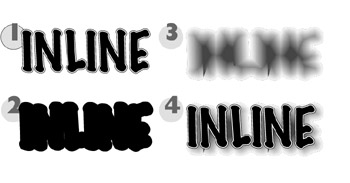
Figure 9-16: A soft shadow made with the Trace tool and a contour gradient
Inline graphics
Occasionally, you need to place a logo or other type of graphic within a line of text. Putting tabs or spaces in the text and pasting a graphic in the blank spot are obvious workarounds, but FreeHand provides a much easier method. In Figure 9-17, a silhouette of a bird has been placed in the middle of a block of text. If you want to work this out, follow these steps:
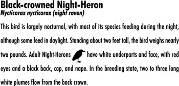
Figure 9-17: An inline graphic places logos and artwork inside a line of text.
-
Open the file
 Herons.FH10 from the Chapter 9 folder on the book's accompanying CD, and make a new page.
 -
Import the
Night-Heron.rtf file from the same folder and place it on the new page. -
Style the text with fonts and size of your choice.
-
While holding the Shift key down to constrain the bird's proportions, drag the Night-Heron silhouette from page one onto page two, and scale it to the size you want it to be to fit within the text line.
-
Cut or copy the graphic to the Clipboard.
-
With the Text tool, place an insertion point where you want the graphic to appear, and paste the graphic.
The graphic aligns with the baseline of the line of text it is pasted in. If it's a tall graphic, such as this bird, you must adjust the leading. In this example, the baseline has also been shifted down for the inline graphic. All you need do is select the graphic with the Text tool, and adjust the baseline shift in the Text inspector. Any adjustments you make to the block of text affect the inline graphic, so you may need to replace it if you change the font size or other shape attributes such as font width. A change in the font itself doesn't affect the graphic, and its location remains fixed within the text.
Placing graphics inside text
Text doesn't have to be centered, or have exact margins. Feel free to think outside the (text) box. Placing text inside graphic shapes to force a little life into your artwork is easy. However, getting the text to "work" inside the graphic requires a bit more planning:
-
Open the file
Herons.FH10 from the Chapter 9 folder on the book's accompanying CD, and make a new page. -
Import the
CattleEgret.rtf file from the same folder and place it on the new page. -
Style the text with the font and size of your choice.
-
Drag the Cattle Egret silhouette from page one onto page two.
-
To flow text inside this closed graphic shape, use the Pointer tool to select the text block and the graphic. Go to Text ® Flow Inside Path. You can align text just as you would a regular text block — justified, flush left or right, or centered.
Figure 9-18 shows an example of text inside a graphic. The text on the right has been converted to paths. Notice that the toned background has disappeared. If you want the background, just clone one and place it behind the converted text.
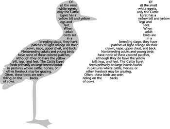
Figure 9-18: Text flowing inside a path can be effective in a layout.
To add a page, open the Document inspector, and click the triangle in the upper-right corner of the panel. This will open the Document Options pop-up menu. Choose Add Pages from the menu. The page will be added to the document, but your view of the current page will not change. However, if you look at the page number indicator at the bottom left of the application window, you'll notice that it says you're on Page 2. You're not. To get to Page 2, you must click somewhere in Page 1, then change the page number at the bottom of the window. Conversely, you can scroll to the right until Page 2 appears. Yet another method is to click on the Page 2 icon in the Document inspector thumbnail window.
Text runarounds
Text running around a graphic can add some flavor to your artwork. The rules are simple: The graphic must not be a group or blend, and the graphic must be above (in front of) the text block. The example shown in Figure 9-19 is easy to accomplish, by following these steps:
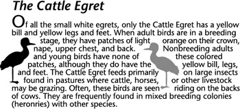
Figure 9-19: Text runarounds in action
-
Open
Herons.FH10 from the Chapter 9 folder on the book's accompanying CD, and make a new page. -
Import the
CattleEgret.rtf file from the same folder, and place it on the new page. -
Style the text with the font and size of your choice.
-
While holding the Shift key down to constrain proportions, drag the Cattle Egret silhouette from page one onto page two, and scale it to fit and ungroup it.
-
Choose Modify ® Arrange ® Bring To Front, and Shift-click the text block. Go to Text ® Run Around Selection. A dialog box enables you to choose whether you want the text to run over or around the graphic.
-
Input a distance you want the text to be offset from the graphic in the four fields. If you choose not to put in a number, the text abuts the graphic.
-
Click OK, and the text reflows around the graphic.
-
Use keyboard arrows or the mouse to move the graphic around so text flows the way you want.
Depending on word lengths and other factors, the effect will work or not. You can resize the graphic, or change the shape of the text block, and the runaround continues to work. Move the text to the front, however, and it runs over the graphic.
The text does not run around a group. If the shape is simple to begin with, just ungroup it. When you come across a situation where an ungrouped mass could possibly cause mass confusion, draw a simple shape that's roughly the same as your grouped object. Give it a stroke and fill of None. I generally group that object with the object that I want the text to run around just to get the placement within the text fixed, and then I ungroup them. It's then a matter of selecting the new object and the text and applying the runaround.
The beauty of Paste Inside
For the last projects in this chapter, you place an image inside a block of text, and use a block of text as a lens fill. This graphic effect doesn't work too well unless you have heavy blocks of text — the heavier the better.
First put an image inside a letterform. Usually this would be a headline, but in this case, use the Habitat Alert logo: Due to font issues, the text has been set for you, then converted to paths (Text>Convert To Paths), and then each word was turned into a compound path (Modify>Join).
-
Start by opening the
TextInGraphic.FH10 file found in the Chapter 9 folder on the book's accompanying CD. When it opens, you'll see the final result of the project, and the elements you need to do it yourself. You build the logo itself in a project in Chapter 11. -
Select the black version of "HABITAT" and notice in the Object inspector that this is a composite path.
-
Import
TobyhannaFerns.tif from this chapter's folder on the CD. Place it so that it covers the text, and cut it to the Clipboard (Command/Ctl+X). -
Select the text, and go to Edit ® Paste Inside. (If you want to experiment a bit, hold down Opt/Alt and click in one of the letters. This clicks "through" the compound path and to the object that is pasted inside. Now you can use the mouse or keyboard arrows to move the image around inside the text.)
-
You have "greenery" for the top word; how about "water" for the bottom? Import
PoconoRipples.tif from this chapter's folder. Repeat the preceding steps with the word "ALERT" and you're done. Group the letterforms to make alignment easier in the future. It should look similar to the image shown in Figure 9-20.
Figure 9-20: An image inside a text block
Let's try another technique. In this project, you use text as a lens fill to modify a graphic. The graphic can be a photographic bitmap or a piece of vector art; the technique doesn't know the difference.
-
Move to page two of
TextInGraphic.FH10 to see the finished image used for Figure 9-21. Below that is a block of text that I've converted to paths and made into a compound path. If you want to try this with another typeface, you can import any of the text files found in this chapter's folder on the CD. Import one of the images from the CD, or just clone the image at the top of the FreeHand page. Place it behind the text block, and adjust (scale) the text or the image to fit comfortably. To be more precise with this technique, you should be working with live text until everything fits, and then convert the text to paths (or a copy of the text to be safe).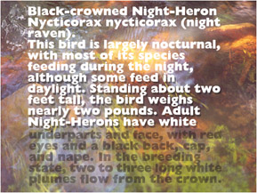
Figure 9-21: Text with a darken lens fill applied to make a shadow -
This time, you don't want a compound path, because they don't work with lens fills. So select the text group, go to the Fills inspector, and select Lens from the menu. At this point, I encourage you to experiment with the various types of lens fills and what they do to the underlying image. Some images work best with a Lighten, others with a Darken, or Transparency. In Figure 9-21, I placed a clone of the text above a Darken lens fill, and moved up and to the left a few points to make the lens fill appear as a shadow. In the top third of the text, there is no lens fill; in the middle white text is shadowed with the lens fill; and at the bottom there's only the lens fill. Exploration and experimentation are key when you're working with this type of graphic effect.
|
| < Day Day Up > |
|
EAN: 2147483647
Pages: 491