ASP.NET Iterative Controls
Overview
Be sincere; be brief; be seated.
-Franklin D. Roosevelt
Iterative controls are a special type of data-bound controls that combine two key capabilities. They support ADO.NET-compliant data sources and supply a template-based mechanism to create free-form user interfaces.
In Part II of the book, while covering database programming and techniques, we covered the DataGrid control in great detail. Technically speaking, the DataGrid control is certainly an iterative control in the sense that it iterates over a bound data source to generate its user interface, one row after the next. Although the DataGrid is highly customizable, it can't go beyond the boundaries of a column-based representation of the data. For example, the DataGrid supports templates, but only within the cells of a column. Other tasks are only for the bravest—for example, redesigning the layout of an individual row, or altering the default template of the control's output to employ multiple rows per record or multiple columns per data source. In some cases, by resorting to dirty and smart tricks you can customize the DataGrid, such as displaying subtotals as we did in Chapter 8, "Real-World Data Access." Generally, though, the DataGrid is not the ideal tool to use when you need a more free-form display of data. For this purpose, the Repeater and DataList controls, each with its own set of pros and cons, seem to be more appropriate.
What s an Iterative Control, Anyway?
Before looking under the hood of the Repeater and DataList controls, let's discuss in general terms the expected features of iterative and templated controls. A control is said to be iterative if it provides the ability to loop over a set of data items in order to apply some layout elements to each of them. In addition, an iterative control works by applying an ASP.NET template to each data item. It exposes the individual data item as a customizable and configurable stand-alone object that holds its own set of properties, methods, and events.
According to this definition, what is the role of all controls that show a list of data rows? Are the DropDownList and CheckBoxList controls, just to name a few, iterative controls? Is the DataGrid iterative as well?
Iterative Controls vs List Controls
The big difference between, say, a DropDownList control and what we recognize here as iterative controls—that is, the Repeater and DataList—is all in how each control shows its contents. The DropDownList control uses a drop-down list and doesn't provide relevant facilities for you to change the user interface of each displayed item.
Similarly, the CheckBoxList control displays a list of selectable options whose value and displayed text can be bound to a data source. With this list control, you can apply some relatively simple HTML formatting to each item. However, you can't do that with a stand-alone object that represents the list item. More specifically, you have no object that is equivalent to the DataGridItem class of the DataGrid control. If you want to render, say, some items of the check-box list in boldface type, you can only modify the text of the single item being displayed and wrap it in a element. Although this is (much) better than nothing, it's still too little for complex applications that need more advanced display features.
In summary, iterative controls differ from list controls because of their greater rendering flexibility. An iterative control lets you apply an ASP.NET template to each row in the bound data source. A list control, on the other hand, provides a fixed and built-in template for each data item. List controls are customizable to some extent, but you can't change anything other than the text displayed. No changes to layout are supported.
On the other hand, using a list control is considerably easier than setting up an iterative control, as we'll see in a moment. Defining templates requires quite a bit of declarative code, and if accomplished programmatically, it requires that you write a class that implements the ITemplate interface. A list control needs only data binding.
Iterative Controls vs the DataGrid Control
The DataGrid is an iterative control because it displays the contents of a data source by using customizable templates in which the programmer can easily access and configure each constituent element—from the data rows to the header and from the footer to the pager. However, the DataGrid can also be considered a list control because the customization facilities it provides don't allow you to break the rigid scheme of a tabular, multicolumn representation of data.
The DataGrid has more advanced features than the Repeater and DataList—particularly, paging. On the other hand, it doesn't offer the same level of flexibility as iterative controls. In a certain sense, it's a sort of highly specialized, off-the-shelf version of an iterative control.
Using a Repeater control, and even more easily using a DataList, you can build a grid of data. Note also that you can't always use a DataGrid control to reproduce the same output you can with either a Repeater or DataList. Table 9-1 summarizes the differences among the DataGrid, iterative controls, and list controls.
|
Rendering |
Usage |
|
|---|---|---|
|
DataGrid Control |
Loop over data, and create a tabular representation of data allowing for column-specific templates. |
Use when you have tabular data to display. If the data is not naturally tabular but can be rendered as such, consider iterative controls too. |
|
Iterative Controls |
Loop over data-bound items, and apply a user-defined template. |
Use when you have data to render as a monolithic structure in a free-form way. |
|
List Controls |
Loop over data-bound items, and apply an immutable, control-specific template. |
Use when you don't need item-specific customization and you like the standard user interface. |
The Repeater Control
The Repeater is a data-bound control that displays data using a custom layout. It works by repeating a specified ASP.NET template for each item displayed in the list. The Repeater is a rather basic templated data-bound control. It has no built-in layout or styling capabilities. All formatting and layout information must be explicitly declared and coded using HTML tags and ASP.NET classes.
Programming Interface of the Repeater Control
The Repeater class inherits from Control and acts as a naming container by implementing the marker interface INamingContainer. Table 9-2 lists the properties exposed by the control, not counting those inherited from the base class Control.
|
Property |
Description |
|---|---|
|
AlternatingItemTemplate |
Gets or sets the template that defines how every other item is to be rendered. |
|
DataMember |
Gets or sets the specific table in the DataSource that is to be bound to the control. |
|
DataSource |
Gets or sets the data source that provides any data for populating the list. |
|
FooterTemplate |
Gets or sets the template that defines how the footer is rendered. |
|
HeaderTemplate |
Gets or sets the template that defines how the header is rendered. |
|
Items |
Gets a RepeaterItemCollection object—that is, a collection of RepeaterItem objects. Each element of the collection represents a displayed data row in the Repeater. |
|
ItemTemplate |
Gets or sets the template that defines how items are rendered. |
|
SeparatorTemplate |
Gets or sets the template that defines how separators between items are rendered. |
For the most part, properties are the template elements that form the control's user interface. Aside from that, the Items property contains the list of child items that are associated with each displayed data row. The RepeaterItem object is the Repeater's counterpart of the DataGridItem object we discussed in earlier chapters. The Repeater populates the Items collection by enumerating all the data objects in its bound data source. In no way does the control filter the contents of the Items collection. All the rows contained in the data source are mapped onto a RepeaterItem object and inserted in the collection. The RepeaterItemCollection class is a plain collection class with no special or peculiar behavior.
Just as in the DataGridItem class, the RepeaterItem class is used to represent any type of constituent item and is not limited to data items. You distinguish between types using the familiar ListItemType enumeration. A few properties characterize the programming interface of the RepeaterItem class. The RepeaterItem class is self-explanatory once you know about the DataGridItem class and have a look at its properties—ItemIndex, ItemType, and DataItem.
Binding a Repeater to Data
Just like any other data-bound ASP.NET control, the Repeater generates its user interface only when a call to its DataBind method is made. DataBind is the only method in the control's interface aside from those directly inherited from parent classes. A call to DataBind causes the control to rebuild its control hierarchy and related view state. Before the whole process starts, the DataBinding event fires.
The call to DataBind is necessary to have the HTML code for the control be generated and added to the output stream. In addition to the events defined on the Control class, the Repeater exposes three additional events—ItemCreated, ItemCommand, and ItemDataBound. (See Table 9-3.) Their overall behavior is nearly identical to that of the analogous events in the DataGrid.
|
Event |
Description |
|---|---|
|
ItemCommand |
Fires when a button is clicked within the Repeater control. |
|
ItemCreated |
Fires when a repeater item is being created. |
|
ItemDataBound |
Fires after an item in the Repeater has been bound to underlying data. The event occurs before the data item is added to the Items collection. (Note that only items and alternating items are bindable.) |
The DataBinding event fires before all the events listed in Table 9-3. The sequence of data-binding events is triggered by the call to DataBind. As the very first step, the Repeater fires the DataBinding event and then begins building the control's hierarchy. Events in Table 9-3 occur only at this time, in the order we're going to discuss in the next section.
How the Repeater Builds the Output
An internal, protected method of the Control class named CreateControlHierarchy is responsible for the generation of the HTML code sent to the browser. This method connects to the data source and then runs a loop over the items in the bound collection. (See the "Resolving the Data Source" sidebar later in the chapter for more information on how the Repeater resolves the reference to the run-time data-bound object.)
The following pseudocode illustrates the process that leads to the creation of the Repeater output.
if (headerTemplate != null)
 CreateItem(ListItemType.Header);

int _counter = 0;
RepeaterItem _repItem;

foreach(object _dataItem in DataSource) {
 if (useSeparator && _counter > 0)
 CreateItem(ListItemType.Separator);
 if (_counter % 2)
 _repItem = CreateItem(_counter, ListItemType.Item, _dataItem);
 else
 _repItem = CreateItem(_counter, ListItemType.AlternatingItem,
 _dataItem);
 Items.Add(_repItem);

 _counter ++;
}

if (footerTemplate != null)
 CreateItem(ListItemType.Footer);
The Repeater first applies the header's template, if any. Next, it walks its way through the collection of bound objects and applies the ItemTemplate or the AlternatingItemTemplate as appropriate. Each item template might be interspersed with a separator template, if any has been provided. Finally, at the end of the loop, the footer's template is applied only once.
Within the CreateItem placeholder, a new RepeaterItem object is created and initialized to default values. Next, the ItemCreated event fires and then the object is added to the Items collection. As explained for DataGrid controls in Chapter 6, "Creating Bindable Grids of Data," the ItemCreated event occurs twice, the first time of which is before the whole data binding process begins. This just means that the CreateItem placeholder is invoked twice. The second time, the DataBind method is invoked on the newly created RepeaterItem object and then ItemDataBound fires. The following listing shows the pseudocode for the CreateItem placeholder.
RepeaterItem CreateItem(int index, ListItemType itemType,
 bool dataBind, object dataItem)
{
 RepeaterItem _repItem;
 RepeaterItemEventArgs e;

 _repItem = new RepeaterItem(itemIndex, itemType);
 e = new RepeaterItemEventArgs(_repItem);
 ApplyItemTemplate(_repItem);
 if (dataBind)
 _repItem.DataItem = dataItem;
 OnItemCreated(e);
 Controls.Add(_repItem);
 if (dataBind)
 {
 _repItem.DataBind();
 OnItemDataBound(e);
 }

 return _repItem;
}
The ApplyItemTemplate placeholder renders a piece of code that instantiates all the controls and the literals contained in a bound template. This point leads us straight to the question: what's a template, anyway?
Templates of the Repeater Control
We've already met ASP.NET templates in Chapter 6 while examining the templated columns of DataGrid controls. Speaking abstractly, a template is a block of server controls, literals, and HTML text that is used as a monolithic output element. To some extent, you can think of a template as a dynamically defined ASP.NET control with a composite interface that can be defined either declaratively using client and server tags or programmatically via ad hoc classes.
At a minimum, the Repeater must provide the ItemTemplate template. Unspecified templates are simply ignored; however, if you also omit the ItemTemplate template, the Repeater will have blank output.
In most cases, you define a template using declarative code. For example, the following code shows how to generate output that looks like that of a DataGrid:
| ID | First Name | Last Name | ||||
| <%# ((DataRowView)Container.DataItem)["EmployeeID"] %> | <%# ((DataRowView)Container.DataItem)["FirstName"] %> | <%# ((DataRowView)Container.DataItem)["LastName"] %> | ||||
| <%# ((DataRowView)Container.DataItem)["EmployeeID"] %> | <%# ((DataRowView)Container.DataItem)["FirstName"] %> | <%# ((DataRowView)Container.DataItem)["LastName"] %> | ||||
| <%# "" + ((DataView)Repeater1.DataSource).Count + " employees found."%> | ||||||
Figure 9-1 shows what this Repeater control looks like.
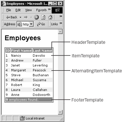
Figure 9-1: The Repeater control can do whatever a DataGrid can do, even though it might require a lot of coding. The opposite is not true.
In this case, the data source of the Repeater control is a DataView object.
DataSet _data = new DataSet();
string _conn = "SERVER=localhost;DATABASE=Northwind;UID=sa;";
string _query = "SELECT employeeid, firstname, lastname FROM employees";
SqlDataAdapter _adapter = new SqlDataAdapter( _query, _conn);
_adapter.Fill(_data);
Repeater1.DataSource = _data.Tables[0].DefaultView;
Repeater1.DataBind();
As you can see, a lot of casting is needed to keep the compiler quiet and avoid errors. Many of those explicit casts can be avoided if you resort to the DataBinder object and its late-binding Eval method.
The final output of the Repeater is simply the summation of the HTML generated by each involved template. As illustrated in the aforementioned example, the Repeater control allows you to split HTML tags across the various templates.
The ITemplate Interface
The Repeater class references a template through the ITemplate interface, meaning that a template is always treated as an instance of any class that implements the ITemplate interface. In spite of this, you are allowed to specify a template by using server-side tags and HTML tags. What's up?
When the page is compiled, all the fragments defined within a template block are compiled into an internal object that implements the ITemplate interface. Set the debug attribute of the @Page directive to true, and look into the actual code being generated for the page shown in Figure 9-1. (See Chapter 2, "Web Forms Internals," for instructions on how to do this and retrieve the correct source file.) The Repeater is built using the following code. Note that the code shown here is the same code generated by the ASP.NET compiler—it's just made more readable.
// Instantiate the Repeater object
Repeater __ctrl = new Repeater();
Repeater1 = __ctrl;
__ctrl.ID = "Repeater1";

// Build the template for the header
BuildTemplateMethod _builder;
_builder = new BuildTemplateMethod(__BuildControl__control3);
CompiledTemplateBuilder _template = new CompiledTemplateBuilder(_builder);
__ctrl.HeaderTemplate = _template;

// Build other templates
The CompiledTemplateBuilder class is listed in the ASP.NET documentation, but it's not documented. The same holds true for the BuildTemplateMethod delegate.
public delegate void BuildTemplateMethod(Control control);
The constructor of the CompiledTemplateBuilder class takes an instance of the delegate and calls it back to build a template class based on the source of the specified control. What's the _control3 in the source code? It's simply the literal control that contains all the source code of the tag.
void __BuildControl__control3(Control __ctrl)
{
 IParserAccessor __parser = (IParserAccessor) __ctrl;
 LiteralControl _header = new LiteralControl("text of ");
 __parser.AddParsedSubObject(_header);
}
When a template is instantiated, all the child controls are instantiated and then rendered to HTML. This is what happens in the preceding procedure using the methods on the IParserAccessor interface. If you want to create templates programmatically, there are simpler ways, and we'll look at a couple of them in a moment. In the meantime, let's review the definition of the ITemplate interface.
The ITemplate interface consists of a single method, named InstantiateIn.
void InstantiateIn(Control container);
The expected behavior of InstantiateIn is intuitive: it programmatically creates all the child controls to be used in the template. All the controls are added to the container's Controls collection. If needed, the newly created controls can be bound to the data source by adding a handler for the DataBinding event.
Creating Templates Programmatically
There are basically two ways to set template properties programmatically. The simplest way is by using the LoadTemplate method of the Page class. LoadTemplate takes only one argument, that being the name of the .ascx file that describes the template. The file name must have an .ascx extension. .ascx is the typical extension of Web user control files. (We'll cover Web user controls in the Chapter 10, "Web Forms User Controls.") You create a file-based template using the following code:
Repeater1.ItemTemplate = Page.LoadTemplate("item_template.ascx");
The template file can be written in any .NET language and doesn't necessarily have to be written in the language of the page. The LoadTemplate method can be used to load the layout code for any template property, including HeaderTemplate and FooterTemplate. The following code shows how to write an .ascx control to emulate the behavior of the page shown in Figure 9-1:
<%@ Control Language="C#" %>


 <%# DataBinder.Eval(((RepeaterItem)Container).DataItem,
"EmployeeID")%>


 <%# DataBinder.Eval(((RepeaterItem)Container).DataItem, "FirstName")
 %>


 <%# DataBinder.Eval(((RepeaterItem)Container).DataItem, "LastName") %>
The use of DataBinder in this case contributes significantly to clarifying the code. Without it, you would have to cast Container to RepeaterItem (unnecessary within the page) and then DataItem to DataRowView.
The second way to set template properties programmatically is by using a class that implements the ITemplate interface. Using a class that implements ITemplate achieves the same effect as using LoadTemplate and an .ascx file. Here is an example the class:
public class MyItemTemplate : ITemplate
{
 public void InstantiateIn(Control container)
 {
 // Create the  element
 TableRow _row = new TableRow();

 // Add the employeeID
 TableCell _empID = new TableCell();
 _empID.DataBinding += new EventHandler(BindEmpID);
 _row.Cells.Add(_empID);

 // Add the lastname
 TableCell _lname = new TableCell();
 _lname.DataBinding += new EventHandler(BindLName);
 _row.Cells.Add(_lname);

 // Add the firstname
 TableCell _fname = new TableCell();
 _fname.DataBinding += new EventHandler(BindFName);
 _row.Cells.Add(_fname);

 // Add the row to the container
 container.Controls.Add(_row);
 }

 public void BindEmpID(object sender, EventArgs e)
 {
 TableCell cell = (TableCell) sender;
 RepeaterItem container = (RepeaterItem) cell.NamingContainer;
 DataRowView _row = (DataRowView) container.DataItem;

 cell.Text = _row["EmployeeID"].ToString();
 }

 public void BindLName(object sender, EventArgs e)
 {
 TableCell cell = (TableCell) sender;
 RepeaterItem container = (RepeaterItem) cell.NamingContainer;
 DataRowView _row = (DataRowView) container.DataItem;

 cell.Text = _row["LastName"].ToString();
 }

 public void BindFName(object sender, EventArgs e)
 {
 TableCell cell = (TableCell) sender;
 RepeaterItem container = (RepeaterItem) cell.NamingContainer;
 DataRowView _row = (DataRowView) container.DataItem;

 cell.Text = _row["FirstName"].ToString();
 }
}
Resolving the Data Source
You should note that the DataGrid control, as well as the Repeater and the DataList, manage the data source through the generic interface of the object class. However, underneath this common and somewhat too simple interface, quite different objects can be used. How can iterative controls distinguish between DataTable, DataSet, DataView, and even custom collections?
Iterative controls use an internal class named DataSourceHelper to resolve any issues related to the actual data source to bind to. In a certain way, the helper class straightens differences out and normalizes all possible sources to the root collection interface IEnumerable. (ICollection descends from IEnumerable, and IList, in turn, inherits from ICollection.)
DataSet and DataTable, for example, don't implement IList directly. They implement IListSource, from which the helper class extracts an IList-compliant array. A similar pattern can be observed with the DataView, DataViewManager, and PagedDataSource classes. All these classes act as proxies between the control and an embedded object—for example, a DataTable. Although they implement IList, an intermediate interface is needed to bind and publish the schema of the underlying data source. The ITypedList interface provides the tools to extract a valid enumerable list from these objects too.
In summary, iterative controls access and manipulate their data items through the IEnumerable interface. However, an extra step is necessary to normalize all possible data sources to IEnumerable. This is a subtle problem that arises if you're going to write a list-bound control yourself. We'll tackle this problem in Chapter 20, "Data-Bound and Templated Controls."
Note that the type of the data item depends on the data source that has been bound to the Repeater. The sender argument refers to the control that is being bound to the data—the TableCell. The NamingContainer property is only a shortcut to obtain a reference to the parent Repeater. In this case, the Repeater is the naming container of the cell; however, this technique should be used with a grain of salt. If the bound control or its parent is a naming container itself, the technique will fail.
Working with the Repeater Control
The output that a Repeater control can generate for you is any HTML code that can be obtained by repeating ASP.NET templates for all rows in a data source. The overall output can be bound within a table as well as flow as plain HTML text. The Repeater control doesn't provide any facility for formatting or styling the output, so whatever effect you need must be manually coded. Note also that you don't necessarily have to bind an ADO.NET object such as DataTable or DataView. Arrays of custom classes, hash tables, and, in general, any objects that implement the IEnumerable interface (or any of its derivates) are acceptable. Of course, you are responsible for casting the Container.DataItem expression to the right type.
Let's build a page that lists some information about the customers stored in the Microsoft SQL Server Northwind database. We did this several times in past chapters, but we did it by using a DataGrid control or a list control. In those cases, though, we were limited by the fixed template of the controls and could show only text. The greater flexibility of the Repeater control allows us to create a sort of Web form for each customer. In particular, our goal is to list minimal information about customers along with a check box. When the page is refreshed, all checked items will display with different colors and more information.
Designing the Templates
For a realistic Repeater control, the item template is a fundamental tool for showing the actual data. The Repeater also needs to have the header template, which is normally used to introduce the user to the information displayed below. The separator template is effective to graphically separate one item from the next. It's especially needed if you use the alternating item template. In this example, we provide a simple implementation of the separator, making it include only a thin horizontal ruler—an
element. However, the separator template might be the ideal tool to use when you need to display summary rows or subtotals.
Building the Page
The following listing illustrates the underpinnings of the page shown in Figure 9-2. It contains a few templates for the header, data items, and separator.
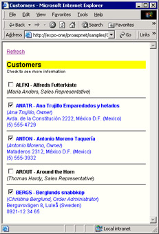
Figure 9-2: The Repeater in action, showing information about customers.
Customers
Check to see more information <%# m_checkBox = (CheckBox) FindCheckBox(Container) %> <%# ShowHeader(Container.DataItem) %> <%# ShowInfoBar(Container.DataItem) %> <%# ShowAddressBar(Container.DataItem) %>
The header template is applied only once, whereas the separator is applied before every displayed item except the first. We modified the default style of the
element to make it one-pixel thin. The core of the page is in the section. Let's examine its constituent pieces.
You see that the item's template begins with a rather odd hidden tag. Next, it includes a check box and three additional functions, each run within a data-bound code block, <%# ... %>. As clearly visible in Figure 9-2, address information is displayed for checked customers and all information appears in blue, even though this last effect is not perceivable from a grayscale picture.
The ShowHeader, ShowInfoBar, and ShowAddressBar output the various blocks of information that make up the customer's form. ShowHeader outputs the boldface line with the customer code and name. ShowInfoBar generates the italicized line with contact details. Finally, ShowAddressBar shows the address of the customer and other personal information such as the phone number. All these functions take the data item and return the HTML-formatted string to add to the page's output stream.
private string ShowHeader(object dataItem)
{
 // Determine the color to use
 string color = (m_checkBox.Checked ?"blue" :"black");

 // Set up the pattern of the final HTML string
 string _output = "{1} - {2}";

 // Fill in the placeholders
 DataRowView _row = (DataRowView) dataItem;
 _output = String.Format(_output,
 color, _row["customerid"], _row["companyname"]);

 // Return the output string
 return _output;
}
The other helper routines have a similar structure. (See this book's sample code.) The key thing going on here is the how the function determines the color to use. Aside from that, it simply casts the Container.DataItem expression to the actual type—DataRowView in this case. Let's see the initialization code of the page.
CheckBox m_checkBox;

public void Page_Load(object sender, EventArgs e) {
 if (!IsPostBack)
 BindData();
}

private void BindData() {
 DataSet _data = new DataSet();

 string _conn = "SERVER=localhost;DATABASE=Northwind;UID=sa;";
 string _query = "SELECT TOP 5 * FROM customers";
 SqlDataAdapter _adapter = new SqlDataAdapter(_query, _conn);
 _adapter.Fill(_data);

 // Bind to a DataView
 // The type of the data item will be DataRowView
 Repeater1.DataSource = _data.Tables[0].DefaultView;
 Repeater1.DataBind();
}
The m_checkBox global variable is reinitialized whenever the item template is processed. As a global variable, it is visible and accessible from within any methods on the page. The check-box variable is initialized when the data item is created.
The Initialization Step
While the repeater's output is being generated, the check-box control is instantiated, but it has yet to be updated with the user's information. If you need to do something when an item is created, you could write either an ItemCreated or ItemDataBound handler. You can also resort to the following trick, in which we run initialization code at the beginning of the template.
<%# m_checkBox = (CheckBox) FindCheckBox(Container) %>
The solutions are not completely equivalent because the various events occur at different times. During the initialization step, the first event that hits the page is ItemCreated. At this point, all controls in the templates have been created and initialized. However, they have yet to be bound to the data.
A detail that often goes unnoticed is that when ItemCreated fires, the ID of each child control has not yet been associated with the correct naming container—the RepeaterItem. If you watch the UniqueID property of, say, the check-box control during the ItemCreated event, you'll see that it equals ExpandButton. Later, when the DataBind method has been called on the RepeaterItem object, each child control is mapped to the actual container. The UniqueID property becomes Repeater1:_ctlX:ExpandButton, where _ctlX indicates the particular item. This is the situation observed from within the FindCheckBox helper function we used in the preceding code. Depending on what you really need to do during the initialization of data items, using ItemCreated or the tricks discussed might lead to significantly different results. On the other hand, the ItemDataBound event occurs as the final step in the initialization process and hits the application at the end of the template data binding.
Retrieving Child Controls
We need to know whether each item's CheckBox is checked, because this affects the way in which the item itself is rendered. At the time we need that information, the most reliable way to get it is by reading the value directly from Request.Form. To do this, we should know the unique ID of the check box.
The ID of the check box is not yet known when ItemCreated fires, and ItemDataBound occurs when the HTML output of the template has already been generated. (Look back at the "How the Repeater Builds the Output" section earlier, and you'll see that OnItemBound fires immediately after the call to DataBind for each repeater's item.) That's why a piece of code placed at the beginning of the item template is an effective trick. There might be other ways of accomplishing the same task, but I find this approach both easy to understand and functional.
The global variable m_checkBox is not strictly needed. However, if it's used, it optimizes your code because there's no need to call FindControl each time you need to access the item-specific instance of the ExpandButton check box.
Handling Postbacks
To retrieve the item-specific instance of a child control, you use the FindControl method from within the actual container—the RepeaterItem object.
CheckBox ctl = (CheckBox) container.FindControl("ExpandButton");
Note that calling the FindControl method exposed by the Page wouldn't work because FindControl explores only the subtree rooted in the naming container. You pass the identifier for the control to be found. Note that the iden tifier doesn't have to be the client-side and unique ID that is used within the page. The contents of the ASP.NET ID property is just fine. The following listing illustrates how we retrieve the item-specific instance of the CheckBox control and update its properties reading from the request's Form collection.
private CheckBox FindCheckBox(Control container)
{
 // Retrieve the item-specific instance of the checkbox
 CheckBox ctl = (CheckBox) container.FindControl("ExpandButton");
 if (ctl == null)
 return null;

 // Update the state of the control
 ctl.Checked = (Page.Request.Form[ctl.UniqueID]=="on");

 // Return the instance of the control
 return ctl;
}
Although at this time the state of the child controls has not been restored, the correct value is held in the Request.Form collection. The FindCheckBox method anticipates the restoration of the current logical state of the check-box field. In addition, it contributes to making the instance globally available within the template. Accessing the check box directly through the m_checkBox variable is faster than running FindControl each time.
A Scrollable List of Data Items
In Chapter 6 and Chapter 7 ("Paging Through Data Sources"), we discussed how to page through the records bound to a DataGrid control. Both the Repeater and DataList have no built-in support for pagination. However, the template-based nature of such controls lends itself well to implementing a scrolling mechanism. Bear in mind that any scrolling capabilities rely on the capabilities of the underlying browser and in particular are tied to the level of support the browser provides for version 2 of cascading style sheets (CSS2).
The page shown in Figure 9-3 employs two Repeater controls. The first one displays a push button for each customer initial; the other one populates the page with information about all the customers whose company name starts with the selected letter. The second Repeater is nearly identical to the one we discussed in the previous section. The only significant change has to do with the layout of the HTML output, which now supports text overflow.
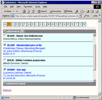
Figure 9-3: A page that features two Repeater controls; one to pick the initial and one to display the related customers in a scrollable area.
Handling the Click Event
As mentioned earlier, the Repeater control doesn't have any built-in mechanisms to render its contents according to special formatting rules. The resulting text, therefore, flows as you write it—either horizontally or vertically. In the previous example, we built a vertical list of data items. Let's see how to create a horizontal strip of data items. We display a push button for each distinct initial found in the companyname column of the Customers table.
SELECT DISTINCT substring(companyname, 1, 1) AS Initial FROM customers
To display items horizontally, the Repeater must build an HTML table with one row and as many cells as there are items in the query's result set.
Each data item is rendered as a push button with a few parametric properties—BackColor, Text, and CommandName. Text and CommandName, in particular, are bound to the same value—the contents of the Initial column in the data set. The CommandName property represents the keyword associated with a command object within an iterative control.
Whenever the user clicks any of the letter buttons, the ItemCommand event fires. The sample page handles the ItemCommand event as follows:
private void ItemCommand(object sender, RepeaterCommandEventArgs e)
{
 BindData(e.CommandName);
}

private void BindData(string initial)
{
 // Store the current initial
 ViewState["Initial"] = initial;

 // Get the necessary data with a single SQL batch
 string _cmdText = m_cmdInitial + ";";
 _cmdText += String.Format(m_cmdCustmrs, initial);
 SqlDataAdapter _adapter = new SqlDataAdapter(_cmdText, m_connString);
 DataSet _data = new DataSet();
 _adapter.Fill(_data);

 // Rename tables
 _data.Tables[0].TableName = "Initials";
 _data.Tables[1].TableName = "Customers";

 // Bind data
 Picker.DataSource = _data.Tables["Initials"].DefaultView;
 Picker.DataBind();
 Customers.DataSource = _data.Tables["Customers"].DefaultView;
 Customers.DataBind();
}
The current initial letter is cached in the ViewState and persists across successive requests of the same page. Note that the result set with all the initials could have effectively been cached in Cache or Application because of its relatively low level of volatility.
Making the Control Scroll
The trick to making a portion of an HTML page scroll vertically and horizontally is the overflow CSS style. Most popular browsers recognize about a hundred style-sheet properties, most of which are CSS1 recommendations. The overflow attribute is specific to CSS2 and supported by Microsoft Internet Explorer 5.0 and later. The overflow attribute controls how a container element (for example, a
) displays its content if it's not the same size as the container.
<%# SetHeader() %>
Possible values for the overflow attribute are listed in Table 9-4.
|
Value |
Description |
|---|---|
|
auto |
Uses scrollbars only if needed. |
|
hidden |
Clips any text that exceeds the fixed container's size. |
|
visible |
Default value, ignores any difference between the fixed size of the container and the contained text. |
|
scroll |
Uses both horizontal and vertical scrollbars. A scrollbar that isn't really needed is disabled. |
The header template defines two
tags, the latter of which is given a fixed height and will contain the output generated by the items. Nothing is to be changed in the section. A section, conversely, is needed to close the pending tag and provide a footer for summary information.
<%# SetFooter() %>
The following code is used to show the count of customers displayed in the table:
private string SetFooter() {
 string _text = "{0} customer(s) found.";
 ICollection _coll = (ICollection) Customers.DataSource;
 return String.Format(_text, _coll.Count);
}
Repeating with Custom Classes
As mentioned earlier, you don't necessarily bind an ADO.NET object to an iterative control. If you use your own classes to store data, those classes can also be used to populate a Repeater as well as a DataList control. The data source must be an array of class instances. To access individual properties, you then use DataBinder.Eval as you would with a DataTable.
private void BindData()
{
 string _conn = "SERVER=localhost;DATABASE=Northwind;UID=sa;";
 string _query = "SELECT firstname, lastname FROM employees";
 SqlDataAdapter _adapter = new SqlDataAdapter(_query, _conn);
 DataTable _data = new DataTable();
 _adapter.Fill(_data);

 ArrayList values = new ArrayList();
 foreach(DataRow _row in _data.Rows)
 values.Add(new Employee(
 _row["LastName"].ToString(),
 _row["FirstName"].ToString()));

 Repeater1.DataSource = values;
 Repeater1.DataBind();
}
public class Employee
{
 private string _lastname;
 private string _firstname;

 public Employee(string lname, string fname) {
 _lastname = lname;
 _firstname = fname;
 }

 public string LastName {
 get {return _lastname;}
 }

 public string FirstName {
 get {return _firstname;}
 }
}
As you can guess, with the DataBinder.Eval method you can access only public properties on your class.
 <%# DataBinder.Eval(Container.DataItem, "LastName") %>
 <%# DataBinder.Eval(Container.DataItem, "FirstName") %>
If you bind an iterative control to an array of classes, you can't rely on any ready-made tool to sort data. You must sort the array yourself using the IComparer interface to define your own rules. (See the MSDN documentation for the IComparer interface.)
The DataList Control
Functionally speaking, the DataList is a data-bound control that falls somewhere in between the Repeater and the DataGrid. It begins where the Repeater ends and terminates a little before the starting point of the DataGrid control. In some unrealistically simple cases, you can even take some code that uses a Repeater, replace the control, and not even notice any difference. Looking at the programming interface, though, the DataList is much more similar to the DataGrid.
In spite of such deep similarities, the DataList is a control with its own personality and a set of features that make it unique and ideal in a number of situations. Compared to the Repeater, the DataList control comes with a full bag of goodies and new features, mostly in the area of graphical layout. The control overtakes the Repeater in several respects. For example, it supports directional rendering, meaning that items can flow horizontally or vertically to match a specified number of columns. Furthermore, just as with the DataGrid, it provides facilities to retrieve a key value associated with the current data row and has built-in support for selection and in-place editing. In addition, the DataList control supports more templates and can fire some extra events beyond those of the Repeater. Data binding and the overall behavior are nearly identical for the Repeater and DataList controls.
Programming Interface of the DataList Control
The DataList is smarter than the Repeater and works by making some assumptions about the expected results. This is good news and bad news for you as a programmer. It means that in some cases much less code is needed to accomplish the same effect; on the other hand, it also indicates that you should know the behavior of the control very well to govern it. For example, the DataList assumes that no HTML tag is split across templates. This fact isn't a problem per se, but it can result in badly formed or totally unexpected HTML output. In addition, by default the DataList renders its entire output as an HTML table, meaning that if this is exactly what you want, there's no need for you to comply with
or
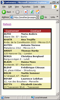
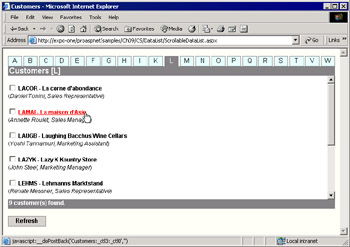
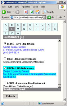
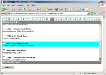
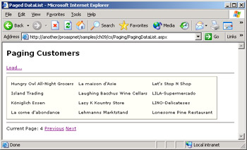 Figure 9-10: All the customers are displayed one page at a time in three columns of data. The link buttons provide for page movements and cause the DataList to refresh its contents.
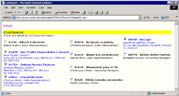
Part I - Building an ASP.NET Page
Part II - Adding Data in an ASP.NET Site
- The ADO.NET Object Model
- Creating Bindable Grids of Data
- Paging Through Data Sources
- Real-World Data Access
Part III - ASP.NET Controls
Part IV - ASP.NET Application Essentials
- Configuration and Deployment
- The HTTP Request Context
- ASP.NET State Management
- ASP.NET Security
- Working with the File System
- Working with Web Services
Part V - Custom ASP.NET Controls
- Extending Existing ASP.NET Controls
- Creating New ASP.NET Controls
- Data-Bound and Templated Controls
- Design-Time Support for Custom Controls
Part VI - Advanced Topics
Index
EAN: 2147483647
Pages: 209
