Building the User Interface
Overview
In Chapter 5, I discussed the core concepts of the TControl class and its derived classes in the VCL and VisualCLX libraries. Then, I provided a rapid tour of the key controls you can use to build a user interface, including editing components, lists, range selectors, and more. This chapter discusses other controls used to define the overall design of a form, such as the PageControl and TabControl. After these components, I'll introduce toolbars and status bars, including some slightly advanced features. This will give you the foundation material for the rest of the chapter, which covers actions and the Action Manager architecture.
Modern Windows applications usually have multiple ways of giving a command, including menu items, toolbar buttons, shortcut menus, and so on. To separate the actual commands a user can give from their multiple representations in the user interface, Delphi uses the concept of actions. In recent Delphi versions, this architecture has been extended to make the construction of the user interface on top of actions totally visual. You can now also let program users customize this interface easily, as is true in many professional programs. Finally, Delphi 7 adds to the visual controls supporting the Action Manager architecture a better and more modern UI, supporting the XP look and feel. On Windows XP, you can create applications that adapt themselves to the active theme, thanks to a lot of new internal VCL code.
Multiple Page Forms
When you need to display a lot of information and controls in a dialog box or a form, you can use multiple pages. The metaphor is that of a notebook: Using tabs, a user can select one of the possible pages. You can use two controls to build a multiple-page application in Delphi:
- The PageControl component has tabs on one side and multiple pages (similar to panels) covering the rest of its surface. There is one page per tab, so you can simply place components on each page to obtain the proper effect both at design time and at run time.
- The TabControl has only the tab portion but offers no pages to hold the information. In this case, you'll want to use one or more components to mimic the page change operation, or you can place different forms within the tabs to simulate the pages.
A third related class, the TabSheet, represents a single page of the PageControl. This is not a stand-alone component and is not available on the Component Palette. You create a TabSheet at design time by using the shortcut menu of the PageControl or at run time by using methods of the same control.
| Note |
Delphi still includes (in the Win 3.1 tab of the Component Palette) the Notebook, TabSet, and TabbedNotebook components introduced in 32-bit versions (that is, since Delphi 2). For any other purpose, the PageControl and TabControl components, which encapsulate Win32 common controls, provide a more modern user interface. In 32-bit versions of Delphi, the TabbedNotebook component was reimplemented using the Win32 PageControl internally, to reduce the code size and update the look. |
PageControls and TabSheets
As usual, instead of duplicating the Help system's list of properties and methods for the PageControl component, I've built an example that stretches the control's capabilities and allows you to change its behavior at run time. The example, called Pages, has a PageControl with three pages. The structure of the PageControl and the other key components appears in Listing 6.1.
Listing 6.1: Key Portions of the DFM of the Pages Example
object Form1: TForm1
 BorderIcons = [biSystemMenu, biMinimize]
 BorderStyle = bsSingle
 Caption = 'Pages Test'
 OnCreate = FormCreate
 object PageControl1: TPageControl
 ActivePage = TabSheet1
 Align = alClient
 HotTrack = True
 Images = ImageList1
 MultiLine = True
 object TabSheet1: TTabSheet
 Caption = 'Pages'
 object Label3: TLabel
 object ListBox1: TListBox
 end
 object TabSheet2: TTabSheet
 Caption = 'Tabs Size'
 ImageIndex = 1
 object Label1: TLabel
 // other controls
 end
 object TabSheet3: TTabSheet
 Caption = 'Tabs Text'
 ImageIndex = 2
 object Memo1: TMemo
 Anchors = [akLeft, akTop, akRight, akBottom]
 OnChange = Memo1Change
 end
 object BitBtnChange: TBitBtn
 Anchors = [akTop, akRight]
 Caption = '&Change'
 end
 end
 end
 object BitBtnPrevious: TBitBtn
 Anchors = [akRight, akBottom]
 Caption = '&Previous'
 OnClick = BitBtnPreviousClick
 end
 object BitBtnNext: TBitBtn
 Anchors = [akRight, akBottom]
 Caption = '&Next'
 OnClick = BitBtnNextClick
 end
 object ImageList1: TImageList
 Bitmap = {...}
 end
end
Notice that the tabs are connected to the bitmaps provided by an ImageList control and that some controls use the Anchors property to remain at a fixed distance from the right or bottom borders of the form. Even if the form doesn't support resizing (this would have been far too complex to set up with so many controls), the positions can change when the tabs are displayed on multiple lines (simply increase the length of the captions) or on the left side of the form.
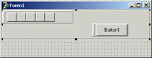
Each TabSheet object has its own Caption, which is displayed as the sheet's tab. At design time, you can use the shortcut menu to create new pages and to move between pages. You can see the shortcut menu of the PageControl component in Figure 6.1, together with the first page. This page holds a list box and a small caption, and it shares two buttons with the other pages.
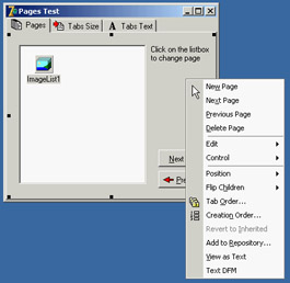
Figure 6.1: The first sheet of the PageControl of the Pages example, with its shortcut menu
If you place a component on a page, it is available only in that page. How can you have the same component (in this case, two bitmap buttons) in each page, without duplicating it? Simply place the component on the form, outside the PageControl (or before aligning it to the client area), and then move it in front of the pages, calling the control ® Bring To Front command from the form's shortcut menu. The two buttons I've placed in each page can be used to move back and forth between the pages and are an alternative to using the tabs. Here is the code associated with one of them:
procedure TForm1.BitBtnNextClick(Sender: TObject);
begin
 PageControl1.SelectNextPage (True);
end;
The other button calls the same procedure, passing False as its parameter to select the previous page. Notice that there is no need to check whether you are on the first or last page, because the SelectNextPage method considers the last page to be the one before the first and will move you directly between those two pages.
Now let's focus on the first page again. It has a list box, which at run time will hold the names of the tabs. If a user clicks an item in this list box, the current page changes. This is the third method available to change pages (after the tabs and the Next and Previous buttons). The list box is filled in the FormCreate method, which is associated with the OnCreate event of the form and copies the caption of each page (the Page property stores a list of TabSheet objects):
for I := 0 to PageControl1.PageCount - 1 do
 ListBox1.Items.Add (PageControl1.Pages.Caption);
When you click a list item, you can select the corresponding page:
procedure TForm1.ListBox1Click(Sender: TObject);
begin
 PageControl1.ActivePage := PageControl1.Pages [ListBox1.ItemIndex];
end;
The second page hosts two edit boxes (connected with two UpDown components), two check boxes, and two radio buttons, as you can see in Figure 6.2. The user can input a number (or choose it by clicking the up or down buttons with the mouse or pressing the Up or Down arrow key while the corresponding edit box has the focus), check the boxes and the radio buttons, and then click the Apply button to make the changes:
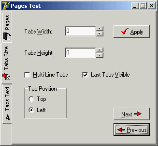
Figure 6.2: The second page of the example can be used to size and position the tabs. Here you can see the tabs on the left of the page control.
procedure TForm1.BitBtnApplyClick(Sender: TObject);
begin
  // set tab width, height, and lines
 PageControl1.TabWidth := StrToInt (EditWidth.Text);
 PageControl1.TabHeight := StrToInt (EditHeight.Text);
 PageControl1.MultiLine := CheckBoxMultiLine.Checked;
  // show or hide the last tab
 TabSheet3.TabVisible := CheckBoxVisible.Checked;
  // set the tab position
 if RadioButton1.Checked then
 PageControl1.TabPosition := tpTop
 else
 PageControl1.TabPosition := tpLeft;
end;
With this code, you can change the width and height of each tab (remember that 0 means the size is computed automatically from the space taken by each string). You can choose to have either multiple lines of tabs or two small arrows to scroll the tab area, and you can move the tabs to the left side of the window. The control also lets you place tabs on the bottom or on the right, but this program doesn't allow that, because it would make the placement of the other controls quite complex.
You can also hide the last tab on the PageControl, which corresponds to the TabSheet3 component. If you hide one of the tabs by setting its TabVisible property to False, you cannot reach that tab by clicking on the Next and Previous buttons, which are based on the SelectNextPage method. Instead, you should use the FindNextPage function, which will select that page even if the tab won't become visible. A call of FindNextPage method is shown in the following new version of the Next button's OnClick event handler:
procedure TForm1.BitBtnNextClick(Sender: TObject);
begin
 PageControl1.ActivePage := PageControl1.FindNextPage (
 PageControl1.ActivePage, True, False);
end;
The last page has a memo component, again with the names of the pages (added in the FormCreate method). You can edit the names of the pages and click the Change button to change the text of the tabs, but only if the number of strings matches the number of tabs:
procedure TForm1.BitBtnChangeClick(Sender: TObject);
var
 I: Integer;
begin
 if Memo1.Lines.Count <> PageControl1.PageCount then
 MessageDlg ('One line per tab, please', mtError, [mbOK], 0)
 else
 for I := 0 to PageControl1.PageCount -1 do
 PageControl1.Pages [I].Caption := Memo1.Lines [I];
 BitBtnChange.Enabled := False;
end;
Finally, the last button, Add Page, allows you to add a new tab sheet to the page control, although the program doesn't add any components to it. The (empty) tab sheet object is created using the page control as its owner, but it won't work unless you also set the PageControl property. Before doing this, however, you should make the new tab sheet visible. Here is the code:
procedure TForm1.BitBtnAddClick(Sender: TObject);
var
 strCaption: string;
 NewTabSheet: TTabSheet;
begin
 strCaption := 'New Tab';
 if InputQuery ('New Tab', 'Tab Caption', strCaption) then
  begin
    // add a new empty page to the control
 NewTabSheet := TTabSheet.Create (PageControl1);
 NewTabSheet.Visible := True;
 NewTabSheet.Caption := strCaption;
 NewTabSheet.PageControl := PageControl1;
 PageControl1.ActivePage := NewTabSheet;
    // add it to both lists
 Memo1.Lines.Add (strCaption);
 ListBox1.Items.Add (strCaption);
  end;
end;
| Tip |
Whenever you write a form based on a PageControl, remember that the first page displayed at run time is the page you were in before the code was compiled. For example, if you are working on the third page and then compile and run the program, it will start with that page. A common way to solve this problem is to add a line of code in the FormCreate method to set the PageControl or notebook to the first page. This way, the current page at design time doesn't determine the initial page at run time. |
An Image Viewer with Owner Draw Tabs
You can also use the TabControl and a dynamic approach, as described in the last example, in more general (and simpler) cases. Every time you need multiple pages that all have the same type of content, instead of replicating the controls in each page, you can use a TabControl and change its contents when a new tab is selected. This is what I've done in the multiple-page bitmap viewer example, called BmpViewer. The image that appears in the TabControl of this form, aligned to the whole client area, depends on the selection in the tab above it (as you can see in Figure 6.3).
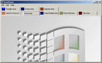
Figure 6.3: The interface of the bitmap viewer in the BmpViewer example. Notice the owner-draw tabs.
At the beginning, the TabControl is empty. After selecting File ® Open, the user can choose various files in the File Open dialog box, and the array of strings with the names of the files (the Files property of the OpenDialog1 component) is added to the tabs (the Tabs property of TabControl1):
procedure TFormBmpViewer.Open1Click(Sender: TObject);
begin
 if OpenDialog1.Execute then
 begin
 TabControl1.Tabs.AddStrings (OpenDialog1.Files);
 TabControl1.TabIndex := 0;
 TabControl1Change (TabControl1);
 end;
end;
| Warning |
The Tabs property of a TabControl in CLX is a collection, whereas in the VCL it is simply a string list. |
After you display the new tabs, you have to update the image so that it matches the first tab. To accomplish this, the program calls the method connected with the OnChange event of the TabControl, which loads the file corresponding to the current tab in the image component:
procedure TFormBmpViewer.TabControl1Change(Sender: TObject);
begin
 Image1.Picture.LoadFromFile (TabControl1.Tabs [TabControl1.TabIndex]);
end;
This example works, unless you select a file that doesn't contain a bitmap. The program will warn the user with a standard exception, ignore the file, and continue its execution.
The program also lets you paste the bitmap on the Clipboard (without immediately getting it, but only adding a tab that will perform the actual paste operation when selected) and copy the current bitmap to it. Clipboard support is available in Delphi via the global Clipboard object defined in the ClipBrd unit. For copying or pasting bitmaps, you can use the Assign method of the TClipboard and TBitmap classes. When you select the Edit ® Paste command in the example, a new tab named Clipboard is added to the tab set (unless it is already present). Then the number of the new tab is used to change the active tab:
procedure TFormBmpViewer.Paste1Click(Sender: TObject);
var
 TabNum: Integer;
begin
 // try to locate the page
 TabNum := TabControl1.Tabs.IndexOf ('Clipboard');
 if TabNum < 0 then
 // create a new page for the Clipboard
 TabNum := TabControl1.Tabs.Add ('Clipboard');
 // go to the Clipboard page and force repaint
 TabControl1.TabIndex := TabNum;
 TabControl1Change (Self);
end;
The Edit ® Copy operation is as simple as copying the bitmap currently in the image
control:
Clipboard.Assign (Image1.Picture.Graphic);
To account for the possible presence of the Clipboard tab, the code of the TabControl1Change method becomes:
procedure TFormBmpViewer.TabControl1Change(Sender: TObject);
var
 TabText: string;
begin
 Image1.Visible := True;
 TabText := TabControl1.Tabs [TabControl1.TabIndex];
 if TabText <> 'Clipboard' then
 // load the file indicated in the tab
 Image1.Picture.LoadFromFile (TabText)
  else
    {if the tab is 'Clipboard' and a bitmap
    is available in the clipboard}
 if Clipboard.HasFormat (cf_Bitmap) then
 Image1.Picture.Assign (Clipboard)
    else
    begin
 // else remove the clipboard tab
 TabControl1.Tabs.Delete (TabControl1.TabIndex);
 if TabControl1.Tabs.Count = 0 then
 Image1.Visible := False;
 end;
This program pastes the bitmap from the Clipboard each time you change the tab. The program stores only one image at a time, and it has no way to store the Clipboard bitmap. However, if the Clipboard content changes and the bitmap format is no longer available, the Clipboard tab is automatically deleted (as you can see in the previous listing). If no more tabs are left, the Image component is hidden.
An image can also be removed using either of two menu commands: Cut or Delete. Cut removes the tab after making a copy of the bitmap to the Clipboard. In practice, the Cut1Click method does nothing besides call the Copy1Click and Delete1Click methods. The Copy1Click method is responsible for copying the current image to the Clipboard; Delete1Click simply removes the current tab. Here is their code:
procedure TFormBmpViewer.Copy1Click(Sender: TObject);
begin
 Clipboard.Assign (Image1.Picture.Graphic);
end;

procedure TFormBmpViewer.Delete1Click(Sender: TObject);
begin
 with TabControl1 do
 begin
 if TabIndex >= 0 then
 Tabs.Delete (TabIndex);
 if Tabs.Count = 0 then
 Image1.Visible := False;
 end;
end;
One of the special features of the example is that the TabControl has the OwnerDraw property set to True. This means the control won't paint the tabs (which will be empty at design time) but will instead have the application do this, by calling the OnDrawTab event. In its code, the program displays the text vertically centered, using the DrawText API function. The text displayed is not the entire file path but only the filename. Then, if the text is not None, the program reads the bitmap the tab refers to and paints a small version of it in the tab itself. To accomplish this, the program uses the TabBmp object, which is of type TBitmap and is created and destroyed along with the form. The program also uses the BmpSide constant to position the bitmap and the text properly:
procedure TFormBmpViewer.TabControl1DrawTab(Control: TCustomTabControl;
 TabIndex: Integer; const Rect: TRect; Active: Boolean);
var
 TabText: string;
 OutRect: TRect;
begin
 TabText := TabControl1.Tabs [TabIndex];
 OutRect := Rect;
 InflateRect (OutRect, -3, -3);
 OutRect.Left := OutRect.Left + BmpSide + 3;
 DrawText (Control.Canvas.Handle, PChar (ExtractFileName (TabText)),
 Length (ExtractFileName (TabText)), OutRect,
 dt_Left or dt_SingleLine or dt_VCenter);
 if TabText = 'Clipboard' then
    if Clipboard.HasFormat (cf_Bitmap) then
 TabBmp.Assign (Clipboard)
    else
 TabBmp.FreeImage
  else
 TabBmp.LoadFromFile (TabText);
 OutRect.Left := OutRect.Left - BmpSide - 3;
 OutRect.Right := OutRect.Left + BmpSide;
 Control.Canvas.StretchDraw (OutRect, TabBmp);
end;
The program has also support for printing the current bitmap, after showing a page preview form in which the user can select the proper scaling. This extra portion of the program I built for earlier editions of the book is not discussed in detail, but I've left the code in the program so you can examine it.
The User Interface of a Wizard
Just as you can use a TabControl without pages, you can also take the opposite approach and use a PageControl without tabs. Now I'll focus on the development of the user interface of a wizard. In a wizard, you direct the user through a sequence of steps, one screen at a time, and at each step you typically offer the choice of proceeding to the next step or going back to correct input entered in a previous step. Instead of tabs that can be selected in any order, wizards typically offer Next and Back buttons to navigate. This won't be a complex example; its purpose is just to give you a few guidelines. The example is called WizardUI.
The starting point is to create a series of pages in a PageControl and set the TabVisible property of each TabSheet to False (while keeping the Visible property set to True). Since Delphi 5, you can also hide the tabs at design time. In this case, you'll need to use the shortcut menu of the page control, the Object Inspector's combo box, or the Object Tree View to move to another page, instead of the tabs. But why don't you want to see the tabs at design time? You can place controls on the pages and then place extra controls in front of the pages (as I've done in the example), without seeing their relative positions change at run time. You might also want to remove the useless captions from the tabs; they take up space in memory and in the resources of the application.
In the first page, I've placed an image and a bevel control on one side and some text, a check box, and two buttons on the other side. Actually, the Next button is inside the page, and the Back button is over it (and is shared by all the pages). You can see this first page at design time in Figure 6.4. The following pages look similar, with a label, check boxes, and buttons on the right side and nothing on the left.
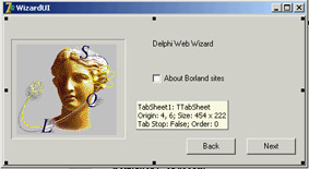
Figure 6.4: The first page of the WizardUI example at design time
When you click the Next button on the first page, the program looks at the status of the check box and decides which page is the following one. I could have written the code like this:
procedure TForm1.btnNext1Click(Sender: TObject);
begin
 BtnBack.Enabled := True;
 if CheckInprise.Checked then
 PageControl1.ActivePage := TabSheet2
 else
 PageControl1.ActivePage := TabSheet3;
  // move image and bevel
 Bevel1.Parent := PageControl1.ActivePage;
 Image1.Parent := PageControl1.ActivePage;
end;
After enabling the common Back button, the program changes the active page and finally moves the graphical portion to the new page. Because this code has to be repeated for each button, I've placed it in a method after adding a couple of extra features. This is the code:
procedure TForm1.btnNext1Click(Sender: TObject);
begin
 if CheckInprise.Checked then
 MoveTo (TabSheet2)
 else
 MoveTo (TabSheet3);
end;

procedure TForm1.MoveTo(TabSheet: TTabSheet);
begin
  // add the last page to the list
 BackPages.Add (PageControl1.ActivePage);
 BtnBack.Enabled := True;
  // change page
 PageControl1.ActivePage := TabSheet;
  // move image and bevel
 Bevel1.Parent := PageControl1.ActivePage;
 Image1.Parent := PageControl1.ActivePage;
end;
Besides the code I've already explained, the MoveTo method adds the last page (the one before the page change) to a list of visited pages, which behaves like a stack. The BackPages object of the TList class is created as the program starts, and the last page is always added to the end. When the user clicks the Back button, which is not dependent on the page, the program extracts the last page from the list, deletes its entry, and moves to that page:
procedure TForm1.btnBackClick(Sender: TObject);
var
 LastPage: TTabSheet;
begin
  // get the last page and jump to it
 LastPage := TTabSheet (BackPages [BackPages.Count - 1]);
 PageControl1.ActivePage := LastPage;
  // delete the last page from the list
 BackPages.Delete (BackPages.Count - 1);
  // eventually disable the back button
 BtnBack.Enabled := not (BackPages.Count = 0);
  // move image and bevel
 Bevel1.Parent := PageControl1.ActivePage;
 Image1.Parent := PageControl1.ActivePage;
end;
With this code, the user can move back several pages until the list is empty, at which point you disable the Back button. You need to deal with a complication: While moving from a particular page, you know which pages are "next" and "previous," but you don't know which page you we came from, because there can be multiple paths to reach a page. Only by keeping track of the movements with a list can you reliably go back.
The rest of the program code, which simply shows some website addresses, is very simple. The good news is that you can reuse the navigational structure of this example in your own programs and modify only the graphical portion and the content of the pages. Because most of the programs' labels show HTTP addresses, a user can click a label to open the default browser showing that page. You accomplish this by extracting the HTTP address from the label and calling the ShellExecute function:
procedure TForm1.LabelLinkClick(Sender: TObject);
var
 Caption, StrUrl: string;
begin
 Caption := (Sender as TLabel).Caption;
 StrUrl := Copy (Caption, Pos ('http://', Caption), 1000);
 ShellExecute (Handle, 'open', PChar (StrUrl), '', '', sw_Show);
end;
This method is hooked to the OnClick event of many labels on the form, which have been turned into links by setting the Cursor to a hand. This is one of the labels:
object Label2: TLabel
 Cursor = crHandPoint
 Caption = 'Main site: http://www.borland.com'
 OnClick = LabelLinkClick
end
The ToolBar Control
To create a toolbar, Delphi includes a specific component that encapsulates the corresponding Win32 common control or the corresponding Qt widget in VisualCLX. This component provides a toolbar with its own buttons, and it has many advanced capabilities. You place the component on a form and then use the component editor (the shortcut menu activated by a right-click) to create buttons and separators.
The toolbar is populated with objects of the TToolButton class. These objects have a fundamental property, Style, which determines their behavior:
- The tbsButton style indicates a standard pushbutton.
- The tbsCheck style indicates a button with the behavior of a check box, or that of a radio button if the button is grouped with the others in its block (determined by the presence of separators).
- The tbsDropDown style indicates a drop-down button (a sort of combo box). The drop-down portion can be easily implemented in Delphi by connecting a PopupMenu control to the DropdownMenu property of the control.
- The tbsSeparator and tbsDivider styles indicate separators with no or different vertical lines (depending on the Flat property of the toolbar).
To create a graphic toolbar, you can add an ImageList component to the form, load some bitmaps into it, and then connect the ImageList with the Images property of the toolbar. By default, the images will be assigned to the buttons in the order they appear, but you can change this behavior quite easily by setting the ImageIndex property of each toolbar button. You can prepare further ImageLists for special button conditions and assign them to the DisabledImages and HotImages properties of the toolbar. The first group is used for the disabled buttons; the second is used for the button currently under the mouse.
| Note |
In a nontrivial application, you will generally create toolbars using an ActionList or the recent Action Manager architecture, discussed later in this chapter. In this case, you'll attach little behavior to the toolbar buttons, because their properties and events will be managed by the action components. Moreover, you'll end up using a toolbar of the specific TActionToolBar class. |
The RichBar Example
As an example of the use of a toolbar, I've built the RichBar application, which has a RichEdit component you can operate by using the toolbar. The program has buttons for loading and saving files, for copy and paste operations, and to change some of the attributes of the current font.
I won't cover the many details of the RichEdit control's features, which I briefly discussed in a previous chapter, nor discuss the details of this application, which has quite a lot of code. All I'll do is focus on features specific to the ToolBar used by the example and visible in Figure 6.5. This toolbar has buttons, separators, and even a drop-down menu and two combo boxes (discussed in the next section).
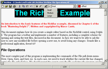
Figure 6.5: The RichBar example's toolbar. Notice the drop-down menu.
The various buttons implement features, including opening and saving text files—the program asks the user to save any modified file before opening a new one, to avoid losing any changes. The file-handling portion of the program is quite complex but it is worth exploring, because many file-based applications will use similar code. More details are available in the file RichBar File Operations.rtf with the source code for this example, a file you can open with the RichBar program itself.
Besides file operations, the program supports copy and paste operations and font management. The copy and paste operations don't require an interaction with the VCL Clipboard object, because the component can handle them with simple commands like these:
RichEdit.CutToClipboard;
RichEdit.CopyToClipboard;
RichEdit.PasteFromClipboard;
RichEdit.Undo;
It is a little more advanced to know when these operations (and the corresponding buttons) should be enabled. You can enable Copy and Cut buttons when some text is selected, in the OnSelectionChange event of the RichEdit control:
procedure TFormRichNote.RichEditSelectionChange(Sender: TObject);
begin
 tbtnCut.Enabled := RichEdit.SelLength > 0;
 tbtnCopy.Enabled := tbtnCut.Enabled;
end;
The Copy operation cannot be determined by an action of the user, because it depends on the content of the Clipboard, which is also influenced by other applications. One approach is to use a timer and check the Clipboard content from time to time. A better approach is to use the OnIdle event of the Application object (or the ApplicationEvents component). Because the RichEdit control supports multiple Clipboard formats, the code cannot simply look at those, but should ask the component itself, using a low-level feature not surfaced by the Delphi control:
procedure TFormRichNote.ApplicationEvents1Idle(Sender: TObject;
 var Done: Boolean);
begin
  // update toolbar buttons
 tbtnPaste.Enabled := RichEdit.Perform (em_CanPaste, 0, 0) <> 0;
end;
Basic font management is given by the Bold and Italic buttons, which have similar code. The Bold button toggles the relative attribute from the selected text (or changes the style at the current edit position):
procedure TFormRichNote.BoldExecute(Sender: TObject);
begin
 with RichEdit.SelAttributes do
    if fsBold in Style then
 Style := Style - [fsBold]
    else
 Style := Style + [fsBold];
end;
Again, the current status of the button is determined by the current selection, so you'll need to add the following line to the RichEditSelectionChange method:
tbtnBold.Down := fsBold in RichEdit.SelAttributes.Style;
A Menu and a Combo Box in a Toolbar
Besides a series of buttons, the RichBar example has a drop-down menu and a couple of combo boxes, a feature shared by many common applications. The drop-down button allows selection of the font size, and the combo boxes allow rapid selection of the font family and the font color. This second combo is built using a ColorBox control.
The Size button is connected to a PopupMenu component (called SizeMenu) using the DropdownMenu property. A user can click the button, firing its OnClick event as usual, or select the drop-down arrow, open the pop-up menu (see again Figure 6.5), and choose one of its options. This case has three possible font sizes, per the menu definition:
object SizeMenu: TPopupMenu
 object Small1: TMenuItem
 Tag = 10
 Caption = 'Small'
 OnClick = SetFontSize
 end
  object Medium1: TMenuItem
 Tag = 16
 Caption = 'Medium'
 OnClick = SetFontSize
 end
  object Large1: TMenuItem
 Tag = 32
 Caption = 'Large'
 OnClick = SetFontSize
 end
end
Each menu item has a tag indicating the actual size of the font, activated by a shared event
handler:
procedure TFormRichNote.SetFontSize(Sender: TObject);
begin
 RichEdit.SelAttributes.Size := (Sender as TMenuItem).Tag;
end;
The ToolBar control is a full-featured control container, so you can take an edit box, a combo box, and other controls and place them directly inside the toolbar. The combo box in the toolbar is initialized in the FormCreate method, which extracts the screen fonts available in the system:
ComboFont.Items := Screen.Fonts;
ComboFont.ItemIndex := ComboFont.Items.IndexOf (RichEdit.Font.Name)
The combo box initially displays the name of the default font used in the RichEdit control, which is set at design time. This value is recomputed each time the current selection changes, using the font of the selected text, along with the current color for the ColorBox:
procedure TFormRichNote.RichEditSelectionChange(Sender: TObject);
begin
 ComboFont.ItemIndex :=
 ComboFont.Items.IndexOf (RichEdit.SelAttributes.Name);
 ColorBox1.Selected := RichEdit.SelAttributes.Color;
end;
When a new font is selected from the combo box, the reverse action takes place. The text of the current combo box item is assigned as the name of the font for any text selected in the RichEdit control:
RichEdit.SelAttributes.Name := ComboFont.Text;
The selection of a color in the ColorBox activates similar code.
A Simple Status Bar
Building a status bar is even simpler than building a toolbar. Delphi includes a specific StatusBar component, based on the corresponding Windows common control (a similar control is available in VisualCLX). This component can be used almost like a panel when its SimplePanel property is set to True. In this case, you can use the SimpleText property to output some text. The real advantage of this component, however, is that it allows you to define a number of subpanels by activating its Panels property editor. (You can also display this property editor by double-clicking the status bar control or perform the same operations using the Object TreeView.) Each subpanel has its own graphical attributes, which you can customize using the Object Inspector. Another feature of the status bar component is the "size grip" area added to the lower-right corner of the bar, which is useful for resizing the form. This is a typical element of the Windows user interface, and you can partially control it with the SizeGrip property (it auto-disables when the form is not resizable).
A status bar has various uses. The most common is to display information about the menu item currently selected by the user. In addition, a status bar often displays other information about the status of a program: the position of the cursor in a graphical application, the current line of text in a word processor, the status of the lock keys, the time and date, and so on. To show information on a panel, you use its Text property, generally in an expression like this:
StatusBar1.Panels[1].Text := 'message';
In the RichBar example, I've built a status bar with three panels, for command hints, the status of the Caps Lock key, and the current editing position. The StatusBar component of the example actually has four panels—you need to define the fourth in order to delimit the area of the third panel. The last panel is always large enough to cover the remaining surface of the status bar.
| Tip |
Again, for more detail about the RichBar program, see the RTF file in the example's source code. Notice also that because the hints are to be displayed in the first panel of the status bar, I could have simplified the code by using the AutoHint property. I preferred showing the more detailed code, so you'll be able to customize it. |
The panels are not independent components, so you cannot access them by name, only by position as in the preceding code snippet. A good solution to improve the readability of a program is to define a constant for each panel you want to use, and then use these constants when referring to the panels. This is my sample code:
const
 sbpMessage = 0;
 sbpCaps = 1;
 sbpPosition = 2;
In the first panel of the status bar, I want to display the toolbar button's hint message. The program obtains this effect by handling the application's OnHint event, again using the ApplicationEvents component, and copying the current value of the application's Hint property to the status bar:
procedure TFormRichNote.ApplicationEvents1Hint (Sender: TObject);
begin
 StatusBar1.Panels[sbpMessage].Text := Application.Hint;
end;
By default, this code displays in the status bar the same text of the fly-by hints, which aren't generated for menu items. You can use the Hint property to specify different strings for the two cases, by writing a string divided into two portions by a separator: the pipe (|) character. For example, you might enter the following as the value of the Hint property:
'New|Create a new document'
The first portion of the string, New, is used by fly-by hints, and the second portion, Create a new document, by the status bar. You can see an example in Figure 6.6.
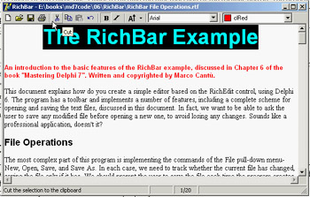
Figure 6.6: The StatusBar of the RichBar example displays a more detailed description than the fly-by hint.
| Tip |
When the hint for a control is made up of two strings, you can use the GetShortHint and GetLongHint methods to extract the first (short) and second ( long) substrings from the string you pass as a parameter, which is usually the value of the Hint property. |
The second panel displays the status of the Caps Lock key, obtained by calling the GetKeyState API function, which returns a state number. If the low-order bit of this number is set (that is, if the number is odd), then the key is pressed. I've decided to check this state when the application is idle, so the test is executed every time a key is pressed but also as soon as a message reaches the window (in case the user changes this setting while working with another program). I've added to the ApplicationEvents1Idle handler a call to the custom CheckCapslock method, implemented as follows:
procedure TFormRichNote.CheckCapslock;
begin
 if Odd (GetKeyState (VK_CAPITAL)) then
 StatusBar1.Panels[sbpCaps].Text := 'CAPS'
 else
 StatusBar1.Panels[sbpCaps].Text := '';
end;
Finally, the program uses the third panel to display the current cursor position (measured in lines and characters per line) every time the selection changes. Because the CaretPos values are zero-based (that is, the upper-left corner is line 0, character 0), I've added one to each value to make them more reasonable for a casual user:
procedure TFormRichNote.RichEditSelectionChange(Sender: TObject);
begin
 ...
 // update the position in the status bar
 StatusBar.Panels[sbpPosition].Text := Format ('%d/%d',
 [RichEdit.CaretPos.Y + 1, RichEdit.CaretPos.X + 1]);
end;
Themes and Styles
In the past, a GUI-based operating system dictated all the elements of the user interface for programs running on it. In recent years, Linux began to allow users to customize the look-and-feel of both the main windows of applications and user interface controls, like buttons. The same idea (often indicated by the term skin) has appeared in numerous programs with such a positive impact that even Microsoft has begun to integrate it (first in programs and then in the entire operating system).
CLX Styles
As I mentioned, on Linux (on XWindow, to be more precise) the user can generally choose the user interface style of the controls. This approach is fully supported by Qt and by the KDE system built on top of it. Qt offers a few basic styles, such as the Windows look-and-feel, the Motif style, and others. A user can also install new styles in the system and make them available to applications.
| Note |
The styles I'm discussing here refer to the user interface of the controls, not of the forms and their borders. This is generally configurable on Linux systems but is technically a separate element of the user interface. |
Because this technique is embedded in Qt, it is also available on the Windows version of the library; CLX makes it available to Delphi developers, so that an application can have a Motif look-and-feel on a Microsoft operating system. The CLX Application global object has a Style property you can use to set a custom style or a default one, indicated by the DefaultStyle subproperty. For example, you can select a Motif look-and-feel with this code:
Application.Style.DefaultStyle := dsMotif;
In the StylesDemo program, I've added, among various sample controls, a list box with the names of the default styles, as indicated in the TDefaultStyle enumeration, and this code for its OnDblClick event:
procedure TForm1.ListBox1DblClick(Sender: TObject);
begin
 Application.Style.DefaultStyle := TDefaultStyle (ListBox1.ItemIndex);
end;
The effect is that, by double-clicking the list box, you can change the current application style and immediately see its effect on screen, as demonstrated in Figure 6.7.
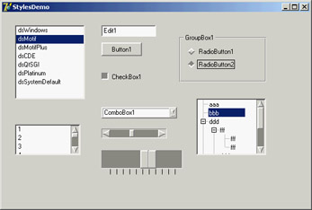
Figure 6.7: The StylesDemo program, a Win-dows application that currently has an unusual Motif layout
Windows XP Themes
With the release of Windows XP, Microsoft has introduced a new, separate version of the common controls library. The old library is still available for compatibility reasons, so that a program running on XP can choose which of the two libraries it wants to use. The new common controls library's main difference is that is doesn't has a fixed rendering engine, but relies on the XP theme engine and delegates the user interface of the controls to the current theme.
In Delphi 7, the VCL fully supports themes, due to a lot of internal code and to the themes management library originally developed by Mike Lischke. Some of these new rendering features are used by the visual controls of the Action Manager architecture, independently of the operating system you are running on. However, full theme support is available only on an operating system that has this feature—at the moment, Windows XP.
Even on XP, Delphi applications use the traditional approach by default. To support XP themes, you must include a manifest file in the program. You can do so multiple ways:
- Place a manifest file in the same folder as the application. This is an XML file indicating the identity and the dependencies of the program. The file has the same name as the executable program with an extra .manifest extension at the end (as in MyProgram.exe.manifest). You can see a sample of such a file in Listing 6.2.
- Add the same information in a resource file compiled within the application. You have to write a resource file that includes a manifest file. In Delphi 7, the VCL has a WindowsXP.res compiled resource file, which is obtained by recompiling the WindowsXP.rc file available among the VCL source files. The resource file includes the sample.manifest file, again available among the VCL source files.
- Use the XpManifest component, which Borland has added to Delphi 7 to further simplify this task. As you drop this do-nothing component in a program's form, Delphi will automatically include its XPMan unit, which imports the VCL resource file mentioned earlier.
| Warning |
When you remove the XpManifest component from an application, you also have to delete the XPMan unit from the uses statement manually—Delphi won't do it for you. If you fail to do so, even without the XpManifest component, the program will still bind in the manifest resource file. Using the unit is what really matters (which really makes me wonder why Borland chose to create the component instead of simply providing the unit or the related resource file; by the way the component isn't documented at all). |
Listing 6.2: A Sample Manifest File (pages.exe.manifest)
Mastering Delphi Demo
As a demo, I've added the manifest file from Listing 6.2 to the folder of the Pages example discussed at the beginning of this chapter. By running it on Windows XP with the standard XP theme, you'll obtain output similar to that shown in Figure 6.8. You can compare this to Figures 6.1 and 6.2, which display the same program under Windows 2000.
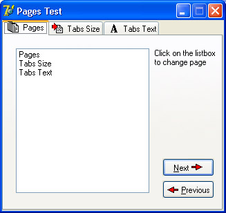
Figure 6.8: The Pages example uses the current Windows XP theme, as it includes a manifest file (compare the figure with 6.1)
The ActionList Component
Delphi's event architecture is very open: You can write a single event handler and connect it to the OnClick events of a toolbar button and a menu. You can also connect the same event handler to different buttons or menu items, because the event handler can use the Sender parameter to refer to the object that fired the event. It's a little more difficult to synchronize the status of toolbar buttons and menu items. If you have a menu item and a toolbar button that both toggle the same option, then every time the option is toggled, you must both add the check mark to the menu item and change the status of the button to show it pressed.
To overcome this problem, Delphi includes an event-handling architecture based on actions. An action (or command) both indicates the operation to do when a menu item or button is clicked and determines the status of all the elements connected to the action. The connection of the action with the user interface of the linked controls is very important and should not be underestimated, because it is where you can get the real advantages of this architecture.
There are many players in this event-handling architecture. The central role is certainly played by the action objects. An action object has a name, like any other component, and other properties that will be applied to the linked controls (called action clients). These properties include the Caption, the graphical representation (ImageIndex), the status (Checked, Enabled, and Visible), and the user feedback (Hint and HelpContext). There is also the ShortCut and a list of SecondaryShortCuts, the AutoCheck property for two-state actions, the help support properties, and a Category property used to arrange actions in logical groups.
The base class for all action objects is TBasicAction, which introduces the abstract core behavior of an action, without any specific binding or correction (not even to menu items or controls). The derived TContainedAction class introduces properties and methods that enable actions to appear in an action list or action manager. The further-derived TCustomAction class introduces support for the properties and methods of menu items and controls that are linked to action objects. Finally, there is the derived ready-to-use TAction class.
Each action object is connected to one or more client objects through an ActionLink object. Multiple controls, possibly of different types, can share the same action object, as indicated by their Action property. Technically, the ActionLink objects maintain a bidirectional connection between the client object and the action. The ActionLink object is required because the connection works in both directions. An operation on the object (such as a click) is forwarded to the action object and results in a call to its OnExecute event; an update to the status of the action object is reflected in the connected client controls. In other words, one or more client controls can create an ActionLink, which registers itself with the action object.
You should not set the properties of the client controls you connect with an action, because the action will override the property values of the client controls. For this reason, you should generally write the actions first and then create the menu items and buttons you want to connect with them. Note also that when an action has no OnExecute handler, the client control is automatically disabled (or grayed), unless the DisableIfNoHandler property is set to False.
The client controls connected to actions are usually menu items and various types of buttons (pushbuttons, check boxes, radio buttons, speed buttons, toolbar buttons, and the like), but nothing prevents you from creating new components that hook into this architecture. Component writers can even define new actions, as we'll do in Chapter 9 ("Writing Delphi Components"), and new link action objects.
Besides a client control, some actions can also have a target component. Some predefined actions hook to a specific target component. Other actions automatically look for a target component in the form that supports the given action, starting with the active control.
Finally, the action objects are held by an ActionList or ActionManager component, the only class of the basic architecture that shows up on the Component Palette. The action list receives the execute actions that aren't handled by the specific action objects, firing the OnExecuteAction. If even the action list doesn't handle the action, Delphi calls the OnExecuteAction event of the Application object. The ActionList component has a special editor you can use to create several actions, as you can see in Figure 6.9.
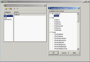
Figure 6.9: The ActionList component editor, with a list of predefined actions you can use
In the editor, actions are displayed in groups, as indicated by their Category property. By simply setting this property to a new value, you instruct the editor to introduce a new category. These categories are basically logical groups, although in some cases a group of actions can work only on a specific type of target component. You might want to define a category for every pull-down menu or group them in some other logical way.
Predefined Actions in Delphi
With the action list and the ActionManager editor, you can create a new action or choose one of the existing actions registered in the system. These are listed in a secondary dialog box, as shown in Figure 6.9. There are many predefined actions, which can be divided into logical groups:
File Actions Include open, save as, open with, run, print setup, and exit.
Edit Actions Illustrated in the next example. They include cut, copy, paste, select all, undo, and delete.
RichEdit Actions Complement the edit actions for RichEdit controls and include bold, italic, underline, strikeout, bullets, and various alignment actions.
MDI Window Actions Demonstrated in Chapter 8, "The Architecture of Delphi Applications," as we examine the Multiple Document Interface approach. They include all the most common MDI operations: arrange, cascade, close, tile (horizontally or vertically), and minimize all.
Dataset Actions Relate to database tables and queries and will be discussed in Chapter 13. There are many dataset actions, representing all the main operations you can perform on a dataset. Delphi 7 adds to the core dataset actions a group of actions specifically tailored to the ClientDataSet component, including apply, revert, and undo. I'll talk more about these actions in Chapter 13 (where I'll cover database programming in general and the ClientDataSet component in particular) and Chapter 14 (in which I'll discuss updating database data).
Help Actions Allow you to activate the contents page or index of the Help file attached to the application.
Search Actions Include find, find first, find next, and replace.
Tab and Page Control Actions Include previous page and next page navigation.
Dialog Actions Activate color, font, open, save, and print dialogs.
List Actions Include clear, copy, move, delete, and select all. These actions let you interact with a list control. Another group of actions, including static list, virtual list, and some support classes, allow the definition of lists that can be connected to a user interface. More on this topic is in the section "Using List Actions" toward the end of this chapter.
Internet Actions Include browse URL, download URL, and send mail actions.
Tools Actions Include only the dialog to customize the action bars.
In addition to handling the OnExecute event of the action and changing the status of the action to affect the client controls' user interface, an action can handle the OnUpdate event, which is activated when the application is idle. This gives you the opportunity to check the status of the application or the system and change the user interface of the controls accordingly. For example, the standard PasteEdit action enables the client controls only when the Clipboard contains some text.
Actions in Practice
Now that you understand the main ideas behind this important Delphi feature, let's try an example. The program is called Actions, and it demonstrates a number of features of the action architecture. I began building it by placing a new ActionList component in its form and adding the three standard edit actions and a few custom ones. The form also has a panel with some speed buttons, a main menu, and a Memo control (the automatic target of the edit actions). Listing 6.3 is the list of the actions, extracted from the DFM file.
Listing 6.3: The Actions of the Actions Example
object ActionList1: TActionList
 Images = ImageList1
 object ActionCopy: TEditCopy
 Category = 'Edit'
 Caption = '&Copy'
 ShortCut =
 end
 object ActionCut: TEditCut
 Category = 'Edit'
 Caption = 'Cu&t'
 ShortCut =
 end
 object ActionPaste: TEditPaste
 Category = 'Edit'
 Caption = '&Paste'
 ShortCut =
 end
 object ActionNew: TAction
 Category = 'File'
 Caption = '&New'
 ShortCut =
 OnExecute = ActionNewExecute
 end
 object ActionExit: TAction
 Category = 'File'
 Caption = 'E&xit'
 ShortCut =
 OnExecute = ActionExitExecute
 end
 object NoAction: TAction
 Category = 'Test'
 Caption = '&No Action'
 end
 object ActionCount: TAction
 Category = 'Test'
 Caption = '&Count Chars'
 OnExecute = ActionCountExecute
 OnUpdate = ActionCountUpdate
 end
  object ActionBold: TAction
 Category = 'Edit'
 AutoCheck = True
 Caption = '&Bold'
 ShortCut =
 OnExecute = ActionBoldExecute
 end
 object ActionEnable: TAction
 Category = 'Test'
 Caption = '&Enable NoAction'
 OnExecute = ActionEnableExecute
 end
 object ActionSender: TAction
 Category = 'Test'
 Caption = 'Test &Sender'
 OnExecute = ActionSenderExecute
 end
end
| Note |
The shortcut keys are stored in the DFM files using virtual key numbers, which also include values for the Ctrl and Alt keys. In this and other listings throughout the book, I've replaced the numbers with the literal values, enclosing them in angle brackets. |
All these actions are connected to the items of a MainMenu component and some of them also to the buttons of a Toolbar control. Notice that the images selected in the ActionList control affect the actions in the editor only, as you can see in Figure 6.10. In order for the ImageList images to show up in the menu items and in the toolbar buttons, you must also select the image list in the MainMenu and in the Toolbar components.
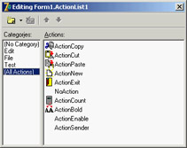
Figure 6.10: The ActionList editor of the Actions example
The three predefined actions for the Edit menu don't have associated handlers, but these special objects have internal code to perform the related action on the active edit or memo control. These actions also enable and disable themselves, depending on the content of the Clipboard and on the existence of selected text in the active edit control. Most other actions have custom code, except the NoAction object; because it has no code, the menu item and the button connected with this command are disabled, even if the Enabled property of the action is set to True.
I've added to the example and to the Test menu another action that enables the menu item connected to the NoAction object:
procedure TForm1.ActionEnableExecute(Sender: TObject);
begin
 NoAction.DisableIfNoHandler := False;
 NoAction.Enabled := True;
 ActionEnable.Enabled := False;
end;
Setting Enabled to True produces the effect for only a short time, unless you set the Disable-IfNoHandler property as discussed in the previous section. Once this operation is done, you disable the current action, because there is no need to issue the same command again.
This is different from an action you can toggle, such as the Edit ® Bold menu item and the corresponding speed button. Here is the code of the Bold action (which has the AutoCheck property set to True, so that it doesn't need to change the status of the Checked property in code):
procedure TForm1.ActionBoldExecute(Sender: TObject);
begin
 with Memo1.Font do
 if fsBold in Style then
 Style := Style - [fsBold]
 else
 Style := Style + [fsBold];
end;
The ActionCount object has very simple code, but it demonstrates an OnUpdate handler; when the memo control is empty, it is automatically disabled. You could obtain the same effect by handling the OnChange event of the memo control itself, but in general it might not always be possible or easy to determine the status of a control simply by handling one of its events. Here is the code for the two handlers of this action:
procedure TForm1.ActionCountExecute(Sender: TObject);
begin
 ShowMessage ('Characters: ' + IntToStr (Length (Memo1.Text)));
end;

procedure TForm1.ActionCountUpdate(Sender: TObject);
begin
 ActionCount.Enabled := Memo1.Text <> '';
end;
Finally, I've added a special action to test the action event handler's sender object and get some other system information. Besides showing the object class and name, I've added code that accesses the action list object. I've done this mainly to show that you can access this information and how to do it:
procedure TForm1.ActionSenderExecute(Sender: TObject);
begin
 Memo1.Lines.Add ('Sender class: ' + Sender.ClassName);
 Memo1.Lines.Add ('Sender name: ' + (Sender as TComponent).Name);
 Memo1.Lines.Add ('Category: ' + (Sender as TAction).Category);
 Memo1.Lines.Add (
 'Action list name: ' + (Sender as TAction).ActionList.Name);
end;
You can see the output of this code in Figure 6.11, along with the user interface of the example. Notice that the Sender is not the menu item you've selected, even if the event handler is connected to it. The Sender object, which fires the event, is the action, which intercepts the user operation.
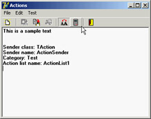
Figure 6.11: The Actions example, with a detailed description of the Sender of an Action object's OnExecute event
Finally, keep in mind that you can also write handlers for the events of the ActionList object itself, which play the role of global handlers for all the actions in the list, and for the Application global object, which fires for all the actions of the application. Before calling the action's OnExecute event, Delphi activates the ActionList's OnExecute event and the Application global object's OnActionExecute event. These events can look at the action, eventually execute some shared code, and then stop the execution (using the Handled parameter) or let it reach the next level.
If no event handler is assigned to respond to the action, either at the action list, application, or action level, then the application tries to identify a target object to which the action can apply itself.
| Note |
When an action is executed, it searches for a control to play the role of the action target, by looking at the active control, the active form, and other controls on the form. For example, edit actions refer to the currently active control (if they inherit from TCustomEdit), and dataset controls look for the dataset connected with the data source of the data-aware control having the input focus. Other actions follow different approaches to find a target component, but the overall idea is shared by most standard actions. |
The Toolbar and ActionList of an Editor
In Chapter 5, I built the RichBar example to demonstrate the development of an editor with a toolbar and a status bar. Of course, I should have also added a menu bar to the form, but doing so would have created quite a few troubles in synchronizing the status of the toolbar buttons with those of the menu items. A very good solution to this problem is to use actions, as I've done in the MdEdit1 example discussed in this section.
The application is based on an ActionList component, which includes actions for file handling and Clipboard support, with code similar to the RichBar version. The font type and color selections are still based on combo boxes, so they don't involve actions—the same is true for the drop-down menu of the Size button. The menu, however, has a few extra commands, including one for character counting and one for changing the background color. These commands are based on actions, and the same is true for the three new paragraph justification buttons (and menu commands).
One of the key differences in this new version is that the code never refers to the status of the toolbar buttons, but eventually modifies the status of the actions. In other cases I've used the actions' OnUpdate events. For example, the RichEditSelectionChange method doesn't update the status of the Bold button, which is connected to an action with the following OnUpdate handler:
procedure TFormRichNote.acBoldUpdate(Sender: TObject);
begin
 acBold.Checked := fsBold in RichEdit.SelAttributes.Style;
end;
Similar OnUpdate event handlers are available for most actions, including the counting operations (available only if there is some text in the RichEdit control), the Save operation (available if the text has been modified), and the Cut and Copy operations (available only if some text is selected):
procedure TFormRichNote.acCountcharsUpdate(Sender: TObject);
begin
 acCountChars.Enabled := RichEdit.GetTextLen > 0;
end;

procedure TFormRichNote.acSaveUpdate(Sender: TObject);
begin
 acSave.Enabled := Modified;
end;

procedure TFormRichNote.acCutUpdate(Sender: TObject);
begin
 acCut.Enabled := RichEdit.SelLength > 0;
 acCopy.Enabled := acCut.Enabled;
end;
In the older example, the status of the Paste button was updated in the OnIdle event of the Application object. Now that you're using actions you can convert it into yet another OnUpdate handler (see Chapter 5 for details on this code):
procedure TFormRichNote.acPasteUpdate(Sender: TObject);
begin
 acPaste.Enabled := SendMessage (RichEdit.Handle, em_CanPaste, 0, 0) <> 0;
end;
The three paragraph-alignment buttons and the related menu items work like radio buttons: they're mutually exclusive, and one of the three options is always selected. For this reason, the actions have the GroupIndex set to 1, the corresponding menu items have the RadioItem property set to True, and the three toolbar buttons have their Grouped property set to True and the AllowAllUp property set to False. (They are also visually enclosed between two separators.)
This arrangement is required so that the program can set the Checked property for the action corresponding to the current style, which avoids unchecking the other two actions directly. This code is part of the OnUpdate event of the action list, because it applies to multiple actions:
procedure TFormRichNote.ActionListUpdate(Action: TBasicAction;
 var Handled: Boolean);
begin
  // check the proper paragraph alignment
 case RichEdit.Paragraph.Alignment of
 taLeftJustify: acLeftAligned.Checked := True;
 taRightJustify: acRightAligned.Checked := True;
 taCenter: acCentered.Checked := True;
 end;
  // checks the caps lock status
 CheckCapslock;
end;
Finally, when one of these buttons is selected, the shared event handler uses the value of the Tag, set to the corresponding value of the TAlignment enumeration, to determine the proper alignment:
procedure TFormRichNote.ChangeAlignment(Sender: TObject);
begin
 RichEdit.Paragraph.Alignment := TAlignment ((Sender as TAction).Tag);
end;
Toolbar Containers
Most modern applications have multiple toolbars, generally hosted by a specific container. Microsoft Internet Explorer, the various standard business applications, and the Delphi IDE all use this general approach. However, they each implement it differently. Delphi has two ready-to-use toolbar containers:
- The CoolBar component is a Win32 common control introduced by Internet Explorer and used by some Microsoft applications.
- The ControlBar component is totally VCL based, with no dependencies on external libraries.
Both components can host toolbar controls as well as some extra elements such as combo boxes and other controls. A toolbar can also replace the menu of an application, as you'll see later. Because the CoolBar component is not frequently used in Delphi applications, it is covered in the sidebar "A Really Cool Toolbar"; the emphasis in the following sections is on Delphi's ControlBar.
A Really Cool Toolbar
The Win32 CoolBar common control is basically a collection of TCoolBand objects that you can activate by using the editor of the Bands property, available also in the component editor menu items or through the Object TreeView. You can customize the CoolBar component in many ways. You can set a bitmap for its background, add some bands to the Bands collection, and then assign an existing component or component container to each band. You can use any window-based control (not graphic controls), but only some of them will show up properly. If you want to have a bitmap on the background of the CoolBar, for example, you need to use partially transparent controls. The typical component used in a CoolBar is the Toolbar, but combo boxes, edit boxes, and animation controls are also quite common.
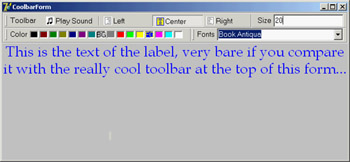
You can place one band on each line or all of them on the same line. Each would use a part of the available surface, and it would be automatically enlarged when the user clicks on its title. It is easier to use this component than to explain it. Try it yourself or open the CoolDemo example:
The CoolDemo example's form has a TCoolBar component with four bands, two for each of the two lines. The first band includes a subset of the toolbar of the previous example, this time adding an ImageList for the highlighted images. The second has an edit box used to set the font of the text; the third has a ColorGrid component, used to choose the font color and background color. The last band has a ComboBox control with the available fonts.
The user interface of the CoolBar component is nice, and Microsoft uses it in its applications, but alternatives such as the ControlBar component offer a similar UI with no troubles attached. The Windows CoolBar control has had many different and incompatible versions, because Microsoft has released different versions of the common control library with different versions of the Internet Explorer. Some of these versions "broke" existing programs built with Delphi—a very good reason for not using it now even if it is more stable.
The ControlBar
The ControlBar is a control container, and you build it by placing other controls inside it, as you do with a panel (there is no list of Bands in it). Every control placed in the bar gets its own dragging area or grabber (a small panel with two vertical lines, on the left of the control), even a stand-alone button:
For this reason, you should generally avoid placing specific buttons inside the ControlBar, but instead add containers with buttons inside them. Rather than using a panel, you should use one ToolBar control for every section of the ControlBar.
The MdEdit2 example is another version of the demo I developed to discuss the ActionList component earlier in this chapter. I've grouped the buttons into three toolbars (instead of a single one) and left the two combo boxes as stand-alone controls. All these components are inside a ControlBar so a user can arrange them at runtime, as you can see in Figure 6.12.
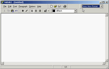
Figure 6.12: The MdEdit2 example at run time, while a user is rearranging the toolbars in the control bar
The following snippet of the DFM listing of the MdEdit2 example shows how the various toolbars and controls are embedded in the ControlBar component:
object ControlBar1: TControlBar
 Align = alTop
 AutoSize = True
 ShowHint = True
  PopupMenu = BarMenu
 object ToolBarFile: TToolBar
 Flat = True
 Images = Images
 Wrapable = False
 object ToolButton1: TToolButton
 Action = acNew
 end
 // more buttons...
 end
 object ToolBarEdit: TToolBar...
 object ToolBarFont: TToolBar...
  object ToolBarMenu: TToolBar
 AutoSize = True
 Flat = True
 Menu = MainMenu
  end
  object ComboFont: TComboBox
 Hint = 'Font Family'
 Style = csDropDownList
 OnClick = ComboFontClick
  end
  object ColorBox1: TColorBox...
end
To obtain the standard effect, you have to disable the edges of the toolbar controls and set their style to flat. Sizing all the controls alike, so that you obtain one or two rows of elements of the same height, is not as easy as it might seem at first. Some controls have automatic sizing or various constraints. In particular, to make the combo box the same height as the toolbars, you have to tweak the type and size of its font. Resizing the control itself has no effect.
The ControlBar also has a shortcut menu that allows you to show or hide each of the controls currently inside it. Instead of writing code specific to this example, I've implemented a more generic (and reusable) solution. The shortcut menu, called BarMenu, is empty at design time and is populated when the program starts:
procedure TFormRichNote.FormCreate(Sender: TObject);
var
 I: Integer;
 mItem: TMenuItem;
begin
 ...
  // populate the control bar menu
 for I := 0 to ControlBar.ControlCount - 1 do
 begin
 mItem := TMenuItem.Create (Self);
 mItem.Caption := ControlBar.Controls [I].Name;
 mItem.Tag := Integer (ControlBar.Controls [I]);
 mItem.OnClick := BarMenuClick;
 BarMenu.Items.Add (mItem);
 end;
The BarMenuClick procedure is a single event handler used by all the menu items; it uses the Tag property of the Sender menu item to refer to the element of the ControlBar associated with the item in the FormCreate method:
procedure TFormRichNote.BarMenuClick(Sender: TObject);
var
 aCtrl: TControl;
begin
 aCtrl := TControl ((Sender as TComponent).Tag);
 aCtrl.Visible := not aCtrl.Visible;
end;
Finally, the OnPopup event of the menu is used to refresh the check mark of the menu items:
procedure TFormRichNote.BarMenuPopup(Sender: TObject);
var
 I: Integer;
begin
 // update the menu check marks
  for I := 0 to BarMenu.Items.Count - 1 do
 BarMenu.Items [I].Checked := TControl (BarMenu.Items [I].Tag).Visible;
end;
A Menu in a Control Bar
If you look at the user interface of the MdEdit2 application in Figure 6.12, you'll notice that the form's menu appears inside a toolbar, hosted by the control bar, and below the application caption. All you have to do to accomplish this is set the toolbar's Menu property. You must also remove the main menu from the form's Menu property (keeping the MainMenu component on the form), to avoid having two copies of the menu on screen.
Delphi s Docking Support
Another feature available in Delphi is support for dockable toolbars and controls. In other words, you can create a toolbar and move it to any side of a form, or even move it freely on the screen, undocking it. However, setting up a program properly to obtain this effect is not as easy as it sounds.
Delphi's docking support is connected with container controls, not only with forms. A panel, a ControlBar, and other containers (technically, any control derived from TWinControl) can be set up as dock targets by enabling their DockSite property. You can also set the AutoSize property of these containers, so they'll show up only if they hold a control.
To be able to drag a control (an object of any TControl-derived class) into the dock site, simply set its DragKind property to dkDock and its DragMode property to dmAutomatic. This way, the control can be dragged away from its current position into a new docking container. To undock a component and move it to a special form, you can set its FloatingDockSiteClass property to TCustomDockForm (to use a predefined stand-alone form with a small caption).
All the docking and undocking operations can be tracked by using special events of the component being dragged (OnStartDock and OnEndDock) and the component that will receive the docked control (OnDockOver and OnDockDrop). These docking events are very similar to the dragging events available in earlier versions of Delphi.
There are also commands you can use to accomplish docking operations in code and to explore the status of a docking container. Every control can be moved to a different location using the Dock, ManualDock, and ManualFloat methods. A container has a DockClientCount property, indicating the number of docked controls, and a DockClients property, which is an array of these controls.
Moreover, if the dock container has the UseDockManager property set to True, you'll be able to use the DockManager property, which implements the IDockManager interface. This interface has many features you can use to customize the behavior of a dock container, including support for streaming its status.
As you can see from this brief description, docking support in Delphi is based on a large number of properties, events, and methods—more features than I have room to explore in detail. The next example introduces the main features you'll need.
| Note |
Docking support is not currently available in VisualCLX on either platform. |
Docking Toolbars in ControlBars
The MdEdit2 example, already discussed, includes docking support. The program has a second ControlBar at the bottom of the form, which accepts dragging one of the toolbars in the ControlBar at the top. Because both toolbar containers have the AutoSize property set to True, they are automatically removed when the host contains no controls. I've also set the AutoDrag and AutoDock properties of both ControlBars to True.
I had to place the bottom ControlBar inside a panel, together with the RichEdit control. Without this trick, the ControlBar, when activated and automatically resized, kept moving below the status bar, which isn't the correct behavior. In the example, the ControlBar is the only panel control aligned to the bottom, so there is no possible confusion.
To let users drag the toolbars out of the original container, you once again (as stated previously) set their DragKind property to dkDock and their DragMode property to dmAutomatic. The only two exceptions are the menu toolbar, which I decided to keep close to the typical position of a menu bar, and the ColorBox control, because unlike the combo box this component doesn't expose the DragMode and DragKind properties. (In the example's FormCreate method, you'll find code you can use to activate docking for the component, based on the "protected hack" discussed in Chapter 2.) The Fonts combo box can be dragged, but I don't want to let a user dock it in the lower control bar. To implement this constraint, I've used the control bar's OnDockOver event handler, by accepting the docking operation only for toolbars:
procedure TFormRichNote.ControlBarLowerDockOver(Sender: TObject;
 Source: TDragDockObject; X, Y: Integer; State: TDragState;
 var Accept: Boolean);
begin
 Accept := Source.Control is TToolbar;
end;
| Warning |
Dragging a toolbar directly from the upper control bar to the lower control bar doesn't work. The control bar doesn't resize to host the toolbar during the dragging operation, as it does when you drag the toolbar to a floating form and then to the lower control bar. This is a bug in the VCL, and it is very difficult to circumvent. As you'll see the next example, MdEdit3 works as expected even if it has the same code: It uses a different component with different VCL support code! |
When you move one of the toolbars outside of any container, Delphi automatically creates a floating form; you might be tempted to set it back by closing the floating form. This doesn't work, because the floating form is removed along with the toolbar it contains. However, you can use the shortcut menu of the topmost ControlBar, also attached to the other ControlBar, to show this hidden toolbar.
The floating form created by Delphi to host undocked controls has a thin caption, the so-called toolbar caption, which by default has no text. For this reason, I've added some code to the OnEndDock event of each dockable control to set the caption of the newly created form into which the control is docked. To avoid a custom data structure for this information, I've used the text of the Hint property for these controls (which is basically not used) to provide a suitable caption:
procedure TFormRichNote.EndDock(Sender, Target: TObject; X, Y: Integer);
begin
 if Target is TCustomForm then
 TCustomForm(Target).Caption := GetShortHint((Sender as TControl).Hint);
end;
You can see an example of this effect in the MdEdit2 program in Figure 6.13.
Figure 6.13: The MdEdit2 example allows you to dock the toolbars (but not the menu) at the top or bottom of the form or to leave them floating.
Another extension of the example (which I haven't done) might add dock areas on the two sides of the form. The only extra effort this would require would be a routine to turn the toolbars vertically instead of horizontally. Doing so requires switching the Left and Top properties of each button after disabling the automatic sizing.
Controlling Docking Operations
Delphi provides many events and methods that give you a lot of control over docking operations, including a dock manager. To explore some of these features, try the DockTest example, a test bed for docking operations shown in Figure 6.14.
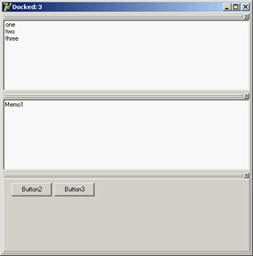
Figure 6.14: The DockTest example with three controls docked in the main form
The program handles the OnDockOver and OnDockDrop events of a dock host panel to display messages to the user, such as the number of controls currently docked:
procedure TForm1.Panel1DockDrop(Sender: TObject; Source: TDragDockObject;
 X, Y: Integer);
begin
 Caption := 'Docked: ' + IntToStr (Panel1.DockClientCount);
end;
In the same way, the program handles the main form's docking events. The controls have a shortcut menu you can invoke to perform docking and undocking operations in code, without the usual mouse dragging, with code like this:
procedure TForm1.menuFloatPanelClick(Sender: TObject);
begin
 Panel2.ManualFloat (Rect (100, 100, 200, 300));
end;

procedure TForm1.Floating1Click(Sender: TObject);
var
 aCtrl: TControl;
begin
 aCtrl := Sender as TControl;
 // toggle the floating status
 if aCtrl.Floating then
 aCtrl.ManualDock (Panel1, nil, alBottom)
 else
 aCtrl.ManualFloat (Rect (100, 100, 200, 300));
end;
To make the program perform properly at startup, you must dock the controls to the main panel in the initial code; otherwise you can get a weird effect. Oddly enough, for the program to behave properly, you need to add controls to the dock manager and also dock them to the panel (one operation doesn't trigger the other automatically):
// dock memo
Memo1.Dock(Panel1, Rect (0, 0, 100, 100));
Panel1.DockManager.InsertControl(Memo1, alTop, Panel1);
// dock listbox
ListBox1.Dock(Panel1, Rect (0, 100, 100, 100));
Panel1.DockManager.InsertControl(ListBox1, alLeft, Panel1);
// dock panel2
Panel2.Dock(Panel1, Rect (100, 0, 100, 100));
Panel1.DockManager.InsertControl(Panel2, alBottom, Panel1);
The example's final feature is probably the most interesting and the most difficult to implement properly. Every time the program closes, it saves the current docking status of the panel, using the dock manager support. When the program is reopened, it reapplies the docking information, restoring the window's previous configuration. Here is the code you might think of writing for saving and loading:
procedure TForm1.FormDestroy(Sender: TObject);
var
 FileStr: TFileStream;
begin
 if Panel1.DockClientCount > 0 then
 begin
 FileStr := TFileStream.Create (DockFileName, fmCreate or fmOpenWrite);
 try
 Panel1.DockManager.SaveToStream (FileStr);
 finally
 FileStr.Free;
 end;
 end
 else
 // remove the file
 DeleteFile (DockFileName);
end;

procedure TForm1.FormCreate(Sender: TObject);
var
 FileStr: TFileStream;
begin
  // initialization code above...

 // reload the settings
 DockFileName := ExtractFilePath (Application.Exename) + 'dock.dck';
 if FileExists (DockFileName) then
 begin
 FileStr := TFileStream.Create (DockFileName, fmOpenRead);
 try
 Panel1.DockManager.LoadFromStream (FileStr);
 finally
 FileStr.Free;
   end;
  end;
 Panel1.DockManager.ResetBounds (True);
end;
This code works fine as long as all controls are initially docked. When you save the program, if one control is floating, you won't see it when you reload the settings. However, because of the initialization code inserted earlier, the control will be docked to the panel anyway, and will appear when you drag away the other controls. Needless to say, this is a messy situation. For this reason, after loading the settings, I added this further code:
for i := Panel1.DockClientCount - 1 downto 0 do
begin
 aCtrl := Panel1.DockClients[i];
 Panel1.DockManager.GetControlBounds(aCtrl, aRect);
 if (aRect.Bottom - aRect.Top <= 0) then
 begin
 aCtrl.ManualFloat (aCtrl.ClientRect);
 Panel1.DockManager.RemoveControl(aCtrl);
 end;
end;
The complete listing includes more commented code, which I used while developing this program; you might use it to understand what happens (which is often different from what you'd expect!). Briefly, the controls that have no size set in the dock manager (the only way I could figure out they are not docked) are shown in a floating window and are removed from the dock manager list.
If you look at the complete code for the OnCreate event handler, you'll see a lot of complex code, just to get a plain behavior. You could add more features to a docking program, but to do so you should remove other features, because some of them might conflict. Adding a custom docking form breaks features of the dock manager. Automatic alignments don't work well with the docking manager's code for restoring the status. I suggest you take this program and explore its behavior, extending it to support the type of user interface you prefer.
| Note |
Remember that although docking panels make an application look nice, some users are confused by the fact that their toolbars might disappear or be in a different position than they are used to. Don't overuse the docking features, or some of your inexperienced users may get lost. |
Docking to a PageControl
Another interesting feature of page controls is their specific support for docking. As you dock a new control over a PageControl, a new page is automatically added to host it, as you can easily see in the Delphi environment. To accomplish this, you set the PageControl as a dock host and activate docking for the client controls. This technique works best when you have secondary forms you want to host. Moreover, if you want to be able to move the entire PageControl into a floating window and then dock it back, you'll need a docking panel in the main form.
This is what I've done in the DockPage example, which has a main form with the following settings:
object Form1: TForm1
 Caption = 'Docking Pages'
 object Panel1: TPanel
 Align = alLeft
 DockSite = True
 OnMouseDown = Panel1MouseDown
 object PageControl1: TPageControl
 ActivePage = TabSheet1
 Align = alClient
 DockSite = True
 DragKind = dkDock
 object TabSheet1: TTabSheet
 Caption = 'List'
 object ListBox1: TListBox
 Align = alClient
 end
 end
 end
 end
 object Splitter1: TSplitter
 Cursor = crHSplit
 end
  object Memo1: TMemo
 Align = alClient
  end
end
Notice that the Panel has the UseDockManager property set to True and that the PageControl invariably hosts a page with a list box, because when you remove all the pages, the code used for automatic sizing of dock containers might cause you trouble.
The program has two other forms with similar settings (although they host different controls):
object Form2: TForm2
 Caption = 'Small Editor'
 DragKind = dkDock
 DragMode = dmAutomatic
 object Memo1: TMemo
 Align = alClient
  end
end
You can drag these forms onto the page control to add new pages to it, with captions corresponding with the form titles. You can also undock each of these controls and even the entire PageControl. The program doesn't enable automatic dragging, which would make it impossible to switch pages; instead, the feature is activated when the user clicks on the area of the PageControl that has no tabs—that is, on the underlying panel:
procedure TForm1.Panel1MouseDown(Sender: TObject; Button: TMouseButton;
 Shift: TShiftState; X, Y: Integer);
begin
 PageControl1.BeginDrag (False, 10);
end;
You can test this behavior by running the DockPage example, and Figure 6.15 tries to depict it. Notice that when you remove the PageControl from the main form, you cannot directly dock the other forms to the panel, as this is prevented by specific code within the program (simply because at times the behavior won't be correct).
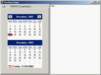
Figure 6.15: The main form of the DockPage example after a form has been docked to the page control on the left.
The ActionManager Architecture
You have seen that actions and the ActionManager component can play a central role in the development of Delphi applications, because they allow a much better separation of the user interface from the actual code of the application. The user interface can now easily change without impacting the code too much. The drawback of this approach is that a programmer has more work to do. To create a new menu item, you need to add the corresponding action first, then move to the menu, add the menu item, and connect it to the action.
To solve this issue, and to provide developers and end users with some advanced features, Delphi 6 introduced a new architecture based on the ActionManager component, which largely extends the role of actions. The ActionManager has a collection of actions as well as a collection of toolbars and menus tied to them. The development of these toolbars and menus is completely visual: You drag actions from a special component editor of the ActionManager to the toolbars to access the buttons you need. Moreover, you can let the end user of your programs do the same operation, rearranging their toolbars and menus beginning with the actions you provide them.
In other words, using this architecture allows you to build applications with a modern user interface, customizable by the user. The menu can show only the recently used items (as many Microsoft programs do), allows for animation, and more.
This architecture is centered on the ActionManager component, but it also includes a few other components found at the end of the Additional page of the palette:
- The ActionManager component is a replacement for the ActionList (but can also use one or more existing ActionLists).
- The ActionMainMenuBar control is a toolbar used to display the menu of an application based on the actions of an ActionManager component.
- The ActionToolBar control is a toolbar used to host buttons based on the actions of an ActionManager component.
- The CustomizeDlg component includes the dialog box you can use to let users customize the user interface of an application based on the ActionManager component.
- The PopupActionBarEx component is an extra component you should use to let your pop-up menus follow the same user interface as your main menus. This component doesn't ship with Delphi 7 but is available as a separate download.
| Tip |
You can find the PopupActionBarEx (also called ActionPopupMenu) component on Borland's CodeCentral web repository (number 18870). In addition, you'll find more information at the component author's website (homepages.borland.com/strefethen); he is a member of Delphi's R&D Team at Borland; the component is on the site, but is not officially supported. |
Building a Simple Demo
Because this architecture is mostly visual, a demo is worth more than a general discussion (although a printed book is not the best way to discuss a highly visual series of operations). To create a sample program based on this architecture, drop an ActionManager component on a form and double-click it to open its component editor, shown in Figure 6.16. Notice that this editor is not modal, so you can keep it open while doing other operations in Delphi. This same dialog box is also displayed by the CustomizeDlg component, although with some limited features (for example, adding new actions is disabled).
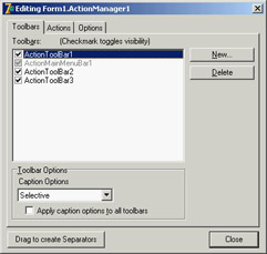
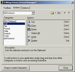
Figure 6.16: The three pages of the ActionManager editor dialog box
The editor's three pages are as follows:
- The first page provides a list of visual containers of actions (toolbars or menus). You add new toolbars by clicking the New button. To add new menus, you have to add the corresponding component to the form, then open the ActionBars collection of the ActionManager, select an action bar or add a new one, and hook the menu to it using the ActionBar property. These are the same steps you could follow to connect a new toolbar to this architecture at run time.
- The second page of the ActionManager editor is very similar to the ActionList editor, providing a way to add new standard or custom actions, arrange them in categories, and change their order. A nice feature of this page, though, is that you can drag a category or a single action from it and drop it onto an action bar control. If you drag a category to a menu, you obtain a pull-down menu with all the category items; if you drag it to a toolbar, each of the category's actions gets a button on the toolbar. If you drag a single action to a toolbar, you get the corresponding button; if you drag it to the menu, you get a direct menu command, which is something you should generally avoid.
- The last page of the ActionManager editor allows you (and optionally an end user) to activate the display of recently used menu items and to modify some of the toolbars' visual properties.
The AcManTest program is an example that uses some of the standard actions and a RichEdit control to showcase the use of this architecture (I haven't written any custom code to make the actions work better, because I wanted to focus only on the action manager for this example). You can experiment with it at design time or run it, click the Customize button, and see what an end user can do to customize the application (see Figure 6.17).
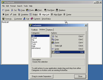
Figure 6.17: Using the CustomizeDlg component, you can let a user customize the toolbars and the menu of an appli-cation by dragging items from the dialog box or moving them around in the action bars.
In the program, you can prevent the user from doing some operations on actions. Any specific element of the user interface (a TActionClient object) has a ChangedAllowed property that you can use to disable modify, move, and delete operations. Any action client container (the visual bars) has a property to disable hiding itself (AllowHiding by default is set to True). Each ActionBar Items collection has a Customizable option you can turn off to disable all user changes to the entire bar.
| Tip |
When I say ActionBar I don't mean the visual toolbars containing action items, but the items of the ActionBars collection of the ActionManager component, which in turn has an Items collection. The best way to understand this structure is to look at the subtree displayed by the Object TreeView for an ActionManager component. Each TActionBar collection item has a TCustomActionBar visual component connected, but not the reverse (so, for example, you cannot reach this Customizable property if you start by selecting the visual toolbar). Due to the similarity of the two names, it can take a while to understand what the Delphi help is referring to. |
To make user settings persistent, I've connected a file (called settings) to the FileName property of the ActionManager component. When you assign this property, you should enter the name of the file you want to use; when you start the program, the file will be created for you by the ActionManager. The persistency is accomplished by streaming each ActionClientItem connected with the action manager. Because these action client items are based on the user settings and maintain state information, a single file collects both user changes to the interface and usage data.
Because Delphi stores user setting and status information in a file you provide, you can make your application support multiple users on a single computer. Simply use a file of settings for each of them (under the MyDocuments or MySettings virtual folder) and connect it to the action manager as the program starts (using the current user of the computer or after some custom login). Another possibility is to store these settings over the network, so that even when a user moves to a different computer, the current personal settings will move along with them.
In the program, I've decided to store the settings in a file store in the same folder as the program, assigning the relative path (the filename) to the ActionManager's FileName property. The component will fill in the complete filename with the program folder, easily finding the file to load. However, the file includes among its data its own filename, with an absolute path. So, when it is time to save the file, the operation may refer to an older path. This prevents you from copying this program with its settings to a different folder (for example, this is an issue for the AcManTest demo). You can reset the FileName property after loading the file. As a further alternative, you could set the filename at runtime, in the form's OnCreate event. In this case you also have to force the file to reload, because you are assigning it after the ActionManager component and the ActionBars have already been created and initialized. However, you might want to force the filename after loading it, as just described:
procedure TForm1.FormCreate(Sender: TObject);
begin
 ActionManager1.FileName :=
 ExtractFilePath (Application.ExeName) + 'settings';
 ActionManager1.LoadFromFile(ActionManager1.FileName);
 // reset the settings file name after loading it (relative path)
 ActionManager1.FileName :=
 ExtractFilePath (Application.ExeName) + 'settings';
end;
Least Recently Used Menu Items
Once a file for the user settings is available, the ActionManager will save the user preferences into it and also use it to track the user activity. This is essential to let the system remove menu items that haven't been used for some time, making them available in an extended menu using the same user interface adopted by Microsoft (see Figure 6.18 for an example).
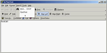
Figure 6.18: The ActionManager disables least-recently used menu items that you can still see by selecting the menu extension command.
The ActionManager doesn't just show the least-recently used items: It allows you to customize this behavior in a very precise way. Each action bar has a SessionCount property that keeps track of the number of times the application has been executed. Each ActionClientItem has a LastSession property and a UsageCount property used to track user operations. Notice, by the way, that a user can reset all this dynamic information by using the Reset Usage Data button in the customization dialog.
The system calculates the number of sessions the action has gone unused by computing the difference between the number of times the application has been executed (SessionCount) and the last session in which the action has been used (LastSession). The value of UsageCount is used to look up in the PrioritySchedule how many sessions the items can go unused before it is removed. In other words, the PrioritySchedule maps each the usage count with a number of unused sessions. By modifying the PrioritySchedule, you can determine how quickly the items are removed in case they are not used.
You can also prevent this system from being activated for specific actions or groups of actions. The Items property of the ActionManager's ActionBars has a HideUnused property you can toggle to disable this feature for an entire menu. To make a specific item always visible, regardless of the actual usage, you can also set its UsageCount property to –1. However, the user settings might override this value.
To help you better understand how this system works, I've added a custom action (ActionShowStatus) to the AcManTest example. The action has the following code that saves the current action manager settings to a memory stream, converts the stream to text, and shows it in the memo (refer to Chapter 4 for more information about streaming):
procedure TForm1.ActionShowStatusExecute(Sender: TObject);
var
 memStr, memStr2: TMemoryStream;
begin
 memStr := TMemoryStream.Create;
 try
 memStr2 := TMemoryStream.Create;
 try
 ActionManager1.SaveToStream(memStr);
 memStr.Position := 0;
 ObjectBinaryToText(memStr, memStr2);
 memStr2.Position := 0;
 RichEdit1.Lines.LoadFromStream(memStr2);
 finally
 memStr2.Free;
 end;
 finally
 memStr.Free;
 end;
end;
The output you obtain is the textual version of the settings file automatically updated at each execution of the program. Here is a small portion of this file, including the details of one of the pull-down menus and plenty of comments:
item // File pulldown of the main menu action bar
 Items = <
    item
 Action = Form1.FileOpen1
 LastSession = 19 // was used in the last session
 UsageCount = 4 // was used four times
    end
    item
 Action = Form1.FileSaveAs1 // never used
    end
    item
 Action = Form1.FilePrintSetup1
 LastSession = 7 // used some time ago
 UsageCount = 1 // only once
    end
    item
 Action = Form1.FileRun1 // never used
    end
    item
 Action = Form1.FileExit1 // never used
    end>
 Caption = '&File'
 LastSession = 19
 UsageCount = 5 // the sum of the usage count of the items
end
Porting an Existing Program
If this architecture is useful, you'll probably need to redo most of your applications to take advantage of it. However, if you're already using actions (with the ActionList component), this conversion will be much simpler. The ActionManager has its own set of actions but can also use actions from another ActionManager or ActionList. The ActionManager's LinkedActionLists property is a collection of other containers of actions (ActionLists or ActionManagers), which can be associated with the current ActionManager. Associating all the various groups of actions is useful because you can let a user customize the entire user interface with a single dialog box.
If you hook external actions and open the ActionManager editor, you'll see in the Actions page a combo box listing the current ActionManager plus the other action containers linked to it. You can choose one of these containers to see its set of actions and change their properties. The All Action option in this combo box allows you to work on all the actions from the various containers at once; however, I've noticed that at startup it is selected but not always effective. Reselect it to see all the actions.
As an example of porting an existing application, I've extended the program built throughout this chapter into the MdEdit3 example. This example uses the same action list as the previous version, hooked to an ActionManager that has the extra customize property to let users rearrange the user interface. Unlike the earlier AcManDemo program, the MdEdit3 example uses a ControlBar as a container for the action bars (a menu, three toolbars, and the usual combo boxes) and has full support for dragging them outside the container as floating bars and dropping them into the lower ControlBar.
To accomplish this, I only had to modify the source code slightly to refer to the new classes for the containers (TCustomActionToolBar instead of TToolBar) in the ControlBarLowerDockOver method. I also found that the ActionToolBar component's OnEndDock event passes as parameter an empty target when the system creates a floating form to host the control, so I couldn't easily give this form a new custom caption (see the form's EndDock method).
Using List Actions
You'll see more examples of the use of this architecture in the chapters devoted to MDI and database programming (Chapter 8 and Chapter 13, for example). For the moment, I want to add an extra example showing how to use a rather complex group of standard actions: the list actions. List actions comprise two different groups. Some of them (such as Move, Copy, Delete, Clear, and Select All) are normal actions that work on list boxes or other lists. The VirtualListAction and StaticListAction, however, define actions providing a list of items that will be displayed in a toolbar as a combo box.
The ListActions demo highlights both groups of list actions; its ActionManager has five of actions displayed on two separate toolbars. This is a summary of the actions (I've omitted the action bars portion of the component's DFM file):
object ActionManager1: TActionManager
 ActionBars.SessionCount = 1
 ActionBars = <...>
 object StaticListAction1: TStaticListAction
 Caption = 'Numbers'
 Items.CaseSensitive = False
 Items.SortType = stNone
 Items = <
 item
 Caption = 'one'
      end
      item
 Caption = 'two'
      end
      ...>
 OnItemSelected = ListActionItemSelected
 end
 object VirtualListAction1: TVirtualListAction
 Caption = 'Items'
 OnGetItem = VirtualListAction1GetItem
 OnGetItemCount = VirtualListAction1GetItemCount
 OnItemSelected = ListActionItemSelected
  end
  object ListControlCopySelection1: TListControlCopySelection
 Caption = 'Copy'
 Destination = ListBox2
 ListControl = ListBox1
  end
  object ListControlDeleteSelection1: TListControlDeleteSelection
 Caption = 'Delete'
  end
  object ListControlMoveSelection2: TListControlMoveSelection
 Caption = 'Move'
 Destination = ListBox2
 ListControl = ListBox1
  end
end
The program has also two list boxes in its form, which are used as action targets. The Copy and Move actions are tied to these two list boxes by their ListControl and Destination properties. The Delete action automatically works with the list box having the input focus.
The StaticListAction defines a series of alternative items in its Items collection. This is not a plain string list, because any item also has an ImageIndex that lets you add graphical elements to the control displaying the list. You can, of course, add more items to this list programmatically. However, if the list is highly dynamic, you can also use the VirtualListAction. This action doesn't define a list of items but has two events you can use to provide strings and images for the list: OnGetItemCount allows you to indicate the number of items to display, and OnGetItem is then called for each specific item.
In the ListActions demo, the VirtualListAction has the following event handlers for its definition, producing the list you can see in the active combo box in Figure 6.19:
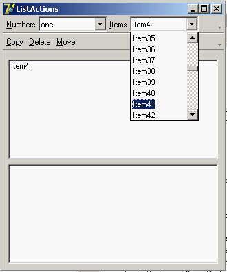
Figure 6.19: The ListActions application has a toolbar hosting a static list and a virtual list.
procedure TForm1.VirtualListAction1GetItemCount(Sender: TCustomListAction;
 var Count: Integer);
begin
 Count := 100;
end;

procedure TForm1.VirtualListAction1GetItem(Sender: TCustomListAction;
 const Index: Integer; var Value: String;
 var ImageIndex: Integer; var Data: Pointer);
begin
 Value := 'Item' + IntToStr (Index);
end;
| Note |
I thought the virtual action items were requested only when needed for display, making this a virtual list. Instead, all the items are created right away. You can prove it by enabling the commented code in the VirtualListAction1GetItem method (not included in the previous listing), which adds to each item the time its string is requested. |
Both the static list and the virtual list have an OnItemSelected event. In the shared event handler, I've written the following code to add the current item to the form's first list box:
procedure TForm1.ListActionItemSelected(Sender: TCustomListAction;
 Control: TControl);
begin
 ListBox1.Items.Add ((Control as TCustomActionCombo).SelText);
end;
In this case, the sender is the custom action list, but the ItemIndex property of this list is not updated with the selected item. However, by accessing the visual control that displays the list, you can obtain the value of the selected item.
What s Next?
In this chapter, I've introduced the use of actions, the actions list, and Action Manager architectures. As you've seen, this is an extremely powerful architecture to separate the user interface from your application code, which uses and refers to the actions and not the menu items or toolbar buttons related to them. The recent extension of this architecture allows users of your programs to have a lot of control, and makes your applications resemble high-end programs without much effort on your part. The same architecture is also very handy for designing your program's user interface, regardless of whether you give this ability to users.
I've also covered some user-interface techniques, such as docking toolbars and other controls. You can consider this chapter the first step toward building professional applications. We will take other steps in the following chapters; but you already know enough to make your programs similar to some best-selling Windows applications, which may be very important for your clients.
Now that the elements of your program's main form are properly set up, you can consider adding secondary forms and dialog boxes. This is the topic of Chapter 7, along with a general introduction to forms. Chapter 8 will then discus the overall structure of a Delphi application.
Part I - Foundations
- Delphi 7 and Its IDE
- The Delphi Programming Language
- The Run-Time Library
- Core Library Classes
- Visual Controls
- Building the User Interface
- Working with Forms
Part II - Delphi Object-Oriented Architectures
- The Architecture of Delphi Applications
- Writing Delphi Components
- Libraries and Packages
- Modeling and OOP Programming (with ModelMaker)
- From COM to COM+
Part III - Delphi Database-Oriented Architectures
- Delphis Database Architecture
- Client/Server with dbExpress
- Working with ADO
- Multitier DataSnap Applications
- Writing Database Components
- Reporting with Rave
Part IV - Delphi, the Internet, and a .NET Preview
- Internet Programming: Sockets and Indy
- Web Programming with WebBroker and WebSnap
- Web Programming with IntraWeb
- Using XML Technologies
- Web Services and SOAP
- The Microsoft .NET Architecture from the Delphi Perspective
- Delphi for .NET Preview: The Language and the RTL
- Appendix A Extra Delphi Tools by the Author
- Appendix B Extra Delphi Tools from Other Sources
- Appendix C Free Companion Books on Delphi
EAN: 2147483647
Pages: 279
