KEYS TO MOTION GRAPHICS
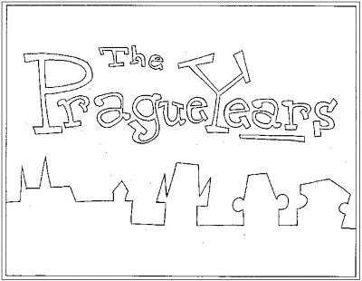
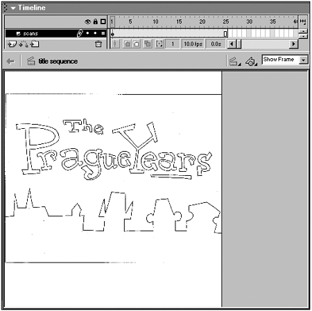
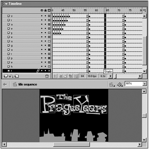
| Now that there's an understanding of the challenges in creating animation for devices, let's develop a motion graphics title sequence to investigate the keys to motion graphic design for devices. The following title sequence is from a cartoon project called "The Prague Years." The cartoon is about a couple of twentysomething characters named Godpy and Podie that move to Prague in the early '90s to enjoy the expatriate experience in the recently freed communist city. The title sequence needs to quickly imply the foreign setting, define the style of the cartoon, and attempt to impart the idea of Prague's rapidly changing society all in 10 to 15 seconds and at a miniscule file size so that it doesn't impede the download of the rest of the cartoon. Making Motion Graphics that WorkBecause the cartoon is aimed at handhelds, and currently only Pocket PCs, the movie size is set at 230x250. Although the available display size on Pocket PCs is 240x260 (full display size is 320x240), it's prudent to develop movies at a slightly smaller size. This is because scrollbars may appear in the browser and take up about 10 pixels vertically and horizontally if the Flash movie is set to 240x260. Although it's possible to set the margins to 0 in the HTML document to solve this problem, this doesn't always seem to work. The pragmatic solution is to develop at a slightly smaller file size. The first choice to make in developing this title sequence is the main font. Although a classic art nouveau or socialist constructivist font would imply Prague's setting and the comic strip's ethos, neither kind of font would impart the whimsical and capricious nature of the story. The original comic strip used a handmade title font so in the end it makes the most sense to create that font in Flash and animate the motion graphic title sequence with the resulting artwork (see Figure 6.13). Figure 6.13. The hand drawn font used in the original comic strip title was re-created for the Flash cartoon.
The color palette for the entire cartoon, as well as the title's motion graphic sequence, contains flat colors that adhere as closely as possible to the web-safe color palette. The end result of this decision is that the project has a lot of strong colors like red that really pop out from the screen. Although this is useful on smaller screen sizes like handhelds, it does cause a problem because a lot of the more vibrant colors won't display well on television. The choice of colors ends up limiting where the project can display properly.
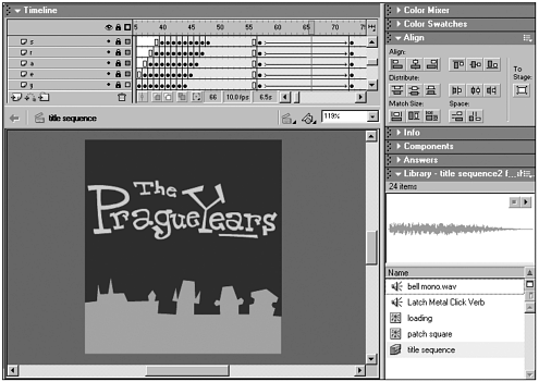
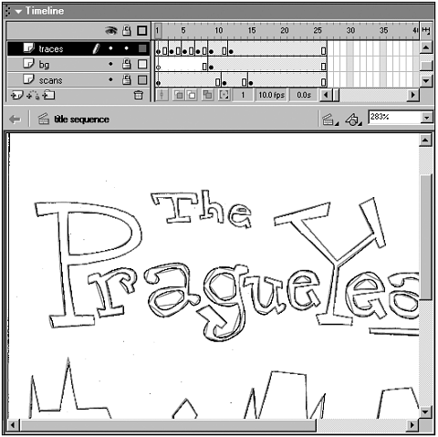
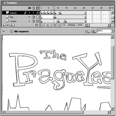
The next choice to make is what kind of music to use during the motion graphics title sequence. Because Prague has a long fascination with Mozart and the city's link to his classical music heritage (Mozart premiered The Magic Flute in Prague), let's use a clip of classical music from a sound library. Because we want to imply a changing society with the title sequence, let's find a piece of rock or grunge music to imply the new era of freedom that was ushered in with the fall of communism. Although it's always best to have a composer create music specifically for a motion graphic, this kind of original music is often out of reach due to budgetary restrictions. Musical clips are available from a variety of sound libraries on the web or through mail order on CD. Some favorite sound libraries include the Fresh library (www.freshmusic.com) and the Music Bakery (www.musicbakery.com). If a production team member has any musical talent, then it's possible to create soundtracks with software tools like ACID. This tool provides small chunks of music that can be built up to create a musical composition. It's basically a drag and drop timeline that allows you to create in a WYHIWYG (What You Hear Is What You Get) manner. After the musical choices have been made, it's important to think about what kind of animation will be used to create the motion graphics. Flash supports two main kinds of animation keyframe animation and motion tweening (see Figure 6.14). Keyframe animation is the classic way to animate characters by creating a new drawing in successive frames, while motion tweening lets the software program move objects around the screen automatically after defining a beginning and end point. Figure 6.14. Flash supports both keyframe and motion tween animation. Because the software does so much of the work with motion tweening, it's considerably faster than keyframing. Motion tweening does have a tendency to look a bit mechanical. Motion graphics designers use motion tweening to rough out the movement and then use keyframe animation to give more emotion to a motion graphics project. The type of animation that will predominate throughout a movie also impacts the choice of a movie frame rate. Motion graphics play back best when the frame rates are set to 20 and above. The movement of letters and graphics is much more fluid at higher frame rates. Unfortunately, character animation in Flash can't keep up at those frame rates so a choice has to be made. One solution is to put the title sequence in a movie with a higher frame rate and develop the character animation in a completely different movie set to a lower frame rate. When the title movie ends, a command then brings up the character animation movie as a new URL link. This is an awkward solution because the cartoon doesn't get a chance to load while the title sequence plays. The standard approach is to animate the motion graphics at the character animation frame rate of 10 12 frames per second and use strong movement that still looks good at the lower frame rate (see Figure 6.15). It's always important with Flash to create the motion graphic effect with the lowest common denominator in mind and develop a solution that looks good for that viewer. Because pans, zooms, and cross-fades don't work well for playback (and look even worse at slow frame rates), it's important to concentrate on finding a motion treatment that doesn't use these techniques. Figure 6.15. Set the movie frame rate to 10 12 fps to get decent playback. In the case of "The Prague Years," the solution is to drop the text onto the screen in a wavelike sequence, to give the title an interesting movement at a small file size, while also implying that change is coming to the setting of the cartoon. The other useful aspect of this motion technique is that the bounding box around the changing animation elements never contains the whole screen. This allows the animation to play back at the intended frame rate because the entire screen never has to refresh completely. After deciding how to animate the title into the scene, it's important to consider the background that will appear behind the title. The simpler the background, the better the playback of the title sequence (see Figure 6.16). The worst backgrounds for playback are complex vector graphics. Figure 6.16. The simpler the background in the title sequence, the better.. Following up the text motion, the title and background will change from grayscale to color. This helps give a sense of the setting's impending change at little file size cost. Because this technique requires the entire screen to change in each frame, the animation does play back slowly on some devices. Although this title sequence ends up being quite simple graphically and somewhat limited in its motion graphics, it does the job for a title sequence that will work on devices. The title sequence plays back at the proper frame rate at a small file size, and gives a fair sense of the coming cartoon. Movie Creation Step by StepNow that the decisions on how to create the motion graphics title sequence for "The Prague Years" have been made, the following section goes through the sequence step-by-step to show how to create it in Flash. The Title SequenceThe title sequence files are available for download at the book's web site (www.flashenabled.com). These files include the font scan, the traces of the letters, the symbols, the animated title sequence, and the loading code. The scratch soundtrack also is provided. Use these files to follow along or put together your own motion graphic sequence. Because the title sequence for "The Prague Years" uses a hand-drawn font for the title, the first step is to scan and trace the letters. The secret to getting the absolutely smallest file size and most efficient playback with any tracing in Flash is to use the Line tool or the Bezier curve tool. Using these tools creates the smallest number of points in the traced drawing.
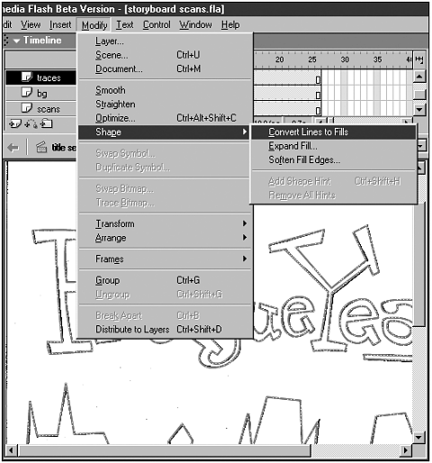
It's important to turn the wider lines into fills because line widths in Flash do not resize as expected. Line widths change unexpectedly as symbols scale up and down. Letters that were created at the same time with the same line width and then put into different symbols might have completely different line widths when they're resized. The only way around this aesthetic disaster is to turn thicker lines into fills. Hairlines do resize properly, but hairlines are often the wrong graphic choice for a project. Hairlines also jiggle when displayed on televisions so they are somewhat limited.
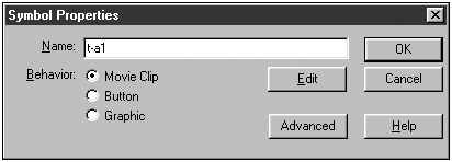
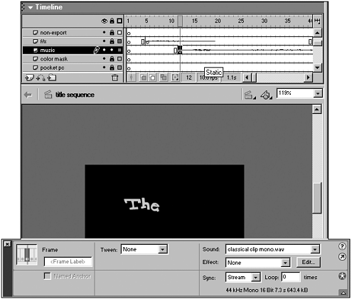
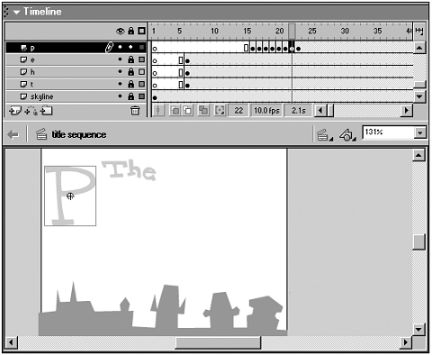
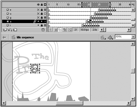
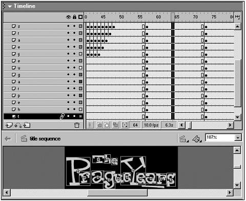
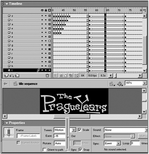
Now that the title font has been traced into Flash, each letter can be made into a symbol. Decide on a naming sequence, in this case it's "t-a1" where the "t" stands for title, the "a" stands for the letter and the "1" stands for the first instance of that letter (see Figure 6.21). Select each letter and turn it into a movie clip symbol. In general, it's best to make all symbols movie clip symbols (F8). This allows ActionScript to work with the symbols more easily. Figure 6.21. Decide on a symbol naming convention and stick to it throughout the project. At this point it's also useful to move all the letters onto distinct layers. Because each letter will be animated with a motion tween, which only affects one object per layer, each letter has to have its own layer. Add layers for each letter and then name them accordingly. Cut and paste each letter onto the appropriate layer. Adding Sound to the Title SequenceThe next step in the project is to digitize and import the audio files into Flash. The music and effects for the title sequence are pulled from a royalty-free CD. Syntrillium Software (www.syntrillium.com) makes a good, and inexpensive, audio editing program called Cool Edit 2000. A 64-track audio editing program called Cool Edit Pro also is available. Using Cool Edit, it's possible to record dialogue using a simple microphone, digitize audio clips off CDs, and edit clips. It's preferable to record the clips at the highest possible quality, generally 44KHz, stereo and 16-bit. After the audio is recorded, it's then possible to convert the audio to mono before bringing the files into Flash (see Figure 6.22). The reason for doing this is that higher quality stereo audio will be on hand in case it's possible to use it in the future, but it's easier to work with smaller size audio files (less than 3M) in the Flash authoring environment. Figure 6.22. Importing sound into Flash as mono is useful for keeping working file sizes small. If needed, it's easy to update to stereo in the future. Adding Animation to the Title LettersAfter the music is inserted, it's time to create the "wave" effect on the title letters. This is done by resizing each letter and applying a standard motion tween to each. As an example, the P that starts Prague will begin much larger than the movie area, drop quickly into place, get a bit smaller than the final symbol size, and then ease into the correct size. Try to minimize the amount of motion that happens outside the screen area. This motion still affects the processor and screen redraw. The drop into place will take three to four frames and then the easing in from the smaller size will take three frames. The reason for adding the small motion at the end is so that the overall motion doesn't appear too mechanical.
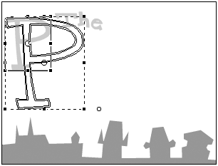
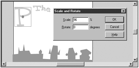
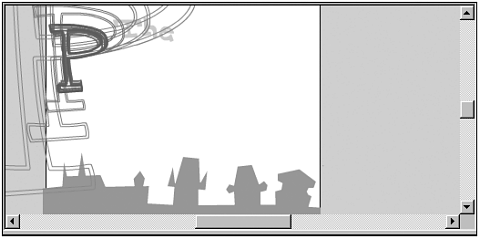
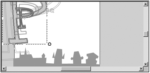
First, insert a series of keyframes in the P layer after the first instance of the P symbol (see Figure 6.23). Resize the P by selecting the symbol with the arrow tool (keyboard shortcut "V") and the Scale option in Flash 5 or the Free Transform Tool in Flash 6 (see Figure 6.24). The other way to do this is to select Modify, Transform, Scale and Rotate (Ctrl+Alt+S). When the dialog box comes up, enter a numeric value for the resize (see Figure 6.25). This can be useful in doing title sequences that require all the changes to be exactly the same because it's much easier to apply numeric value changes across multiple letter symbols. Figure 6.23. Insert keyframes into the P layer. Figure 6.24. Resize the P using the Free Transform tool. Figure 6.25. It's possible to resize using the Scale and Rotate tool as well. Review the motion by playing through the frame sequence. If the motion seems off, turn onion skinning on and look at the outlines of the letter (see Figure 6.26). Figure 6.26. Compare the size of the symbols using onion skinning. After review, the P in the second frame is a little too small for the rest of the movement. With onion skinning on, it's possible to go to that frame and resize in comparison to the letters in the other frames (see Figure 6.27). Figure 6.27. Resize the symbols in the sequence as needed using the Edit Multiple Frames feature of onion skinning. Once the feel of the movement is right for the P symbol, go through all the rest of the symbols and create the same sequence of frames and resize the symbols appropriately (see Figure 6.28). Figure 6.28. Resize all the other letter symbols to create the motion sequence.
If you're using a lot of motion tweens, then try to make sure the symbols are movie clips rather than animated graphics or, even worse, groups of objects. The file size for animated graphics and groups is calculated in a different way in tweens so the graphics inside the symbol usually get counted multiple times, while in most movie clip symbols the graphics are only counted once. This will take some trial and error. It's also useful to keep in mind that large tweens add 12 bytes per frame. This can add up to a lot of bytes so it's important to use tweens cautiously. There are several programs that simplify the creation of motion graphics and title sequences. The most commonly used program is Wildform SWfX available at www.wildform.com. SWfX provides hundreds of built-in text animations at a reasonable price, but be aware when using these programs because they can create larger than usual Flash movie file sizes. This is because symbols aren't always created in the most efficient manner in these software programs. It's important to import the resulting SWF into Flash and review the symbols and structure to see if it's possible to optimize the file size as well as the playback speed. Adding Color with Motion TweenThe next part of "The Prague Years" motion title movement is a transformation from black and white to color using a motion tween on all the symbols.
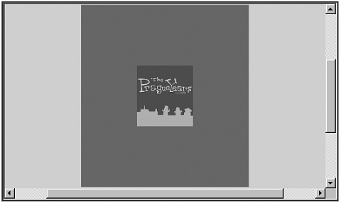
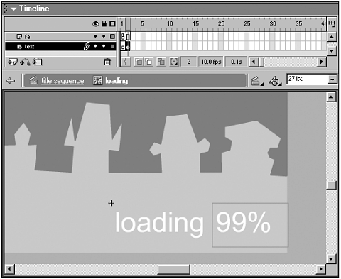
Adding a Picture FrameDon't forget to put a "picture frame" around the movie to mask the work area outside the viewable display (see Figure 6.32). Without a frame to mask the work area, this whole area can be seen if the movie is placed in an HTML document incorrectly or if the movie is sent out as a standalone movie that is resizable. Figure 6.32. Add a picture frame on the top layer to cover the movie's work area. It's important to add the picture frame because the final movie is often shown from sites that the designer or animator has no control over. Because other people might make mistakes in the HTML code or even distribute the movie as a standalone file that can be resized to show the work area, it's best to cover the area up so that it can't ever be seen. Adding the picture frame allows the creator to know that the viewer will only see the intended movie area. Designing the Loading SequenceThe final step in creating the title sequence is to make sure that there is a loading sequence so viewers will know if they have to wait for the cartoon or motion graphics to download before they can view anything (see Figure 6.33). This can often be accomplished visually by using a progress bar. It's easy to see filling up on a Pocket PC and is readily understandable. Figure 6.33. The loading sequence should tell the audience when the cartoon is loaded and viewable. The most important thing to remember is that waiting is bad. People hate to wait. This should not only influence the creation of a loading sequence but also the entire development of movies in Flash. Because some viewers of the finished cartoon will watch it over a direct wireless connection, enough of the cartoon will need to load so that it doesn't stop during playback. Depending on the connection speed, this might be anywhere from 20 80% of the cartoon.
It's also important that the loading sequence doesn't come up if the cartoon is being accessed off a hard drive or if it's being downloaded over a really fast connection. In these cases there will be no loading time, so it is poor information design that allows the load sequence to be seen. Because the load sequence won't be seen by a lot of the audience on Pocket PCs, the file size should be kept small. Some of the best practices for loading sequences are to tell the viewer how long the cartoon will take to load at different connection speeds and to show the viewer what percentage of the file has loaded. It's important to give viewers as much information as possible so that they don't get frustrated and leave. If it's at all possible to integrate a game, a quiz, or some other kind of time killer while the cartoon loads, then that should be done as well. It's also imperative that the font that is used in the loading sequence isn't used later in the movie. Flash loads an entire font family the first time any characters are used in a movie. The letters for "loading" and the numbers for the percentage of the movie that is loaded will only add a few K to the file size, but an entire font family can be up to 20K. If the font used for "loading" were the same font as one used later, the entire font family would have to be loaded. It's completely unnecessary to load all those bytes at the start of a movie and make people wait; so use a separate font. The basic steps in creating a loading movie are to find out how large the file is and whether it's already downloaded. If it's already downloaded, then it's possible to skip the loading sequence and go directly to the title sequence. If it's not already loaded, then it's possible to find out how quickly the movie is being downloaded. This general connection speed test will define how much of the movie needs to be downloaded before the loading sequence should start the movie playing. On a slow connection (14.4K and below), 80% of the movie might need to be downloaded before it will play without a hitch. On a faster connection (56K and above), only half of the movie or less might need to be downloaded. The amount that is loaded will need to be determined per project and for each connection speed, but this more detailed loading code provides the audience with the least amount of waiting based on the connection and thus the best possible viewing experience. Rather than go through the load sequence ActionScript code used in this project in this book, the code is available in the files that can be downloaded from this book's web site. The file also includes the scanned and traced letters, as well as the motion graphic sequence. |


EAN: N/A
Pages: 178