| In this exercise, you will create a new movie clip that adds a feedback form to the Contact page of the Tech Bookstore website. The feedback form gathers information from a visitor and then sends it to a server, which will email the information to you. That part of the feedback form will be covered in Lesson 10. Here, you create the visual part of the feedback form. 1. | Open bookstore11.fla from the TechBookstore folder on your hard drive and save it as bookstore12.fla. Create a new movie clip by choosing Insert > New Symbol and call it mcFeedback. Rename Layer 1 to background.
Alternatively, you can open bookstore12.fla from the lesson08/start folder on the CD-ROM. Insert a new movie clip symbol. After you create the new movie clip called mcFeedback, rename Layer 1 to background.
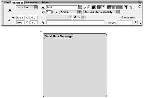
| 2. | Draw a rectangle on the Stage with a fill color of #E7E7E7 and a one-pixel black stroke. Add some text to the background. Lock the background layer.
Select the Rectangle tool from the Tools panel, set the Fill color to #E7E7E7, and set the Stroke color to #000000 (black). Set the drawing model to Object drawing. Press the Set Corner Radius button in the options area of the Tools panel and set the corner radius to 5 points. Draw a rectangle on the Stage and resize it by using the Property inspector.
Double-click the rectangle to select the fill and stroke and maximize the Property inspector. Set the width to 300 px and the height to 300 px. With the object still selected, press F8 to convert the object to a graphic symbol and name it grBackground. Move the rectangle to the x and y coordinates of 10, 10.
Finally, add a title at the top of the form on the background layer. Select the Text tool and set the Text type to Static, choose Arial for the font, select a black fill color, select a font size of 14 points, select Anti-alias for readability as the font-rendering method, and make the text bold.
Click the Stage and type Send us a message. Position the text field near the upper-left corner of the rectangle on the background layer. When you finish changing the coordinates and adding the static text, the Stage will look similar to the figure following. Lock the background layer when you're finished.
 | 3. | Insert a new layer and then drag the Label component onto the Stage.
The Label component allows you to add captions to text fields. Although you can create labels using the Text tool, using Label instances allows you to keep a consistent look among your components and you can make your application accessible to visually impaired visitors.
Create a new layer and rename the layer form. Open the Components panel and locate the Label component from the UI Components folder. Drag three instances of the Label component onto the Stage near the left edge of the rectangle you created in Step 2.
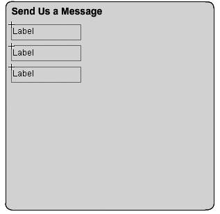 | 4. | Add custom text for each Label instance on the Stage.
Select the first Label instance on the Stage and open the Property inspector. In the Property inspector, make sure the Parameters tab is active and click on the text parameter. Enter Your email for the text parameter and press Enter or Return. The Stage immediately updates the component's appearance.
 Tip You can also maximize the Component inspector panel and change the label's text in the inspector. It contains options that are not available in the Property inspector and are only otherwise accessible using ActionScript. Select the second Label instance, change the text parameter to Subject and press Enter. Then change the third Label instance's text parameter to Message.
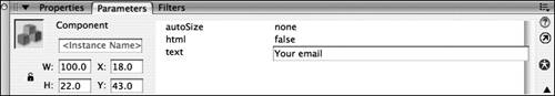
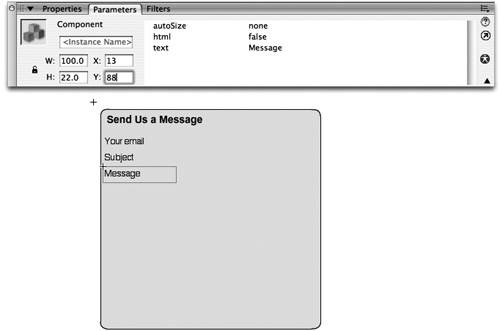
| 5. | Change the x and y coordinates of the Your email, Subject, and Message Label instances on the Stage using the Property inspector.
Select the Your email Label instance on the Stage and use the Property inspector or Info panel to change the x coordinate to 13 and the y coordinate to 44. Select the Label instance for Subject and change the x coordinate to 13 and the y coordinate to 66. Change the Message label to an x coordinate of 13 and a y coordinate of 88.
 | 6. | Drag two instances of the TextInput component onto the Stage. Then change the width of both instances using the Property inspector.
The TextInput component is similar to using the Text tool and setting the Text type to Input Text. It replicates a text input form field on an HTML page or on your operating system. Each kind of text input field allows a user to input values and data that can then be used in your application.
The TextInput component is limited to displaying only a single line of text. Using the Property inspector, you can set whether or not the text in the component can be modified, whether it is a password (the characters are replaced by symbols such as dots), or whether default text is entered into the field when the page loads. If you maximize the Component inspector panel, you will see additional parameters that can be used to modify the component. By using the Component inspector panel you can set a maximum number of characters that can be entered into the component instance, whether or not certain characters are accepted, and whether the component is enabled or even visible on the Stage.
Drag two instances of the TextInput component onto the Stage. Maximize the Property inspector and enter tiEmail into the <Instance Name> field. Resize the component's width by entering 200 into the width field. You can maintain the default instance height of 22 pixels.
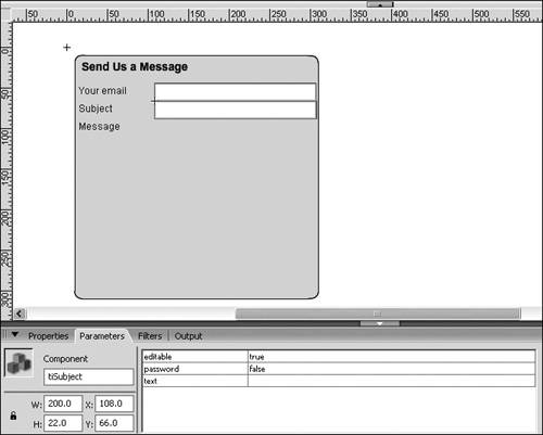
Select the second copy of the TextInput component on the Stage and type in an instance name of tiSubject. Change the instance's width to 200, as you did with the previous instance.
| 7. | Position the TextInput instances on the Stage.
With the Property inspector still maximized, select the tiEmail instance on the Stage. Change the x coordinate to 108 pixels and the y coordinate to 44 pixels, which will align the TextInput instance with the Your email label that was created earlier. Change the x coordinate of tiSubject to 108 pixels and the y coordinate to 66 pixels so it is aligned with the Subject label.
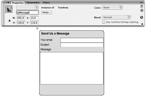
 | 8. | Add an instance of the TextArea component to the Stage, change its dimensions, and position the instance among the other elements already on the Stage. Give the new instance an instance name of taMessage.
The TextArea component is a multiline (more than one line of text) version of the TextInput component, and it has a few features that are quite useful. First and foremost, you have the ability to format text that is displayed in the component using Cascading Style Sheets (CSS), which allows you to display text that is much nicer than was possible in previous versions of Flash. Flash has HTML formatting support built into the text area component as well, and there are more tags now supported than there used to be. Most notably, HTML support also includes embedded JPEG, PNG, and GIF images by using the <img> tag. Because TextArea is a multiline component, you can also control word wrapping. But the best thing about the component is this: when there is more text than there is component to display it, a scrollbar appears! This is enough to make many designers and developers weep with joy.
Drag an instance of the TextArea component onto the Stage. Position at the x and y coordinate of 13 and 110 pixels, respectively, using the Property inspector. While you're at it, set the width of the component to 295 pixels and the height to 150 pixels so the Stage matches the following figure. Then type in an instance name of taMessage into the Property inspector.
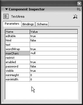
 Note You may have noticed the naming convention you are using prefixes each instance name with ti for Text Input and ta for Text Area. This convention makes it easy to identify which kind of component you are referencing when you are writing or viewing ActionScript. Very often, when you are working with ActionScript, you don't see the objects on the Stage. This naming convention makes it easy to figure out what they are. Select the TextArea component on the Stage and open the Component inspector panel. The Parameters tab in the Component inspector panel allows you to modify additional properties of the TextArea component which the Property inspector doesn't display. The Component inspector panel allows you to limit the total number of characters that can be entered into the TextArea by entering a number into the maxChars parameter. You can also disable word wrapping, restrict which characters can be entered into the TextArea, mask the text input as a password, or disable the TextArea so that users cannot enter any text.
You do not need to modify any of these parameters; however, it helps to remember what parameters are available because you will work with and modify them in upcoming lessons.
 | 9. | Save the changes you made to the file.
You will continue building the form in the following exercise, except that you will be working exclusively with the Button component in the next steps. Make sure that your changes are saved before moving on.
|
|