Adding Content
| As we have discussed already, the template provides the placeholders for content to be entered. The type of content a placeholder may contain is defined by the placeholder's properties, which are set up by the template designers at the development stage.
NOTE: Information about the placeholder properties is one of the details stored in the template's TGI (you may want to refer to the CMS Templates sidebar earlier in this chapter for the definition of a TGI). CMS provides three types of placeholders where the content authors can enter content, as follows:
Template designers may create additional custom placeholders for example, a drop-down list or a specific placeholder for XML content.
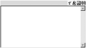
NOTE: We will discuss custom placeholders in detail in Chapter 29. An example of an empty multipurpose HTML placeholder is shown in Figure 5-16. The icons displayed on the top of a placeholder indicate the content that is allowed within this placeholder; they are listed in Table 5-4. The placeholder is referred to as "multipurpose" because it may contain different content; however, technically speaking, it generates HTML; therefore, it is formally called the HTML placeholder. Figure 5-16. HTML placeholder
Examples of content that an HTML placeholder may contain include the following:
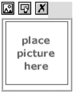
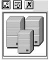
It is worth mentioning that the content of a placeholder is validated against the placeholder properties before the page is saved; the content that is not allowed is deleted. A single image placeholder is shown in Figure 5-17. It is currently empty; the default graphic displayed is provided for CMS to remind the page authors to insert the graphic into the placeholder. The icons on the top of the placeholder are clickable buttons. They allow us, from left to right, to add an image to the placeholder, edit image properties, and remove the image from the placeholder. When you work with the image placeholder, you can use only these buttons; the buttons on the CMS toolbar on top of the page, if present, will be disabled. Figure 5-17. Default single image placeholder
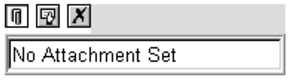
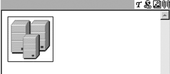
A single attachment placeholder provides the same functionality for file attachments as the single image placeholder provides for images. A file attachment is a resource that is displayed in a page as a link; it cannot be displayed inline within a browser window. The default presentation of an empty single attachment placeholder in a page template is shown in Figure 5-18. As with the image placeholder, the icons on the top of an attachment placeholder are clickable buttons. These buttons, from left to right, allow us to add an attachment, edit the attachment's properties, and remove the attachment. When you work with the attachment placeholder, you can use only these buttons; the CMS toolbar buttons will be disabled if present. Figure 5-18. Default single attachment placeholder
In the Web Author, content may be added to placeholders in a number of different ways, as follows:
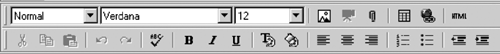
NOTE: Empty placeholders may contain the default elements that the designers incorporate in the template to help users when they need to add content to the placeholders. When you add your own content, you should delete these default elements. Adding Text and HyperlinksThe HTML placeholder provides a simple inline authoring environment for the content creators. When you are creating or editing a page, two new toolbars appear in the browser at the top of the page (Figure 5-19). These toolbars provide the ability to edit and insert content into the placeholders on the page. Figure 5-19. CMS toolbars
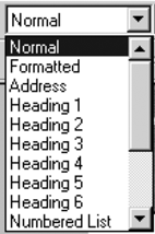
Depending on the current placeholder properties set up at the template design stage, certain buttons on these toolbars are enabled or disabled. Figure 5-19 shows the toolbars with all buttons enabled; however, it may not be the case for the placeholders in your templates. When you add content to the placeholder, CMS creates HTML for this content. The toolbars provide the following options:
Adding Images and File AttachmentsAny file that can be inserted in or attached to a page is known as a site resource. Examples include images, audio and video files, Adobe PDF files, and other files that are required on the CMS site. A file of any type can be a resource. Resources can be shared between multiple pages using resource galleries. A resource gallery provides virtual storage space for the site resources. The resource gallery can contain individual resources and other resource galleries. The resource gallery hierarchy is created and maintained by site administrators and resource managers.
NOTE: We will look into management of resource galleries and resources in Chapter 16. Resource types that can be rendered inline and viewed in a browser are images and video files in the following formats:
All other resources are rendered not inline, but as links pointing to a resource; therefore, they are called file attachments. File attachments can be of any type; a file attachment may be displayed with an icon showing the file type. How the linked file is viewed is determined by a client's browser and the applications available on the client computer. For example, Adobe PDF files require an additional viewer (Acrobat Reader) to be installed on the client machine.
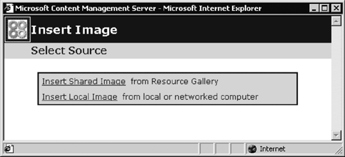
NOTE: By default, Flash animations will display as an attachment rather than an embedded inline page element. It is possible to change this behavior programmatically using the Publishing API. For example, the content authors add the Flash animation as an attachment, but the code in the template dynamically accesses the attachment's URL and displays the content inline. Another approach is to create a custom placeholder control for Flash resources. Custom placeholders are discussed in Chapter 29. Images and attachments can be added to placeholders from the resource galleries and from a local or network file system. The template designer may restrict this choice for a particular placeholder to resource galleries only. Images can be added to HTML placeholders and single image placeholders. Attachments can be added to HTML placeholders and single attachment placeholders. Images and attachments are added to the multipurpose HTML placeholders using the buttons on the CMS toolbar on the top of the screen. Single image and single attachment placeholders provide clickable buttons at the top of the placeholder for adding images and attachments. To add an image to an HTML placeholder, click the Insert Image button on the CMS toolbar; to add an image to a single image placeholder, click the Add Image button on the top of the placeholder. If the placeholder allows images from the file system and shared images from resource galleries, the dialog shown in Figure 5-27 is displayed. This dialog allows us to select images from resource galleries and local or network files. If the placeholder in the template doesn't allow the file system images, then the dialog shown in Figure 5-28 is displayed. This dialog only allows us to insert shared images from a resource gallery. Figure 5-27. Insert Image Select Source dialog, with local files permitted
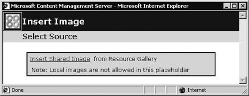
Figure 5-28. Insert Image Select Source dialog, with local files not permitted
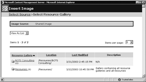
Let's insert an image from a resource gallery; we will click the Insert Shared Image link. The Web Author displays the list of resource galleries set up on the CMS site that the current user has permissions to access (Figure 5-29). Figure 5-29. Select Resource Gallery dialog
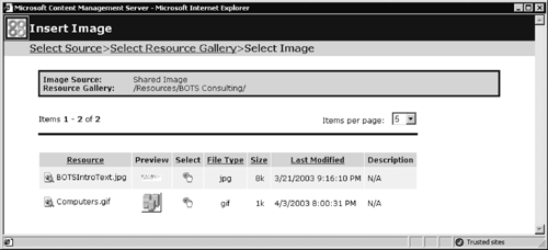
NOTE: As with the template galleries, it is possible to switch to the tree view in the Select Resource Gallery dialog. However, the same warning applies: If you don't have sufficient rights to view all galleries in the tree, you may not see the resource gallery you require. The interface in the Select Resource Gallery dialog is organized in the same way as the interface in the Select Template Gallery dialog that we have discussed before. You can navigate to the resource gallery that stores the resource you need, and then click its name to open the Select Image dialog, as shown in Figure 5-30. Figure 5-30. Select Image dialog
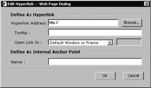
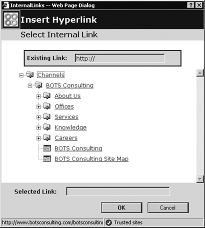
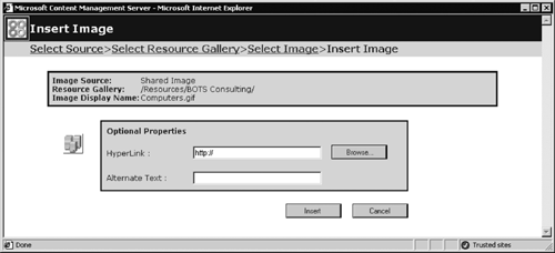
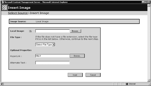
You can preview and then select the images by clicking the appropriate icon (refer to Table 5-4 for the icons and their functionality). After you've selected the image, the Insert Image dialog is displayed by the Web Author, asking you to provide optional properties for an image (Figure 5-31). If you want an image to become a hyperlink, then you need to provide a URL for the image to link to. You can either type the URL or use the Browse button to navigate to the page or channel you would like to link to using the Insert Hyperlink dialog (Figure 5-24). The alternate text for the image you specify becomes a value of the ALT attribute of the IMG tag for the image; some browsers display this text as a mouse tip. It is a good practice of Web design to provide all images on the site with the text for alternative representation. There are multiple uses for this text; for example, when the images are disabled in the browser, this text is displayed instead. Figure 5-31. Insert Image dialog
After you've typed the text for alternative representation, click Insert, and the image is inserted into a placeholder. Figure 5-32 shows an image inserted into the single image placeholder; Figure 5-33 shows the same image inserted into the HTML placeholder. Figure 5-32. Image inserted into a single image placeholder
Figure 5-33. Image inserted into an HTML placeholder
If you want to insert an image from local storage, you need to click the Insert Local Image link in the Select Source dialog (Figure 5-27), and the Web Author displays an Insert Image dialog for the local image source, as shown in Figure 5-34. This dialog provides the ability to browse to the required image; to preview the image; to select a file type from a list of GIF, JPEG, PNG, and BMP image types; and to type in alternate text for the image. After you've specified the necessary parameters, click Insert, and the image is inserted into a placeholder. You can also copy and paste, or drag and drop, images into an HTML placeholder, provided the local images are allowed in this particular placeholder. Figure 5-34. Insert Image dialog for local image
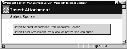
NOTE: Local files aren't added to the CMS resource gallery. For example, if you want to use a file on multiple pages, it may be better to import it into a resource gallery first and then insert it into the page. In this case, there is only one copy of the resource in the CMS database that is shared between multiple pages. Attachments are inserted in the placeholders in the same way as images. To add an attachment to an HTML placeholder, click the Insert Attachment button on the CMS toolbar; to add an attachment to a single attachment placeholder, click the Add Attachment button on the top of the placeholder. The Web Author displays the Insert Attachment Select Source dialog (Figure 5-35), which allows us to browse the resource galleries and the file system, if the latter is allowed by the placeholder's properties set up by the template designers. Figure 5-35. Insert Attachment Select Source dialog
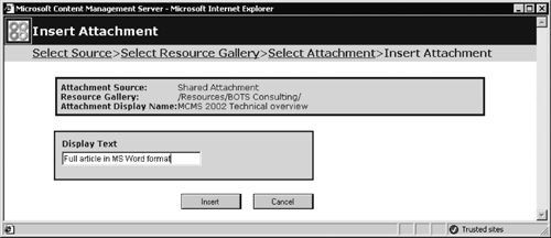
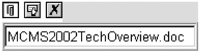
After the attachment has been selected, the Web Author displays the Insert Attachment dialog box (Figure 5-36), which allows us to set the text for the link to this attachment. An example of an attachment inserted into a single attachment placeholder is shown in Figure 5-37. Figure 5-36. Insert Attachment dialog
Figure 5-37. Placeholder with inserted attachment
|
EAN: 2147483647
Pages: 298