| Once you have created a basic title, you'll want to customize it. In this section, you'll learn how to alter the font and point size, and also how to enhance the title using shadows, colored backgrounds, and background images. Changing the font and point size The text defaults to Arial 96 points whenever you open the application. This is a rather large point size, and it's easy for your titles to start looking messy once you've entered only a little bit of text. At this stage, you'll want to adjust the point size of the text and think about altering the font you are using. To change the font 1. | Highlight your text by dragging a lasso around it with the mouse (Figure 10.10).
Figure 10.10. Dragging the lasso around the text selects it. You must do this to apply any changes to text or objects in Title Deko. 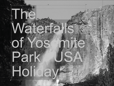
| 2. | Select the font you want by doing one of the following:
- Click the drop-down font menu and choose from the list (Figure 10.11).
Figure 10.11. The drop-down font menu. 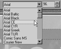
- Click the Browse Typefaces button
 , or press Ctrl+T and make your selection by double-clicking any of the available fonts (Figure 10.12). , or press Ctrl+T and make your selection by double-clicking any of the available fonts (Figure 10.12).
Figure 10.12. The Typeface browser allows you a better look at the fonts that are available. 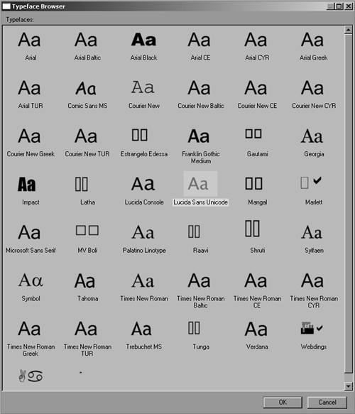
|
 Tip Tip
To change the point size 1. | Highlight your text by dragging a lasso around it with the mouse (Figure 10.10).
| 2. | Then do one of the following:
- Click the up and down arrows next to the point size (Figure 10.14).
Figure 10.14. Adjusting the point size using the up and down arrows… 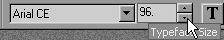
- Double-click inside the point size box and directly enter the size you want (Figure 10.15).
Figure 10.15. ...or by directly entering the numerical value… 
- Click one of the adjustment handles around your text and drag it to the size required (Figure 10.16).
Figure 10.16. …or by dynamically dragging the text to a new size using the selection box. 
|
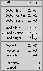
Aligning text Once you have the right point size and font style, you can move the text by surrounding either all of it or just one word (or even one letter) and dragging it to wherever you want to place it. However, to align the text with a bit more accuracy, you should use the alignment tools. You can find these arranged down the left side of the interface. To align the text 1. | Highlight your text by dragging a lasso around it with the mouse (Figure 10.10).
| 2. | Click one of the three alignment buttons (Top, Center, Bottom) and make your choice (Figure 10.17).
Figure 10.17. The three types of alignments in Title Deko. 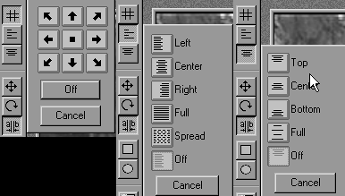
|
Tip
Safe Areas When you're working with alignment, be aware of the safe area markers, which are displayed as dotted red lines inside the Title Deko interface (Figure 10.19). Figure 10.19. The safe area for a title is inside these dotted red lines. 
These lines indicate where a title is likely to be viewable on the majority of TV sets; I'd advise you to play it safe and always keep your titles within the confines of these lines. |
|