Components
As was previously mentioned, Visual C++ offers a number of components in the toolbox that allow you to create standard Windows features. Each of these components has different properties and methods and is used in a different manner. These components are summarized in Table 15.4.
| Component | Purpose |
|---|---|
| Picture | This component is used simply to display images, such as BMP, JPG, GIF, and the like. |
| Static Text | This component displays read-only text. The user can view it, but cannot change it. |
| Edit Box | This component is used to allow the user to type in information. |
| Group Box | This component is simply used to group other components in logical groupings. |
| Button | This component is used to let the user click to initiate some action. |
| Check Box | Check boxes are used when a user can select multiple options. |
| Radio Button | Radio buttons are used when the user must select one from a list of mutually exclusive options. |
| Combo Box | The combo box provides a drop-down list the user can select from. |
| List Box | The list box also displays a list, but it is static rather than drop-down. |
| Horizontal Scroll Bar | This allows the user to scroll horizontally. |
| Vertical Scroll Bar | This allows the user to scroll vertically. |
| Spin | This is used in conjunction with another component, such as an Edit box, to allow the user to increment and decrement the value of the second component. |
| Progress | This is used to show the user a gradually increasing progress bar. |
| Slider | With this component, the user can select values by sliding the slider back and forth. |
| Hot Key | Creates a short cut or hot key. |
| List Control | Creates a list of items. |
| Tree Control | This component allows you to display data in a hierarchical tree. |
| Tab Control | This data allows you to display data grouped logically onto tabs. |
| Animate | This is used to display short animations. |
| Rich Edit | This component works much like the Edit box, but has more formatting options. |
| Date Time Picker | This gives you a drop-down box whereby you can select date and time. |
| Calendar | The calendar allows you to view a monthly calendar and to select specific dates. |
| Extended Combo box | This is a combo box that you can also place images in. |
There are even more components in Windows that you can manipulate inside of Visual C++, but these are the basics and should be sufficient for most applications. You have already seen the use of the Edit box and the Button. You will see several of the other components utilized in this chapter and in the next. A few of these components, the ones most commonly used, and the methods for using them will be addressed in this section.
Button
The Button is used to allow the user to initiate action by clicking the button. The most commonly associated function would be OnButton, which is associated with clicking the button. In addition to the obvious properties, such as disabled, the properties tab of the button has a number of settings you may wish to choose. You can choose to have an icon on your button, to have the text vertically aligned, as well as several other options.
Combo Box
This component has a few special caveats you need to be aware of. To begin with, when you draw the component on the form, the area you draw it in, is how far it will drop down when a user selects it. This means that if you only draw it about X inches tall, then it will only drop X inches when selected by the user!
Another important thing to know about the Combo Box is how you add data. You do this by right-clicking on the Combo box to get its properties window, then selecting the second tab, title data. All you have to do then is type in each item you want in the Combo box and press ctl-enter after each entry. You can see this shown clearly in Figure 15.17A.
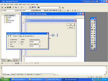
Figure 15.17a: The Combo box.
List Box
The List box presents data in a vertical list. It has a number of properties you can set. These properties include vertical scroll, horizontal scroll, and border.
The Dialog Application
The Dialog application has a number of properties you can set. These properties will effect the operation of the dialog itself. The properties tab for the Dialog application is shown in Figure 15.17B.
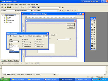
Figure 15.17b: The dialog properties.
Several of these properties should look interesting to you. You can set whether your application has a title bar and/or scroll bars, minimize or maximize buttons, and even what type of border it has.
There are, of course, many other components available to you. We will investigate many of these as this book progresses. You can look any one of them up in the Microsoft Help files that come with Visual C++ if you want more information on them.
EAN: 2147483647
Pages: 197
- Chapter V Consumer Complaint Behavior in the Online Environment
- Chapter VIII Personalization Systems and Their Deployment as Web Site Interface Design Decisions
- Chapter IX Extrinsic Plus Intrinsic Human Factors Influencing the Web Usage
- Chapter X Converting Browsers to Buyers: Key Considerations in Designing Business-to-Consumer Web Sites
- Chapter XVII Internet Markets and E-Loyalty