9.1 CSS, Level 3
| The XForms specification includes an example of XForms-specific CSS code in an appendix. Example 9-1 reproduces this sample: Example 9-1. Sample CSS from the XForms specification@namespace xforms url(http://www.w3.org/2002/xforms/); /* Display a red background on all invalid form controls */ *:invalid { background-color: red; } /* Display a red asterisk after all required form controls */ *:required::after { content: "*"; color: red; } /* Do not render non-relevant form controls */ *:disabled { visibility: hidden; } /* The following declarations cause form controls and their labels to align neatly, as if a two-column table were used */ xforms|group { display: table; } xforms|input { display: table-row; } xforms|input > xforms|label { display: table-cell; } xforms|input::value { border: thin black solid; display: table-cell; } /* Display an alert message when appropriate */ *:valid > xforms|alert { display: none; } *:invalid > xforms|alert { display: inline; } /* Display repeat-items with a dashed border */ *::repeat-item { border: dashed; } /* Display a teal highlight behind the current repeat item */ *::repeat-index { background-color: teal; } /* Display non-relevant repeat items in the system GrayText color */ *::repeat-item:disabled { visibility: visible; color: GrayText; } The CSS selectors mentioned in the XForms appendix are listed in Table 9-1.
A specification called CSS3 Basic User Interface Module officially defines these selectors, and a number of additional useful properties. (The information in this chapter is based on the Last Call Working Draft version of that specification. See http://www.w3.org/TR/css3-ui/ for updates.).
Figure 9-1. The CSS box model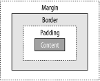 9.1.1 The Appearance PropertyCSS Level 3 defines a new property named appearance. Even though the aforementioned XForms appendix doesn't use this property, form authors find it to be one of the most useful CSS properties. It allows, for example, a select1 element to be rendered specifically as radio buttons, or a pull-down menu, or any of a large number of options. The property has a broad-ranging effect on the rendering of an element, and can change color, font, background, padding, border, margin, and other properties. It's important to note, however, that this CSS property affects only the rendering of the element. For example, applying an appearance value of pull-down-menu to any given element won't make it suddenly start behaving as a data collection tool. To be useful, the element has to have a predefined set of data collection semantics, as XForms nicely provides, leaving CSS just to control the details of presentation. Other than a few special values (`normal' and `inherit'), the predefined values for this property are:
The values are arranged as five general purpose categories with more specific sub-categories. When one of the more specific properties isn't recognized, it is to be treated as the more general one. The application of CSS properties is, strictly speaking, distinct from the appearance attribute on form control elements. Using attribute value selectors, however, it is possible to take control of exactly how a form control is rendered for various values of the appearance attribute. The following CSS code in Example 9-2 demonstrates: Example 9-2. Using the appearance attribute to fine-tune how form controls renderselect1[appearance="minimal"] { appearance: pop-up-menu; } select1[appearance="compact"] { appearance: list-menu; } select1[appearance="full"] { appearance: radio-group; }
The first selector shown selects all select1 elements that have an attribute appearance="minimal", applying the declaration {appearance:pop-up-menu;}. The second and third rules perform a similar function. 9.1.2 Aligning Form Controls and LabelsConsider this section of CSS code: Example 9-3. CSS to align form controls and labels@namespace xforms url(http://www.w3.org/2002/xforms/); /* The following declarations cause form controls and their labels to align neatly, as if a two-column table were used */ xforms|group { display: table; } xforms|input { display: table-row; } xforms|input> xforms|label { display: table-cell; } xforms|input::value { border: thin black solid; display: table-cell; } The above set of rules uses the namespace-aware rules of CSS Level 3 to provide special layout rules for input elements appearing in a group. The display: table rule, in combination with display: table-row and display: table-cell, cause the same layout effect as if HTML tables had been used. Note, however, that even with actual tables, this kind of layout wouldn't be possible, because of the way the CSS box model interacts with form controls. Each form control has a child label element, which can be styled using the techniques described in this chapter. Additionally, each form control has a wrapper element bearing the name of the form control, such as input, select, or range. Any styling applied to this wrapper affects the overall form control, and any styles not specifically overridden will inherit to the label, too. Thus, a style rule such as: input { background-color: blue; } will color the background of both the label and the actual data entry area a lovely shade of electric blue. A common request is to style just the data entry area, typically with a border or background color, without affecting the label. The difficulty is that no element exists that directly represents the data entry region of a form control. This is a good example of a case where CSS pseudo-elements are needed, as shown in Figure 9-2. In CSS terminology this can be described by a fictional tag sequence, which shows pseudo-elements along with the normal elements, even though the pseudo-elements aren't visible through View Source, the DOM, or any other means. Figure 9-2 illustrates how CSS rules can address the different parts of form controls. Figure 9-2. Styling a form control with a pseudo-element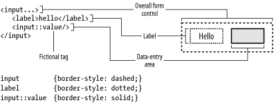 Taking advantage of the pseudo-element, the style rules at the beginning of this section cause a group element to be treated as a table, an input element as a table-row, and the label element and the data entry area pseudo-element as table cells. Note that the table layout algorithm defined by CSS properly accounts for languages with a right-to-left reading order, so that in such cases, the label will appear on the right-hand side, as expected.
As a result of these rules, form controls can be presented in a nicely aligned grid, as shown in Figure 9-3, which is based on the code shown in Example 9-4: Figure 9-3. Form control alignment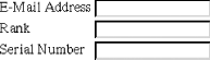 Example 9-4. Aligned form controls and labels<group> <input bind="email"> <label>E-Mail Address</label> <input> <input bind="rank"> <label>Rank</label> </input> <input bind="serial"> <label>Serial Number</label> </input> </group> 9.1.3 Styling Invalid Form ControlsConsider this CSS rule in Example 9-5: Example 9-5. Style rule for invalid form controls/* Display a red background on all invalid form controls */ *:invalid { background-color: red; } The above rule selects form controls based on the :invalid pseudo-class, giving all invalid controls a red background. Note that due to the dynamic nature of CSS, the form controls will change appearance as soon as the XForms processor is able to make the determination of validity. As a result, form controls will have an overall red background, as shown in Figure 9-4. Figure 9-4. Invalid form control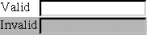 Of course, if the goal is to have just the data entry portion of the form control change color, then the style rule needs to select only the ::value pseudo-element, as shown in Example 9-6: Example 9-6. Improved style rule for invalid form controls/* Display a red background on all invalid form controls */ *::value:invalid { background-color: red; } Figure 9-5 shows how this might look. Figure 9-5. Invalid form control, with pseudo-element styling 9.1.4 Styling Required Form ControlsConsider this CSS rule in Example 9-7: Example 9-7. Style rule for required form controls/* Display a red asterisk after all required form controls */ *:required::after { content: "*"; color: red; } The above rule selects form controls based on the :required pseudo-class, producing generated content (an asterisk) for elements that match the rule. As a result, any form controls that are required for submission will have an asterisk appear just after in the rendered content, colored red by an additional rule, as shown in Figure 9-6. Figure 9-6. Required form control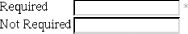 9.1.5 Styling Alert MessagesConsider these two CSS rules in Example 9-8: Example 9-8. Style rules to selectively display an error message/* Display an alert message when appropriate */ *:valid > xforms|alert { display: none; } *:invalid > xforms|alert { display: inline; } These rules alter the visibility of the alert element, selected as part of the XForms namespace, based on the validity of the form control. When valid, the element is set to display:none, which removes the content from the document flow altogether. Otherwise, the content is set to display: inline, which causes the text to appear in the document, as shown in Figure 9-7. Figure 9-7. Alert messages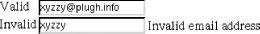 9.1.6 Styling Repeating ItemsConsider these two CSS rules in Example 9-9: Example 9-9. Style rules for repeating items/* Display repeat-items with a dashed border */ *::repeat-item { border: dashed; } /* Display a teal highlight behind the current repeat item */ *::repeat-index { background-color: teal; } Repeating items also present a unique situation for styling, since the original document tree contains only a single repetition. Thus, XForms defines a pseudo-element for each repetition, which allows style rules to be associated with each repeat item. Also, since repeating groups have a special concept of a current index, an additional pseudo-element allows the current repeat index to be styled as well, as shown in Figure 9-8. Figure 9-8. Repeating items, with one active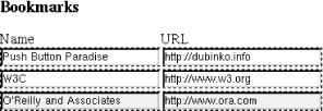 9.1.7 Styling Non-Visible ItemsFinally, consider this CSS rule in Example 9-10: Example 9-10. Style rule for the current repeat item/* Display non-relevant repeat items in the system GrayText color */ *::repeat-item:disabled { visibility: visible; color: GrayText; } The final example from the XForms appendix shows one way of controlling the appearance of non-relevant form controls, which use the existing CSS properties :enabled and :disabled. The code above shows how, when individual members of a repeat group are invalid, they can be rendered in a different color. In this case, it is the special GrayText color, which varies depending on local operating system settings, but it is typically a lower-contrast rendition of the normal system text. Figure 9-9 shows one possible rendering for invalid text, which appears on the second line. Figure 9-9. Controlling display of non-relevant form controls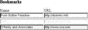 |
