Controlling Space between Words
Another way to improve legibility, particularly when you work with small type sizes, is to increase the amount of space between words, as in Figure 49.4. Figure 49.4. Just three pixels of extra word spacing make the paragraph on the left easier to read.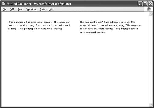 The attribute for the job is word-spacing. This attribute is different from the others so far in that the browser adds whatever value you give to its default amount of word space. So, the following style definition: word-spacing: 3px; doesn't set the word spacing to 3 pixels, but puts three additional pixels of space between words. Similarly, the style definition: word-spacing: -3px;
takes away three pixels of space, making your lines of type tighter. To set word spacing to the browser's default, type this in your style definition: word-spacing: normal; |