Chapter 14. Creating Fixed-Width Layouts with Tables
| Fixed-width layouts use absolute pixel measurements to determine the width of the page. The opposite of fixed width is liquid or expando, which automatically resizes itself to fit the width of the visitor's browser window.
Fixed-width layouts are the only choice for pages that require precise control over graphic design. You can't expect to place visual elements with any accuracy when a liquid layout keeps changing the width of the page to match the width of the browser window. At the same time, fixed width means fixed width, whether the size of the browser window matches the actual width of the page or greatly exceeds it. As Figure 14.1 shows, fixed-width layouts can feel simultaneously cramped and lost in interstellar space when the browser window is too large for the page. Centering the fixed-width layout cuts down on this phenomenon, as in Figure 14.2. Figure 14.1. A fixed-width page can feel cramped when you look at it in a much wider browser window.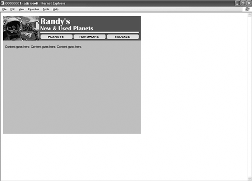 Figure 14.2. Centering the fixed-width layout improves matters.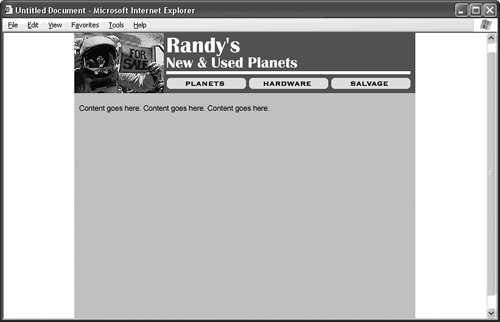
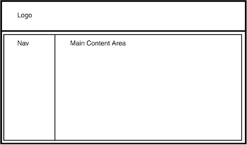
All good Web layouts start with a sketch like the one in Figure 14.3, where you mark out the main areas of your page. Don't get too clever with the layout here. HTML's colspan and rowspan attributes let you build incredibly complex tables, but do everything in your power to avoid them. Colspans and rowspans are fine for data tables, or tables that present rows and columns of data according to HTML spec. Layout tables like the kind you're building here are against spec, and browsers tend to do unfriendly things to your colspanned or rowspanned design. Figure 14.3. Begin by sketching the layout you want to build and labeling the areas.
If you want a more adventurous design, try nested tables instead. A nested table is a table that appears inside the cell of another table. The design in Figure 14.3 isn't adventurous by any stretch of the imagination, but it nests a table in the bottom cell of the main table to avoid a colspan in the top cell.
Once you sketch your design, you should start to think about pixel measurements. The pixel is the basic unit of measurement in HTML tables. Conveniently enough, computer operating systems measure screen widths in pixels, too, which makes sizing your layout for a particular screen setting a painless operation. You simply pick a screen width that makes sense for your visitors, and then you custom-build your layout to fit in a similarly sized table.
Table 14.1 gives you the numbers. As you can see, it isn't quite as easy as building a 640-pixel-wide table to match a 640-pixel-wide screen. You have to factor in browser interface elements such as scrollbars, so you subtract a couple of pixels from your table, just to be on the safe side. The exception is MSNTV, still occasionally known as WebTV, which doesn't have scrollbars or other interface elements to eat into your design space.
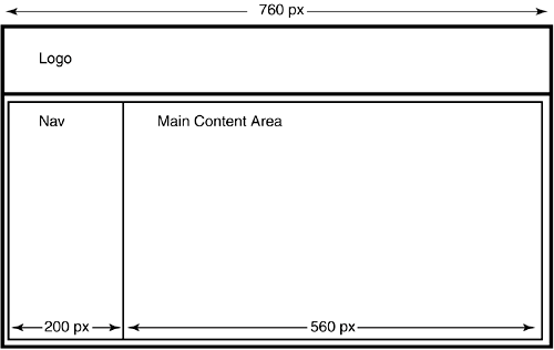
For the purposes of this example, play it safe and go with an 800-width screen, which calls for a table width of 760 pixels. Now that you know this, figuring out the widths of the areas inside the table isn't hard. Eyeball it. Make your best guess. You can adjust the values later if need be. Just make sure the individual widths don't add up to more (or less) than the total width of the table. Record the numbers on your sketch as in Figure 14.4, and the table code practically writes itself. Replace the labels in the HTML with your site's contentusing nested tables if you need extra designand you have a fixed-width layout. Figure 14.4. After you determine the width of the table, the rest of the numbers fall into place.
Listing 14.1. View Source for Figure 14.4.[View full width] <div align="center"> <!-- If you don't want to center the layout table, delete the div tag here and at the end Notice in this example that you don't worry about the heights of the table cells. This is actually one of the advantages of building layouts with tables. The browser automatically adjusts the heights of the table cells to match whatever content sits inside them. While you can certainly specify precise height measurements if you know them, you can also just let nature take its course and rely on the browser to calculate the correct heights.
Here's what the listing might look like with some height values thrown in: <div align="center"> <table width="760" border="0" cellpadding="0" cellspacing="0"> <tr> <td width="760" height="100" valign="top">Logo</td> </tr> <tr> <td width="760" height="400" valign="top"> <!-- The nested table begins here. --> <table width="760" border="0" cellpadding="0" cellspacing="0"> <tr> <td width="200" height="400" valign="top">Nav</td> <td width="560" height="400" valign="top">Content</td> </tr> </table> <!-- The nested table ends here. --> </td> </tr> </table> </div> The downside to omitting the heights is that your table looks completely collapsed in a browser window until you start adding content to the cells. If this bugs you, just give your table cells arbitrary height values while you're building it, but then don't forget to remove the heights once the content is in the cells. |
 of the listing. --> <table width="760" border="0" cellpadding="0" cellspacing="0"> <tr> <td width="760" valign="top">Logo</td> </tr> <tr> <td width="760" valign="top"> <!-- The nested table begins here. --> <table width="760" border="0" cellpadding="0" cellspacing="0"> <tr> <td width="200" valign="top">Nav</td> <td width="560" valign="top">Content</td> </tr> </table> <!-- The nested table ends here. --> </td> </tr> </table> </div>