Managing Your Use of Color
| Color is invaluable as a design tool. You use it to call attention to certain elements on your page. You use it to distinguish one type of content from another type. However, color is just as much a visual element as an image, so, as an accessibility-minded Web builder, you need to be careful about how you use it. After all, many your visitors are colorblind.
Take the example in Figure 6.1. Notice how the underline helps you spot a link in this block of text. However, if you remove the underline, as in Figure 6.2, you have no way of telling where the text ends and the hyperlinks begin. Figure 6.1. Underlines help to call attention to the hyperlinks in a block of text.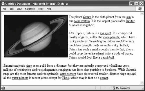 Figure 6.2. Remove the underlines, and someone who can't perceive color has trouble finding the links. So, while color is an effective visual cue or indicator for an element such as a hyperlink, it shouldn't be the only visual cue you provide. By all means, use color to call attention to elements on your page. Just make sure you send the color in with some backup. Use an underline, a solid border, an arrow symbol, boldface, italicsanything that translates to a black-and-white environment, as in Figure 6.3. Figure 6.3. You don't need the underline to make hyperlinks work without color. Boldface works just as well, and any color-independent visual cue does the job.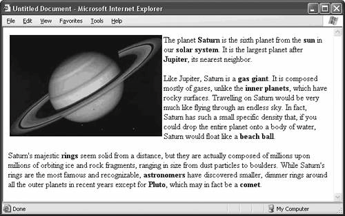 |