Section 18.4. Applying Style Rules to Form Elements
18.4. Applying Style Rules to Form ElementsThe default appearance of HTML form elements is enough to induce catatonia. If any element needs the CSS treatment, it's these, so click that New CSS Rule button on the CSS Styles panel and get busy. For the purposes of style rules, the <input> tag controls single-line and password text fields, checkboxes, radio buttons, and Submit and Reset buttons. The <textarea> tag controls textareas and the <select> tag controls lists and menus, so there isn't an especially high level of consistency here.
As a further complication, browsers don't apply the same style definitions to the various <input> elements consistently. For instance, in Internet Explorer, adding a text color and background color to a text field, Submit button, or Reset button has the expected results: the text acquires the text color and the background of the field acquires the background color. However, the same attributes applied to a checkbox or radio button gives you a white checkbox or radio button against a field of the specified background color, while the check mark or radio bullet inside the element retains its default color. (In Firefox, the text field, Submit button, and Reset button appear much as they do in IE, while the style rule has no effect at all on radio buttons and checkboxes.) Your best approach here is to create class stylesstyles that aren't tied to a specific HTML tag. You can have a single class style that applies equally to text fields, text areas, lists, menus, Submit buttons, and Reset buttons; or you can define several different class styles: say one for text fields and text areas, another for lists and menus, and a third for Submit and Reset buttons. Because of the disappointing and inconsistent effects of CSS on radio buttons and checkboxes, don't bother including them in your class style. Also, for this reason, don't redefine the appearance of the <input> tag in general, because your style rule will affect the "good" elements like text fields along with the "naughty" elements like checkboxes.
By way of example, the following procedure gives you a general-purpose class style for all the "good" form elements:
When you finish, your document window looks something like Figure 18-35. Figure 18-35. Applying a class style to the form fields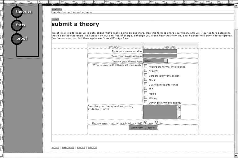 |
 Save.
Save.
EAN: 2147483647
Pages: 154