DateTimePicker Control
The DateTimePicker control (see output of Fig. 14.11) is similar to the MonthCalendar control, but displays the calendar when a down arrow is selected. The DateTimePicker can be used to retrieve date and time information from the user. The DateTimePicker is also more customizable than a MonthCalendar controlmore properties are provided to edit the look and feel of the drop-down calendar. Property Format specifies the user's selection options using the DateTimePickerFormat enumeration. The values in this enumeration are Long (displays the date in long format, as in Friday, July 1, 2005), Short (displays the date in short format, as in 7/1/2005), Time (displays a time value, as in 11:48:02 PM) and Custom (indicates that a custom format will be used). If value Custom is used, the display in the DateTimePicker is specified using property CustomFormat. The default event for this control is ValueChanged, which occurs when the selected value (whether a date or a time) is changed. DateTimePicker properties and a common event are summarized in Fig. 14.10.
|
DateTimePicker properties and an event |
Description |
|---|---|
|
DateTimePicker Properties |
|
|
CalendarForeColor |
Sets the text color for the calendar. |
|
CalendarMonthBackground |
Sets the calendar's background color. |
|
CustomFormat |
Sets the custom format string for the user's options. |
|
Format |
Sets the format of the date and/or time used for the user's options. |
|
MaxDate |
The maximum date and time that can be selected. |
|
MinDate |
The minimum date and time that can be selected. |
|
ShowCheckBox |
Indicates if a CheckBox should be displayed to the left of the selected date and time. |
|
ShowUpDown |
Used to indicate that the control should have up and down Buttons. This is helpful for instances when the DateTimePicker is used to select a timethe Buttons can be used to increase or decrease hour, minute and second values. |
|
Value |
The data selected by the user. |
|
Common DateTimePicker Event |
|
|
ValueChanged |
Generated when the Value property changes, including when the user selects a new date or time. |
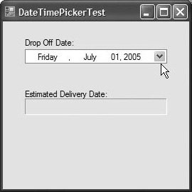
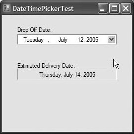
Figure 14.11 demonstrates using the DateTimePicker control to select an item's drop-off time. Many companies use such functionality. For instance, several online DVD rental companies specify the day a movie is sent out, and the estimated time that the movie will arrive at your home. In this application, the user selects a drop-off day, and then an estimated arrival date is displayed. The date is always two days after drop off, three days if a Sunday is reached (mail is not delivered on Sunday).
Figure 14.11. Demonstrating DateTimePicker.
 1 // Fig. 14.11: DateTimePickerForm.cs
 2 // Using a DateTimePicker to select a drop off time.
 3 using System;
 4 using System.Windows.Forms;
 5
 6 public partial class DateTimePickerForm : Form
 7 {
 8 // default constructor
 9 public DateTimePickerForm()
10 {
11 InitializeComponent();
12 } // end constructor
13
14 private void dateTimePickerDropOff_ValueChanged( 15 object sender, EventArgs e ) 16 { 17 DateTime dropOffDate = dateTimePickerDropOff.Value; 18 19 // add extra time when items are dropped off around Sunday 20 if ( dropOffDate.DayOfWeek == DayOfWeek.Friday || 21 dropOffDate.DayOfWeek == DayOfWeek.Saturday || 22 dropOffDate.DayOfWeek == DayOfWeek.Sunday ) 23 24 //estimate three days for delivery 25 outputLabel.Text = dropOffDate.AddDays( 3 ).ToLongDateString(); 26 else 27 // otherwise estimate only two days for delivery 28 outputLabel.Text = dropOffDate.AddDays( 2 ).ToLongDateString(); 29 } // end method dateTimePickerDropOff_ValueChanged 30 31 private void DateTimePickerForm_Load( object sender, EventArgs e ) 32 { 33 // user cannot select days before today 34 dateTimePickerDropOff.MinDate = DateTime.Today; 35 36 // user can only select days of this year 37 dateTimePickerDropOff.MaxDate = DateTime.Today.AddYears( 1 ); 38 } // end method DateTimePickerForm_Load 39 } // end class DateTimePickerForm
(a)
(b)
(c)
(d)
|
The DateTimePicker (dateTimePickerDropOff) has its Format property set to Long, so the user can select a date and not a time in this application. When the user selects a date, the ValueChanged event occurs. The event handler for this event (lines 1429) first retrieves the selected date from the DateTimePicker's Value property (line 17). Lines 2022 use the DateTime structure's DayOfWeek property to determine the day of the week on which the selected date falls. The day values are represented using the DayOfWeek enumeration. Lines 25 and 28 use DateTime's AddDays method to increase the date by two days or three days, respectively. The resulting date is then displayed in Long format using method ToLongDateString.
In this application, we do not want the user to be able to select a drop-off day before the current day, or one that is more than a year into the future. To enforce this, we set the DateTimePicker's MinDate and MaxDate properties when the Form is loaded (lines 34 and 37). Property Today returns the current day, and method AddYears (with an argument of 1) is used to specify a date one year in the future.
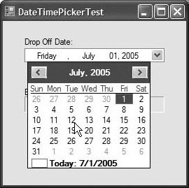
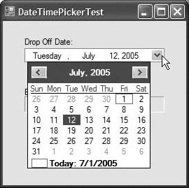
Let's take a closer look at the output. This application begins by displaying the current date (Fig. 14.11(a)). In Fig. 14.11(b), we selected the 12th of July. In Fig. 14.11(c), the estimated arrival date is displayed as the 14th. Figure 14.11(d) shows that the 12th, after it is selected, is highlighted in the calendar.
LinkLabel Control |
Preface
Index
Introduction to Computers, the Internet and Visual C#
- Introduction
- What Is a Computer?
- Computer Organization
- Early Operating Systems
- Personal Computing, Distributed Computing and Client/Server Computing
- Hardware Trends
- Microsofts Windows® Operating System
- Machine Languages, Assembly Languages and High-Level Languages
- C#
- C, C++, Java and Visual Basic
- Other High-Level Languages
- The Internet and the World Wide Web
- Extensible Markup Language (XML)
- Microsofts .NET
- The .NET Framework and the Common Language Runtime
- Test-Driving a C# Application
- Software Engineering Case Study: Introduction to Object Technology and the UML
- Wrap-Up
- Web Resources
- Summary
- Terminology
- Self-Review Exercises
- Exercises
Introduction to the Visual C# 2005 Express Edition IDE
- Introduction
- Overview of the Visual Studio 2005 IDE
- Menu Bar and Toolbar
- Navigating the Visual Studio 2005 IDE
- Using Help
- Using Visual Programming to Create a Simple Program Displaying Text and an Image
- Wrap-Up
- Web Resources
- Summary
- Terminology
- Self-Review Exercises
- Exercises
Introduction to C# Applications
- Introduction
- A Simple C# Application: Displaying a Line of Text
- Creating Your Simple Application in Visual C# Express
- Modifying Your Simple C# Application
- Formatting Text with Console.Write and Console.WriteLine
- Another C# Application: Adding Integers
- Memory Concepts
- Arithmetic
- Decision Making: Equality and Relational Operators
- (Optional) Software Engineering Case Study: Examining the ATM Requirements Document
- Wrap-Up
- Summary
- Terminology
- Self-Review Exercises
- Exercises
Introduction to Classes and Objects
- Introduction
- Classes, Objects, Methods, Properties and Instance Variables
- Declaring a Class with a Method and Instantiating an Object of a Class
- Declaring a Method with a Parameter
- Instance Variables and Properties
- UML Class Diagram with a Property
- Software Engineering with Properties and set and get Accessors
- Value Types vs. Reference Types
- Initializing Objects with Constructors
- Floating-Point Numbers and Type decimal
- (Optional) Software Engineering Case Study: Identifying the Classes in the ATM Requirements Document
- Wrap-Up
- Summary
- Terminology
- Self-Review Exercises
- Exercises
Control Statements: Part 1
- Introduction
- Algorithms
- Pseudocode
- Control Structures
- if Single-Selection Statement
- if...else Double-Selection Statement
- while Repetition Statement
- Formulating Algorithms: Counter-Controlled Repetition
- Formulating Algorithms: Sentinel-Controlled Repetition
- Formulating Algorithms: Nested Control Statements
- Compound Assignment Operators
- Increment and Decrement Operators
- Simple Types
- (Optional) Software Engineering Case Study: Identifying Class Attributes in the ATM System
- Wrap-Up
- Summary
- Terminology
- Self-Review Exercises
- Exercises
Control Statements: Part 2
- Introduction
- Essentials of Counter-Controlled Repetition
- for Repetition Statement
- Examples Using the for Statement
- do...while Repetition Statement
- switch Multiple-Selection Statement
- break and continue Statements
- Logical Operators
- Structured Programming Summary
- (Optional) Software Engineering Case Study: Identifying Objects States and Activities in the ATM System
- Wrap-Up
- Summary
- Terminology
- Self-Review Exercises
- Exercises
Methods: A Deeper Look
- Introduction
- Packaging Code in C#
- static Methods, static Variables and Class Math
- Declaring Methods with Multiple Parameters
- Notes on Declaring and Using Methods
- Method Call Stack and Activation Records
- Argument Promotion and Casting
- The Framework Class Library
- Case Study: Random-Number Generation
- Case Study: A Game of Chance (Introducing Enumerations)
- Scope of Declarations
- Method Overloading
- Recursion
- Passing Arguments: Pass-by-Value vs. Pass-by-Reference
- (Optional) Software Engineering Case Study: Identifying Class Operations in the ATM System
- Wrap-Up
- Summary
- Terminology
- Self-Review Exercises
- Exercises
Arrays
- Introduction
- Arrays
- Declaring and Creating Arrays
- Examples Using Arrays
- Case Study: Card Shuffling and Dealing Simulation
- foreach Statement
- Passing Arrays and Array Elements to Methods
- Passing Arrays by Value and by Reference
- Case Study: Class GradeBook Using an Array to Store Grades
- Multidimensional Arrays
- Case Study: Class GradeBook Using a Rectangular Array
- Variable-Length Argument Lists
- Using Command-Line Arguments
- (Optional) Software Engineering Case Study: Collaboration Among Objects in the ATM System
- Wrap-Up
- Summary
- Terminology
- Self-Review Exercises
- Exercises
- Special Section: Building Your Own Computer
Classes and Objects: A Deeper Look
- Introduction
- Time Class Case Study
- Controlling Access to Members
- Referring to the Current Objects Members with the this Reference
- Indexers
- Time Class Case Study: Overloaded Constructors
- Default and Parameterless Constructors
- Composition
- Garbage Collection and Destructors
- static Class Members
- readonly Instance Variables
- Software Reusability
- Data Abstraction and Encapsulation
- Time Class Case Study: Creating Class Libraries
- internal Access
- Class View and Object Browser
- (Optional) Software Engineering Case Study: Starting to Program the Classes of the ATM System
- Wrap-Up
- Summary
- Terminology
- Self-Review Exercises
- Exercises
Object-Oriented Programming: Inheritance
- Introduction
- Base Classes and Derived Classes
- protected Members
- Relationship between Base Classes and Derived Classes
- Constructors in Derived Classes
- Software Engineering with Inheritance
- Class object
- Wrap-Up
- Summary
- Terminology
- Self-Review Exercises
- Exercises
Polymorphism, Interfaces & Operator Overloading
- Introduction
- Polymorphism Examples
- Demonstrating Polymorphic Behavior
- Abstract Classes and Methods
- Case Study: Payroll System Using Polymorphism
- sealed Methods and Classes
- Case Study: Creating and Using Interfaces
- Operator Overloading
- (Optional) Software Engineering Case Study: Incorporating Inheritance and Polymorphism into the ATM System
- Wrap-Up
- Summary
- Terminology
- Self-Review Exercises
- Exercises
Exception Handling
- Introduction
- Exception Handling Overview
- Example: Divide by Zero Without Exception Handling
- Example: Handling DivideByZeroExceptions and FormatExceptions
- .NET Exception Hierarchy
- finally Block
- Exception Properties
- User-Defined Exception Classes
- Wrap-Up
- Summary
- Terminology
- Self-Review Exercises
- Exercises
Graphical User Interface Concepts: Part 1
- Introduction
- Windows Forms
- Event Handling
- Control Properties and Layout
- Labels, TextBoxes and Buttons
- GroupBoxes and Panels
- CheckBoxes and RadioButtons
- PictureBoxes
- ToolTips
- NumericUpDown Control
- Mouse-Event Handling
- Keyboard-Event Handling
- Wrap-Up
- Summary
- Terminology
- Self-Review Exercises
- Answers To Self-Review Exercises
- Exercises
Graphical User Interface Concepts: Part 2
- Introduction
- Menus
- MonthCalendar Control
- DateTimePicker Control
- LinkLabel Control
- ListBox Control
- CheckedListBox Control
- ComboBox Control
- TreeView Control
- ListView Control
- TabControl Control
- Multiple Document Interface (MDI) Windows
- Visual Inheritance
- User-Defined Controls
- Wrap-Up
- Summary
- Terminology
- Self-Review Exercises
- Exercises
Multithreading
- Introduction
- Thread States: Life Cycle of a Thread
- Thread Priorities and Thread Scheduling
- Creating and Executing Threads
- Thread Synchronization and Class Monitor
- Producer/Consumer Relationship without Thread Synchronization
- Producer/Consumer Relationship with Thread Synchronization
- Producer/Consumer Relationship: Circular Buffer
- Multithreading with GUIs
- Wrap-Up
- Summary
- Terminology
- Self-Review Exercises
- Exercises
Strings, Characters and Regular Expressions
- Introduction
- Fundamentals of Characters and Strings
- string Constructors
- string Indexer, Length Property and CopyTo Method
- Comparing strings
- Locating Characters and Substrings in strings
- Extracting Substrings from strings
- Concatenating strings
- Miscellaneous string Methods
- Class StringBuilder
- Length and Capacity Properties, EnsureCapacity Method and Indexer of Class StringBuilder
- Append and AppendFormat Methods of Class StringBuilder
- Insert, Remove and Replace Methods of Class StringBuilder
- Char Methods
- Card Shuffling and Dealing Simulation
- Regular Expressions and Class Regex
- Wrap-Up
- Summary
- Terminology
- Self-Review Exercises
- Exercises
Graphics and Multimedia
- Introduction
- Drawing Classes and the Coordinate System
- Graphics Contexts and Graphics Objects
- Color Control
- Font Control
- Drawing Lines, Rectangles and Ovals
- Drawing Arcs
- Drawing Polygons and Polylines
- Advanced Graphics Capabilities
- Introduction to Multimedia
- Loading, Displaying and Scaling Images
- Animating a Series of Images
- Windows Media Player
- Microsoft Agent
- Wrap-Up
- Summary
- Terminology
- Self-Review Exercises
- Exercises
Files and Streams
- Introduction
- Data Hierarchy
- Files and Streams
- Classes File and Directory
- Creating a Sequential-Access Text File
- Reading Data from a Sequential-Access Text File
- Serialization
- Creating a Sequential-Access File Using Object Serialization
- Reading and Deserializing Data from a Sequential-Access Text File
- Wrap-Up
- Summary
- Terminology
- Self-Review Exercises
- Exercises
Extensible Markup Language (XML)
- Introduction
- XML Basics
- Structuring Data
- XML Namespaces
- Document Type Definitions (DTDs)
- W3C XML Schema Documents
- (Optional) Extensible Stylesheet Language and XSL Transformations
- (Optional) Document Object Model (DOM)
- (Optional) Schema Validation with Class XmlReader
- (Optional) XSLT with Class XslCompiledTransform
- Wrap-Up
- Web Resources
- Summary
- Terminology
- Self-Review Exercises
- Exercises
Database, SQL and ADO.NET
- Introduction
- Relational Databases
- Relational Database Overview: Books Database
- SQL
- ADO.NET Object Model
- Programming with ADO.NET: Extracting Information from a Database
- Querying the Books Database
- Programming with ADO.NET: Address Book Case Study
- Using a DataSet to Read and Write XML
- Wrap-Up
- Web Resources
- Summary
- Terminology
- Self-Review Exercises
- Exercises
ASP.NET 2.0, Web Forms and Web Controls
- Introduction
- Simple HTTP Transactions
- Multitier Application Architecture
- Creating and Running a Simple Web-Form Example
- Web Controls
- Session Tracking
- Case Study: Connecting to a Database in ASP.NET
- Case Study: Secure Books Database Application
- Wrap-Up
- Web Resources
- Summary
- Terminology
- Self-Review Exercises
- Exercises
Web Services
- Introduction
- .NET Web Services Basics
- Simple Object Access Protocol (SOAP)
- Publishing and Consuming Web Services
- Session Tracking in Web Services
- Using Web Forms and Web Services
- User-Defined Types in Web Services
- Wrap-Up
- Web Resources
- Summary
- Terminology
- Self-Review Exercises
- Exercises
Networking: Streams-Based Sockets and Datagrams
- Introduction
- Connection-Oriented vs. Connectionless Communication
- Protocols for Transporting Data
- Establishing a Simple TCP Server (Using Stream Sockets)
- Establishing a Simple TCP Client (Using Stream Sockets)
- Client/Server Interaction with Stream-Socket Connections
- Connectionless Client/Server Interaction with Datagrams
- Client/Server Tic-Tac-Toe Using a Multithreaded Server
- WebBrowser Control
- .NET Remoting
- Wrap-Up
- Summary
- Terminology
- Self-Review Exercises
- Exercises
Searching and Sorting
- Introduction
- Searching Algorithms
- Sorting Algorithms
- Wrap-Up
- Summary
- Terminology
- Self-Review Exercises
- Exercises
Data Structures
- Introduction
- Simple-Type structs, Boxing and Unboxing
- Self-Referential Classes
- Linked Lists
- Stacks
- Queues
- Trees
- Wrap-Up
- Summary
- Terminology
- Self-Review Exercises
- Exercises
Generics
- Introduction
- Motivation for Generic Methods
- Generic Method Implementation
- Type Constraints
- Overloading Generic Methods
- Generic Classes
- Notes on Generics and Inheritance
- Wrap-Up
- Summary
- Terminology
- Self-Review Exercises
- Exercises
Collections
- Introduction
- Collections Overview
- Class Array and Enumerators
- Non-Generic Collections
- Generic Collections
- Synchronized Collections
- Wrap-Up
- Summary
- Terminology
- Self-Review Exercises
- Exercises
Appendix A. Operator Precedence Chart
Appendix B. Number Systems
- B.1. Introduction
- B.2. Abbreviating Binary Numbers as Octal and Hexadecimal Numbers
- B.3. Converting Octal and Hexadecimal Numbers to Binary Numbers
- B.4. Converting from Binary, Octal or Hexadecimal to Decimal
- B.5. Converting from Decimal to Binary, Octal or Hexadecimal
- B.6. Negative Binary Numbers: Twos Complement Notation
- Summary
- Terminology
- Self-Review Exercises
- Exercises
Appendix C. Using the Visual Studio 2005 Debugger
- C.1. Introduction
- C.2. Breakpoints and the Continue Command
- C.3. The Locals and Watch Windows
- C.4. Controlling Execution Using the Step Into, Step Over, Step Out and Continue Commands
- C.5. Other Features
- C.6. Wrap-Up
- Summary
- Terminology
- Self-Review Exercises
Appendix D. ASCII Character Set
Appendix E. Unicode®
- E.1. Introduction
- E.2. Unicode Transformation Formats
- E.3. Characters and Glyphs
- E.4. Advantages/Disadvantages of Unicode
- E.5. Using Unicode
- E.6. Character Ranges
- Summary
- Terminology
- Self-Review Exercises
- Answers to Self-Review exercises
- Exercises
Appendix F. Introduction to XHTML: Part 1
- F.1. Introduction
- F.2. Editing XHTML
- F.3. First XHTML Example
- F.4. W3C XHTML Validation Service
- F.5. Headers
- F.6. Linking
- F.7. Images
- F.8. Special Characters and More Line Breaks
- F.9. Unordered Lists
- F.10. Nested and Ordered Lists
- F.11. Web Resources
Appendix G. Introduction to XHTML: Part 2
- G.1. Introduction
- G.2. Basic XHTML Tables
- G.3. Intermediate XHTML Tables and Formatting
- G.4. Basic XHTML Forms
- G.5. More Complex XHTML Forms
- G.6. Internal Linking
- G.7. Creating and Using Image Maps
- G.8. meta Elements
- G.9. frameset Element
- G.10. Nested framesets
- G.11. Web Resources
Appendix H. HTML/XHTML Special Characters
Appendix I. HTML/XHTML Colors
Appendix J. ATM Case Study Code
- Appendix J. ATM Case Study Code
- J.1. ATM Case Study Implementation
- J.2. Class ATM
- J.3. Class Screen
- J.4. Class Keypad
- J.5. Class CashDispenser
- J.6. Class DepositSlot
- J.7. Class Account
- J.8. Class BankDatabase
- J.9. Class Transaction
- J.10. Class BalanceInquiry
- J.11. Class Withdrawal
- J.12. Class Deposit
- J.13. Class ATMCaseStudy
- J.14. Wrap-Up
Appendix K. UML 2: Additional Diagram Types
Appendix L. Simple Types
Index
EAN: 2147483647
Pages: 600
