Recipe 3.1. Choosing Between a Flexible and Fixed Layout
ProblemYou need to determine which design format will do the best job of presenting your web site's content for its audience. SolutionWeb designers have three basic options when creating a grid into which web site content can be arranged and presented: a fixed-width layout that locks page elements in place regardless of the browser window size; a flexible, or liquid, layout in which content blocks can be resized when the browser window size changes, and a hybrid layout that combines both fixed and flexible components. Consider a hypothetical three-column web page that uses CSS-styled content blocks in <div>s for its layout. A fixed-width design specifies pixels for the three columns and their margins: <html> <head> …other head tags … <style type="text/css" title="text/css"> <!-- #column1 { float: left; width: 150px; margin-left: 5px; background-color: #CCCCCC; } #column2 { float: left; width: 390px; margin-left: 5px; background-color: #FFFFCC;} #column3 { float: left; width: 200px; margin-left: 5px; background-color: #CCCCCC; } --> </style> </head> <body> <div >…column 1 content …</div> <div >…column 2 content …</div> <div >…column 3 content …</div> </body> </html> The code for a flexible layout looks the same, but uses a relative unit, such as percentages, rather than an absolute dimension. <html> <head> …other head tags … <style type="text/css" title="text/css"> <!-- #column1 { float: left; width: 20%; margin-left: 2%; background-color: #CCCCCC; } #column2 { float: left; width: 50%; margin-left: 2%; background-color: #FFFFCC;} #column3 { float: left; width: 20%; margin-left: 2%; background-color: #CCCCCC; } --> </style> </head> <body> <div >…column 1 content …</div> <div >…column 2 content …</div> <div >…column 3 content …</div> </body> </html>
A hybrid layout might use percentages in the outer columns and a pixel width for the middle column to ensure a more consistent line length in the middle content block. Amazon.com is one of the best examples of the opposite hybrid approachfixed outer columns and a stretchable middle. DiscussionIdeally, your site layout should minimize the amount of mousing and scrolling it requires of its users and avoid hiding content beyond the right edge of the browser window. That was a relatively easy task in the early days of the Web, when a designer could more or less count on visitors seeing his site on a 640x480 pixel monitor. Now, the 800x600 pixel resolution has become the new standard. But depending on whom you ask, only about half of the surfers on the Web today browse at that resolution.
Browsing devices and screen resolutions are increasingly varied, as are the browsing skills of the people who will visit your site. Power users know the extent to which they can adjust browser windows, resize web site font sizes, and even change their monitor's resolution, but many others do not. Ultimately, the fixed-or-flexible decision comes down to one of personal preference, filtered through as much site planning, testing, and user feedback as possible. With that in mind, let's look more closely at some of the pros and cons for the fixed and flexible layout templates presented in the Solution. Flexible layoutsDesigners who use liquid layouts assumecorrectlythat they have no control over the conditions in which the site will be viewed. Whether viewed on a 1600x1200 monitor in a maximized browser window or squeezed down on an ancient public library PC, a flexible layout yields control of the browsing experience to its users. Flexible layouts succeed for the most part at being an all-in-one design approach, with some pitfalls. Flexible layouts are:
Figure 3-1. Two views of the Wired.com home page: narrow (left) and wide (right)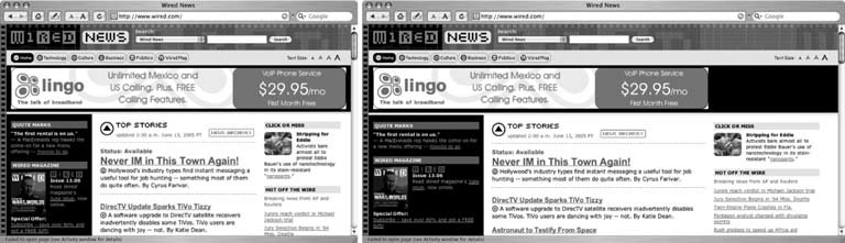 Fixed layoutsControl is what turns many designers to fixed layouts. By gearing a site's layout toward some middle groundsay, the perceived 800x600-pixel standardfixed layouts provide a better canvas for accurately translating a designer's mockup into HTML. On larger monitors at higher resolutions, however, locked-down layouts permit ample stretches of empty space to fill the right and bottom sections of the browser window (see Figure 3-2). An increasingly popular faux-flexible layout style minimizes the visual impact of unsightly white space by centering all content in a fixed-width block. When a visitor widens her browser window, the content block shifts to the right, dividing the increased empty space against the right and left edges of the window. Beyond that, the arguments for and against fixed layouts fill a mixed bag. Fixed layouts are:
See AlsoFor more information on the actual sizes of various browser windows, read Chunky-Soup.net's article "Tracking Visitor's Browser Sizes" at http://www.chunkysoup.net/advanced/bugged/. |

EAN: 2147483647
Pages: 144