Shape-Changing Dialogs
We have seen how to create dialogs that always show the same widgets whenever they are used. In some cases, it is desirable to provide dialogs that can change shape. The two most common kinds of shape-changing dialogs are extension dialogs and multi-page dialogs. Both types of dialog can be implemented in Qt, either purely in code or using Qt Designer.
Extension dialogs usually present a simple appearance but have a toggle button that allows the user to switch between the dialog's simple and extended appearances. Extension dialogs are commonly used for applications that are trying to cater for both casual and power users, hiding the advanced options unless the user explicitly asks to see them. In this section, we will use Qt Designer to create the extension dialog shown in Figure 2.13.
Figure 2.13. Sort dialog with simple and extended appearances
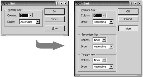
The dialog is a Sort dialog in a spreadsheet application, where the user can select one or several columns to sort on. The dialog's simple appearance allows the user to enter a single sort key, and its extended appearance provides for two extra sort keys. A More button lets the user switch between the simple and extended appearances.
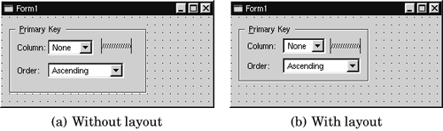
We will create the widget with its extended appearance in Qt Designer, and hide the secondary and tertiary keys at run-time as needed. The widget looks complicated, but it's fairly easy to do in Qt Designer. The trick is to do the primary key part first, then copy and paste it twice to obtain the secondary and tertiary keys:
- Create a group box, two text labels, two comboboxes, and one horizontal spacer.
- Drag the bottom right corner of the group box to make it larger.
- Move the other widgets into the group box and position them approximately as shown in Figure 2.14(a).
- Drag the right edge of the second combobox to make it about twice as wide as the first combobox.
- Set the group box's title property to "&Primary Key", the first label's text property to "Column:", and the second label's text property to "Order:".
- Double-click the first combobox to pop up Qt Designer's list box editor, and create one item with the text "None".
- Double-click the second combobox and create an "Ascending" item and a "Descending" item.
- Click the group box, then click Layout|Lay Out in a Grid. This will produce the layout shown in Figure 2.14(b).
Figure 2.14. Laying out the group box's children in a grid
If a layout doesn't turn out quite right or if you make a mistake, you can always click Edit|Undo, then roughly reposition the widgets being laid out and try again.
We will now add the Secondary Key and Tertiary Key group boxes:
- Make the dialog window tall enough for the extra parts. Select the group box, click Edit|Copy, then click Edit|Paste twice to obtain two additional group boxes. Drag the two new group boxes to the approximate positions that they should occupy. Change their title property to "&Secondary Key" and "&Tertiary Key".
- Create the OK, Cancel, and More buttons.
- Set the OK button's default property to "True" and the More button's toggle property to "True".
- Create two vertical spacers.
- Arrange the OK, Cancel, and More buttons vertically, with a vertical spacer between the Cancel and More buttons. Then select all four items and click Layout|Lay Out Vertically.
- Place the second vertical spacer between the primary key group box and the secondary Key group box.
- Set the two vertical spacer items' sizeHint property to (20, 10).
- Arrange the widgets in the grid-like pattern shown in Figure 2.15(a).
- Click Layout|Lay Out in a Grid. The form should now match Figure 2.15(b).
Figure 2.15. Laying out the form's children in a grid
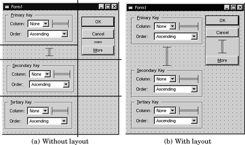
The resulting grid layout has two columns and four rows, giving a total of eight cells. The Primary Key group box, the leftmost vertical spacer item, the Secondary Key group box, and the Tertiary Key group box each occupy a single cell. The vertical layout that contains the OK, Cancel, and More buttons occupies two cells. That leaves two empty cells in the bottom-right of the dialog. If this isn't what you have, undo the layout, reposition the widgets, and try again.
Change the form's resizeMode property from "Auto" to "Fixed", making the dialog non-resizable by the user. The layout then takes over the responsibility for resizing, and resizes the dialog automatically when child widgets are shown or hidden, ensuring that the dialog is always displayed at its optimal size.
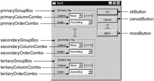
Rename the form "SortDialog" and change its caption to "Sort". Set the names of the child widgets to those shown in Figure 2.16.
Figure 2.16. Naming the form's widgets
Finally, set up the connections:
- Connect the okButton's clicked() signal to the form's accept() slot.
- Connect the cancelButton's clicked() signal to the form's reject() slot.
- Connect the moreButton's toggled(bool) signal to the secondaryGroupBox's setShown(bool) slot.
- Connect the moreButton's toggled(bool) signal to the tertiaryGroupBox's setShown(bool) slot.
Double-click the form to launch Qt Designer's C++ code editor and type in the following code:
 1 void SortDialog::init()
 2 {
 3 secondaryGroupBox->hide();
 4 tertiaryGroupBox->hide();
 5 setColumnRange('A', 'Z');
 6 }

 7 void SortDialog::setColumnRange(QChar first, QChar last)
 8 {
 9 primaryColumnCombo->clear();
10 secondaryColumnCombo->clear();
11 tertiaryColumnCombo->clear();

12 secondaryColumnCombo->insertItem(tr("None"));
13 tertiaryColumnCombo->insertItem(tr("None"));

14 primaryColumnCombo->setMinimumSize(
15 secondaryColumnCombo->sizeHint());
16 QChar ch = first;
17 while (ch <= last) {
18 primaryColumnCombo->insertItem(ch);
19 secondaryColumnCombo->insertItem(ch);
20 tertiaryColumnCombo->insertItem(ch);
21 ch = ch.unicode() + 1;
22 }
23 }
The init() function hides the secondary and tertiary key parts of the dialog.
The setColumnRange() slot initializes the contents of the comboboxes based on the selected columns in the spreadsheet. We insert a "None" item in the comboboxes for the (optional) secondary and tertiary keys. Although we have not created this slot using Qt Designer's slot editor, Qt Designer will detect that we have created a new slot in code, and uic will automatically generate the correct function declaration in the SortDialog class definition.
Lines 14 and 15 present a subtle layout idiom. The QWidget::sizeHint() function returns a widget's "ideal" size, which the layout system tries to honor. This explains why different kinds of widgets, or similar widgets with different contents, may be assigned different sizes by the layout system. For comboboxes, this means that the secondary and tertiary comboboxes, which contain "None", end up larger than the primary combobox, which contains only single-letter entries. To avoid this inconsistency, we set the primary combobox's minimum size to the secondary combobox's ideal size.
Here is a main() test function that sets the range to include columns 'C' to 'F' and then shows the dialog:
#include

#include "sortdialog.h"

int main(int argc, char *argv[])
{
 QApplication app(argc, argv);
 SortDialog *dialog = new SortDialog;
 app.setMainWidget(dialog);
 dialog->setColumnRange('C', 'F');
 dialog->show();
 return app.exec();
}
That completes the extension dialog. As the example illustrates, an extension dialog isn't much more difficult to design than a plain dialog: All we need is a toggle button, a few extra signalslot connections, and a non-resizable layout.
The other common type of shape-changing dialogs, multi-page dialogs, are even easier to create in Qt, either in code or using Qt Designer. These dialogs can be built in many different ways.
- A QTabWidget can be used in its own right. It provides a tab bar along the top that controls a built-in QWidgetStack.
- A QListBox and a QWidgetStack can be used together, with the QListBox's current item determining which page the QWidgetStack shows.
- A QListView or a QIconView can be used with a QWidgetStack in a similar way to a QListBox.
The QWidgetStack class is covered in Chapter 6 (Layout Management).
Part I: Basic Qt
Getting Started
Creating Dialogs
- Creating Dialogs
- Subclassing QDialog
- Signals and Slots in Depth
- Rapid Dialog Design
- Shape-Changing Dialogs
- Dynamic Dialogs
- Built-in Widget and Dialog Classes
Creating Main Windows
- Creating Main Windows
- Subclassing QMainWindow
- Creating Menus and Toolbars
- Implementing the File Menu
- Setting Up the Status Bar
- Using Dialogs
- Storing Settings
- Multiple Documents
- Splash Screens
Implementing Application Functionality
- Implementing Application Functionality
- The Central Widget
- Subclassing QTable
- Loading and Saving
- Implementing the Edit Menu
- Implementing the Other Menus
- Subclassing QTableItem
Creating Custom Widgets
- Creating Custom Widgets
- Customizing Qt Widgets
- Subclassing QWidget
- Integrating Custom Widgets with Qt Designer
- Double Buffering
Part II: Intermediate Qt
Layout Management
- Layout Management
- Basic Layouts
- Splitters
- Widget Stacks
- Scroll Views
- Dock Windows
- Multiple Document Interface
Event Processing
- Event Processing
- Reimplementing Event Handlers
- Installing Event Filters
- Staying Responsive During Intensive Processing
2D and 3D Graphics
Drag and Drop
Input/Output
- Input/Output
- Reading and Writing Binary Data
- Reading and Writing Text
- Handling Files and Directories
- Inter-Process Communication
Container Classes
Databases
Networking
XML
Internationalization
- Internationalization
- Working with Unicode
- Making Applications Translation-Aware
- Dynamic Language Switching
- Translating Applications
Providing Online Help
- Providing Online Help
- Tooltips, Status Tips, and Whats This? Help
- Using QTextBrowser as a Simple Help Engine
- Using Qt Assistant for Powerful Online Help
Multithreading
- Multithreading
- Working with Threads
- Communicating with the GUI Thread
- Using Qts Classes in Non-GUI Threads
Platform-Specific Features
EAN: 2147483647
Pages: 140
