Chapter 38: Designing for Embedded Systems
The previous chapter dealt with issues concerning the Web as a design platform. Embedded systems, or software systems integrated into devices that we may not naturally think of as computers (such as cellular phones, TVs, microwave ovens, automobile dashboards, cameras, bank machines, and laboratory equipment), have their own sets of opportunities and limitations. You must be aware of these when you are designing embedded systems. Without careful design, adding digital smarts to devices and appliances results in products that behave more like desktop computers than the products that users expect and require them to be (Cooper, 1999).
This chapter discusses some common types of embedded systems and presents some useful principles for approaching these devices from the standpoint of goal-directed design.
General Design Principles
Embedded systems, although they may include software interactions, have some unique concerns that differentiate them from desktop systems. When designing any embedded system, be it smart appliance, kiosk system, or handheld device, keep in mind these basic principles:
-
Don't think of your product as a computer.
-
Integrate your hardware and software design.
-
Context drives the design.
-
Use modes judiciously.
-
Limit the scope.
-
Balance navigation with display density.
-
Customize for your platform.
We discuss each of these principles in more detail in the following sections.
Don't think of your product as a computer
Perhaps the most critical principle to follow while designing an embedded system is that what you are designing is not a computer, even though its interface might be dominated by a computer-like bitmap display. Your users will approach your product with very specific expectations of what the product can do (if it is an appliance or familiar handheld device) or with very few expectations (if you are designing a public kiosk). The last thing that you want to do is bring all the baggage—the idioms and terminology—of the desktop computer world with you to a simple device like a camera or microwave oven. Similarly, users of scientific and other technical equipment expect to quickly and directly access data and controls within their domain, not wade through a computer operating system or file system to find what they need.
Programmers, especially those who have designed for desktop platforms, can easily forget that even though they are designing software, they are not always designing it for computers in the usual sense: devices with large color screens, desktop metaphors, lots of power and memory, full size keyboards, and mouse pointing devices. Few, if any, of these assumptions are valid for most embedded devices. Does it make sense, for instance, to include a Menu button on a TV remote control? Certainly you need to access functions, but Menu is a term from the world of computers, not TVs. Similarly, Cancel would not be an appropriate term for turning off an oven timer.
A much better approach than trying to squeeze a computer interface into the form factor of an embedded system is to see the device you're designing for what it is and to then figure out how digital technology can be applied to enhance the experience for its users. Microsoft could learn a lesson here with its PocketPC interface, although like all Microsoft products, it has improved gradually with each new version.
Integrate your hardware and software design
From an interaction standpoint, one defining characteristic of embedded systems is the often closely intertwined relationship of hardware and software components of the interface. Unlike desktop computers, where the focus of user attention is on a large, high-resolution, color screen, most embedded systems offer hardware controls that command greater user attention and that must integrate smoothly with user tasks. Due to cost, power, and form factor constraints, hardware-based navigation and input controls must often take the place of on-screen equivalents. Therefore, they need to be specifically tailored to the requirements of the software portion of the interface as to well as to the goals and ergonomic needs of the user.
It is therefore critical to design the hardware and software elements of the system's interface—and the interactions between them—simultaneously, and from a goal-directed and an ergonomic perspective. This seldom occurs in the standard development process, where hardware engineering teams regularly hand off completed mechanical and industrial designs to the software teams, who must then accommodate them, regardless of what is best from the user's perspective.
As a design practitioner, you need to lobby in your organization to begin the process of interaction design before the hardware platform has been completely specified. Many of the best, most innovative digital devices available today, such as the Handspring Treo and the Apple iPod, were designed from such a holistic perspective, where hardware and software combine seamlessly to create a compelling and effective experience for users (see Figure 38-1).
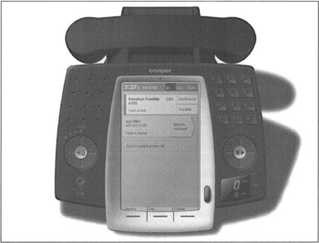
Figure 38-1: A Cooper design for a smart desktop phone, exhibiting strong integration of hardware and software controls. Users can easily adjust volume/speakerphone, dial new numbers, control playback of voicemail messages with hardware controls, and manage known contacts/numbers, incoming calls, call logs, voicemail, and conferencing features using the touch screen and thumbwheel. Rather than attempt to load too much functionality into the system, the design focuses on making the most frequent and important phone features much easier to use. Note the finger-sized regions devoted to touchable areas on the screen and use of text hints to reinforce the interactions.
Context drives the design
Another distinct difference between embedded systems and desktop applications is the importance of environmental context. Although there can sometimes be contextual concerns with desktop applications, designers can generally assume that most software running on the desktop will be used on a computer that is stationary, located in a relatively quiet and private location. Although this is becoming less true as laptops gain both the power of desktop systems and wireless capabilities, it remains the case that users will, by necessity of the form factor, be stationary and out of the hubbub even when using laptops.
Exactly the opposite is true for many embedded systems, which are either designed for on-the-go use (handhelds) or are stationary but in a location at the center of public activity (kiosks). Even embedded systems that are mostly stationary and secluded (like household appliances) have a strong contextual element: A host juggling plates of hot food for a dinner party is going to be distracted, not in a state of mind to navigate a cumbersome set of controls for a smart oven. Similarly, a technician on a manufacturing floor should not be required to focus on cumbersome test equipment controls—that kind of distraction could be life-threatening in some circumstances.
Thus the design of embedded systems must match very closely the context of use. For handhelds, this context concerns how and where the device is physically handled. How is it held? Is it a one-handed or two-handed device? Where is it kept when not in immediate use? What other activities are users engaged in while using the device? In what environments is it being used? Is it loud, bright, or dark, there? How does the user feel about being seen and heard using the device if he is in public? We'll discuss some of these issues in detail a bit later.
For kiosks, the contextual concerns focus more on the environment in which the kiosk is being placed and also on social concerns: What role does the kiosk play in the environment? Is the kiosk in the main flow of public traffic? Does it provide ancillary information, or is it the main attraction itself? Does the architecture of the environment guide people to the kiosks when appropriate? How many people are likely to use the kiosk at a time? Are there sufficient numbers of kiosks to satisfy demand without a long wait? Is there sufficient room for the kiosk and kiosk traffic without impeding other user traffic? We touch on these and other questions shortly.
Use modes judiciously
Desktop computer applications are often rich in modes: The software can be in many different states in which input and other controls are mapped to different behaviors. Tool palettes are a good example: Choose a tool, and mouse and keyboard actions will be mapped to a set of functions defined by that particular tool; choose a new tool, and the behavior resulting from similar input changes.
Most embedded systems have difficulty supporting a large set of modes for these reasons:
-
Screen real estate is limited, and therefore so is the ability to clearly convey mode changes.
-
Embedded-systems users are most often (as in the case of many kiosks) beginners rather than intermediates and usually do not have time to familiarize themselves with modes and navigation between modes.
-
Use modes results in navigational excise when input mechanisms are constrained.
Embedded systems designs should in general avoid use of modes. If modes must be used, they should be limited in number; and mode switches should, ideally, result naturally from situational changes in context. For example, it makes sense for a PDA/phone convergence device to shift into telephone mode when an incoming call is received and to shift back to its previous mode when the call is terminated. (Permitting a call while other data is being accessed is a preferable alternative.) If modes are truly necessary, they should be clearly accessible in the interface, and the exit path should also be immediately clear. The four hardware application buttons on most Palm OS handhelds are a good example of clearly marked modes.
In contrast, most cellular telephones offer extremely poor navigation of too many modes, which are usually organized in a hierarchical structure requiring multiple key presses to access. Most users of cell phones use only the dialing and address book functionality in their phones and quickly get lost if they try to access other functions. Even an important function such as silencing the ringer is often beyond the expertise of average phone users. Handspring has neatly addressed this problem by providing a clearly marked Ringer Mode switch next to the Power button on its Treo communicators, an interface feature that every cell phone should emulate.
The usability of a mode is completely dependent on input and display mechanisms. Both the input and display facilities of virtually every embedded system are significantly smaller and fewer than those found on a desktop computer. This means that modes implemented for embedded systems devices are, typically, difficult to perceive and navigate. Modes should, therefore, be reduced in number and in complexity.
Limit the scope
Most embedded systems are used in specific contexts and for specific purposes. Avoid the temptation to turn these systems into general-purpose computers. Users will be better served by devices that enable them to do a limited set of tasks more effectively, than by devices that attempt to address too many disparate tasks in one place. Devices such as Microsoft PocketPC handhelds, which of late have attempted to emulate full desktop systems, run the risk of alienating users with cumbersome interfaces saturated with functions whose only reason for inclusion is that they currently exist on desktop systems.
Many devices share information with desktop systems. It makes sense to approach the design of such systems from a desktop-centric point of view: The device is an extension or satellite of the desktop, providing key information and functions in contexts where the desktop system isn't available. Scenarios can help you determine what functions are truly useful for such satellite systems.
Balance navigation with display density
Most embedded systems (kiosks being the exception) are constrained by limited display real estate. Handheld devices are constrained by their form factor and power requirements. For appliances, cost is often the determining factor. Whatever the reasons, designers must create designs that make the best use of the display technology available, while meeting the information needs of users. Although it's possible to be a bit more lax with the layout of large displays, every pixel and every square millimeter of display counts for embedded systems. Such limitations in display real estate almost always result in a tradeoff between clarity of information displayed and complexity of navigation. By appropriately limiting the scope of functions, you can ameliorate this situation somewhat; but the tension between display and navigation almost always exists to some degree.
You must carefully map out embedded systems displays, developing a hierarchy of information. Determine what is the most important information to get across, and make that feature the most prominent. Then, look to see what ancillary information can still fit on the screen. Try to avoid flashing between different sets of information by blinking the screen. For example, an oven with a digital control might display both the temperature you set it to reach and how close it is to reaching that temperature by flashing between the two numerical values. However, this solution easily leads to confusion about which number is which. A better solution is to display the temperature that the oven has been set to reach and next to that, to show a small bar graph that registers how close to the desired temperature the oven currently is. You must also leave room in the display to show the state of associated hardware controls; or better yet, use controls that can display their own state, such as hardware buttons with lamps or that maintain a physical state (for example, toggles, switches, sliders, knobs).
Minimize input complexity
Almost all embedded systems share the quality of having a simplified input system rather than a keyboard or desktop-style pointing device. This means that any input to the system—especially textual input—is awkward, slow, and difficult for users. Even the most sophisticated of these input systems—touch screens, voice recognition, handwriting recognition, and thumboards among them—are cumbersome in comparison to full-sized keyboards and mice. Thus, it's important that input be limited and simplified as much as possible.
Devices such as RIM's Blackberry and the Danger Hiptop make effective use of a thumbwheel as their primary selection mechanism: Spinning the wheel very rapidly scrolls through possible choices, and pressing the wheel (or a nearby button) selects a given item. Both of these devices also make use of thumboards when textual data entry is necessary.
In contrast, the Handspring Treo makes use of a touch screen and a thumboard. This would be effective if you could adequately activate everything on the Treo screen by the touch of a finger. However, most Palm screen widgets are too small and require you to use a stylus to make accurate selections. This means that you must switch between stylus and thumboard, making input more awkward than it needs to be. Palm's Tungsten devices address a similar problem with the addition of a four-way directional pad and selection button, which allows stylus-free navigation of screen controls.
Kiosks, whose screens are usually larger, should nonetheless avoid textual input whenever possible. Touchscreens can display soft keyboards if they are large enough; each virtual key should be large enough to make it difficult for the user to accidentally mistype. Touchscreens should also avoid idioms that involve dragging; single-tap idioms are easier to control and more obvious (when given proper affordance) to novice users.
Customize for your platform
In the desktop world, software vendors sometimes try to develop interfaces across multiple platforms: The program looks and acts the same (or close to it) on MacOS, Windows, and Unix, for example. Not only does this create an enormous amount of programming overhead for the programmers, but it also usually ends up displeasing users, who would rather use an application native to their platforms, which takes advantage of the unique features, facilities, and interface idioms of their personal working environment.
This issue is compounded for embedded system software. It is almost impossible to port a desktop product to a device platform, and it is equally futile to try to develop cross-platform interfaces for devices with divergent operating systems and hardware profiles. In the embedded systems world, it is simply best to program and customize directly for each platform.
Designing for Handhelds
Handheld devices present special challenges for interaction designers. Because they are designed specifically for mobile use, these devices must be small, lightweight, economical in power consumption, ruggedly built, and easy to hold and manipulate in busy, distracting situations.
Especially for handhelds, close collaboration between interaction designers, industrial designers, programmers, and mechanical engineers is a real necessity. Of particular concern are size and clarity of display, ease of input and control, and sensitivity to context. This section discusses, in more detail, these concerns and useful approaches to address them. The following are the most useful interaction and interface principles for designing handheld devices:
-
Think about how the device will be held and carried. Physical models are essential to understanding how a device will be manipulated. The models should at least reflect the size, shape, and articulation (flip covers and so on) of the device, and they are more effective when weight is also taken into account. These models should be employed by designers in context and key path scenarios to validate proposed form factors.
-
Determine early on whether the device will support one-handed or two-handed operation. Again, scenarios should make it clear which modes are acceptable to users in various contexts. It's okay for a device that is intended primarily for one-handed use to support some advanced functions that require two-handed use, as long as they are needed infrequently. A handheld inventory tool, for example, that allows all counting to be done single-handedly, but then requires two hands to submit the entered data confers no advantage because the Submit function is part of a frequent-use scenario.
-
Consider whether the device will be a satellite or a standalone. Most handheld data devices are best designed as satellites of desktop data systems. Palm and Symbian devices both succeed best as portable systems that communicate with desktop systems or servers. Rather than replicate all desktop functions, they are geared primarily towards accessing and viewing information and provide only lightweight input and edit features. (Full size, folding keyboards are available for these systems; but these, in essence, convert the device into a very compact desktop system while the keyboard is in use.) The latest handheld models extend the idea of a tethered satellite into the realm of wireless connectivity, making the idea of the satellite device even more powerful and appropriate.
On the other hand, some devices, such as standard cell phones, are truly designed to be standalone. It's possible to upload phone numbers from PCs to many cell phones, but most users never try to do so because of the interaction complexity. Such standalone devices are most successful when they focus on a narrow set of functions, but provide world-class behaviors for those functions. The RIM Blackberry is a great example of a narrowly focused, data-centric handheld; it excels at one function: real-time wireless reception, viewing, and sending of corporate e-mail. Blackberry devices include support for other PIM (personal information management) functions, but these are typically used infrequently. It is wireless e-mail that defines the product.
-
Avoid use of pluralized and pop-up windows. On small, low-resolution screens, floating windows typically have no place. Interfaces, in this regard, should resemble sovereign posture applications (see Chapter 8), taking the full-screen real estate. Modeless dialogs should be avoided at all cost, and modal dialogs and errors should, whenever possible, be replaced using the techniques discussed in Chapters 33 and 34.
-
Strive for integration of functionality to minimize navigation. Handheld devices are used in a variety of specific contexts. By exploring context scenarios, you can get a good idea of what functions need to be integrated to provide a seamless, goal-directed experience.
Most convergence devices run the risk of pleasing nobody by attempting to do too much. Communicators such as the Treo are at their best when they integrate functionality for a more seamless experience of communication-related functions. These devices, currently, do a reasonable job of integrating the phone and address book: When a call arrives, you can see the full name from the address book and, by tapping on a name in the address book, you can dial it. However, this integration could be taken a step further. Clicking on a name in an address book could show you all documents known to the communicator that are associated with that person: appointments, e-mails, phone calls from the log, memos including the caller's name, Web sites associated with him, and so on. Clicking on one of these documents could then take you to an interface to respond appropriately to that person. Some recent applications for communicators, such as iambic Inc.'s Agendus, are beginning to take this approach to integrating what were once different applications into a more seamless flow that matches user goals.
-
On-screen controls should be larger and brighter. If you are using a touch screen on your device, controls should be large enough to be touchable by fingers. Styli can get lost and because of this (and the nerd factor), teenage users are often put off by the use of a stylus. Handheld screens are often low power and may have low brightness and contrast, so small icons and controls may also be difficult to see in some lighting conditions. Finally, because handheld interfaces must often be compartmentalized into several screens (only some of which may be used in any given context), handheld screens should resemble the transient posture applications (see Chapter 8) with large, high contrast, and colorful (if available) controls.
-
Use larger, sans-serif fonts. Serif fonts are hard to read at low resolution; sans-serif fonts should be used for low-resolution handheld displays.
-
Don't require dragging. Touch screens can support dragging, but it is difficult for users to perform, and risks accidental scratching of the screen. Ideally, a hardware control such as RIM's Blackberry thumbwheel or Palm's Up and Down buttons should provide the primary mechanism for scrolling. Drag-and-drop idioms should be avoided as well.
-
Don't require shifting input modes. As mentioned earlier, input should remain as simple as possible. When the device sports a keypad or thumboard, it should not also require a cumbersome switch from one-handed to two-handed use or a stylus to tap a screen. It is fine to allow both types of input independently, but requiring constant input mode switches in mid-use can lead to user frustration.
-
Clearly indicate when there is more data off screen. Many people aren't used to the idea of a small screen with scrolling information. If there is more data than fits on a screen, make sure to boldly indicate that more data is available, ideally with a hint as to how to access it.
|
|
EAN: N/A
Pages: 263